INTERVIEW WITH AKIRA KOBAYASHI
December 11, 2010
Tokyo
Interviewer: Minako Sando
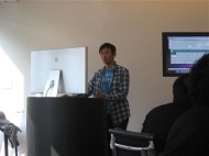
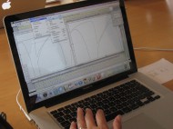
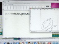
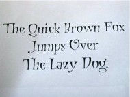
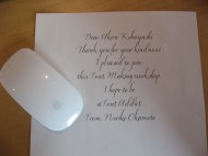
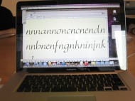
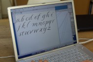
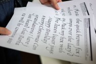
In November 2010, J-LAF hosted a workshop on creating fonts. This feature article presents an interview with Akira Kobayashi, Type Director at Linotype Library GmbH in Germany, who instructed the workshop.
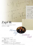
Question: From end of March 2011*, you and J-LAF will be co-hosting the Zapf Exhibition in Tokyo. What do you wish for the visitors to see when they view the exhibits? Will you tell us what you wish for the type designers to see, for the calligraphers to see, and finally for the general public?
Kobayashi: Let me first talk about what I wish for the type designers to see. It may seem that a capable calligrapher should also be a capable type designer, but working as a type designer, I have come to realize that surprisingly very few people can do both. Some people who are capable calligraphers cannot design typeface at all, or on the other hand, some people, such as myself, who are capable of designing typefaces are not capable calligraphers. There really are very few people who are both capable calligrapher and type designer. Hermann Zapf is one of the few. I hope that the designers will keep that in mind and see the origin of such beautiful and widely-used type design at the Zapf Exhibition. Hermann Zapf did not intend on becoming a type designer at first. He began from teaching himself calligraphy. He started reading books on calligraphy, but did not realize that he was holding the pen incorrectly until later on. He corrected his pen-hold after that, but his letters probably were not so beautiful in the beginning. Even with a start like that, Hermann Zapf gained fame as a calligrapher and also started producing great designs as a type designer. I think this will be a good opportunity for the designers to find out the origins of Zapf's type designs.
Now, what I would like for the calligraphers to see.... It is totally opposite of what I said earlier about designers. It does not mean that a capable calligrapher can design typeface. There is a process for letters to become typeface. That is, as you can understand from taking the workshop for calligraphers, typeface is different from calligraphy in that it basically needs only one letter a. What I mean is, with typeface, you make one letter in an alphabet, and whenever the same letter is needed that one letter is repeated all the way through. You cannot choose to use a certain shaped a here or a different shaped b somewhere else. You are given little freedom with fonts. It is difficult to take advantage of that little freedom or to make fonts without losing the calligraphic touch. I hope to be able to show that difficulty somewhere when I have an opportunity, although I am not sure if I can exhibit something like that.Now for the general public... Maybe there are some people who are not familiar with calligraphy, but may have heard of calligraphy classes offered at so-called "culture schools" in Japan. I would assume that even fewer people have heard of type design. I mean, I think there will be a lot of people who will be surprised to find that typefaces are made by designers. So, I wish for the people who somewhat know about calligraphy to be moved by the amazing art of calligraphy. Then afterwards they may think, "I now know that there is such a profession as type design. What kind of skills do type designers need?" It would be nice if they can see a subtle connection between calligraphy and type design. I think that in the end, both calligraphy and type design try to aim the same thing, and that is, it has to look beautiful when the letters are put together as words. Calligraphy aims that with handwritten letters. Typeface is very inconvenient in that you can only make one design for each letter, but there are ways you can make the typeface dynamic or beautiful, and I hope people can see how beautiful typefaces can look when they form words.
Question: You planned a workshop targeting calligraphers this time. What motivated you to do so?
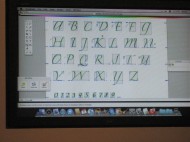
Kobayashi: I held a workshop for designers last year (2009) and received a tremendous response. Of course, since it targeted people who are used to using the Illustrator software, the level we reached was quite high. It was so successful that I thought I could hold the same workshop over and over. The reason I thought of doing the same workshop targeting calligraphers this year is because I wanted calligraphers to take a peek inside a different world. Of course, it's just fine for calligraphers only sticking to calligraphy. I just wanted to show them a little of another peculiar world. What I mean is, as I said before, with typeface, you make one a and that is it for letter a. When you are restricted to only being able to repeat the same letter, you have to use a different part of the brain than when you do when you are handwriting letters in calligraphy. Instead of writing a letter that goes with the letter before or a letter that follows, you must imagine how one letter from the keyboard will connect to any other letter and how they combine with each other. You didn't notice it when you were writing all the letters separately, but when the letters were put together as words, you noticed that the letters you wrote have different slants. Or you thought that each letter would go with one another but you find that it doesn't quite work....and so on. If you have to say that it was a success or failure, you might have to say that it was a failure, but it was important for the calligraphers to see that you don't have much freedom when you want to make a font from your own handwritten letters. It would have been impossible to make a perfectly working font in two days, so I wanted each calligrapher to first find this out: there is little freedom in making a font. Then, it would be nice if from there, they will start thinking, "Yes, I see. If I shape my letter this way, then a, b, or c or any other letter will connect nicely." Or, if it gets them wondering "Why do the letters look like they have different slants?" As I said before, calligraphy and type design seem similar, but actually, type design involves a totally different process. That's why a very capable calligrapher may not be able to design type. I thought it would be nice if the workshop motivated the calligraphers to start asking as they write, "What would these letters look like as a font?" or "When I write with a pen, these letters connect easily, but would it connect as nicely as a font?"
Question: Were there things you expected to happen in this workshop? Also, how did your expectations compare with what actually happened?
Kobayashi: Since I wasn't working with designers, I expected some stumbling with how to use the Mac or the software. Aside from that, I knew that when handwritten letters became a font, I would see problems such as letters not connecting as they should or the slants being different. What I mean is that I didn't think that fonts would be completed in one workshop. I expected that, but I didn't want to say, "Oh, that doesn't work", but rather, "No, your letters don't connect, but isn't that interesting?" Of course, from the type designer's point of view, something didn't work but the goal for this workshop was for the calligraphers to find out that it is difficult to make it work. I wanted them to experience failure once. Then, with one failure, there were things they realized. I had given the calligraphers information on how to prepare their handwritten letters before the workshop, but they had to actually see what makes it go wrong to understand why they needed to have a referential baseline or a gauge. You realize and learn from your mistake. What you realize is exactly the really interesting difference between calligraphy and type design, and I think that's what makes it so fascinating.
Question: Do you plan on holding a similar workshop in the future?
Kobayashi: I would love to hold a "similar workshop in the future"! I had a great response from the people who took the workshop this time. I had someone who almost started crying because she was so touched. I mean when you see something like that. Someone who writes such beautiful letters in calligraphy was so touched when her letters became a font. Why is that? That is what makes teaching such workshop fun for me, and I also learn a lot from teaching. If you've been thinking that type design is a totally different world or that you must need some special skill, then you are wrong. Anyone can do it. Once you understand the process of making a font, when you see different typefaces used in stores or in advertisements, ask yourself questions such as "How were these letters made? Why do these letters connect so well? Is it because of this part that the letters connect so well?" I think you will quite enjoy how you find yourself looking at fonts.
Question: What kind of difference do you see in calligraphers and type designers regarding their perspective on design?
Kobayashi: I don' really know. Having done the workshops, I do think that there is clearly a difference. Also, for my work, I meet a lot of calligraphers, but if it seems like they will be able to design faultless typeface at first try, that doesn't seem to be the case. I've been thinking about what the difference is, but I still can't quite put my finger on it.
Question: Do you see a potential for calligraphers (or calligraphy) in the world of design?
Kobayashi: Living in Europe, there is something that I feel whenever I return to Japan. There are many logos out there that I wish graphic designers would consult calligraphers. I think that if there is more exchange between graphic designers and calligraphers so they can easily ask each other questions, then logo designs in Japan in general will become more interesting. Now, it seems that very angular and unpolished letters that look like they belong in construction sites are accepted for all sorts of logos. I think the logos are either rough design that you might see in construction sites or very loose design that looks like it is missing something. Surprisingly there are very few logo designs in Latin alphabet that look mature and steady; most belong to either the rough design or the loose design. I don't think that a graphic designer tried different options before deciding on the rough design or the loose design. Will the same graphic designer be able to design a traditional and orthodox style logo if asked? If the designer has a background in calligraphy, I think the answer is probably yes. I would like for graphic designers to know more about calligraphy. If they have more communication with calligraphers, then I think there will more options in logo designs. That's where the potential for calligraphy lies.
Question: What kind of script typefaces do you think are in demand?
Kobayashi: Few years ago, a rough script typeface came out. It looked like handwriting that an amateur tried to make it look a little decorative, and it was popular at the time. I didn't see why it had to be digitalized, but I think that people want a handmade touch. Even with all the technological advancements, I think that there is still a need for a handmade touch, and that will always be the case.
Question: What points should we keep in mind if we want to make a font that takes advantage of handwritten letters, a design that one can imagine stroke order or see traces of applied pressure? If a font director, a designer, and a calligrapher can cooperate on this point, what do you think will be important? (Although I guess a calligrapher can also be a designer).
Kobayashi: I can only speak from the type designer's standpoint, but a type designer think of that as ordinary and can do it quite easily. A somewhat capable type designer can imagine from experience a stroke order, what should be done so that a letter connects to the following letter, or how the letters will look combined. If I were told, "Mr. Kobayashi, please make a type that looks like calligraphy," then I already have an organized process in my head, and I can readily select a way that I can make a font without a problem. Now, how can you make a font with a handwritten look in which you can almost see stroke order or applied pressure? For example, there is a font called "Hamada" which I helped digitalize. Gaynor (Goffe), a calligrapher, and I made it, but I did the digitalization alone. Gaynor had written many types of letters from a to z, and from instinct, I was able to select letters that I knew would work and connect nicely. A type designer with some knowledge of calligraphy can make a font with a handwritten look.
Question: What kind of relationship does calligraphers and designers have overseas? How do you think they should relate to each other in Japan?
Kobayashi: The biggest difference between Japan and overseas is that in Japan, if you go to take lessons in calligraphy, 98% of students are women and 2% men. I've never taken calligraphy lessons overseas, but I would guess that it would be half women and half men. Even successful calligraphers, the ones I know are mostly men. So the male-female ratio is totally different. That may be due to the fact the calligraphy has been developing through so-called "culture school classes" in Japan, so calligraphy is thought of as something for enrichment lessons. I think that's too bad. I would like for graphic designers to know about calligraphy. You need to hold a pen to understand the origins of letters or letterforms. That has not been considered important in the Japanese design education. I really wish that schools would teach calligraphy properly, but unfortunately, I think there isn't anyone who can teach it. There is no one to teach it so the designers graduate from school without the knowledge. Somewhere along the line, the importance of writing letters with pens has been omitted from design education in Japan, and so it's like... it has been okay until now, why change now. I really want to say, "It's really better if you know about these things." That is why in my book Oubunshotai (Latin Alphabets), I wrote that if you hold a pen or a flat brush and write letters, you will understand why a letter is shaped the way it is, and included information so that the readers will realize about the real basics about the origins of letterforms. I really wish that art and design schools in Japan spent much more time to teach this. I think that if calligraphers and graphic designers can relate to each other in Japan, this may be it. For example, calligraphers can be invited as a special instructor for designers. It would be wonderful if calligraphers can take part in design education.
◆Below is a conversation between Akira Kobayashi and the interviewer (Minako Sando, director of J-LAF).
Sando: In the workshop, I wanted to make a font that looks so handwritten that it doesn't look like a font. So I thought it would be better if the width, height, or slant were not so uniform. When I tried to make my letters into a font though, I found that what needs to be uniform must be uniform or the letters do not look cohesive. I thought I should have followed your instructions. I wrote my letters with only a baseline and did not set a line for the x-height. I thought it would look more handwritten that way, but when I tried it, the letters looked uneven and misaligned. The letters were not even aligned along the baseline and the letter sizes were different.
Kobayashi: Did it bother you that much?
Sando: Yes, it did. Maybe I wasn't supposed to do those things on purpose, but I thought I would try. So, I thought looping the descender of "g" would look good or that the ascender of "d" may look interesting if it curved to the left. When the letters became a font, it was too much when the letters were repeated with the same descenders and ascenders. I also thought that when the letters with extenders had the same thickness, they stood out too much. I thought that for the first try, it would have been better if I was careful about uniformity while leaving the good parts of handwritten letters.
Kobayashi: Those are the things you see once you combine the letters. You couldn't while the letters were lined up separately in alphabetical order.
Sando: You're right. For some reason, while I was writing the letters, I didn't notice those points at all. I think when I handwrite next time, I might always be conscious of those points. Hermann Zapf drew his extenders thin as they should be, so they look beautiful. I usually teach students to write uniformly and I make sure that I can write uniformly also, but it is actually difficult to decide if uniformity makes the letters beautiful or if irregularity makes them look interesting. Sometimes I think perfect uniformity looks uninteresting, and then other times, I think uniformity is better.
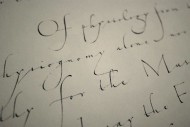
Kobayashi: Now, if it seems impossible to make a font from letters that are uneven and different, then that isn't quite so. All that works in Zapfino. You wonder what makes this font so different, right? The answer to that isn't a simple one. It's a result of trial and error, and the fact Hermann Zapf made it work in the end is what makes him such a brilliant font designer. But, I do think that thinking about what makes it work is really the interesting part. An easier solution may be for you to draw impeccable but lifeless letters on a grid paper, but if you are able to make a font that looks truly handwritten with letters that are not aligned exactly, then I think you have really made quite a high-level font. It may be difficult to do in the beginning, but in time, I think you can do it.
I explained earlier that with typeface there is only one letter a, but actually, in the current font design environment, it is possible to program so that you have five different a's and five different b's and one is chosen according to what letter comes before and after. But, the experience and discovery of making fonts wouldn't be half as interesting if you knew you could do that from the beginning, so it's better to start from having only one a. It's better to experience not having freedom in the beginning.
Sando: Considering that there is such little freedom, it is also perfect. There is only one a but it works wherever it's used.
Kobayashi: That's right! Why is that? There is so little freedom with fonts, and yet why is it that the letters in Zapfino font connect so well? Why does it have that momentum? And that dynamic look? You look at it and the letter sizes are uneven, and the slants are irregular. That is what is so remarkable about that font.
Sando: I thought that the little difference in thickness or stroke direction made Zapfino beautiful even if the letters look uneven. There is nothing unnatural about it. I understood that from trying to make a font.
Kobayashi: Yes, once you try it yourself, you see it. It becomes interesting after you make a mistake and find out how little freedom you have with fonts. I think that our workshop was a great success if everyone saw that.
Sando: Yes, I think so. I look forward to the next opportunity. Thank you for taking the time to talk with me today.
Biography
Akira Kobayashi has resided in Germany since spring of 2001 as the Type Director of Linotype GmbH. His main duties at Linotype include supervising type designs, controlling the quality of typefaces, planning new typefaces, selecting typefaces in competitions, proposing and producing corporate typefaces, etc.He also works with renowned type designers, Hermann Zapf and Adrian Frutiger, to revive their classic typefaces. In 1998, at a competition in the United States, he won both Best of Category and Best of Show for his Roman typeface "Clifford" for text. In 2000, he won the grand prize in the text typeface category in a typeface design competition at Linotype for his typeface "Conrad". He has published three books from Bijutsu Shuppan-sha: Oubunshotai in 2005, Oubunshotai 2 in 2008, and Font no Fushigi in 2011. He gives lectures on Latin alphabet fonts and holds workshops on font designs both overseas and in Japan.
