Interview with JOHN STEVENS 1
Q: When did you begin calligraphy, and what inspired you to do so?
I started calligraphy in 1979-1980. Letterforms have always held fascination for me in some way. When I was young, I was interested in music, art and "cool" letterforms were everywhere, like the album art of my favorite musicians, for example. After teaching myself guitar and working in several rock n' roll bands, (a common thing to do back then) I got tired of the nightlife and bars and decided to pursue the other side of my interest: visual art. (I was playing in bars at 15-16 years old in evenings and not able to get up for school the next day)
My plan was to go to art school while working in the daytime. This plan got diverted when my father met a "sign writer" who had a sign making business. I interviewed with him and went to work as an apprentice for a year or so. I was a very quick study (with a great teacher, Anthony Perner) and I generally liked making signs, making letters and designing them, but I wanted something more. I didn't know it, but I wanted to design. I liked being a "designer-maker" ¹ which, before our age of specialization, was how everything was done.
I could say, looking back, that my real love of letterforms began there.
I was drawn to calligraphy by reading many, many books on type, calligraphy, letterform design, visual design and art history /theory. I read Edward Johnston, Fr. Edward Catich (who used a brush like I did), and each new book led me to the next. I was also very interested in visual design; I read many books on the subjects of design and visual literacy. I enjoyed learning about all of these various facets and putting them to use. I was not always sure how I was going to apply them. There was a parallel with music theory, which was helpful in my ability to understand design theory. At this time of my life, I had an ideal setup: I became freelance and I worked several days in the sign-business and had enough free time to pursue calligraphy and even to incorporate it into my work.
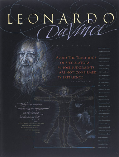
* Leonardo DaVinci 1983 Various pens / media and colored pencil on Canson paper. This work started out as a poster design for a printing company but was put aside unfinished. I pulled it out and finished it several years later for a solo exhibition in 1991. The texts are excerpts dealing with knowledge-theory vs. experience. The words expressed some feelings I had at that time about teachers, especially in lettering and design.
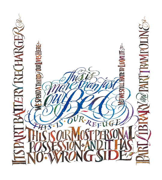
* Bernhardt Bed Illustration: This is one of a series I did for them. Watercolor on paper using pens of various types: Broad-edged and ruling pens.
In the beginning, I did take a few workshops, but I preferred working very intensely on my own. I don't recommend this, but school had not worked for me. At this time the biggest influences on my work were: Edward Johnston, the Arts & Crafts movement thinking. Eric Gill, Fr. Edward Catich, Hermann Zapf, John Howard Benson, Rudolf Koch, Rudolf Von Larische and Friedrich Neugebauer. Other influences on my thinking: artists outside of letterforms: Klee, Picasso, Matisse, and thinkers/teachers: László Moholy-Nagy, György Kepes, Maurice Sansaurez and Critics: Susan K Langer, Armin Hoffman and others. Musicians' ideas have also played an important part in my thinking, I consider music the first abstract art.
I was also interested in painting, drawing and, to be honest, I looked at everything. I was obsessed with learning and I found no shortage of information in libraries, (New York Public Libraries & Huntington Library, NY) and museums. Whether I was studying lettering or design, I found that there were many people before me who did wonderful and interesting things, and I was in a good place in my life to absorb all of it. Many of the interesting books in the NYPL were out of print, and I could not check them out of the library. I felt it to be a wonderful study opportunity to be able to read them in their reading room and take a lot of notes.
Fairly early on, I was more interested in ideas and insights than techniques simply because I was fairly technically advanced from working with a brush in the sign business and realized, probably from being a musician, that technique without an idea was fairly useless. Yet, the reverse was not true. But do not get me wrong, both technique and knowledge are necessary for true mastery.


I was needing some guiding principles and Johnston's ideas were great. On brush roman,
Catich's ideas were pivotal and really led to an investigation into "causality". However, what most people don't understand is, I was looking at everything: drawing and painting, sculpture, type designers Eric Gill, Jan Tschichold, Jan Van Krimpen, Morris Benton, William Dwiggens, Frederick Goudy and, of course, I very carefully studied historical manuscripts. They teach a lot if you ask the right questions, and I was really trying to find what truths would work best for me.
In the end, I think my goal was to have such an understanding, such a facility with the letterforms, the language of form and design, that I could go in any direction I wanted at will.
Looking back I can say I was on a quest, looking for truth, purity of form, various design approaches and expressive potential. I felt in 1980 that there was great promise for me in this course. I thought I would end up doing something similar to Hermann Zapf (type design and calligraphy). However, the world was changing and that was not to be.
I am, however, still interested in type today, but it is a whole other world than it was then and the economics have shifted radically in the past 28, mostly by our digital age. To summarize: a combination of practice, reading, experimentation/study led me here.


Lastly, commissions and assignments: they offer learning because there is opportunity and limits (The Power of Limits) ² that must be negotiated and thought through and can stimulate ideas. Each commission leaves a mark on me and is a test of the validity of my ideas. Many of my commissions were design-related and my belief early on was to bring a higher quality of "illustrative" letterform or rather "letterform as image" to a project. In design you use as image either illustration, photographs or words. A book-title design would be an example of a "word illustration". My sensibilities leaned heavily toward the calligraphic.
I also did commissions that were the "normal" calligraphers work: certificates of honor, quotations, etc. Lastly I did a lot of experimental work on my own just for the sheer joy of it.
I might also add that I was teaching fairly early on, and that is a learning experience for the teacher as well.
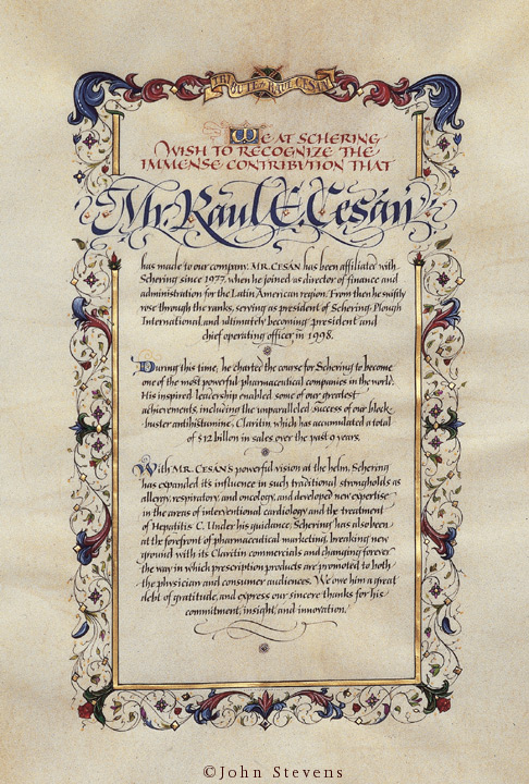
* Illuminated Manuscript. Tribute for the President of Pharmaceutical Company 2002
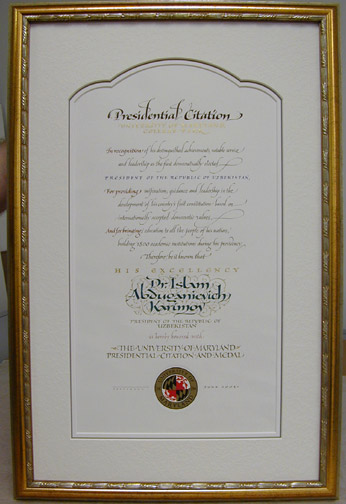
* Citation for the President of Uzbekistan 2001
Afterthought:
------------------------------------
It seems we now live in a time when information is really available. Workshops everywhere, books, online video, DVD, banking on your cell phone. It is a great time in that information can travel quickly and easily. By earning it slowly the way I did, I think the appreciation for process, the original brilliance of what is being studied is absorbed- like eating slowly versus gobbling a fast food meal. The benefits run from subtle to life-changing. One would think with all of this information available, things would be better and in many cases that is true. However, I have also wondered, with all of this information, does one value each piece as much, or does something get missed? Perhaps when the information comes slow, we take longer to absorb what is true for us and it gets mixed with who we truly are, as opposed to regurgitating fragments quickly which leads to derivative work. I remember hearing that Friedrich Neugebauer did not approve of students taking 30 different workshops, but rather felt a calligrapher/book artist only needed one good teacher. Of course it depends on the individual, but it is worth noting that all of the top calligraphers have a base of serious study, and in most cases, it was not by chasing the workshop circuit.
But that may change.


* Seventy-Seven: Logo for a wine. Bottle design by Shapiro Walker
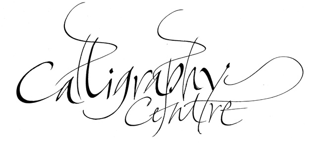
* "Calligraphy Centre" Logo: Written in one take. Used on website, cards, stationery.
* Logo for guitar maker
*² Book: The Power of Limits: Proportional Harmonies in Nature, Art, and Architecture by Gyorgy Doczi
BIOGRAPHY
John Stevens is a calligrapher, designer of logotypes & illustrator of expressive letterforms with 27+ years experience. He has worked for well-known clients in book & magazine publishing, packaging, type design, graphic design, television & film. He has exhibited and been published widely and will be teaching workshop in Tokyo in November 2009