「Take Your Pleasure Seriously」The way of handwriting
letters
from the past
—
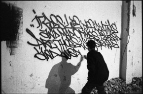
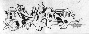
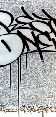
I can’t recall the exact moment in which writing went from being a passion to my line of work, but I do know that it wasn’t premeditated. I began working when I was seventeen, and still a student. I’ve had a lot of different jobs in the past, including some very humble ones. My main interest at the time was graffiti, drawing letters all day just like now, even if I did it in a completely instinctive manner. Like many of my peers, I spent hours sketching out what would later see the light—paradoxically, at night—on subway and train cars or in some other corner of the city.
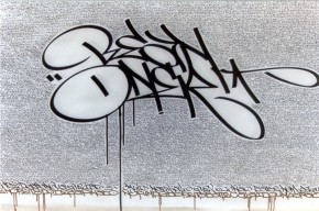
I got by in school, but my strongest memory is of pen and paper, and how intent I was on improving my tag so I could show it to other graffiti writers. I recall choosing my first tag in 1994, based on the letters I liked, without knowing what it meant; first it was “Been,” which later became “Bean” to avoid dealing with the double “e.” There were often no books in my backpack, which I filled instead with cans of spray paint cracked open as soon as school was out, coating diesel trains parked near the station in my hometown on the outskirts of Milan: during class I would prepare the outline, and by 2:30 that afternoon I was out there painting it on the train cars.
Ditto each evening: I always had a marker in my pocket and left marks that to most people looked like little more than small scrawls, while for us writers they grew increasingly complex, and increasingly important, because that was our ID in the subculture we ourselves had created, a micro-society most people ignored. If I were asked to define it now, I could only awkwardly say that we were a bunch of amicable, maladjusted kids who were trying to escape mediocrity by pursuing a somewhat risky pastime. I think this “parallel education” left such a deep mark on me that I decided not to shed it as I grew—it was my real schooling, and I knew I should make something of it.
I found the graphic design that teachers talked about relatively interesting. I remember the transition from analog to digital being a bit traumatic: when I began design school I was fascinated by Pantone, transfer sheets, Rapidographs, and works drawn on Schoeller paper; when I finished, in 1997, all that had been replaced by computers. Had I told anyone I wanted to be a calligrapher, they would certainly have thought I was mad. “There’s no market for that,” they’d have said. All anyone talked about was websites, servers, and Flash, while I was running around with a large black leather-bound sketchbook full of drawings, photos, and sketches of graffiti and a few works of primordial calligraphy. My experiences as a graphic designer came later, and they weren’t very creative. For the most part I did page layouts for design and architecture magazines. A few ad agencies gave me job interviews. I remember an art director who, looking at some of my images, said, “It looks tough. Interesting…” He made a few color photocopies and never called me back.
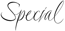
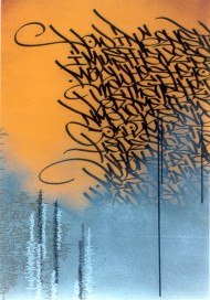
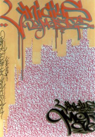
My job search grew more discouraging by the day: I had learned some graphic design software, but I didn’t want using it to become my full-time job. I decided to give it up, because the repulsion I felt toward the gadgets that had completely wiped out all manual work in the field was too strong for me to pretend nothing was wrong and to try adapting to the change. In 2003 I found work at a music store that was part of a large chain. I stayed there for four years, and after work I began to draw and practice with a nib pen, making works on canvas and experimenting with lettering, mostly in a self-taught way. Then I began receiving strange work requests, everything from commissions spray painting stores to customizing booths, products, and model cars for specialized trade fairs. I also began lettering invitations for some stylists with whom a few of my other calligrapher friends had been working for years; it was a real privilege, they paid me to just write all day, and three or four days’ work paid more than what I earned in a month at the store. It was also an exercise that improved my writing, something I probably wouldn’t have done otherwise. Writing names and addresses for eight hours straight can be a kind of “slavery,” as James Clough calls it, but it can be quite useful. I often gave up my vacation days to do that work and other jobs, and when I had no days left I made up absurd excuses to get time off. For a while, some of my close relatives were on the brink of death about once a month (my apologies, everyone!).
I hadn’t yet begun posting works on the web, but a few photos ran in some magazines and I was busy with performances by Rebel Ink, a collective I was part of alongside Rae Martini, Marco Klefisch, and Francesca Gandolfi. We’d begun touring many Italian cities, and later toured abroad as well; the Rebel Ink site was our long-term homepage, but a lot of people also came out to see us in person, and word began to spread. We began performing in 2003 and our last events took place in Prague in 2009, after which we all took different paths. We were well aware of the fact that it wasn’t just some random experience; it had given us real meaning without tying us down to the world of street art, a niche we had never really identified with, and had distanced ourselves from at the very outset. We knew our work with graffiti would come to a turning point, and we were determined to decide where it would go from there.
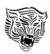
The idea that someone I didn’t even know might wear something I’d drawn piqued my curiosity. I designed my first “official” T-shirt in 2006 for Gold, a company I still work with, and with whom in 2010 I co-produced an entire line. Then came the graphics for Iuter, a streetwear brand founded by friends that was starting to take off. A lot of the connections that brought these commissions came from people I’d met through hip-hop, a scene I had been part of for several years, and which remains a integral part of my roots.
Meanwhile, the demand for my work kept growing, to the point where I transitioned to working half days in the store, and then one day I up and quit, just like that. I left my safety net so I could continue drawing letters, without knowing exactly what kind of work I’d chosen to do. About a month later I designed my first headline for an advertising campaign. I couldn’t believe it, and I strolled out of the agency light on my feet, singing to myself, almost leaping for joy like a scene in a film. I was definitely afraid of not making it, but then I understood that, even if it went badly, I could always go back and find work somewhere else. In the meantime I intensified my calligraphy studies and began taking evening courses in computer graphics, type design, and printmaking, so that I’d have as many visual languages as possible to apply to my work. I knew I had to do that in order to gain a deeper understanding of the subject, although I also have to admit that it wasn’t easy to continue drawing letters all evening after spending the entire day doing it. I bought and read books on typography with an almost maniacal diligence. Actually, it was outright maniacal. But that was a bit of a passing phase, too…
the calligrapher’s
profession today
—
Up until about some years ago I couldn’t have imagined refusing certain gigs and devoting my time only to the ones that interested me—I considered that a luxury. But soon thereafter I found myself in that very position, having to make hard choices.
First of all, I had to deal with the ethical issues: when your passion becomes your profession, you’re faced with the choice of either working or not working with clients that might not share your same values. Soon, however, you realize that in such cases ethics are really just a matter of personal preference, something you have to sort out for yourself. “Purity” and the need for others’ approval are probably relics of graffiti writing.
I chose to try my hand at commercial work very early on. I thought I’d be able to do it just like so many of my idols had done—Herb Lubalin, Saul Bass, and Milton Glaser—without it detracting at all from the splendor of the final creations. The thing that fascinates me about those designers and many other letterers is the way their logos and brands have become part of popular culture—the well-designed lettering found on everyday products, on supermarket shelves and everywhere else. I walk through stores and I encounter Massimo Vignelli on the bottles of Feudi di San Gregorio wine, Saul Bass on boxes of Kleenex, and even Salvador Dalí in the Chupa Chups lollipop logo.
Up to now I’ve found a happy medium, alternating purely commercial jobs with more personal ones, or ones for causes I openly support. Such manual work definitely takes time, especially since I’ve decided to do it all myself and in keeping with traditional methods. If I’m asked to work on something, I absolutely cannot delegate it to anyone else, so I always try to do everything from the first pencil sketches to the scans and digitization. Each step left to others means giving up a bit of control, and in my case, unfortunately, that also means compromising on quality. I’m fairly resigned to dividing my time between drafting table and computer, trying to answer e-mails on one without letting the ink dry on the other. It should also be said that not every time of day is well-suited to doing calligraphy: your mood, or even just a bit too much espresso, can compromise the quality of your writing, and I’ve found it’s almost always best to leave pen work to the evening, after the phone has stopped ringing.
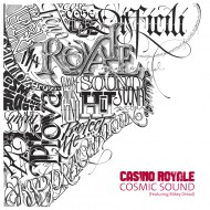
The starting point of a work is fundamental; a good brief can make all the difference. If they tell you “go ahead, we trust your judgment, do something with your own style,” or if their references are confused or conflicting, it means the client doesn’t have clear thoughts and it will be more work than expected. It’s almost always better to deal with small- to medium-sized clients. The bigger the commission, the more people get involved, and then things can get a bit schizophrenic: you might have worked several days on a project that suddenly gets shelved for no apparent reason; you might be asked to make changes or meet insane deadlines that don’t even give you time to see whether your design might be improved upon—either way, you have to pull it off. Clients rarely realize how much time it really takes to work by hand, so you have to be pretty fast in order to meet their deadlines, which are often insane.
I addressed the absurdity of some bad habits that usually increase the demand for designer’s work (and not only the work) in a series of embittered, ironic t-shirts produced by Gold called the Designer Series. I featured phrases like: “Unfortunately, we don’t have a budget for this project,” “Unfortunately, our timeline is really tight,” and “This is a non-profit project, but we guarantee maximum visibility,” accompanied by annoying insects, a mosquito, a fly, a maggot—all phrases we regrettably hear a lot when being asked to work. The shirts were super popular and, paradoxically, one ad agency even asked me if they could print some with their logos as Christmas gifts for their employees. Apparently they were amused by the very phrases they themselves often uttered. But I don’t find it amusing in the least that it’s considered normal for the hard work of graphic designers and photographers to go unpaid, or that they’re constantly bid down and expected to give outrageous discounts, relegating quality to second place. I think the worst kind of commission is when you’re dealing with accounts that reason solely according to market logic.
In certain cases talking about formal qualities and color tones becomes pointless. Especially in advertising, you get the feeling you’re being “bought,” like you’re the mere executor of questionable ideas that you cannot call into question; it can be very frustrating and sometimes alienating, as if you’re just a cog in the machine, tightening the same screw all day on the assembly line. You can design a logotype or a headline for an ad campaign that then becomes the company’s property: you might see it distorted or modified, its letters cut out to assemble other words, and never once are you asked about any of it; naturally, those who see the ad plastered up all around town or in the newspapers have no idea of the back story, they just think you did a mediocre, sub-standard job.
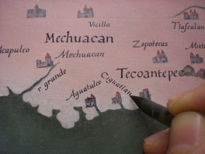
Fortunately, I’ve also met some great art directors, ones with a real eye, culture, and sensibility. Some film directors have asked me to do the titles and credits for their movies, spending hours explaining to me their vision and exactly what they had in mind; that proved their total passion for the project, and when that happens and you reflect on the outcome, you can feel satisfied and even a bit amazed. I really believe in the concept of gratification: using your own capabilities to complete something that makes you feel useful, alive, active, and fully realized. That feeling is amplified through collaborative teamwork, those rare instances when a group works together, each with his/her own role, casting aside ego and vanity in favor of doing the best work possible. Such occasions include: witnessing the premiere of shows like “C’era una volta a Roma” (Once Upon A Time in Rome), after months of work that culminated in a couple hours of music and high suspense, remembering—as the images cross the enormous screen before a vast audience—every single letter drawn by brush at the drafting table on boiling July afternoons; seeing the reproduction of the Saint Gallen Globe finished after years of work in many craftspeople’s hands, each bringing their own experience to the object; the titles projected behind the orchestra at the premiere of Cesare Picco’s concert “La storia di Genji,” (The Tale of Genji) at the Teatro Nuovo in Verona; the opening titles of “Io sono l’amore” (I Am Love) at the cinema. These projects and a few others gave me that indescribable sensation I continually seek, the feeling that pushes me forward on my quest through the fascinating world of letterforms.
In addition to the work, memories of the voyage—the people and places you’ve encountered—stay with you. I don’t, therefore, view of all these things as mere aspects of making a living; rather, they are a fundamental part of life itself.
--------------------
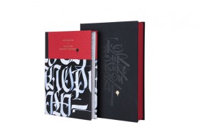
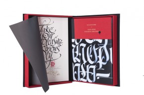
This article was originally published in Take Your Pleasure Seriously (2012) by Luca Barcellona.
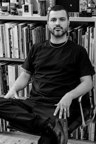
Luca Barcellona is born in 1978. He has his own studio in Milan, where he works as a freelance graphic designer and calligrapher. Letters are the main ingredient of his creations. He teaches calligraphy with the Associazione Calligrafica Italiana and holds workshops and lectures in several cities, as the last one in California and Australia. The means of his work is to make the manual skill of an ancient art as writing and the languages and instruments of the digital era coexist. In 2003 he founded with Rae Martini and Marco Klefisch the collective Rebel Ink, with which he gives life to a live exhibition of calligraphy, writing and illustration. In 2009 he has worked for the National Museum of Zurich, with calligraphist Klaus-Peter Schäffel, to realize the faithful reproduction of a big globe dated back to the 1569, using calligraphy with original materials (quill and natural inks). Among the brands that requested his lettering we can number Carhartt, Nike, Mondadori, Zoo York, Dolce & Gabbana, Sony BMG, Seat, Volvo, Universal, Eni, Mont Blanc, Wall Street Institute. Among his latest collective exhibitions: "Stuck on the City" in Prague, "Don't Forget To Write" at Carhartt Gallery (Germany). As well as taking part to several independent projects his works appeared in many publications. In 2010 he produced his own personal clothing brand "Luca Barcellona Gold Series". He recently published his first monographic book Take Your Pleasure Seriously by Lazy Dog Press, the publishing house which is a member himself. His study into lettering led him to experience from graffiti to classic calligraphy, up to big wallpainting, typography and letterpress printing.
http://www.lucabarcellona.com/
