The way of handwriting
—
--------------------
This article was originally published in Take Your Pleasure Seriously (2012) by Luca Barcellona.

--------------------
wow,
it looks printed!
—
And it finally is. Now I can see, collected, many of the works that previously had no precise place outside of my hard drives and flat files, where they were stored in a state of constant “chronological disorder.” I often balked at the prospect of opening up those drawers, and repeatedly promised myself I’d organize and archive everything—but there they sat, unchanging even through several moves, awaiting that elusive moment of calm when I’d finally be able to spend hours looking through old sketchbooks and catalogue them according to year. Obviously, that moment of calm never came.
Up until now, I preferred to focus on new projects rather than spend time cataloguing the old ones. That’s how I dealt with the formal disorder of not having a proper website or some other good place to put everything.
Then one day I began laying out a personal collection of sorts, and realized how much material had never seen the light of day: I found that a lot of it looked old, but maybe that was just my perspective, influenced by my own evolution. If you look back at something you did five years ago and don’t have any criticisms, maybe that means you haven’t gone very far. Other things had aged so much that they seemed truly vintage, as if they’d been done by someone else. And so, that very day, the need to give some concrete shape to all the work I’d done sprouted in a corner of my mind, and began popping up again and again.

This book was the perfect occasion, and forced me to look back and take in everything I’d done over the past few years. Time-wise, it was nothing compared to the many years of experience logged by the calligraphers I most admire and have been lucky enough to meet. Nevertheless, I spent that bit of time sprinting ahead, constantly producing new work, ceaselessly consuming paper and ink, and almost never had time to stop for a second and realize what was happening.
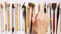
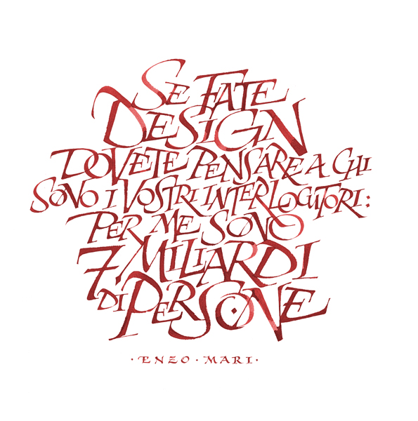
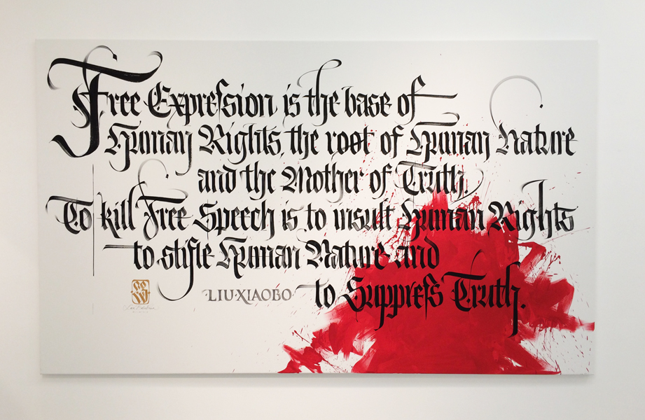
"It looks printed” is a comment all calligraphers have repeatedly heard said about their work, usually by people who see them write without ever having seen how calligraphy is practiced. I’m amused when people say that to me. I think I even said it, and certainly thought it, back when I saw books with hand-drawn letterforms for the first time. All professions have their routines, reflected also in their anecdotes. I think that’s symptomatic of the fact that people outside the world of letters are, admittedly, accustomed to the perfection of digital forms and flawless vectors, but are at the same time amazed at how a broad-nib pen can produce, through a series of apparently simple gestures, the same letters they’re so used to seeing, and whose provenance they’d never given any thought to.
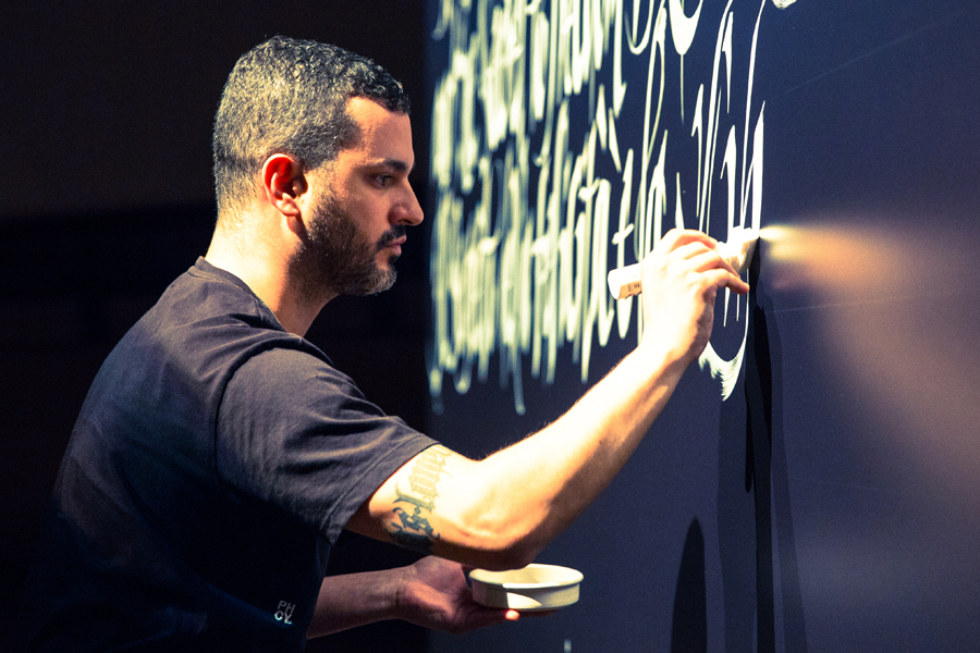
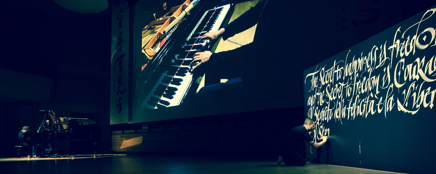
I think a lot of calligraphy’s strength, especially nowadays, lies in seeing it done live. That’s why I’ve always tried to incorporate performances, videos, and demonstrations in my workshops. It’s my hope that these little “extras” will spark in viewers the same fire that was lit for me when I first understood the potential of the pen moving across paper, laying down ink in just the right way.
I’ve always believed that, in order to make real progress, you have to involve others in your work, and have constant contact with them. The web makes this possible—everyone is free to access content, comment on it, and judge it in more or less pertinent ways. Ever since writing and calligraphy began to occupy most of my time, I decided to share what I was up to by publishing it online: over the past few years I’ve seen my work circle the globe on the web while I was seated at my drafting table; the sole exception includes a few magazine articles and other print publications.
I’ve always been quite spontaneous about putting things online, knowing that if I gave it too much thought I’d start second-guessing myself. Rather, as soon as I finished a new piece I’d often also post the preparatory sketches and other drawings of it. It was almost as if I couldn’t wait to share what I’d done, thinking about someone on the other side of the planet who’d see it right away, and maybe be as excited about it as I was. Sometimes that someone might have been disappointed, or used it for the wrong ends, but I didn’t care—I felt an instinctual need to show anyone and everyone what I made of the passing time, and that’s exactly what I need to make sense of things and sleep soundly each night.

I remember one evening, when I was in Basel working on a replica of the Saint Gallen Globe, I turned on my computer and was surprised almost to the point of fright: normally, 200-odd people viewed my work on any given day, but that day it had garnered over 2,000 views, which led to an enormous chain of messages and requests for work I could never have fulfilled, no matter how much I wanted to. I soon discovered that all that interest came from just a few images posted on a popular typography blog, but I was still a bit shaken to think how life could change from one moment to the next thanks to the unbelievable speed and user-friendliness of a medium like the Internet. I tried to bring that event into perspective, but the more images I posted, the more daily requests I received: some people asked me to design a tattoo; others just wrote to say they liked what I was doing.
Letter Arts Review devoted an interview and a sixteen-page special to my work, and when it came out I almost felt a bit perturbed. I really wasn’t important enough to be given such visibility, I felt. I thought of all the calligraphers who would see it, professionals with thirty- or forty-plus years of experience, and what they might think. But Chris Calderhead, who edited the article, said the journal’s readers were very interested in the fusion of graffiti and formal calligraphy.
They also published, among other things, some pieces and tags; given that it was a high-caliber magazine I’d followed and respected for quite some time, I was proud of that. It was as if I’d managed to restore the dignity of a type of lettering I’d often seen criticized or covered only superficially, like something related more to the realm of snotty little vandals and questions of legality and private property rights rather than an aesthetic worthy of real judgment. Even though that aspect of my work was already becoming part of the past, I was nevertheless determined to openly recognize it as a formative part of my personal path, and that’s when things began to come full circle.
I gave a lot of interviews, both for print magazines and the web. Naturally, the recurring questions met with recurring answers; for example, the answer to “How did you get started?” can’t but be the same every time. Others—like the one asked at the end of an article published in the first issue of Codex, “Will you make a book?”—made me reflect more on how I wanted to answer. I said that no one had ever made the offer and, considering my laziness, it certainly wouldn’t come about of my own volition.
That led one of the readers, on the very day after the organizational crisis described above, to propose just such a project, following the same criteria I had in mind. I deeply believe in these small signs that fate sends to us, by chance or otherwise. The result, about one year later, is the book you now hold.

I guess some opportunities are like bondinhos, the aerial tramways in Rio that you literally have to jump aboard to catch. Once you make the leap, you can meet new people and watch how quickly the colors and surroundings change. After the quick ride you leave greatly enriched, almost without even realizing it.
And so I send my heartfelt thanks to everyone who has enriched my journey thus far, filling it with their teachings in the form of letters, words, spirituality, love, hospitality, and friendship. As for the journey, perhaps this is just the beginning.
--------------------

Luca Barcellona is born in 1978. He has his own studio in Milan, where he works as a freelance graphic designer and calligrapher. Letters are the main ingredient of his creations. He teaches calligraphy with the Associazione Calligrafica Italiana and holds workshops and lectures in several cities, as the last one in California and Australia. The means of his work is to make the manual skill of an ancient art as writing and the languages and instruments of the digital era coexist. In 2003 he founded with Rae Martini and Marco Klefisch the collective Rebel Ink, with which he gives life to a live exhibition of calligraphy, writing and illustration. In 2009 he has worked for the National Museum of Zurich, with calligraphist Klaus-Peter Schäffel, to realize the faithful reproduction of a big globe dated back to the 1569, using calligraphy with original materials (quill and natural inks). Among the brands that requested his lettering we can number Carhartt, Nike, Mondadori, Zoo York, Dolce & Gabbana, Sony BMG, Seat, Volvo, Universal, Eni, Mont Blanc, Wall Street Institute. Among his latest collective exhibitions: "Stuck on the City" in Prague, "Don't Forget To Write" at Carhartt Gallery (Germany). As well as taking part to several independent projects his works appeared in many publications. In 2010 he produced his own personal clothing brand "Luca Barcellona Gold Series". He recently published his first monographic book Take Your Pleasure Seriously by Lazy Dog Press, the publishing house which is a member himself. His study into lettering led him to experience from graffiti to classic calligraphy, up to big wallpainting, typography and letterpress printing.
http://www.lucabarcellona.com/