---------------------------------------
The following article was featured in the volume 29:2 of the quarterly magazine “Letter Arts Review” We would like to present an interview article of Liesbet Boudens following the introduction by Christopher Calderhead, the editor of the magazine.
---------------------------------------
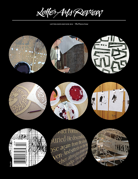
Left, The front cover of Letter Arts Review Vol. 29:2
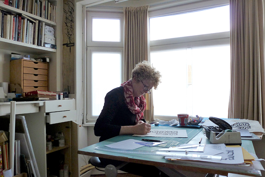
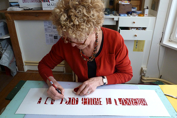
Right, The artist at work in her light-filled studio
INTRODUCTION
BY CHRISTOPHER CALDERHEAD • Work in the visual arts is often a solitary affair. Although a few lettering artists work in teams—the artists at the large greeting card companies come to mind—most of us work alone, silently refining our projects in our studios or workshops.
The studio is a privileged space, its secret life not always open to outsiders. When we have the opportunity to enter that space and peer over the shoulder of the artist at work, we are invited to share in a long process of artistic toil and exploration.
Recently I was given a chance to look into the inner workings of one of my favorite lettering artists. Out of the blue, Carl Rohrs sent me a pdf file that detailed the creation of a sculpture he had made for an exhibition in California. He described the commission and shoed step-by-step photographs of the piece as he brought it to fruition. He also included other images that had inspired him along the way.
This sparked an idea. I so enjoyed looking through all the images and descriptions Carl had sent me that I thought perhaps other lettering artists might have projects they would want to share with me. I started sending out e-mails to people I knew, and the projects began flowing in. Soon, I had so many projects that what had started as an idea for a single article turned into an entire issue of Letter Arts Review.
The projects shown in this issue include almost every kind of lettering art. There are commercial commissions and works made for the pleasure of the individual artist. The projects explore a wide range of practices, including digitizing work for reproduction, carving in stone, painting letters, and mechanically cutting letters from sheet metal. They range in size from tiny ceramic bowls to huge installations at an architectural scale.
I sent a series of questions to each artist, often following up with further questions. I was struck by how each artist’s personality and practice came through in their answers. Some focused on the practical issues of working out an artistic problem, while others were much more theoretical. Some were decidedly concise, using an economy of words to describe the project at hand, while others sent me paragraph after paragraph of thoughts, insights, and interesting asides.
The texts that appear here have been edited. My words appear in italic, while the words of the artists appear in roman.
---------------------------------------
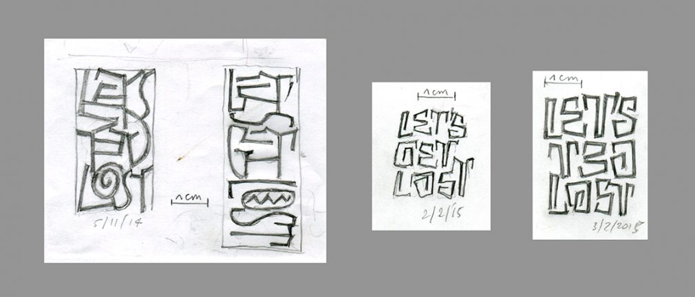
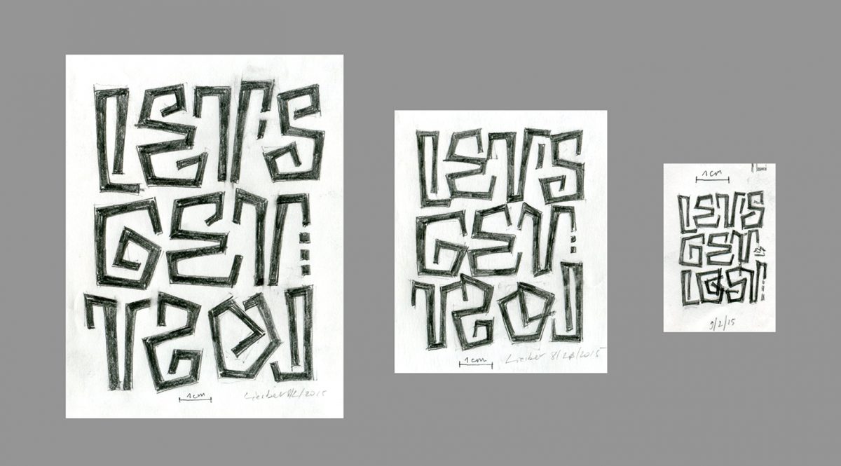
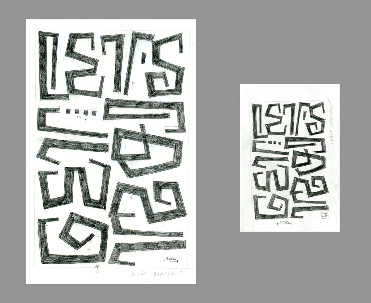
Note that the artist has dated each drawing – the mark of a careful, detail-oriented approach to her work.
CHRISTOPHER CALDERHEAD: Liesbet Boudens is internationally known for her crisp reinterpretation of alphabetic forms. Here, she shows us the development of one of her painted inscriptions.
THE INTERVIEW
CC: How do you find texts to work with? I notice you like short phrases from popular culture.
LIESBET BOUDENS: I listen to songs, find sayings, and read poems and novels. Sometimes I am so attracted by the content that I start composing in my head—often at night when I cannot go to sleep—and then on paper when there is time. The words and phrases need to touch my feelings, and the letter shapes must also give me the physical possibility to compose a work.
Whether I work on paper or on walls, I start to make very small sketches, which grow and grow in shape, atmosphere, and composition, as well as in scale. The meaning of the words leads me the way to the letter shapes and colors.
CC: Is your working process on this piece much like your usual working process? Walk me through how you create your layout. How are you making decisions about what works and what doesn’t work?
LB: My working process is quite the same for every paper piece, and very different from the working process of my paintings on canvas. I always start at a very small scale, with a 0.3 mm automatic (mechanical) pencil. I am not always able to create; it depends on how I feel.
My work grows slowly, like a growing plant. It is for me a very organic ritual, and pure joy. My decisions come very naturally. I have trained myself very deeply to look at balance and rhythm in my work. I cannot really explain why I decide something does or doesn’t work. This is a matter of intuition.
CC: Give me simple technical details about making the finished piece. What is your procedure as you work through each stage of the process?
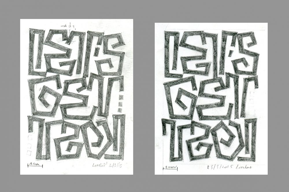
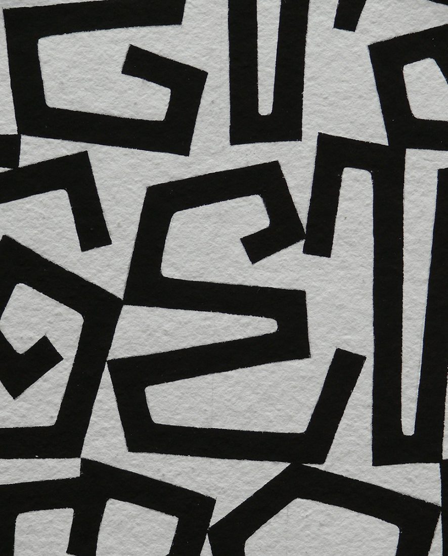
LB: As I mentioned already, I start on a piece of paper at a very small scale until I think I can take it further and move on to layout paper. The small drawing has to be enlarged by 150% to 200%, depending on the format of the drawing. Then I start again, refining my enlarged work, and I make multiple sketches to rework the composition. I start by outlining the letters without measuring anything. Then I fill them with my automatic pencil to see the contrast and balance and the letter shapes, which must fit together. I always try to invent new letter shapes to make the composition more exciting. I prefer them not to be immediately legible; that is my game and my challenge.
I love to play with letter shapes. The letter shapes of the work shown here are influenced by the rune letters which I love so much. They give me the possibility to invent totally new shapes. This piece grew more and more into something like a maze as I moved the letters nearer to one another, sometimes letting them touch, but not always. I want the composition to look natural.
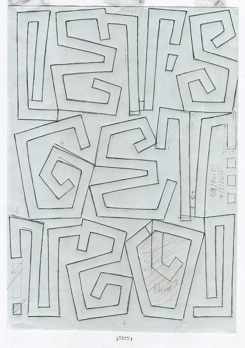
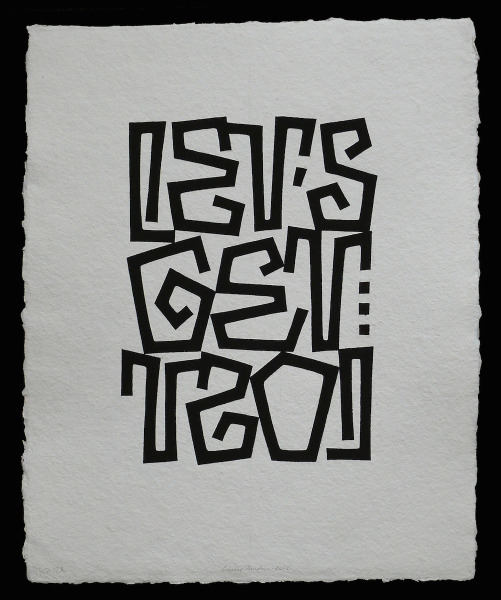
The letter O was the biggest challenge, and I decided to leave it open, which gives the whole composition more strength. I tried painting the inside of the O in red. That turned out to be the wrong choice, but it was worth the try! I decided I wanted the result to be in black and white.
When the design has reached its final state, I fill the back of the layout paper with a soft (B8) graphite pencil. I lay this down on a clean sheet of cold-press paper and trace over my drawing to transfer the design for the final painting. I then very carefully correct the transferred drawing. I fill the shapes in using a Speedball pen, and for the finishing touches I use a very thin brush or a finer pen.
Left to right:
Final sketch
Finished piece
Let’s Get Lost 36 x 29 centimeters, Gouache on paper, Finished March 2015
Details
CC: Do you work differently when making large or small pieces?
LB: Well, if you are referring to works on paper, I always work in the same way. I use the same technique as well when I am making lettered inscriptions on walls, which are usually commissioned works.
CC: What do you think of the role of legibility in your work? Your pieces are always legible, but often in ways that slow the reader down. Is this a conscious choice?
LB: Absolutely—this is my way of making it more interesting. As a matter of fact, the game of legibility makes the spectator look first at the whole image instead of reading it. This is what I like. In the end, however, my letters or words, always have to be legible.
--------------------
LIESBET BOUDENS
Born in Bruges in 1957
Qualified secondary school art teacher.
Studied Visual Arts with Dan Van Severen, Sint Lucas School of Arts in Ghent
Art teacher in Bruges, lettering workshops in Belgium and abroad
My first ventures into the world of letters were made using the calligraphic pen, which incidentally was my father's medium as well. Gradually I changed from written to freely drawn and painted letters on paper, canvas and walls. Pattern, rhythm and colour are very important in my work. When I work on canvas - which means a bigger format - I prefer a technique of constructive exploration, layer after layer after layer of paint: for me a ritual of tranquillity.
Liesbet Boudens Website
--------------------
CHRISTOPHER CALDERHEAD is a lettering artist, graphic designer, and educator. He is the author of Calligraphy Studio, Illuminating the Word: The Making of The Saint John's Bible, and, with Holly Cohen, The World Encyclopedia of Calligraphy. He has been the editor of Letter Arts Review since 2007.