A subjective story of living as a calligrapher in Oslo for 25 years
Upon arriving in Oslo I started taking on various commissions, ranging from names on diplomas to book covers and headings. This was during the transition period where old methods of reproduction would gradually make way to new ones.
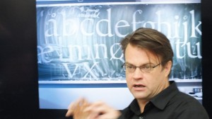
I haven't yet had the privilege of doing anything in letterpress, though I have admired many books printed in letterpress from Gutenberg's time up until today. But I have used Letraset, photo setting and old photographic techniques (PMTs). Just after returning home in 1989 I started teaching in a private school for graphic design. During the first of two years the students had two days a week doing calligraphy and lettering. The idea was to give the students an understanding of forming letters with the broad edged pen, in order for them to gain a better understanding of typography. I arranged two workshops with teachers from abroad before the school went bankrupt: One with Julian Waters and one with Brody Neuenschwander.
The Mac and the PC rapidly took over the production of typography and graphic material. Having experienced art directors setting Futura Extra Bold next to my renaissance italic and other more or less horrifying typographic violations I was exalted to get my first Mac, and some beautiful Adobe Originals typefaces: Adobe Garamond, Minion, Trajan, Lithos. Finally (or so I thought) I should be able to create my own compositions integrating calligraphy and typography. That was not always the case: Typography had become everyman's craft, and in the early days of the Mac desktop publishing became somewhat of a nightmare for sensitive and perhaps over-sensitive calligraphers. Still, I taught myself PageMaker, and much later, InDesign, and have been teaching book design for graphic designers alongside the calligraphic practice.
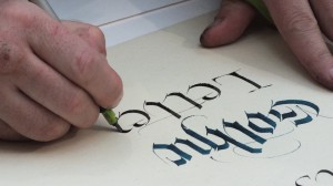
I wrote Hermann Zapf in 1992 and asked him if I could visit him in Darmstadt. He suggested I wrote a handbook of calligraphy for the Norwegian market, and so I did. I designed it as well as I could at the time, although the publisher didn't exactly do a good job proofreading. It really taught me about book design. I concur totally with Jan Tschichold's statement 'I learned more from my mistakes than I ever imagined'. But also 'I regret very much that calligraphy is so little studied in our time among our so called book artists'. And graphic designers, I might add. In 1998 I was hosting four programs on Norwegian television about calligraphy, and I also made a simplified handbook for that program.
I have exhibited several times over the years, using text of my own choosing, with the exception of an exhibition of alphabets which was the result of my work with poetry and my disappointment in the fact that people rarely bothered to read texts that I had written. Making alphabets and presenting them as art may seem futile, as an empty exercise in style, devoid of meaning. Yet we never ask why a Japanese calligrapher repeats the Ensō circle as a contemplative exercise for years and years.
The types of commissions I have had over the years have ranged from book covers ( I have mainly been asked by the authors & not the publishers for some reason), names for packaging (lots of cheese, for some reason), certificates and names on certificates, logos for various companies, titles of various kinds. It goes without saying that many clients have been difficult to work with: It isn't easy to convince someone that some things just ruins letters, and that they should respect your authority, especially when the most common belief is that 'anything goes'. But I have had some really rewarding and nice collaborations, the main one that springs to life is the logo I made for Cappelen Damm.
The two publishers Cappelen (already a large one) and Damm (which had become a large player due to the fact that they bought the rights to publish Harry Potter) were to merge, and I was asked to present sketches for their new logo. They wanted something classical, but with some originality and modernity, having used Trajan in a transitional phase. I presented them with several sketches. The only other people partaking in the process was the CEO, an in house graphic designer and an in house typographer. The whole process went smoothly. I thought it would be a good idea to get the logo digitized, and since I am not too comfortable working with Bezier curves and points I approached Sumner Stone and asked for a quote. I had met Sumner in Ditchling during the Pen to Print seminar a couple of years earlier, and we were in respect of one another's work. After getting his quote for the logo, I first attempted to draw the rest of the letters of the alphabet out of pure curiosity. I then asked what he would charge for digitizing all the drawings. I brought the drawings and his quote, plus my quote for the font, to the publisher, who immediately liked the idea. I made more drawings, as a font consists of much more than the letters on our keyboard. I drew points, commas, question marks, an ampersand, ligatures, special accents,etc., and scanned them. Then they were sent to Sumner, who digitized them in FontLab. I then corrected the drawings, and over a few months of adjusting letters, spacing, adding some characters and incorporating a logo symbol (to be used alongside the word logo), the typeface was done. It is being used for signage on their building and inside the building, as well as for the publishing company's many sub companies. I also suggested placement on books and a color scheme.
Something should be said about the Norwegian calligraphy scene. But this is a subjective article about personal experiences, and it would be unfair to say that Norwegian culture has affected my calligraphy. I have worked despite of it, often uphill, meeting many prejudices and obstacles along the way.
Norway got the art of printing at the same time as Greenland, approximately two hundred years after Sweden and Denmark, and we have very few historical manuscripts of a high standard compared with the treasures of the continent. There have been a line of tutors teaching calligraphy and lettering in the school of Arts & Crafts in Oslo, starting with Ivar Bell, who was an influential teacher who corresponded with many known figures in Europe including Jan Tschichold and Max Bill, but whose work is nowhere to be found. He was followed by Herman Bongard (featured in the Calligraphy Review article by Susan Petty), Ottar Helge Johansen, and Jan Pahle. Pahle, Leif Bakke and Are Bjærke have designed book covers and been active in the publishing industry. Leif Frimann Anisdahl, a graphic designer of some standing, had taken classes with Zapf in Copenhagen, worked for Penguin in London, is featured in Erik Lindgren's An ABC Book, and has made several typefaces for large Norwegian companies. Grethe Dobloug designed book covers for Cappelen, and was a former student of Irene Wellington. So was Jacob Rask Arnesen, whose book Levende Skrift is a personal and thrilling manifesto to the calligraphic and typographic world.
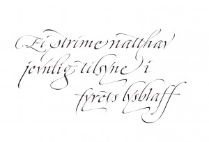
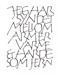
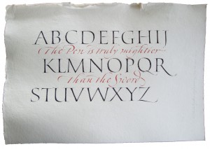
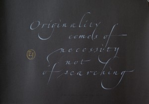
Left:Haiku by Inge Haugane, Norway. Two pens.
Two former students of mine completed the course at Roehampton: Julia Vance and Hedvig Brandt. There have been a few others who have taken the course, to my knowledge, but only two work as full time professionals: Julia Vance and Helene Jenssen. The latter is the chairman of Foreningen Skrift, which was formed to promote calligraphy and arrange workshops. Another group based in Bergen is called Kalligrafisk Klubb. I started up a group, Scriptorium, in 1990, but found it hard to run it by myself (we did make one issue of a magazine, Script).
Yet, despite these teachers and practitioners, there was never truly a renaissance for calligraphy in Norway. Perhaps due to the youth of our culture, the scarce population, the lack of respect for aesthetical history and tradition. The status quo today is that basic drawing skills, basic calligraphy & lettering training and basic typographic skills are barely taught at all. There is no understanding for calligraphy or drawing in our graphic design schools, although calligraphy really can be used as the 'life drawing of typography'.
Many tasks lie ahead for us as devotees of this ancient craft and art: We need to assure that calligraphy has a place in education, we need to fight to ensure the survival of handwriting in schools, that people interested in type see the connection between the written and the printed word, and also that art galleries and crafts communities acknowledge that we have a place among them as calligraphers who are not from some distant Medieval times, but that we are in fact exploring new ground, as well as having our roots in the history of our letters. Perhaps ink, pen and paper can be allowed to co exist with computer screens and mobile devices. If you are in doubt, introduce it to kids. Perhaps you will rediscover your own discovery.
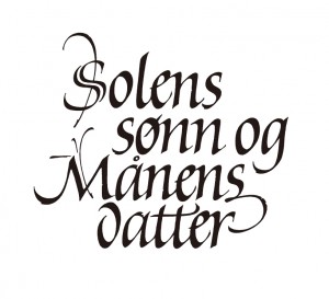
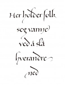
![]()
Center:Quote by Bob Dylan
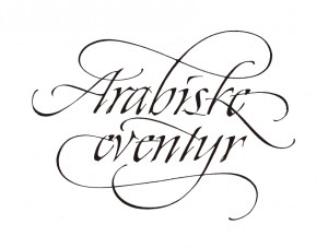
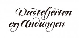
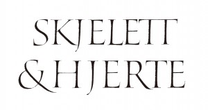
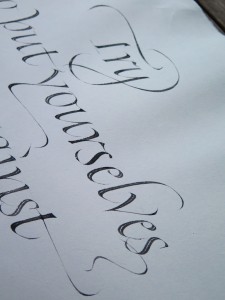
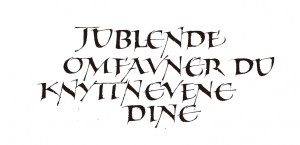
Right:Designs
CHRISTOPHER HAANES (b. 1966) is a calligrapher, book-designer, typographer, teacher & author living in Oslo, Norway. He is Scandinavia's only Fellow member of the Society of Scribes and Illuminators (FSSI). He has taught the subjects of calligraphy and typography for more than 20 years, including workshops in England, Holland, Germany, France, Italy, Sweden, Australia, Hong Kong, USA. He has taught at Westerdals School of Communication (former Skolen for Grafisk Design) in Oslo since 1989. He has written articles and essays for D2 (Dagens Næringsliv), Prosa, Numer, Snitt. He is author & designer of five books on calligraphy and typography: Håndbok i kalligrafi (Aschehoug 1994), Kalligrafi (NRK Fale 1998), Bokstavelig (Aschehoug 2004), ABC for voksne go Abstracts (H//O//F 2012). He is working on a Handbook in Calligraphy in English at the moment. Work featured in several Letter Arts Review Annual (a juried magazine for the lettering arts), plus many other Norwegian and international publications.
http://christopherhaanes.com/
