A subjective story of living as a calligrapher in Oslo for 25 years
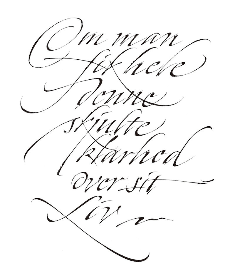

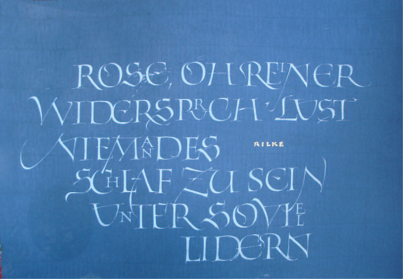
Center:Quote by Rainer Maria Rilke
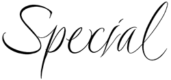
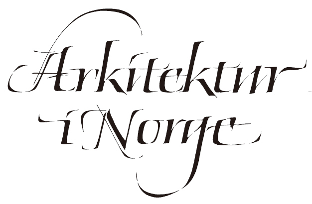
Right:Book title
My father, Patrick Byrne, an Irishman living in London, gave me a broad edged pen when I was nine years old. I had only briefly met him before. It turned out to be one of those moments which create ripples, felt many years later. It was one of those refill Osmiroid fountain pens with a lever on the side which could be pulled to fill the pen with ink. He demonstrated on a napkin how it could be used to create dense, pointed gothic letters and flourishes on a paper napkin, which has been lost along with who knows how many transient notes and doodles over the years, writings on napkins, beermats, envelopes and receipts. My mother had met my father in Cheltenham in 1963, when she worked there as an au pair. According to my father, his father and grandfather were both ‘calligraphers’, but in the tradition of Irish storytelling he was in the habit of embellishing the truth, which probably was that they simply had nice handwriting. He was an amateur calligrapher himself, and he sent me a few pages of printed exemplars, and eventually Johnston’s Writing & Illuminating, & Lettering from which I tried to rule lines for a manuscript book spread and write a more or less corrupt ‘round hand’. After these initial attempts at calligraphy my pen was put in a drawer for a few years, only to be picked out again during my years at upper secondary school (the Norwegian equivalent being ‘videregående’ school, ages ranging from 15-16 yrs to 17-18 yrs, when I wrote a thesis on ‘The History of Writing'.
![]()
![]()
![]()
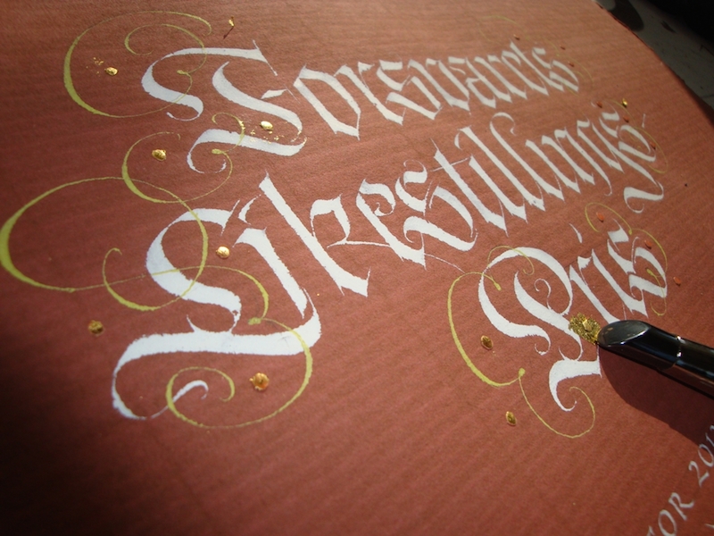
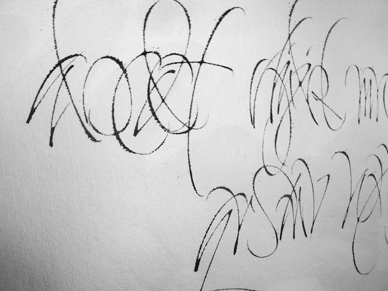
Lettering designs
Later, working as a waiter in a café in Oslo, I wrote out ‘today’s dishes’ on a blackboard in the café, as well as bits of poetry in my spare time, quotes from Lawrence Ferlinghetti, Jack Kerouac, Walt Whitman and others using a homemade bamboo pen and pointed brushes as well as my Osmiroid. I also remember going interrailing, getting stranded in a caravan in Assisi for several days , it rained incessantly, I wrote out several verses from the Buddhist Dhammapada. My letterforms were inconsistent, unsharp and uninformed, but my interest in literature and calligraphy had awakened, as well as at least a certain familiarity with the broad edged pen.
I did my first commission for a neighbor, a business card, the calligraphed text being photographically transferred to an aluminum cliché, from which the cards were printed. The letters were written in an ill conceived italic form, and I remember vividly being fascinated with the reproduction itself, as if some strange magic had occurred that had transferred writing to print. This fascination with the connection between the written and the printed word has stayed with me, leading eventually to investigate the (often hidden) relevance of calligraphy to typography, and vice versa.
At the same time, I did a commission for a festival for a small town, LIER 150 ÅR, in which I had a sudden and never-to-be-forgotten encounter with the falseness and arrogance of the commercial advertising industry. I had been told to make a heading for a magazine, but found to my surprise that they had used it as a logo for the whole arrangement, printing it several times in a modified form, where they had themselves tried to put the ÅR (‘years’) inside the 0 of 150, in their own bad writing. It hasn’t been the first time I have encountered violations of copyright laws over the years. Letters are not sacred beings to most people, funny as it may seem.
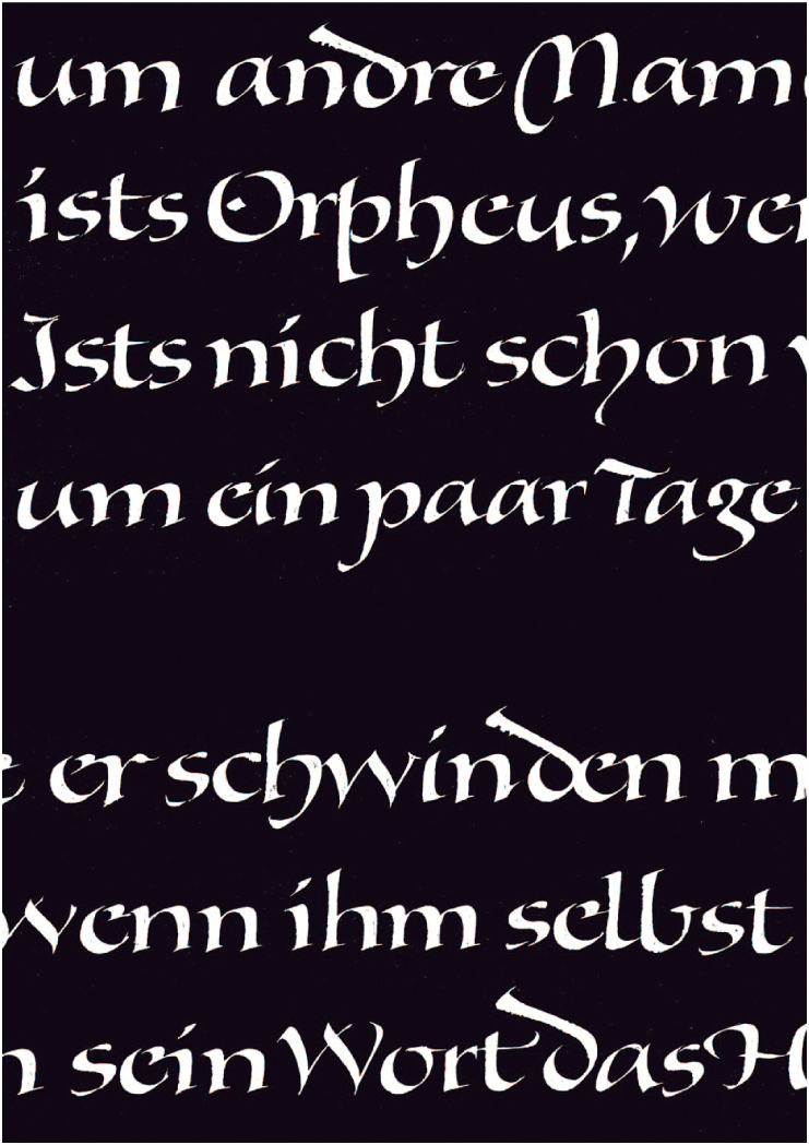
Right:Rilke's Epitaph, 2010
My father sent me a leaflet from Roehampton Institute (Digby Stuart College) and again one of those ‘rippling moments’ took place. I was equally stunned by the beauty of the calligraphy (the whole leaflet was handwritten by Lindsay Castell) and that such a place even existed: Other people who took a serious interest in calligraphy above an amateur level.
Ann Camp had started the education in calligraphy and bookbinding at Roehampton during the seventies as a program for teachers. Her philosophy is outlined in her essay on education in Heather Child’s Calligraphy Today, 2nd edition. It had evolved into an open program for anyone interested, and had students from several different countries. I was told I needed to put in extra work, as most people who had enrolled had taken evening classes already, something that was non-existent in Norway at the time. I am greatly indebted to Ann Camp, whose keen eye and sharp observations helped me get through a first year which was pretty tedious: I threw away most of my old rusty nibs and materials and started afresh, with solid models and strict practice. It proved to be revelating. My main struggle was with ‘the foundational hand’, which was to be written in approx. 4mm x-height, consistently throughout several MS book pages. I had chosen a Walt Whitman poem. ‘I sit and look out upon’, well, several pages of inconsistent writing. They had a room called ‘the quiet room’ to which I had retreated to practice before making the finished piece. Apparently I made no progress. Then, after many lines of practice something ‘clicked’. I got into a writing rhythm that seemingly carried me along without too many worries. Ann Camp came in a few moments later, and immediately pointed to the exact place where my writing had become effortless. ‘There!, something happened there, did you notice?’.
![]()
![]()
Book titles
My other tutors included Gaynor Goffe, Tom Perkins, Gerald Fleuss, and Jen Lindsay, as well as visiting tutors including Donald Jackson, John Woodcock, Ann Hechle and Alan Blackman. Tom taught drawn letters and stonecutting, opening up a world of typography for me and pointing to the work of Hermann Zapf, who later had a strong impact on my own work. Gaynor was very good at getting me to ‘stop thinking and start working’, her motto being ‘just do it!’. Jen Lindsay tried, at least, to teach me bookbinding, although I must admit to being genetically indisposed.
Ann Camp suggested I apply for fellowship in my last year (1989), for which I was unanimously elected next to youngest and only (to this day) Scandinavian fellow. I felt that my journey into the field of letters had only just began. I was looking at work by people who used advanced techniques, like rotation of the pen angle, pressure variation, retouching / building up with the corner of the nib. Techniques that were not really taught at Roehampton, at least not consistently (built up ‘versals’ and the Canute Charter hand being exceptions to the rule). Julian Waters, John Stevens and Hermann Zapf were great sources of inspiration.
![]()
![]()
![]()
Lettering designs
CHRISTOPHER HAANES (b. 1966) is a calligrapher, book-designer, typographer, teacher & author living in Oslo, Norway. He is Scandinavia's only Fellow member of the Society of Scribes and Illuminators (FSSI). He has taught the subjects of calligraphy and typography for more than 20 years, including workshops in England, Holland, Germany, France, Italy, Sweden, Australia, Hong Kong, USA. He has taught at Westerdals School of Communication (former Skolen for Grafisk Design) in Oslo since 1989. He has written articles and essays for D2 (Dagens Næringsliv), Prosa, Numer, Snitt. He is author & designer of five books on calligraphy and typography: Håndbok i kalligrafi (Aschehoug 1994), Kalligrafi (NRK Fale 1998), Bokstavelig (Aschehoug 2004), ABC for voksne og Abstracts (H//O//F 2012). He is working on a Handbook in Calligraphy in English at the moment. Work featured in several Letter Arts Review Annual (a juried magazine for the lettering arts), plus many other Norwegian and international publications.