Interview with JOHN STEVENS 3
Q: Do you have any ongoing work regarding typeface? If you do, could you tell us about it to the extent possible?
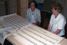
Yes, I finished a proprietary typeface for Salem College here in North Carolina for the Single Sisters House in 2006.
http://www.singlesistersfont.com/
This is a specialized font for a college that wanted to pay tribute to the founding sisters of this center in Bethania, North Carolina, circa 1785.
Type design has always interested me, yet it is a major commitment in time, so I have not finished as many designs as I would have liked. Early in my career, I took some designs to ITC in NY and a few other places, but I did not connect with any of them. Now, you can publish your own if you like. You just need to learn some software (FontLab), find a distributor or distribute it yourself via the web.
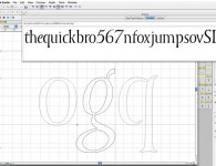
I had to teach myself FontLab Studio. Even though I am well acquainted with drawing Bezier curves on the computer, there was much for me to learn to get a finished typeface done and useable on all platforms. Calligraphers have no idea!
I had wanted to be a type designer before I had the idea to be a calligrapher and it is through type that I decided I needed to learn calligraphy, the origins of letters and the cause of the shapes of the major forms. Eric Gill, Jan Tschichold, Hermann Zapf, Jan Van Krimpen, Stanley Morrison, Frederic Goudy, William Dwiggins, Karl Eric Forsberg, Karlgeorg Hofer, Rudolf Koch, Edward Johnston and Georg Trump are just a few names who have let the influence of calligraphy into their type designs. You could say, it was the life of them.
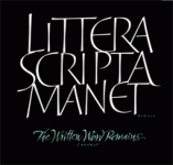
T-Shirt available from John Neal Books http://www.johnnealbooks.com/
At this time, Ryuichi Tateno of Japan(http://www.evergreenpress.jp/)and I are working collaboratively on a brush roman inspired typeface.
Basically, I am supplying the brush roman letters, and he is doing the digital part on this project. He is already experienced at bringing a typeface to market and the idea to do this was his, after seeing an old brush roman alphabet of mine in the San Francisco Public Library.
I am very grateful that he is doing this with me. Ours is a “display” face. I am hoping it will be one of those types that helps keep interest alive for calligraphy in publications and design. It will be interesting to see how it gets used. (there is more…but I will stop here)
I have several others ideas in progress…very slow going as I have to do other commissions.
Q: What do you think are the differences between Western and Japanese calligraphy?
A. Language, of course, and the lineage is quite different. However, aesthetically, I think of Japanese calligraphy as more evolved in terms of pure mark-making.
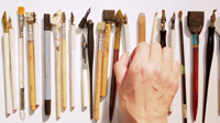
Western calligraphy followed and evolved in a much different way. The subject is too much to go into here, but western calligraphers see the power and the life in the best Japanese work, and they "know" that these are qualities they want in their work. However, one should not copy effects, but rather understand "cause"- the way the brush is wielded, the attitude and thoughtfulness or perhaps "mindlessness" of the stroke. To be able to express something raw, yet eloquent. There are a thousand other words to describe this, but it is something you can feel if you have spent any time trying to bring life to your writing. So, from my perspective there were always more things in common from the visual, abstract side, than the obvious differences. Everyone feels, everyone knows rhythm, movement, energy, precision, and the desire to express ourselves-even in things that started out as communication only. Things evolve to art in civilized cultures.
Q: Have you had any influence or inspiration from Japanese calligraphy?
Yes. I have been inspired to think about the qualities that the best work in both cultures share. I think there is an unspoken ideal that we all wish to find and we work toward that. The better we become the more we see, and then the more there is to learn. I think the expressiveness of brush and composition is a very compelling feature of Japanese calligraphy (for western calligraphers) and is not as grid dominated as the traditional western work. Culturally, there is a better understanding of what a modern calligrapher is doing in Japanese culture than there is in western culture. It should be our goal to change that if we are to be better understood and grow calligraphy in the west. In my opinion, it seems that the Japanese want to preserve “a way of doing things that brings joy” and the in the west, we want to “get it done” to get to the next thing. That is where calligraphy can change our perspective-I think. The purpose of calligraphy may be to change our inside life, not our outside life.
Q: What kind of work would you like to do in the future?
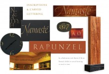
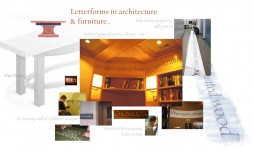
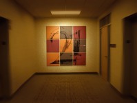
OH! The most difficult question for me to answer. I am part artist and part designer and sometimes one or the other dominates. I would like to take a year off to consider that question! I would like to do some architectural work with calligraphic letterforms. I see too many monumental type projects that have ugly letterforms or at the very least, apathetic letterforms. So, I would like to design a frieze on a building or the inside of a church (for instance)- something in which the words and the sensitivity a calligrapher would bring to such a project might imply. Eric Gill would have received such a commission in his day, but now we are competing in the "font" environment where the letterforms are a mere afterthought. Something that will be around for a long time and would be considered important or vital. I live in an area where there are many churches, but there is much ignorance about what letterforms are and many promising places where they use an "out of the box" effect. I say ignorance, because it is like Johnston said 100 years ago (as did William. Morris) - (paraphrasing) if there is good work around, it will stimulate the demand for good work, but if all anyone sees is bad work, that is what people will want unless they become educated in such matters. To bring together the useful and beautiful is certainly a designer’s dream and I think that is what interests me too. I would like to see beautiful, hand-made letters in a public space here in my town. They can bring warmth to hard surfaces and interest to concrete and glass. I would like to promote the letterform/word as image or illustration idea some more. I can add and maybe close with the idea that I may not know what the next thing is, as I am learning...I still have the feeling that I have not done “it” yet, so I am still searching.
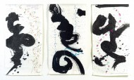
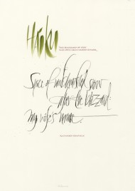
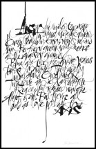
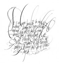
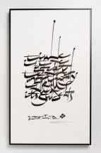
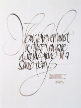
*Calligraphy / Painting: John Stevens
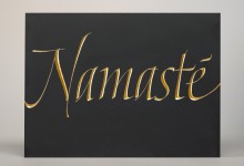
*Carving in wood / stone: Martin O'Brien
BIOGRAPHY
John Stevens is a calligrapher, designer of logotypes & illustrator of expressive letterforms with 27+ years experience. He has worked for well-known clients in book & magazine publishing, packaging, type design, graphic design, television & film. He has exhibited and been published widely and will be teaching workshop in Tokyo in November 2009
http://www.johnstevensdesign.com/
