The Malleable Letter Shape
Thoughts From the Practice of a Text Designer for Stone
Bad typography is older than typography
In which I explain that good letters are better off with good spacing.
As we compare inscriptions across all ages we see differences in quality. Most obvious is the quality of letter shapes, but ‘good’ letterforms don’t always make satisfying inscriptions. A magnificent letter like the Imperial Roman capital is not foolproof. One can find inscriptions where the letterforms in themselves have a most beautiful, rational and sensitive balance, but where letter- and word-spacing are badly conceived, and/or where the placing of the text block (Fig. 1) doesn't show the sense of balance we find in their architecture and their letter shapes. Good letterforms badly spaced! Isn’t that a waste?
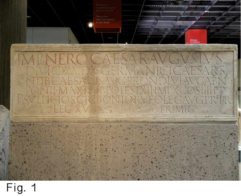
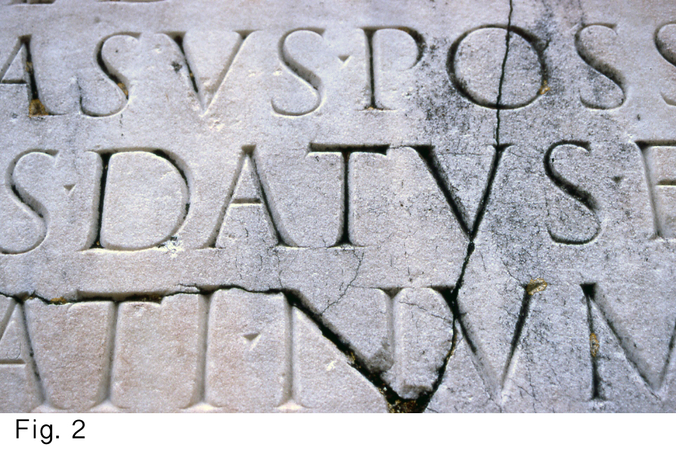
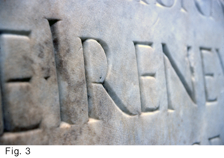
1: Roman-Germanic Museum, Köln, Germany.
2 and 3: Two pictures along the Via Appia in Rome.
Poor letterspacing in DATVS and IRENE, comparable to spacing with inflexible metal type.
Everyone who designs letters by hand gives special attention to the shapes of the counters. In many Roman inscriptions the inter-letter spaces and the room around the text look accidental, haphazard; not ‘designed’ (see also Fig. 1). It is as if the makers were not conscious of them in the same way as they were when conceiving the counter shapes. Less successful inscriptions, even those made long before the invention of movable type, look like poorly laid out printing: they consist of beautiful but inflexible letter shapes, badly placed in relation to one another and thus create a poor rhythm (Fig. 2 and 3). Throughout the ages it seems to have been common for many inscription makers to regard text design as merely linking letters to make words and then lines, and to put these lines one under the other. This way of working suggests that model alphabets (e.g. by Felice Feliciano, Luca de Pacioli, Albrecht Dürer, etc.) must have been around much earlier than the Renaissance. As we have seen, the existence of ‘untouchable’ model letters promotes lack of thought in layout. To start from a set of ‘ideal’ and thus inflexible letter shapes belongs to typography and seems out of place where it comes to handmade lettering. Typography is mainly about fixed letterforms in pre-determined spaces, but everyone who composes text with personally designed letters, has the opportunity of doing better than merely line up the letters of his or her chosen ‘ideal’ alphabet.
The malleable letter shape
In which the uselessness of inflexible letter shapes for certain purposes is explained.
Many formal inscriptions have been made in which the craftsman didn’t have the idea of ‘malleable lettershapes’ in mind. For me, designing text is about weighing the spaces within the letters against the spaces between them. I try to create rhythm by tuning these different kinds of negative shapes to one another. I regard letter proportions at the same time as a result and as a starting point. Letters are malleable units that have the potential to improve rhythm and the composition.
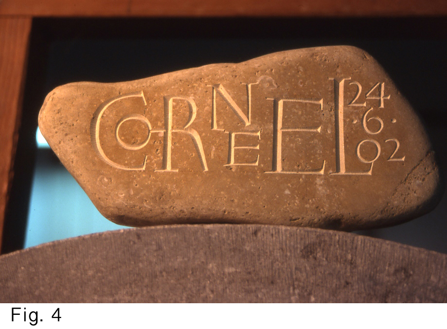
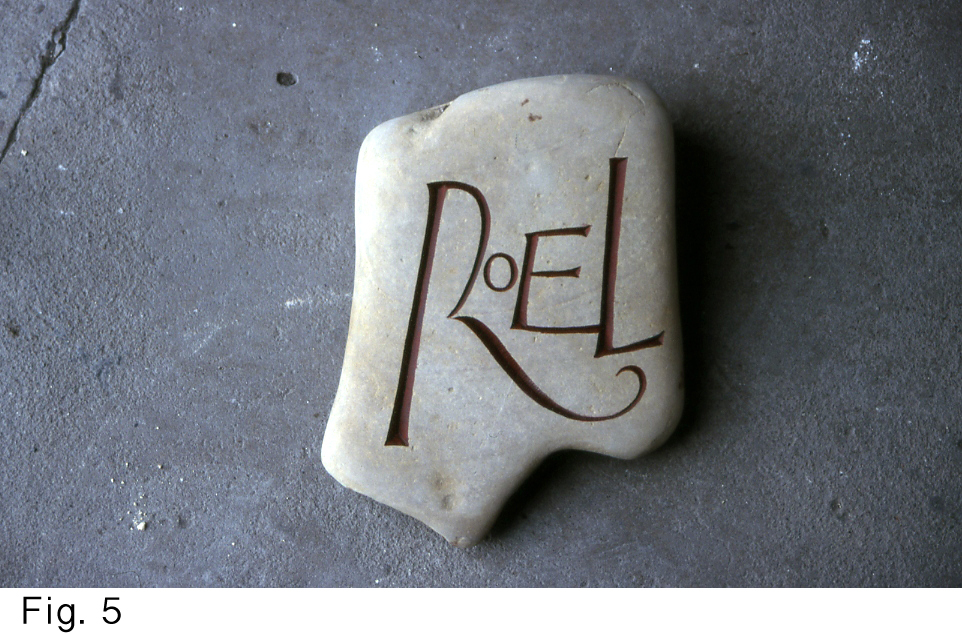
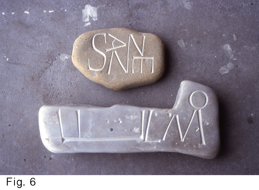
4: CORNEEL 5: ROEL 6: SANNE, ELMO (4, 5 and 6 are presents for births)
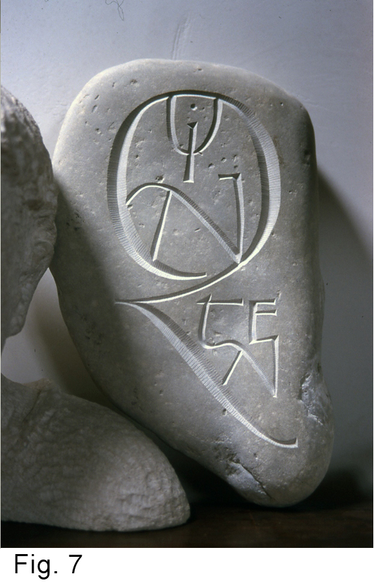
7: QUINTEN (letter Q resembles a 2 as this is a remembrance for one child of twins)
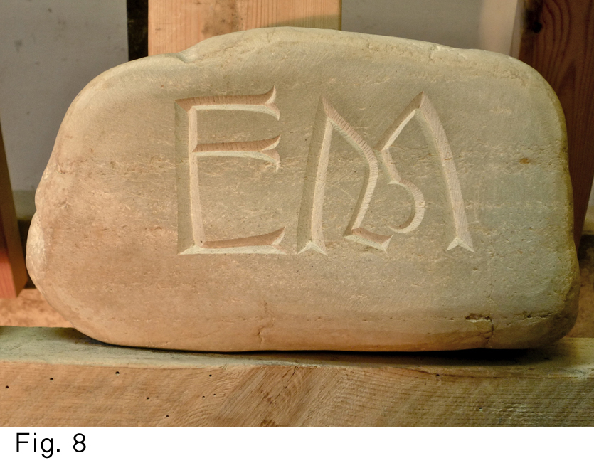
8: EM (initials for a couple married for 25years)
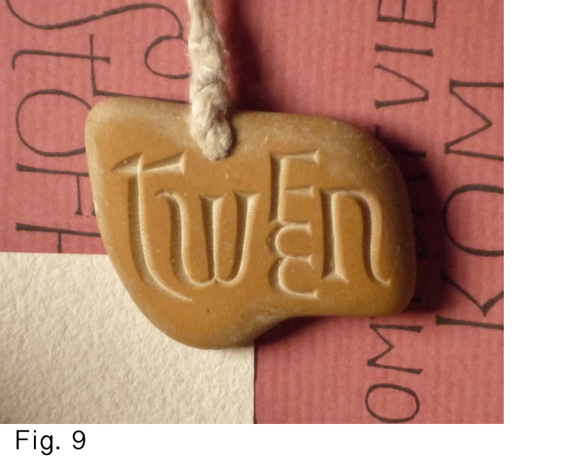
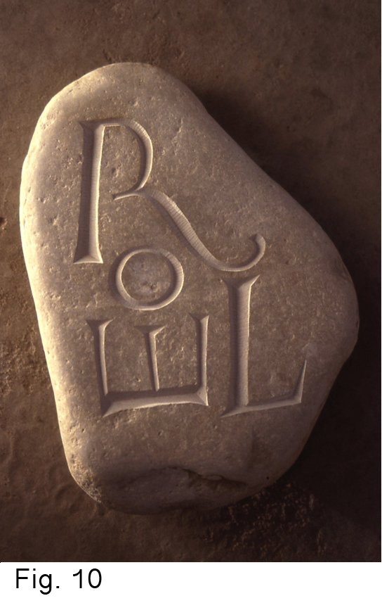
9: TWEEN (twone or two/one) necklace ca 2.5cm wide 10: ROEL (another present for a birth)
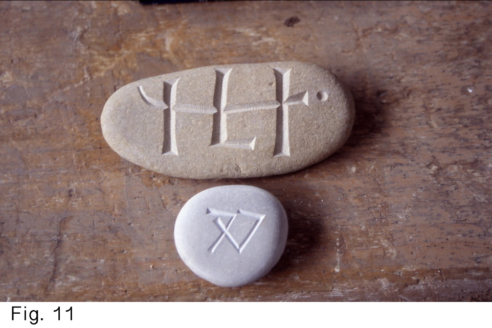
11: Initials H, J & L; and 7 times 7 (for a 49th birthday)
All examples by the author
Designing names on naturally shaped stones (Figs. 4 to 11) has played an important role in my breaking free of thinking in terms of typographic letterforms (though I feel closer to typography than to calligraphy because I draw rather than write). When you would put a typeset word within the irregular contour of a pebble, you would end up with letters that are too small, and the space around the word would be excessive and appear un-designed. That space would feel wasted and the lettering would be unable to compete with the explicitly physical presence of the stone. So in most cases it is advisable to use a combination of letters of different sizes, ligatures and, occasionally, letters enclosed within other letters, also called ‘nesting’ (Fig. 12). This way we can make the irregular contours of word and pebble reinforce one another and the un-designed space around the lettering can be turned from waste to full-value negative space. Readability may decrease, but a name-pebble is not in the first place meant as a ‘legible to the last degree’-inscription. It is an aesthetic and emotionally charged object.
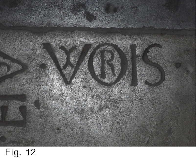
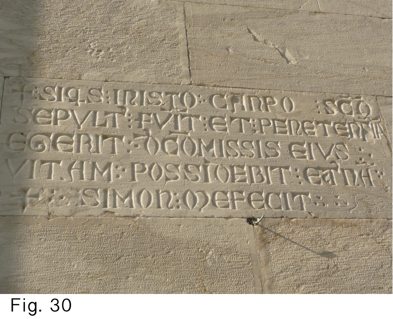
12: UXORIS (wife of). Example of nesting. Pisa, Italy.
Types of stone letters
In which I recognize: GRAPHIC skeleton letters, an IN-BETWEEN form and THREE-DIMENSIONAL letters.
The scratched graffiti (Figs. 13 and 14) as sometimes found on old church walls is a good example of ‘graphic’ skeleton letterforms. They were made with a pointed object in a homecoming movement (drawn toward the writer) and without preliminary drawing. The making is close to the act of writing.
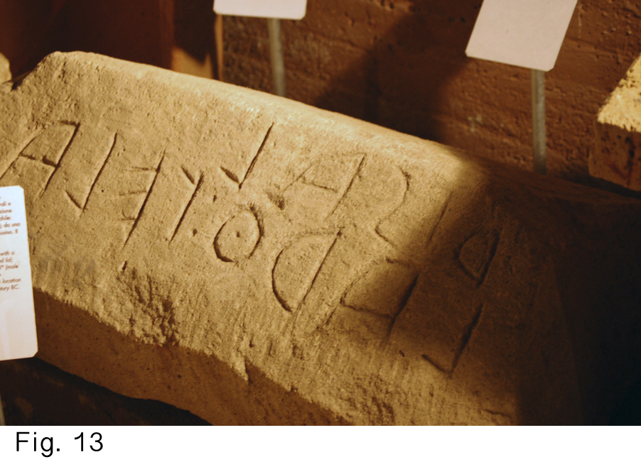
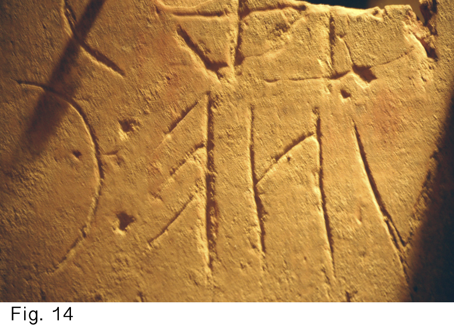
13 and 14: Etruscan inscriptions (between 7th and 1st century BC). Chiusi, Italy.
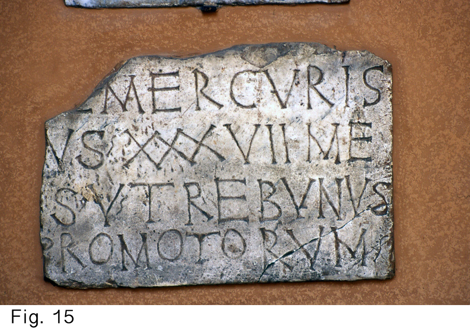
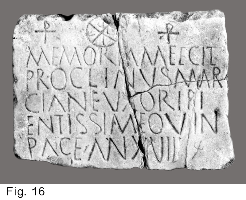
15 and 16: Early Christian inscriptions. Rome.
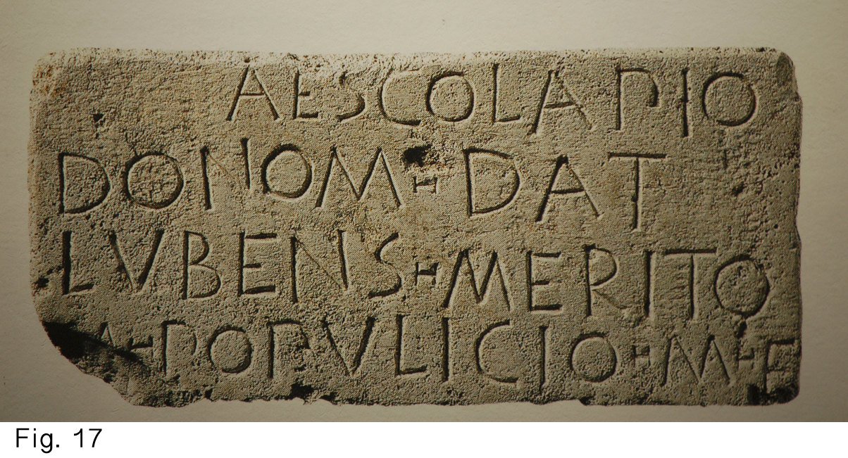
17: Republican style. National Roman Museum.
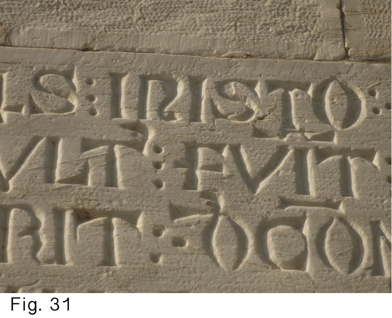
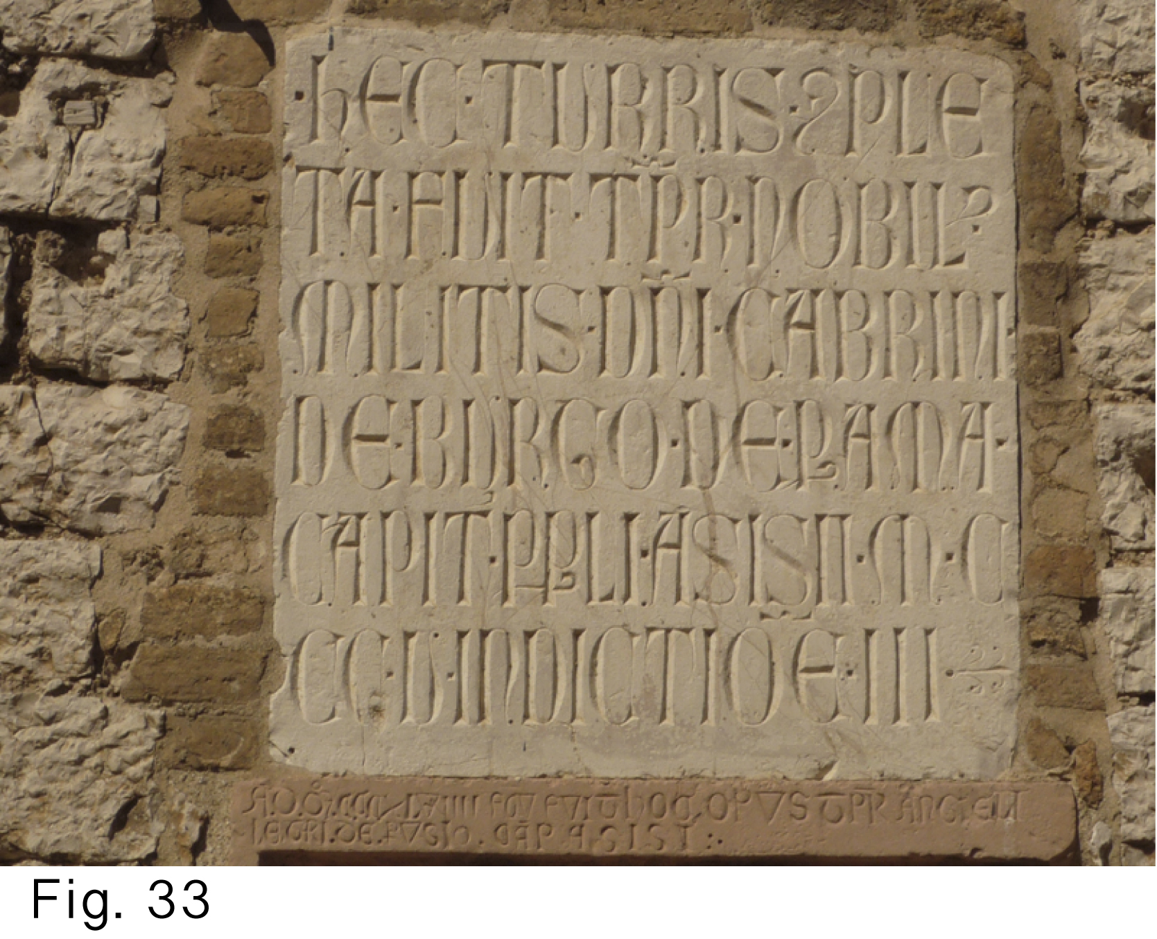
Early Christian (Fig. 15 and 16) and Republican Roman (Fig. 17) inscriptions fall between ‘skeleton’ and ‘three-dimensional’ lettering. The lines are slightly wider, they have a cleaner V-cut with more finished sides but the attention is not explicitly drawn towards the three-dimensionality of the lettering. I gather that early Christian inscriptions were also made without preliminary drawing but chased [1] with dummy and chisel, and are thus closer to the act of writing (just like the scratched graffiti I described above). Republican Roman inscriptions on the other hand, are more formal. They were probably written on the stone with a piece of charcoal or chalk, and then carved in a narrow V-section with a flat chisel. Through the way they were executed we can relate them more to drawing than writing (we’ll come back to this under ‘A missed chance’). Sometimes the three-dimensionality becomes/became so explicit that we can clearly perceive the play of light and shadow (Figs. 18, 30, 31 and 33).
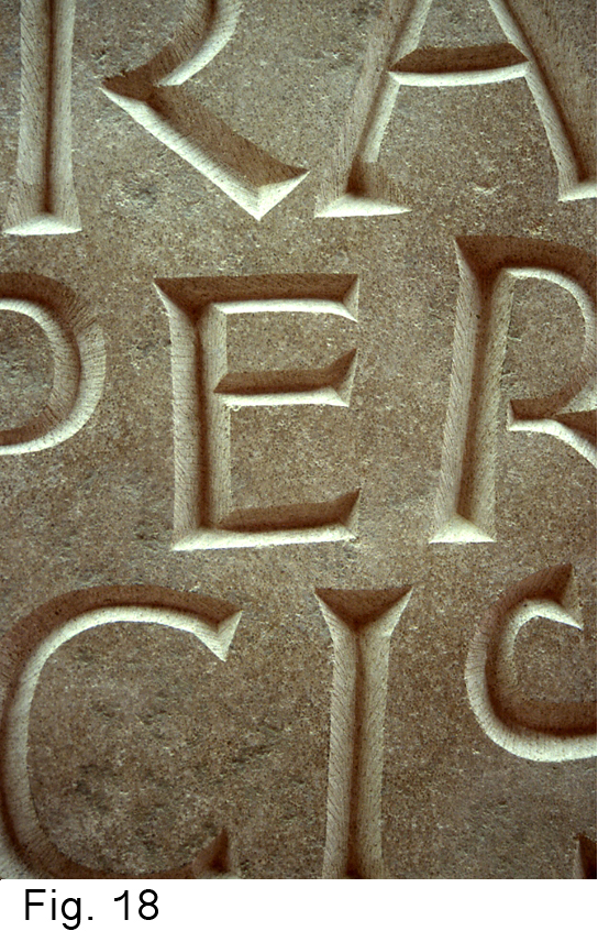
18: Detail of an inscription by the author
(‘HIC HORA SEMPER AMICIS EST’ Friends are welcome at any hour)
If there is no play of light and shadow because the letters are painted black (Figs. 19 and 20) (even when quite bold (Fig. 21)), the carving is again ‘graphic’ but in a different way as when scratched.)
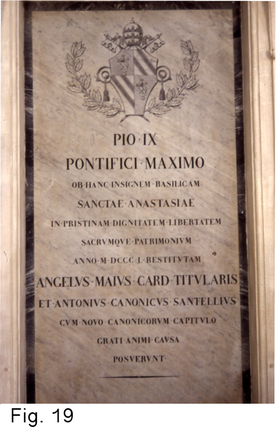
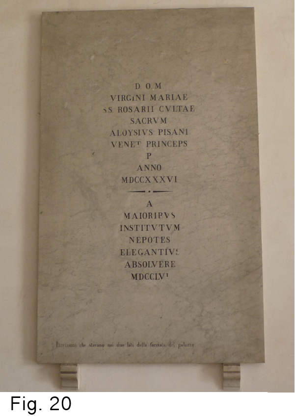
19 and 20: Northern Italy (exact whereabouts unknown)
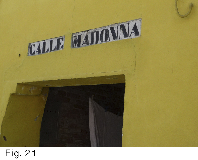
21: Engraved and painted black (The letters lose their sculptural character and become graphic, as if printed)
Properties of typical stone letters:
-Not too thin
-Little thick/thin-contrast
-No long fine serifs
Unless we wish to work in the early Christian, rather graphic (by which I mean not clearly being three-dimensional) skeleton style, we mustn't design stone letters too thin. Carving a long, clean, narrow V-cut line is not so easy, it demands extra concentration. With a wider line, the incision is deeper and the sides of it are broader. This gives more support to the chisel and makes it easier to make the side-surfaces of the V-cut clean and crisp (if desired).
But there are visual reasons as well. The incision divides the stroke into a dark and a light side so optical illusion makes the carved letter look slightly thinner than it was in its designed stage and will thus easily look too light. Also we read stone inscriptions from a certain distance (further away than when we draw the letter-shapes). And sometimes the stone background can have an explicit surface texture or the architecture on which the text must function can sometimes be quite robust. In all these cases, the lettering will be better made bolder. Of course, harder types of stone make this less obvious. As it takes (a lot) more blows of the chisel to carve in hard stone, a designer/carver will probably tend to take this into account and design slightly lighter letters. Also, in a tough piece of stone, letters will naturally be carved more shallow.
There is an interesting side issue in working on a rough surface. The well-defined contour the designer had in mind changes into a wobbly thing. In the act of executing he must let go of his mental image of the letter outline. Only the center-line and side-surfaces of the v-cut can remain intact so only they can give the letter its visual strength and character.
If we are dealing with an average size of about two inches (5 cm), I wouldn't give stone-cut letters a strong thick/thin contrast. Only with bigger letters, this strong contrast can be achieved without losing the minimum weight that is technically necessary to execute the thin parts. In the Trajan inscription, for example, the smallest letters are about four inches (9.5 cm) high. Their thin parts are, after some 2000 years of weathering, about 0.5 cm thick and the serifs about 1 mm at their thinnest. This ‘Trajan’ contrast is technically less advisable for smaller letters. When we considerably reduce lettering with a Trajan contrast by photocopy, the letters become too light in the horizontals and the serifs and the lettering looses its character. On the other hand, when we look at type and enlarge an example from very small printing, we see less thick/thin contrast than in the larger sizes of the same type. The letters are designed wider, to make up for the inner space taken away by beefing up the thin horizontals.
A third characteristic feature we see in letters with a stone-like character: no long, fine serifs. On many kinds of stone we have to fiddle to carve long and fine serifs. In my opinion that gives the lettering a mannered look, unlike in calligraphy where a hairline can emerge naturally from the pen or the brush. We could state that very fine-grained types of stone like slate may be an exception and that serifs come most naturally on big lettering where they are heavy enough to be carved straightforwardly.
Calligraphic mannerism
What else makes a letter on stone a real stone letter?
When I read Catich’s The Origin of the Serif [2] I felt a profound sympathy for it. He questioned apparently unassailable scientific predecessors and tripped up their established theories through his practical knowledge as a brush-letterer. I saw him as a kind of Robin Hood. He rightly assessed that the lettering on numerous Roman inscriptions was written with the flat brush before being carved. But, being through and through a brush-letterer, his stone lettering was a pure emulation of his brush designs, a calligraphic mannerism.
A typical calligraphic morphology emerges from the interaction between pen, paper, and ink (in Catich’s case from the interaction between brush, ink and stone). Real stone letters should be (re)considered through their specific material. They should be developed through the act of carving, taking into account the specificity of the stone, the carving implement, the size of the letters and the function of the text. Aspiring lettercarvers should, as it were, learn to design not on paper or screen but with the chisel straight onto the stone.
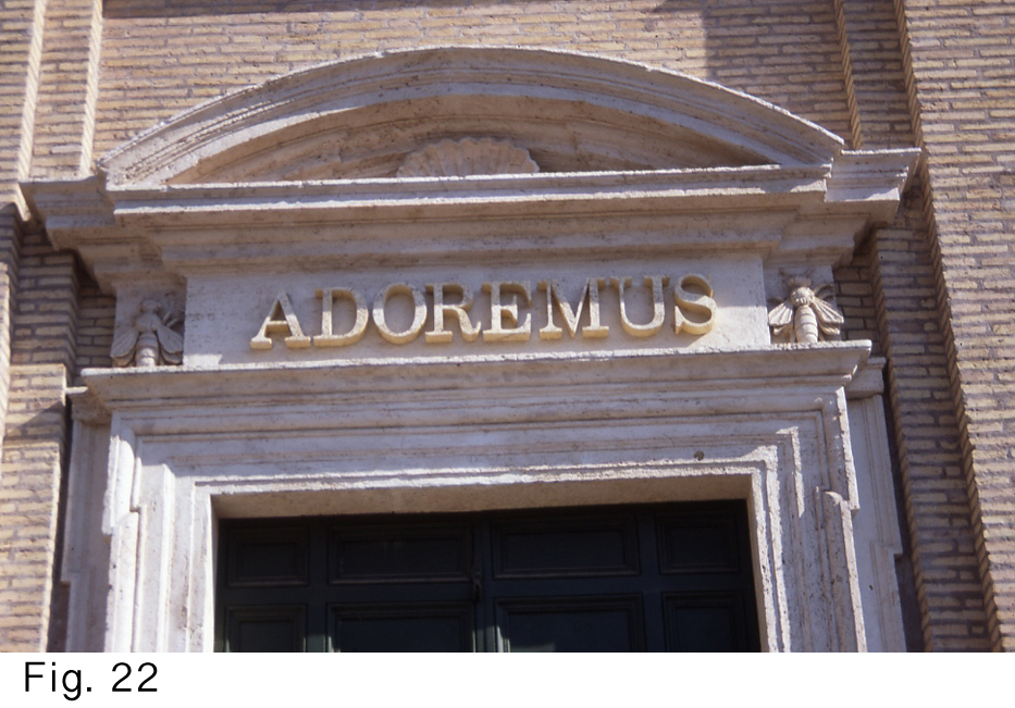
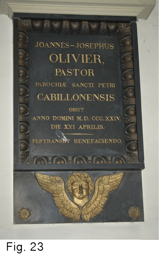
A fine-grained stone which has a mild and even hardness and texture may persuade the lettercarver to imitate beauty he or she has seen in calligraphy or typography. Calligraphically schooled carvers find it difficult to set aside their pen/brush skills (they often end up with what feels for me as paperwork transposed on a piece of stone), while typographically schooled carvers tend to produce typography on stone (Figs. 19, 20, 22, 23). For those reasons, lettering on stone is sometimes not stone lettering but a mere transposition of shapes developed in another medium.
I suddenly realized this when I first saw Republican inscriptions at the National Roman Museum (Fig. 17). They were, in contrast to the smooth white marble used for the Trajan inscription, carved in rougher – presumably local – kinds of stone such as Travertine marble (Fig. 24). It is not possible to carve fine strokes or serifs in this kind of stone, so an obvious thick/thin-contrast and elegant serifs were out of the question. The carving in stone of thick/thin-weighted lettering (as evolved from the flat brush) suddenly showed itself to me as very material specific for the fine-grained stone only the emperor and the very rich could afford. There was more lettering around than only theirs. My love for the Trajan letter suffered from a second blow because until then I had wrongly believed it was ‘The’ Roman lettering. My love for Trajan had already endured the emergence of the typeface with the same name that, compared to its handwritten/carved original, feels lifeless as a stuffed animal. The crude Republican Roman letter suddenly seemed somehow livelier and somehow more real as a stone letter than the highly estimated Trajan (Fig. 25).
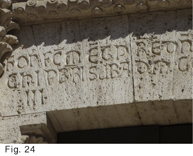
24: Example of Travertine marble (not with Republican lettering though)
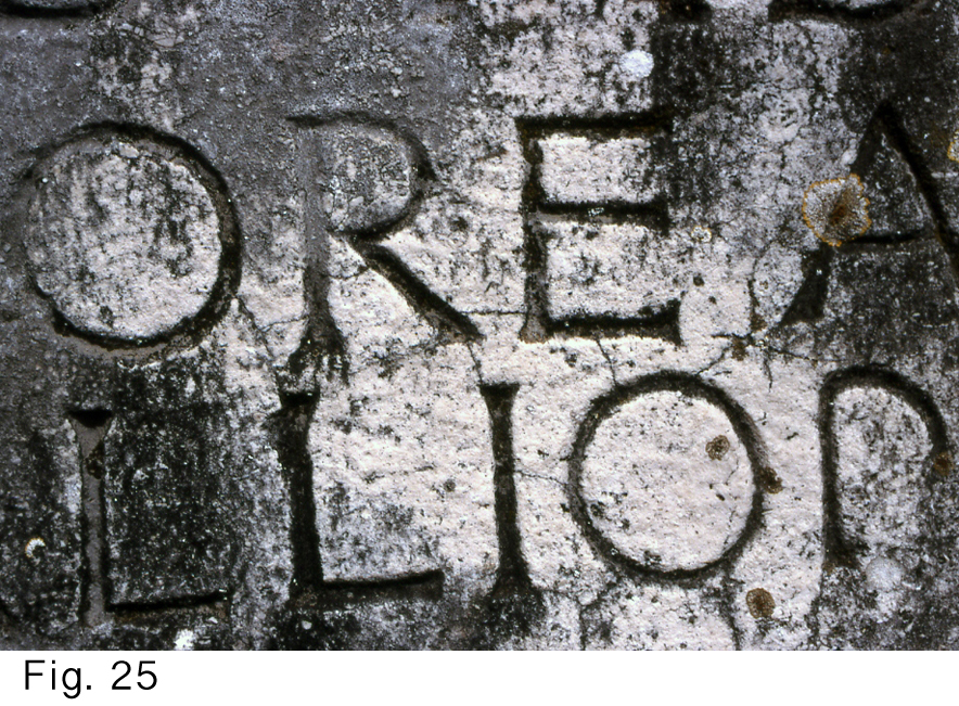
25: Republican letter style. Via Appia, Rome.
A missed chance
Outline-drawn stone lettering did already exist during the Imperial era. The letter shapes carved to take bronze infilling were designed that way (Figs. 26, 27 and 28) and their weight was very well suited to the imposing architecture they were combined with.
Since Trajan, the change for stone lettering has been from brushwork carved out in stone to outline drawing of a different kind as described above. In 15th-century Italy we see not only the example alphabets of Luca de Pacioli and others with their constructed letters; there is also the emergence of freehand outline-drawn stone letters (Figs. 24 and from 29 to 33). This is, amongst other things, exemplified by the kind of N with a narrow diagonal (Fig. 32), a typical drawn shape that can’t be written straightforwardly with a flat nib or brush. Lettercarvers apparently didn’t anymore take the imperial brush-lettering as their example but deliberately opted for outline drawing. This was a potentially beneficial change for real stone lettering because, as said above, carving is much closer to the act of drawing letters than it is to the act of writing them.
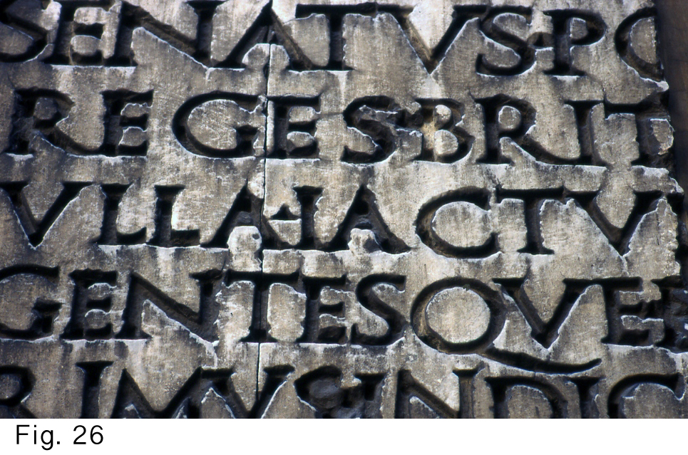
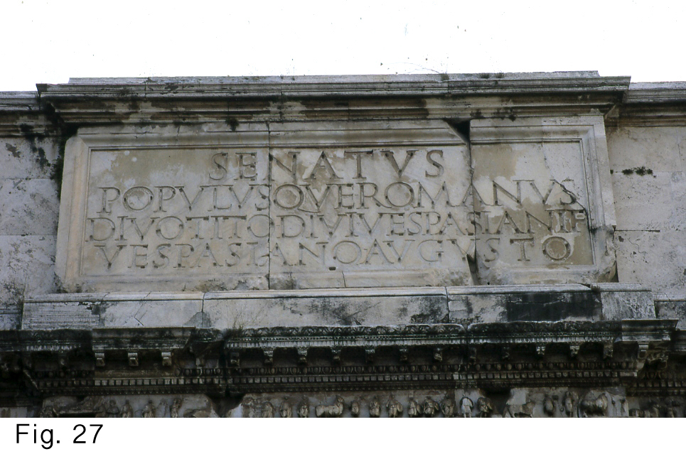
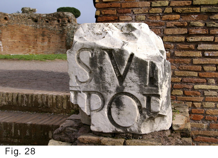
26, 27 and 28: Sockets for bronze lettering. Sienna (26) and Rome (27 and 28).
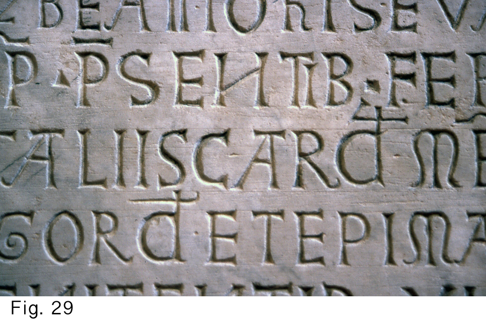
29: St John Before the Latin Gate, Rome
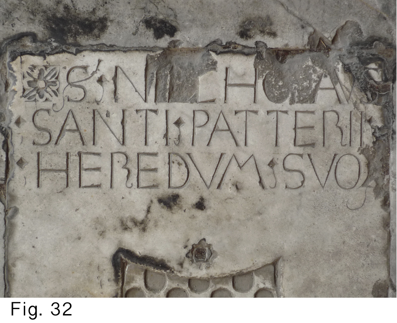
32: In the Camposanto in Pisa
33: Assisi
With the advent of movable type, though, this retreat from calligraphy led to lettercarvers’ imitating type or calligraphy. Stone lettering unfortunately changed from being the little brother of calligraphy into being the little brother of typography (Figs. 19 to 23) and calligraphy! This has lasted until our day, but there are hopeful signs that lettercarvers are once again ‘thinking stone’.
Author’s note: These thoughts were first presented as lecture in London in 2003.
In 2004, I published the article in issue 8 of Forum (UK), then with more illustrations in Letter Arts Review (US) in 2006, and later in an Australian lettering periodical. Here I present a reworked version for J-LAF, with more pictures.
After my lecture in London, I read Nicolete Gray’s Lettering on Buildings (1960) and found that several of my conclusions, though arrived at by a different route, were quite like hers.
[1] To chase is to cut with the chisel quite flat against the stone, as opposed to ‘chopping’ where the carver cuts with the chisel more perpendicular to the stone (approximately 60° between the shank of the chisel and the surface of the stone and where - as in the act of chasing - the one corner of the cutting edge remains above the surface. The exact angle of shank to surface depends on the hardness of the piece of stone at hand). The chopping technique is useful when the stone is less solid and when small particles of stone tend to break off in the act of chasing.
[2] Edward M. Catich, The Origin of the Serif (2nd edn., Davenport: Catich Gallery, St. Ambrose University, 1991)
KRISTOFFEL BOUDENS
Born in 1958 in Bruges, Belgium.
Studied art for six years (painting) and trained in lettering under Tom Perkins, Gaynor Goffe and Pieter Boudens. Informally, Jean-Claude Lamborot and John Nash were important.
Works as an independent textdesigner/lettercarver since 1989.
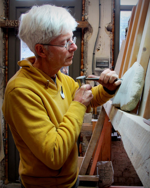
Has in the meanwhile always been teaching, sometimes lettering for stone, sometimes fine art.
Has lectured in San Francisco, Melbourne, Rome, Vatican City, London, and Cambridge.
Has two sisters and two brothers who are letterers. His father was the founder of 20th century calligraphy in Belgium.
Lives with his wife and three children in a medieval village near Bruges.
