Emiko Okayama
Macquarie University, Sydney Australia
When Lafcadio Hearn first stepped into a Japanese city some 120 years ago, he was quick to express his surprise at the array of banners and shop signs. He observed the peculiarity of the writing, describing the characters as pieces of pictures with life (Glimpses of Unfamiliar Japan, 1894: 18-20). Given the pictographic foundation of Japanese writing, it should not come as a surprise that words and pictures have enjoyed substantial equality in Japan, and been used interchangeably across many forms of literature and art – from The Tale of Genji scrolls to Edo picture stories and prints, and in calligraphy. These traditions are alive and well in contemporary Japanese graphic design. I believe this is because writing and pictures are much closer in Japan than in cultures with alphabet writing. It is a condition that has been neglected by scholars, since the dominant views on scripts have come from alphabet users, who see words and pictures as fundamentally different. In the West, the highly abstract, phonetic and single-directional nature of alphabet script has encouraged a separation of words and pictures, and a word-controlled linear presentation of information. But with Japanese, there are multiple choices – of script, characters, script direction, page layout, etc: many characters have a pictographic or ideographic dimension.
As a consequence artists have been far more inclined to incorporate writing in pictures, and writers more inclined to think visually about their texts.
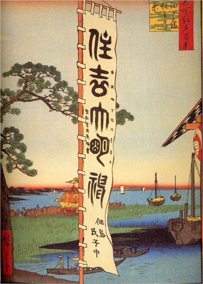

Good examples are Tsukudajima Sumiyoshi matsuri (Ando Hiroshige, 1858) and Taira no tatemaii (Unknown artist, 1855). In both pictures writing is the focus of the picture: a banner in the former indicates the place and event and in the latter the kanji character, taira (peace), is the centre of attraction. In literature, Japanese novelists, writing with strongly graphic kanji and contrasting phonetic kana, are more conscious of visual effects, and express their messages through both textual and visual means. Tanizaki Junichiro’s original novels are such examples: in these he carefully organises scripts, page layout and illustrations to convey particular visual messages. His Kagi (The Key, 1956) consists of two alternating diaries: the husband’s is written with kanji and angular katakana, and the wife’s with kanji and curvaceous hiragana – masculine and feminine respectively. More recent writers are equally adept in their graphic expression. Kyogoku Natsuhiko uses graphic software, InDesign, for his writing template and every single page of his books always ends with a period. Onda Riku’s mystery novel, Eugenia (2005), has pages of different sizes and alternating column widths to add an element of unease to the readers’ experience.
Another example is calligraphy, which sits somewhere between art and writing, and normally considered to be a craft in the West. However, in Japan calligraphy is highly regarded as an art form and commonly housed in art galleries alongside paintings. In Japanese calligraphy, paper, tone of the ink, strokes, shapes of lines and space between scripts are as important as the writing. The meaning (message) of a calligraphic work is conveyed through all these means. Nishikawa Yasushi’s Toro (1976) consists of two characters, which means ‘praying mantis’. In this work, his son, Nishikawa Kyotaro, has explained to me how his father tried to express visually the mantis’s aggressive side when confronted with enemies.
This is the background to my research, from which it is evident that the nature of Japanese script brings with it a set of underpinning ideas that offer far greater graphic versatility than does the alphabet. They can be readily read in any direction. Go into any Japanese library or bookshop, and one will find publications with texts written at least in three directions. Pictures can easily substitute for characters or parts thereof. Over the last six months, I have been exploring this theme in my project, Text-Image Relationships in Art, Literature and E-media in Japan, as a visiting research fellow at the Graduate School of International Development, Nagoya University. My visit was made possible by a Japan Foundation Fellowship 2007-2008. My research suggests that the characteristics of a writing system influence a person’s thinking in all forms of visual and spatial expression. Further, it suggests that because of the picto/ideographic content in Japanese scripts, it may be more useful to think of a script-picture continuum in Japan than the two as separate.
Perhaps one of the most interesting aspects of my work is that which suggests how the nature of the script and associated graphic traditions are giving the Japanese a creative edge in today’s world of e-media, where there are so many ‘new’ opportunities for script-picture combinations to continue ‘old’ cultural practices. My work draws attention to web pages and text messages: reflecting upon contrasting English and Japanese approaches and practices when using words and pictures on websites and in email messages. It highlights the text-driven nature of English websites where images are more often separate from and subordinate to texts, and pages designed to be ‘read’. Japanese counterparts show a higher text-image integration, and actively exploit a variety of computer techniques such as overlaps, layering, pictures within pictures, and wallpaper backgrounds: here, it is less a matter of ‘reading’ and more of ‘navigation’. In the early versions of text-only e-mail environment, the use of images was restricted. Alphabet users were reluctant to move from a conventional writing style with limited visual expression – perhaps multiple exclamation or question marks but little more. Japanese message-makers were quick to express themselves visually in spite of the dearth of symbols: for instance, punctuation marks, and geometric shapes were used to create frames (✩゚・*:.。: :。.:*・゚✩), and emoticons were invented (^_^) (>_<). Such techniques have since been absorbed into text messaging by Western youth. Now the technologies have much improved and combining texts and images has become much easier and Japanese are taking full advantages of these. This is demonstrated by the popularity of mobile novels and mobile comics, which are fast becoming bigger sellers than conventional publications in Japan.
*Note: This is an edited version of my report published in Omusubi, the Japan Foundation Sydney newsletter, in July 2008.
 Dr. Okayama
Dr. Okayama is a lecturer in the Department of Asian Studies (International Studies from 2009) at Macquarie University where she teaches Japanese language and culture. She is also a NAATI accredited translator and holds a Masters degree in Translation Studies from Dublin City University. Her doctoral thesis at Sydney University was an historical investigation of Japanese third person pronouns covering three centuries, and her main interests lie in translation studies, language change and Japanese visual culture.