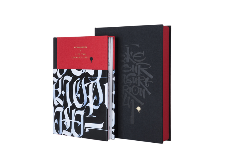
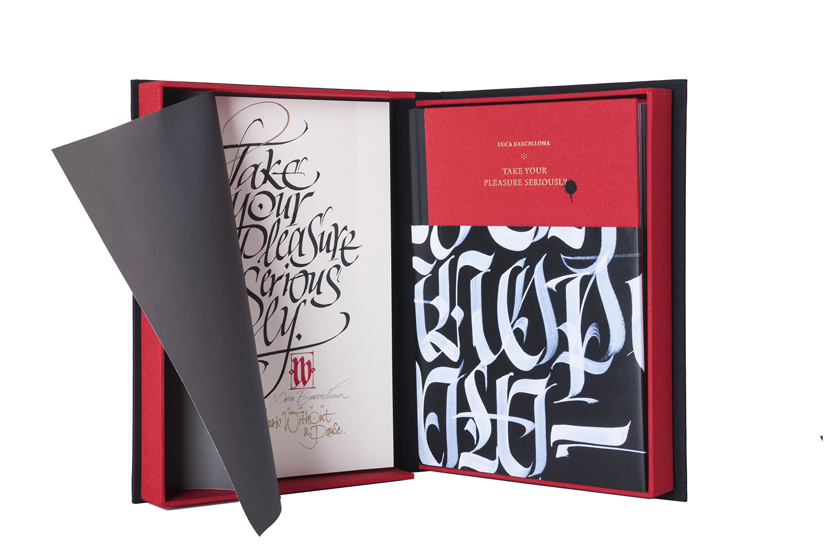
「Take Your Pleasure Seriously」The way of handwriting
personal
projects
—
I occasionally feel a deep need I can’t help but heed: I start my day and just want to shut it all down, isolate myself, sit down at the drafting table and write out the sentence I’ve had in mind for awhile, the one I’ve never had time to write. That makes me feel better, and I can then move on and face the day.
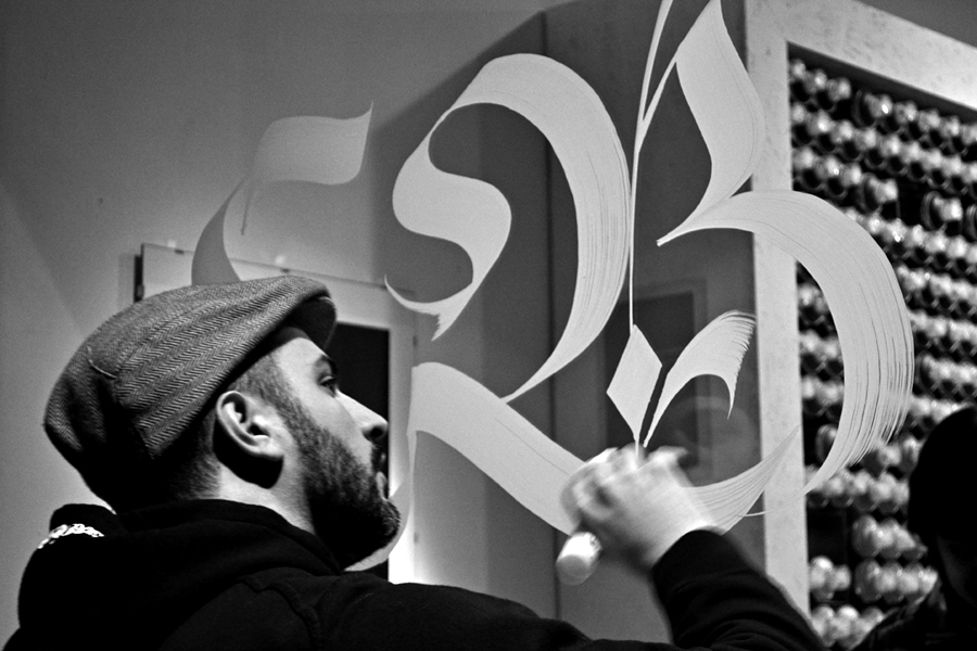
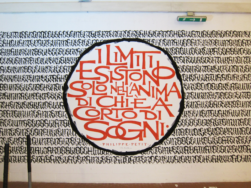
Finding the time to do something for yourself, with no precise aim, is vitally important in any creative line of work. Over the past few years, as my studio work has intensified, the utterly free, unfettered moments I’ve been able to devote to my own personal work have grown increasingly rare. As soon as I realized that, I understood that I needed to slow down and take the time to rediscover my curiosities. So many ideas are out there—on the streets, in open-air markets, in the signs of cities you haven’t been to yet—and you have to go out and look for them. That’s why I usually accept invitations to participate in events that, for instance, call on me to write across an entire wall; it’s like an automatic trigger to do new research, something that will leave its own mark. The best you can hope for is to find new forms of lettering, or create a fusion between various styles, since writing is, by its very nature, in a continuous state of evolution.
In past centuries, before the advent of printing, most people conceived of the calligrapher as an artisan at the service of the text. Copyists didn’t necessarily need any special skills, they just had to reproduce the texts in such a way that others might read them. Obviously, that was the norm back then; truth be told, up until a few decades ago those same skills were taught in schools—it’s hard to believable now, but people used to learn how the manuscripts on view in museum vitrines were made.
So-called expressive calligraphy and the instruments we still use today, like ruling pens, are known in part thanks to masters like Friedrich Poppl, Werner Schneider, and many others who, in the mid-fifties, laid the foundations of calligraphy as an expressive art form in its own right. They began by moving across the page with fluid, controlled gestures that only appeared quick and casual; their instruments were less precise and more rudimentary than nib pens, but everything was done with a deep knowledge of how letters are made.
Knowing as many historic styles as possible, plus constant training and a dose of curiosity and initiative, can lead to the (hoped-for) moment in which your own style becomes recognizable. The hard work pays off as soon as someone asks, “Did you do that? I thought so!” It can take years, but it’s a long road well worth the haul. It’s also essential to compare your work and keep your skill level in perspective by measuring it against the masters, the admired calligraphers who came before. Any truly personal style invariably shows its maker’s background and influences. It’s easy to think you’re good if those judging your work aren’t familiar with the subject; that can boost your self-esteem, but it doesn’t make for a good calligrapher.
When I approach a new piece, I always realize how little I know and how much
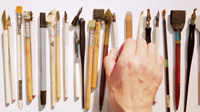
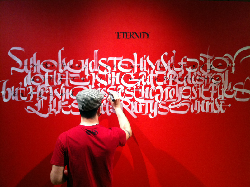
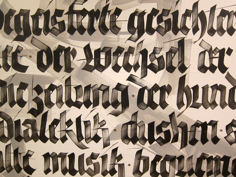
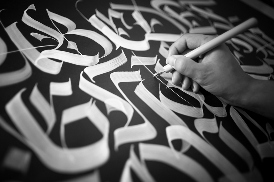
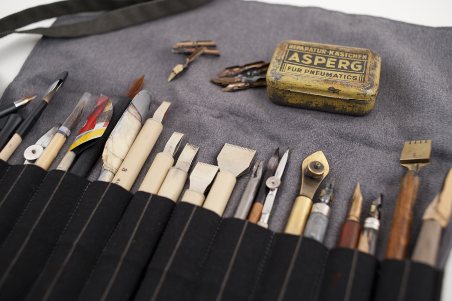
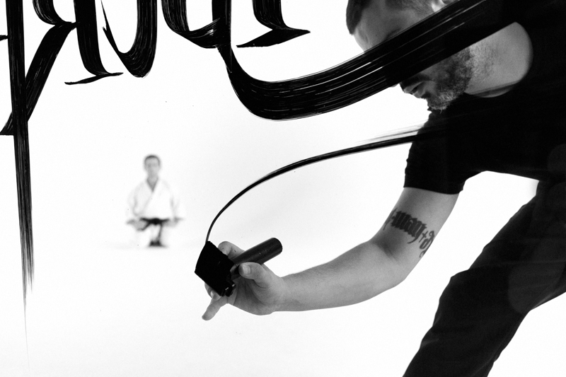
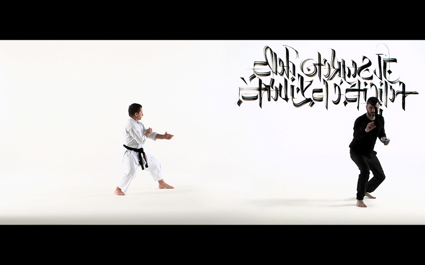
I have yet to learn. There are hundreds of different kinds of paper and ink: what instrument and what style will be best suited to the given text? A combination of motivation, instinct, and knowledge all come together to move the trained hand. Each paper has its own ideal pen, its own ideal ink dilution. On large walls, the challenges multiply: the perception of space is entirely different from the one you have when working on a small page, you have to step back, take measurements, go up and down a ladder (sometimes over and over again), and your whole body aches for days on end. Sometimes you can also just trust your eye, and then you get twice the satisfaction if you manage to keep everything straight and in proportion.
My own laziness with regard to ruling lines led me to train my eye so I can do without it. You can’t know, at first, whether all the words will fit; you have to choose the right brush size, and condense or expand things as necessary. Or you can set up a reference in advance, projecting the layout or tracing the letters in pencil. One thing’s for sure: the more construction underneath it all, the less fresh it will feel. One of my own recent finds was rediscovering the pleasure of making mistakes, of messing up the page or absentmindedly forgetting a letter, and ultimately understanding that there’s nothing wrong with that.
I hate feeling forced to retouch a piece or attempt a perfection that simply isn’t in our nature—that’s a need I aim to free myself from. If you do an illustration many meters wide, no one will notice if you change it a bit from the original sketch. But if your writing is crooked, everyone will notice. So we have to be “artists of emptiness,” as I learned from Tom Kemp in one of his amazing workshops. The nothing is already here, in the emptiness between the letters, and in a text it’s almost more important than the letters themselves: they don’t have to be perfect, but the space between them does have to be harmonious, or at least convincing.
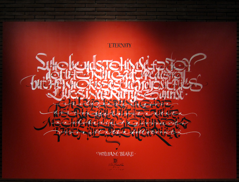
Rudolf Koch’s Gospel books come to mind; their exquisitely beautiful pages are made up of letters that appear distorted and loose when looked at one by one. And yet those dense pages of writing appear lively and harmonious. So the most important thing, again, is the work as a whole.
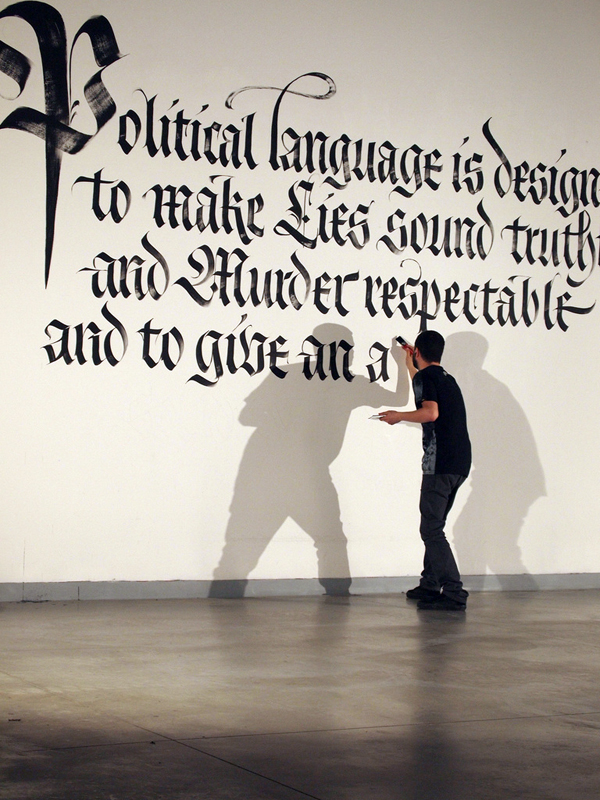

You also have to consider the content—what to write. Sometimes a text comes to you. A while ago I had to write a wall in Florence, but hadn’t yet decided what. I found a book by George Orwell in a local bookstore, its spine stuck out from all the others on the wall. I took it out and looked at the title: Why I Write. That’s it, I thought. The blurb on the cover spoke of the duplicitous, false nature of political lingo. It was perfect for me at the time, and I decided to write it. Choosing a text is a highly personal act: as a staunch atheist, I’ve always steered clear of sacred texts and biblical quotations, but they’re some of the most common content of calligraphic work, even skillfully executed pieces. It’s hard to avoid falling into cliché or constantly quoting others, but I think it’s important to write something that’s truly yours, that’s a part of you and has been there at key moments in your life. It could be a line taken from a song, maybe by a little-known songwriter—in which case you’d help spread the music as well as your own work.
There is only one way to overcome the fear of the blank page: face it head-on, and let a black mark make its start, certain that it will find its end. Certain, too, that there’s still so much more to learn.
teaching calligraphy:
coming full circle
—
My first real contact with calligraphy was through the Associazione Calligrafica Italiana (ACI, the Italian Calligraphic Association) in 1999. I’d heard about it through Francesca Gandolfi, who was part of its administrative team at the time. The Internet wasn’t yet widespread, so info arrived in a flyer showcasing their activities and course offerings. I was already doing calligraphy as an autodidact, but when I discovered that there were such expert calligraphers—in my hometown, no less—and I took my first course on Italic lettering with Francesca Biasetton, a whole new world opened up for me.
My approach was still more closely tied to graffiti writing and bombing the streets than to the discipline of the nib. Obviously, I felt a huge gap between the two, not least a generational gap. And yet both graffiti writers and calligraphers are driven by the same passion for letterforms, albeit in often diametrically opposed ways. In any case, I wanted to find a connection between these two worlds, and in order to do that I knew I’d have to delve deeply into classic calligraphic styles. So I began taking as many courses as I could, studied historic scripts, and diversified the instruments in my toolkit and the way I deployed them.
I was lucky to have had great teachers, each with their own irreplaceable peculiarities. Giovanni De Faccio is a veritable Renaissance man—a highly genuine, inexhaustible resource: I learned a lot from him about gothic lettering and its expressive potential; his rich, creative workshops were unforgettable, and had an almost timeless atmosphere. Anna Ronchi, one of Italy’s leading calligraphers, writes a chancery that exudes the rigor and incredible lightness with which she moves the pen to create elegant flourishes that are never exaggerated and never feel out of place; her specialty is a deep understanding of letters and traditions, as well as an in-depth, effective teaching method. She’s always on the front lines, defending her idea of calligraphy, and over the past few years has taken on the difficult task of bringing handwriting back into the schools through up-to-date programs. James Clough instilled in me a curiosity for letters found all around the city, letters that fully inhabit their own history; it’s his fault that I often find myself stopping in the middle of the street to photograph an old sign. He’s outrageously likable, and enthusiastically conducts memorable lessons while also dispensing constructive criticism with plainspoken honesty. Thanks to Lucio Passerini I learned to appreciate letterpress, blockprinting, and the value of the good time—both qualitative and quantitative (there’s a reason his studio is called Il Buon Tempo)—it takes to print a book.
The world of calligraphy I came to know consists of many exceptional people—including Ivana Tubaro, Francesco Ascoli, Anna Schettin, Ivano Ziggiotti, Marco Campedelli, and many others—who for years now have made their own contributions to calligraphy and typography with unwavering passion, hard work, and active participation. ACI was founded in 1991: this association played a significant role in bringing high-quality calligraphy—the kind of calligraphy passed on to us from Edward Johnston in the early twentieth century—to Italian graphic design and advertising, starting in Milan and spreading far and wide. Without ACI’s support I probably wouldn’t have had the opportunity to learn as much as I did, directly from the masters.
Its founders studied abroad—in England, Belgium, and America—before teaching in Italy. Upon returning they invited calligraphers like Hans Joachim Burgert, Thomas Ingmire, Hassan Massoudy, Klaus Peter Schäffel, Tom Kemp, Ewan Clayton, and others to come and teach as well. Their courses have always been organized by dedicated, self-financed volunteers.The associations that sprung up afterward worked similarly, and made a similarly great contribution to the field. They include the calligraphy groups in Turin led by Piero De Macchi and Massimo Polello, one in Rome run by Monica Dengo, and probably many others I’m not yet personally familiar with. Without their hard work no one in Italy would be talking about calligraphy today without having to start from scratch and explain what it is.
When I was first asked to teach, I wasn’t completely convinced I’d be able to pull it off. I spent a couple months preparing a course on Fraktur, and worried about how it would turn out. Contrary to my fears it went really well, and many other courses followed. The first thing I realized was that, in order to teach, you have to know how to pass on to students the sheer pleasure of practicing calligraphy; it takes major doses of generosity and energy, because at the end of a workshop you feel almost entirely drained. Over time you also develop your own teaching methods, and you have to make an effort not to repeat yourself, instead undertaking different lines of research so as to offer new subjects that reignite people’s interest—and, above all, your own interest.
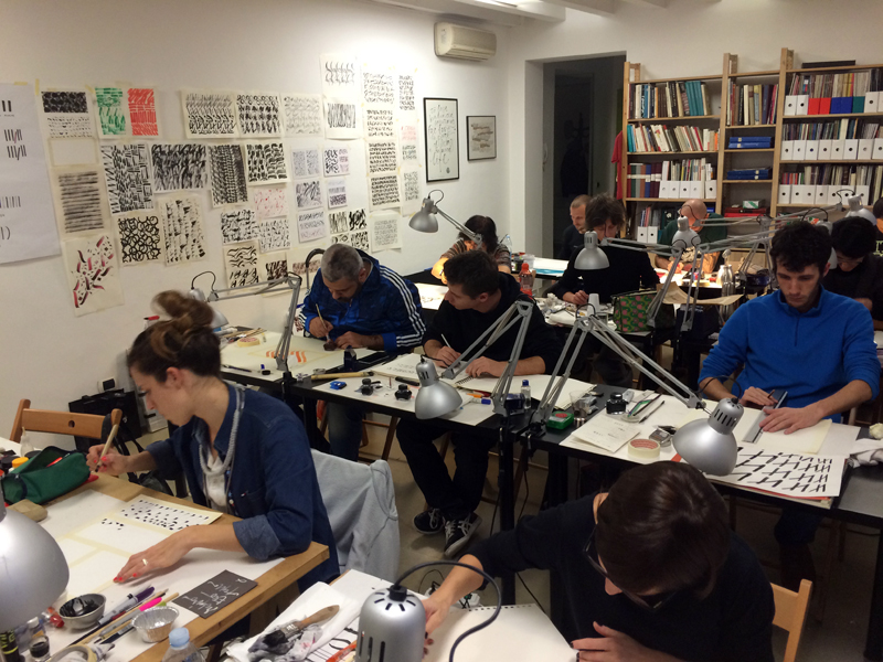
I’ve always been struck at the diversity of participants in each course: they range from curious amateurs to dedicated graffiti writers, bibliophiles, women nostalgic for the inkwells and knuckle-rapping schoolmarms of their youth, tattoo artists who swear like sailors, and journalists tired of the keyboard who want to take up the pen again. I should also note that my courses are increasingly filled with fairly young people—a lot of students and budding graphic designers. Teaching is definitely a privileged opportunity for learning, too; it gives me the chance to travel and see places I otherwise might never have seen, as well as meet new people and, often, new friends.
Writing, like any other discipline, exists as long as it’s passed on; teaching means giving others the possibility of venturing down the same paths that allowed me to get my own start. It’s like coming full circle. Calligraphy is an art that comes from afar, and has deep roots—especially in Italy. You have to want to know its history and past in order to be able to follow its present (especially in the digital age), and hopefully its long future.
--------------------
This article was originally published in Take Your Pleasure Seriously (2012) by Luca Barcellona.
--------------------
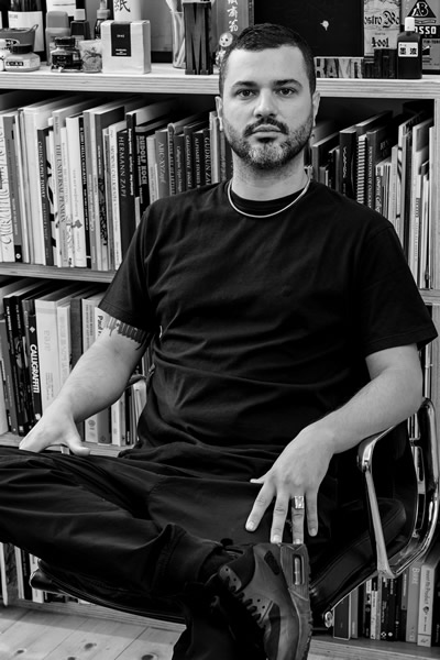
Luca Barcellona is born in 1978. He has his own studio in Milan, where he works as a freelance graphic designer and calligrapher. Letters are the main ingredient of his creations. He teaches calligraphy with the Associazione Calligrafica Italiana and holds workshops and lectures in several cities, as the last one in California and Australia. The means of his work is to make the manual skill of an ancient art as writing and the languages and instruments of the digital era coexist. In 2003 he founded with Rae Martini and Marco Klefisch the collective Rebel Ink, with which he gives life to a live exhibition of calligraphy, writing and illustration. In 2009 he has worked for the National Museum of Zurich, with calligraphist Klaus-Peter Schäffel, to realize the faithful reproduction of a big globe dated back to the 1569, using calligraphy with original materials (quill and natural inks). Among the brands that requested his lettering we can number Carhartt, Nike, Mondadori, Zoo York, Dolce & Gabbana, Sony BMG, Seat, Volvo, Universal, Eni, Mont Blanc, Wall Street Institute. Among his latest collective exhibitions: "Stuck on the City" in Prague, "Don't Forget To Write" at Carhartt Gallery (Germany). As well as taking part to several independent projects his works appeared in many publications. In 2010 he produced his own personal clothing brand "Luca Barcellona Gold Series". He recently published his first monographic book Take Your Pleasure Seriously by Lazy Dog Press, the publishing house which is a member himself. His study into lettering led him to experience from graffiti to classic calligraphy, up to big wallpainting, typography and letterpress printing.
http://www.lucabarcellona.com/