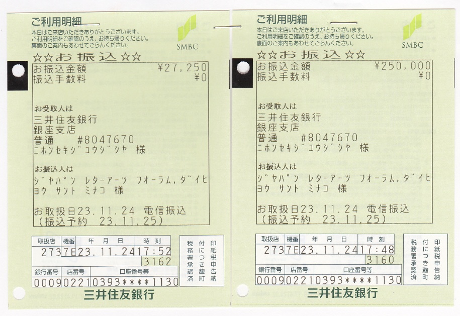
9月に開催されましたツァップ展開催に際し、入場料や売上げからの一部、また開催関係者からのご寄付によって集められました義援金 277,250円を、下記の通り、日本赤十字社に寄付致しましたことをご報告いたします。
今回の東日本大震災の被災者支援のための義援金寄付は、ツァップ氏ご夫妻の希望でもありました。
ご来場いただきました皆様、また、関係者の皆様、ご協力誠にありがとうございました。皆様のご厚意に深く感謝申し上げます。
9月に開催されましたツァップ展開催に際し、入場料や売上げからの一部、また開催関係者からのご寄付によって集められました義援金 277,250円を、下記の通り、日本赤十字社に寄付致しましたことをご報告いたします。
今回の東日本大震災の被災者支援のための義援金寄付は、ツァップ氏ご夫妻の希望でもありました。
ご来場いただきました皆様、また、関係者の皆様、ご協力誠にありがとうございました。皆様のご厚意に深く感謝申し上げます。
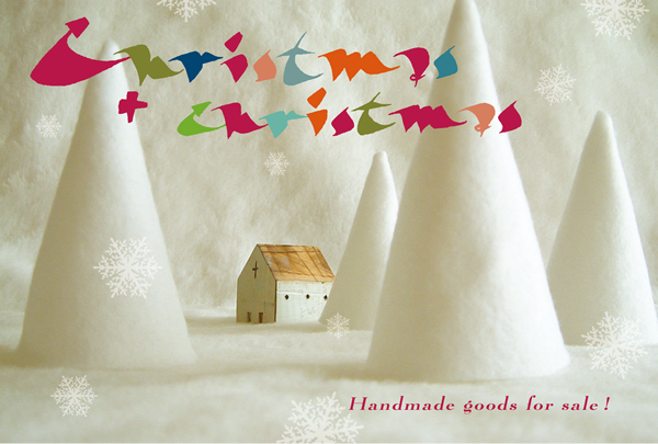
11月23日(水・祝) ~ 11月28日(月) 大阪のイロリ村 [89]画廊での「~トニカク文字イリ~ Christmas+Christmas展 in 関西」が無事終了いたしました。
北海道から九州まで、日本中から文字たちが入った素敵なクリスマス雑貨が集まりました。
出展していただいた皆様、ならびに開場に足を運んでくださった皆様には、スタッフ一同から心よりお礼申し上げます。
また、関西でこのようなイベントが開催できたらと考えております。
その際には皆様に是非ともお力をお借りしたいと思います。
ありがとうございました。
「~トニカク文字イリ~ Christmas+Christmas展 in 関西」担当 籔本・木作・長野・鳥羽
毎年東京の羽ペン工房で開催されている雑貨展「クリクリ展」が、2011年、関西にやってきます!
しかも「~トニカク文字イリ~」・・・
さて、どんな「文字イリ」の雑貨が集まるでしょう??
展示する雑貨たちは全て販売いたします。
プレゼントに、自分へのご褒美に・・・
お気に入りの雑貨を見つけに来てくださいね。お待ちしております。
●開 催 日:2011年11月23日(水・祝) ~ 11月28日(月)
12:00~19:00 (最終日~17:00)
●会 場:イロリ村 [89]画廊 展示室1
〒530-0016 大阪市北区中崎町1丁目4-15
HP:http://www.k3.dion.ne.jp/~irori-05/
お問い合せ: 専用アドレス chrichri_kansai ![]() j-laf.org
j-laf.org
※ ![]() を@に変換してください。
を@に変換してください。
◆◇◆ ◆◇◆ 参加者 65組 ◆◇◆ ◆◇◆
(順不同)
NAKAYO*HI
小澤智史(eſzett)
MOHN
knuts
HitoMina with Machiko, hiro-hiro, jun-jun & yuka
いちあずまみ
Kinu
塚田美保
冨山静香
Apricot Style
湯けむりフレンズ
Kumiko & Keikos
Happy New Knot
ヒガシ・ノゾミ
書タイム
Lunar川島 & POP真田
megurin
Nao
SUMI
山本さちえ
lavande
Berry's
寺床由紀子、今津貴久子、佐藤祐美子、松本和世(nagomi)
k-sachiko
もりたゆにこ
Nauvey's Castle なべかわ ゆきこ
くっちゃん&エンドウマメ
arco iris(アルコ イリス)
マダムハ-ディ-
マサミ・スタヂオ
古賀恵利子
三戸美奈子
Prism
和田祐子
クラフト mie
篠原奈穂子
扇町マテリアル会議
天竺桂 靖子
GIRASOLE
piri-KARA レディース
池田 和代
Atelier Manon
caneton
サンセダイ
向日葵Angels
花の教室スタジオR
COZA"O"henLI
YukiFooh
金曜日の和
みやこ屋
cum litteris (クムリテリス)
ki.na.
moni
堀井洋子
はなあずき
Chelsea(Asai Tomoko,Ichimura Yukari)
あべ まりえ
Toriring
Studio Piccolo
ナガイ ユミ
はまさきさとみ
アトリエ御影
Ihara-yukari
木作輝代
深谷友紀子
「~トニカク文字イリ~ Christmas+Christmas展 in 関西」担当
籔本/木作/長野/鳥羽
2011年9月13〜25日に開催致しましたZapf展
「ヘルマン・ツァップ&グドルン・ツァップのカリグラフィーの世界」の
図録を販売致します。
ツァップご夫妻の作品、書体デザイン資料、金属活字 を収録。図版解説付き。
展示作品すべては掲載されていませんが、
展示されていなかった作品も数点掲載されています。
ヘルマン・ツァップ氏からの挨拶文も掲載
全63ページ フルカラー
B5サイズ
図録企画編集:小林章・三戸美奈子・清水裕子・田代眞理・立野竜一・星幸恵
発行:ジャパン・レターアーツ・フォーラム
価格:2,800円
お申込みはタイトルを「図録注文」とし
を明記のうえ下記アドレスにご連絡ください。
kaikei![]() j-laf.org
j-laf.org
※ ![]() を@に変換してください。
を@に変換してください。
尚、英語版の図録解説も出来上がりました。英語版をご希望の方はその旨お知らせ下さい。
海外の下記サイトでも2013年2月より販売されます。
John Neal Bookseller
Zapf展「ヘルマン・ツァップ&グドルン・ツァップ カリグラフィーの世界展」はおかげさまで好評のうちに終了いたしました。
多くの皆様にご来場いただきまして、心より御礼を申し上げます。
特に最終日は会場が混みあいまして、皆様にはご迷惑をおかけし、大変申し訳ありませんでした。
展覧会図録の販売については、現在準備中です。
近日中にジャパン・レターアーツ・フォーラムのサイトで販売のご案内させていただきます。
どうぞよろしくお願い致します。
»「Zapf展」の義援金を寄付しました
»「ヘルマン・ツァップ&グドルン・ツァップ カリグラフィーの世界」レポート
»「Zapf展」図録販売開始!
»「Zapf展」開催日程変更のお知らせ
»「Zapf展」開催概要
 お待たせ致しました。
東日本大震災の影響で延期となっていたツァップ展の新たな開催日程が決まりました。
新たな会期:2011年9月13日(火)~25日(日)
会場:会場の変更はありません。
ギャラリー ル・ベイン
東京都港区西麻布3-16-28 le bain 1F 東京メトロ六本木駅より徒歩10分
http://www.le-bain.com/gallery/index.html
* 最終日の終了は16:00です。ご注意ください。
* お配りしたチラシのアクセスマップのampmは、ファミリーマートにお店が変わりました。ギャラリー・ルベインに入る目印にて、ご注意くださいますようお願い致します
同時開催の関連プログラム等詳細に関しては、決まり次第お知らせ致します。
どうぞよろしくお願い致します。
尚、このたびの延期につきまして、お知らせが行き届かなかったためにご迷惑を
おかけ致しました皆様には、心よりお詫び申し上げます。
東北地方太平洋沖地震で、被災された皆さまには、心よりお見舞い申し上げます。
J-LAFでは、電力不足の対応、及び安全確保のため、3月22日〜4月3日に予定しておりましたツァップ展の開催を延期する事に決定いたしました。新たな展覧会開催日は、決定次第お知らせいたします。
皆様には大変ご迷惑をおかけ致しますが、ご理解ご協力のほどをよろしくお願い申し上げます。
すでにチケットをお持ちの方は、お手元に保管いただきます様お願い申し上げます。
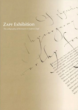
フォントデザイン界の世界的巨匠ヘルマン・ツァップ夫妻
日本初カリグラフィー展覧会
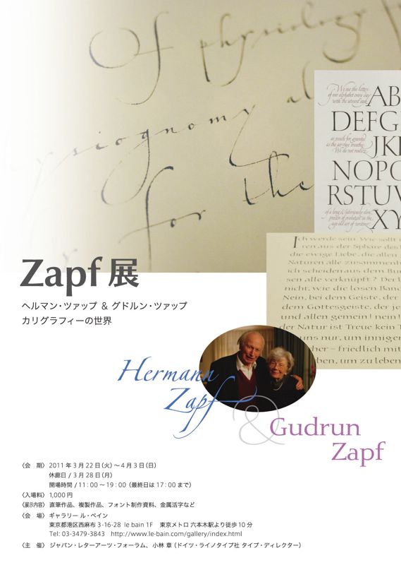

〈展覧会名〉Zapf展 「ヘルマン・ツァップ&グドルン・ツァップ カリグラフィーの世界」
〈会 期〉 2011年3月22日(火)~4月3日(日)
休廊日 / 3月28日(月)
開場時間 /11:00~19:00 最終日17:00まで(チケットの販売は終了30分前まで)
3月26日(土)は六本木アートナイトにより21時までオープン
※会期は延期いたしました
〈会 場〉 ギャラリー ル・ベイン
東京都港区西麻布3-16-28 le bain 1F 東京メトロ六本木駅より徒歩10分
http://www.le-bain.com/gallery/index.html
〈入場料〉 1,000円
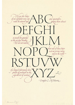
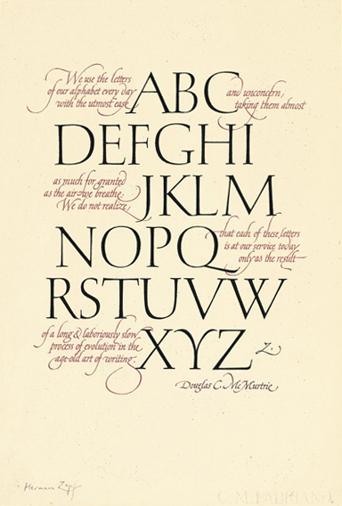
〈作品数〉 50数点を予定(直筆作品、複製品、フォント制作資料、金属活字など)
〈主 催〉 ジャパン・レターアーツ・フォーラム
小林 章(ドイツ・ライノタイプ社タイプ・ディレクター)
■ みどころ
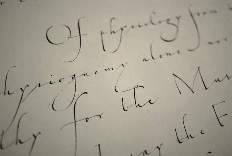
* ツァップ夫妻の原点、カリグラフィーに焦点を当てた展覧会
* 文字芸術の魅力を堪能できるカリグラファー&デザイナー必見の展示内容
* ヘルマン・ツァップの貴重な直筆作品3点日本初公開
* グドルン・ツァップ作、珠玉の手書き本、直筆作品多数展示
* ツァップ氏がデザインした金属活字の特別展示(嘉瑞工房所蔵)
* ライノタイプ社所蔵フォントデザイン関係資料特別公開
* 若きツァップ氏伝説のカリグラフィー指導映像『The Art of Hermann Zapf』DVD特別上映
* シルクスクリーン、直筆作品を含むカリグラフィー作品50数点を展示予定
■ 展覧会の特徴
海外のファッション雑誌や高級ブランドの広告を目にする人、あるいは欧米の書籍に親しんでいる人の多くは、Optima、Palatinoなどツァップ夫妻のデザインしたフォントも同時に見ているといってほぼ間違いないでしょう。
その美しさゆえに高級化粧品や有名ブランドが使いたがり、その読みやすさゆえに多くの書籍の本文に採用されるツァップ夫妻のフォントのデザインの原点は、彼らが若い頃から情熱を注ぎ続けているカリグラフィーにあります。
ツァップ夫妻による直筆も含めたカリグラフィー作品、金属活字やデジタルフォントの制作途中のメモを併せて展示することで、彼らの70年以上にわたる創作活動の一面を紹介します。展示物には日本人カリグラファーとフォントデザイナーによる日本語での細かな解説がつきます。
美術全般に興味のある人はもちろん、カリグラフィーに興味のある人、欧文フォントデザインの神髄に触れたい人が見ても興味深い、また資料的価値も高い展示です。
■ 関連プログラム
DVD『The Art of Hermann Zapf』(1967年 Hallmark社制作 嘉瑞工房所蔵)特別上映
日時 3月27日(日)&4月3日(日)1日2回 13:00 15:00(上映時間約18分)
場所 展示会場内
内容 伝説のカリグラフィー指導映像。若きヘルマン・ツァップが教授する手書き文字の極意。
カリグラファー&デザイナー必見の動画。
 ■ アーティスト プロフィール
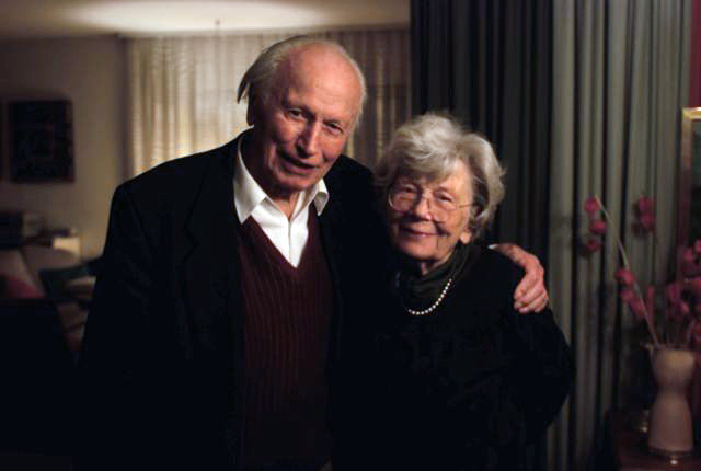
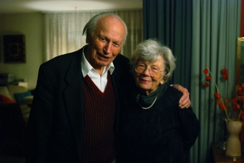
ヘルマン・ツァップ(Hermann Zapf)
1918年ドイツ生まれ。カリグラファー、フォントデザイナー。独学でカリグラフィーを始め、1930年代から活字鋳造会社で活字のデザインを担当。代表的なフォントは Optima、Palatino、Melior、Zapfinoなど。カリグラフィーを取り入れた書籍のカバーデザインなども多い。フォントデザインへの貢献と多くの著作などが評価され、2010年ドイツ連邦共和国功労勲章を受賞。
グドルン・ツァップ・フォン・ヘッセ(Gudrun Zapf-von Hesse)
1918年ドイツ生まれ。ヘルマン・ツァップ氏の妻。カリグラファー、フォントデザイナー、製本家。 代表的なフォントは Diotima, Alcuin, Nofretなど。1991年フレデリック・ガウディ賞を受賞。
■ 協力・協賛
〈特別協力〉高岡昌生(有限会社 嘉瑞工房)
[金属活字展示、The Art of Hermann Zapf DVD特別上映]
有限会社 嘉瑞工房 代表取締役。英国王立芸術協会フェロー。 ドイツ・ライノタイプ社極東顧問(コーポレートタイプ担当)。
http://www.kazuipress.com/
〈協 賛〉ライノタイプ社 (Linotype GmbH)
ドイツ、フランクフルト市近郊のバート・ホンブルク(Bad Homburg)市にあるデジタルフォント制作販売会社。1886年に発明されたライノタイプ自動鋳造植字機以来培ってきた技術を基に高品質のフォントをつくっている。
金属活字時代から定評のある書体 Optima, Palatino, Diotimaなどを所有するステンペル社など多くの歴史的な活字会社と合併してきた歴史を持ち、同社のデジタルフォント数は現在10,000以上にのぼる。
http://www.linotype.com/
〈協 力〉エス・ディ・ジー株式会社
ライノタイプ/モノタイプ日本総代理店 http://www.linotype.co.jp/
■ 主催者
〈小林 章〉
欧米で開かれた欧文フォントのコンペティションで2度大賞を受賞したのをきっかけに、2001年春よりライノタイプ社のタイプ・ディレクターとしてドイツに在住。主な職務は、フォントの制作指揮と品質検査、新しいフォントの企画立案など。 ツァップ夫妻の過去のフォントの改刻も行っている。2005年に、著作『欧文書体:その背景と使い方』、2008年に『欧文書体2:定番書体と演出法』、2011年に『フォントのふしぎ』が美術出版社より出版された。海外と日本で欧文フォントについての講演やフォントデザインのワークショップを開いている。
〈ジャパン・レターアーツ・フォーラム〉
カリグラフィーを軸に、日本におけるレターアーツ(文字芸術)の芸術性向上とレターアーツを介した海外との文化交流を目指し、その支援と交流を推し進めている非営利団体。2008年2月に設立。 https://j-laf.org/
【本件に関するお問い合わせ先】
E-mail:info ![]() j-laf.org
j-laf.org
※ ![]() を@に変換してください。
を@に変換してください。
「~トニカク文字イリ~ Christmas+Christmas展 in 関西」は7月中旬より参加者を募集しておりましたが、
参加者多数のため9月16日をもちまして募集を終了させて頂きました。
たくさんのお申し込みありがとうございました。
なお近々「~トニカク文字イリ~ Christmas+Christmas展 in 関西」のご案内と参加者を掲載いたします。
お問い合せ: 専用アドレスchrichri_kansai@j-laf.org
先日募集を開始いたしました小林章氏のワークショップ「自分の書体をフォント化しよう!」は、おかげさまで定員に達しました。
ありがとうございました。
なお、引き続きキャンセル待ちは受付させて頂きます。
申込要領に沿ってご連絡下さい。
キャンセルがでましたらこちらからその旨ご連絡させて頂きます。
2011/09/07
*先日募集を開始いたしました小林章氏のワークショップ「自分の書体をフォント化しよう!」は、おかげさまで定員に達しました。
なお、引き続きキャンセル待ちは受付させて頂きます。
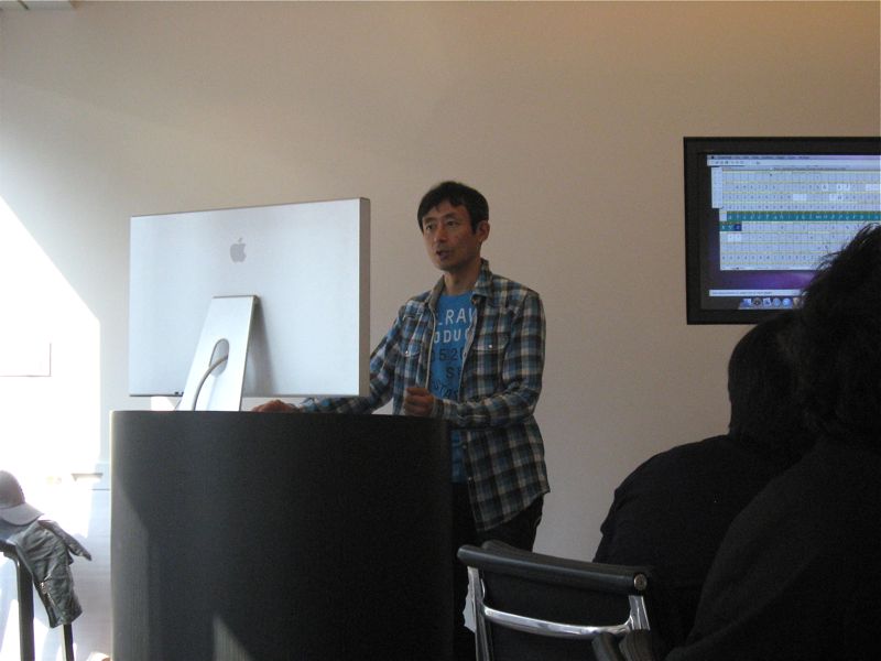
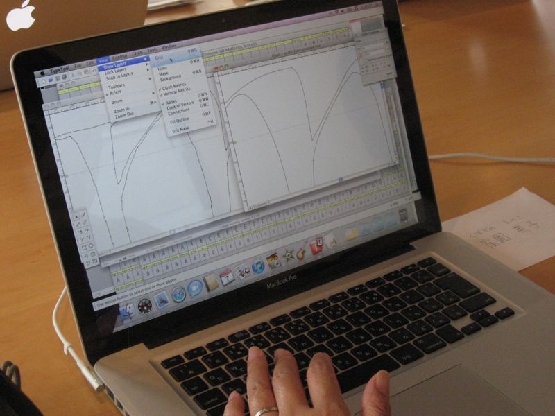
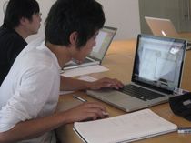
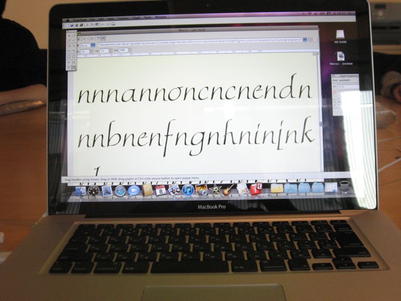
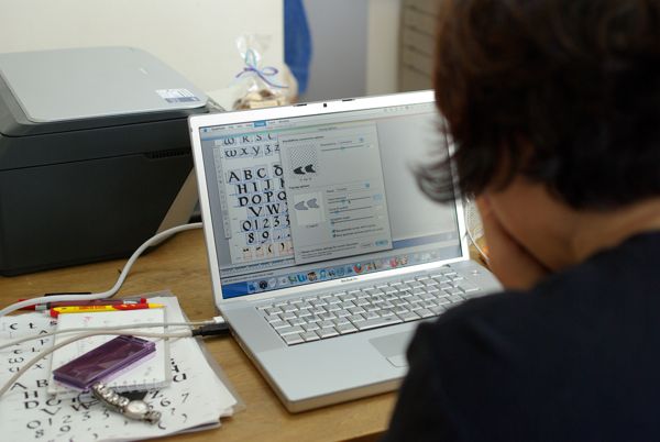
去年の秋、羽ペン工房で開催されました小林章氏のワークショップ
「自分の書体をフォント化しよう!」が、今年は関西で開催される運びとなりました。
自分の手書き文字がフォントになっていく過程をどうぞ体験してください。
*当日までにご準備頂くことがあります。
●日時:2011年11月6日(日)9:30~15:30(休憩含む)
●場所:大阪デザイナー専門学校
〒530-0003 大阪市北区堂島2-3-20
http://www.odc.ac.jp/access/index.html
●講師:小林 章(こばやし あきら)氏
●定員:10名
●参加実費:5,500円
●申込方法:
電子メールのみの申込受付けとし、下記事項を記入した上、申込先アドレスに送信ください。
書類を送付いたしますのでパソコンからお申し込み下さい。
1) 件名「小林章氏WS」
2) 氏名、住所、電話番号
●申込締切日 :10月7日(金)
但し、定員に空きがある場合には、その後のお申込みも受付けます。
空きの有無はJ-LAFウェブサイトでお知らせ致します。
■ お申込み
workshop ![]() j-laf.org(WSに関する質問、ご意見もこのアドレスまで)
j-laf.org(WSに関する質問、ご意見もこのアドレスまで)
※ 自動返信メールが送信されます。届かない場合にはinfo ![]() j-laf.orgへご連絡ください。
j-laf.orgへご連絡ください。
※ ![]() を@に変換してください。
を@に変換してください。
詳細
Akira Kobayashi_WS2010_new.pdf
※現在は定員に達しておりますので締切りました。
INTERVIEW WITH AKIRA KOBAYASHI
December 11, 2010
Tokyo
Interviewer: Minako Sando
In November 2010, J-LAF hosted a workshop on creating fonts. This feature article presents an interview with Akira Kobayashi, Type Director at Linotype Library GmbH in Germany, who instructed the workshop.
Kobayashi: Let me first talk about what I wish for the type designers to see. It may seem that a capable calligrapher should also be a capable type designer, but working as a type designer, I have come to realize that surprisingly very few people can do both. Some people who are capable calligraphers cannot design typeface at all, or on the other hand, some people, such as myself, who are capable of designing typefaces are not capable calligraphers. There really are very few people who are both capable calligrapher and type designer. Hermann Zapf is one of the few. I hope that the designers will keep that in mind and see the origin of such beautiful and widely-used type design at the Zapf Exhibition. Hermann Zapf did not intend on becoming a type designer at first. He began from teaching himself calligraphy. He started reading books on calligraphy, but did not realize that he was holding the pen incorrectly until later on. He corrected his pen-hold after that, but his letters probably were not so beautiful in the beginning. Even with a start like that, Hermann Zapf gained fame as a calligrapher and also started producing great designs as a type designer. I think this will be a good opportunity for the designers to find out the origins of Zapf's type designs.

Now, what I would like for the calligraphers to see.... It is totally opposite of what I said earlier about designers. It does not mean that a capable calligrapher can design typeface. There is a process for letters to become typeface. That is, as you can understand from taking the workshop for calligraphers, typeface is different from calligraphy in that it basically needs only one letter a. What I mean is, with typeface, you make one letter in an alphabet, and whenever the same letter is needed that one letter is repeated all the way through. You cannot choose to use a certain shaped a here or a different shaped b somewhere else. You are given little freedom with fonts. It is difficult to take advantage of that little freedom or to make fonts without losing the calligraphic touch. I hope to be able to show that difficulty somewhere when I have an opportunity, although I am not sure if I can exhibit something like that.Now for the general public... Maybe there are some people who are not familiar with calligraphy, but may have heard of calligraphy classes offered at so-called "culture schools" in Japan. I would assume that even fewer people have heard of type design. I mean, I think there will be a lot of people who will be surprised to find that typefaces are made by designers. So, I wish for the people who somewhat know about calligraphy to be moved by the amazing art of calligraphy. Then afterwards they may think, "I now know that there is such a profession as type design. What kind of skills do type designers need?" It would be nice if they can see a subtle connection between calligraphy and type design. I think that in the end, both calligraphy and type design try to aim the same thing, and that is, it has to look beautiful when the letters are put together as words. Calligraphy aims that with handwritten letters. Typeface is very inconvenient in that you can only make one design for each letter, but there are ways you can make the typeface dynamic or beautiful, and I hope people can see how beautiful typefaces can look when they form words.

Kobayashi: I held a workshop for designers last year (2009) and received a tremendous response. Of course, since it targeted people who are used to using the Illustrator software, the level we reached was quite high. It was so successful that I thought I could hold the same workshop over and over. The reason I thought of doing the same workshop targeting calligraphers this year is because I wanted calligraphers to take a peek inside a different world. Of course, it's just fine for calligraphers only sticking to calligraphy. I just wanted to show them a little of another peculiar world. What I mean is, as I said before, with typeface, you make one a and that is it for letter a. When you are restricted to only being able to repeat the same letter, you have to use a different part of the brain than when you do when you are handwriting letters in calligraphy. Instead of writing a letter that goes with the letter before or a letter that follows, you must imagine how one letter from the keyboard will connect to any other letter and how they combine with each other. You didn't notice it when you were writing all the letters separately, but when the letters were put together as words, you noticed that the letters you wrote have different slants. Or you thought that each letter would go with one another but you find that it doesn't quite work....and so on. If you have to say that it was a success or failure, you might have to say that it was a failure, but it was important for the calligraphers to see that you don't have much freedom when you want to make a font from your own handwritten letters. It would have been impossible to make a perfectly working font in two days, so I wanted each calligrapher to first find this out: there is little freedom in making a font. Then, it would be nice if from there, they will start thinking, "Yes, I see. If I shape my letter this way, then a, b, or c or any other letter will connect nicely." Or, if it gets them wondering "Why do the letters look like they have different slants?" As I said before, calligraphy and type design seem similar, but actually, type design involves a totally different process. That's why a very capable calligrapher may not be able to design type. I thought it would be nice if the workshop motivated the calligraphers to start asking as they write, "What would these letters look like as a font?" or "When I write with a pen, these letters connect easily, but would it connect as nicely as a font?"
Kobayashi: Since I wasn't working with designers, I expected some stumbling with how to use the Mac or the software. Aside from that, I knew that when handwritten letters became a font, I would see problems such as letters not connecting as they should or the slants being different. What I mean is that I didn't think that fonts would be completed in one workshop. I expected that, but I didn't want to say, "Oh, that doesn't work", but rather, "No, your letters don't connect, but isn't that interesting?" Of course, from the type designer's point of view, something didn't work but the goal for this workshop was for the calligraphers to find out that it is difficult to make it work. I wanted them to experience failure once. Then, with one failure, there were things they realized. I had given the calligraphers information on how to prepare their handwritten letters before the workshop, but they had to actually see what makes it go wrong to understand why they needed to have a referential baseline or a gauge. You realize and learn from your mistake. What you realize is exactly the really interesting difference between calligraphy and type design, and I think that's what makes it so fascinating.
Kobayashi: I would love to hold a "similar workshop in the future"! I had a great response from the people who took the workshop this time. I had someone who almost started crying because she was so touched. I mean when you see something like that. Someone who writes such beautiful letters in calligraphy was so touched when her letters became a font. Why is that? That is what makes teaching such workshop fun for me, and I also learn a lot from teaching. If you've been thinking that type design is a totally different world or that you must need some special skill, then you are wrong. Anyone can do it. Once you understand the process of making a font, when you see different typefaces used in stores or in advertisements, ask yourself questions such as "How were these letters made? Why do these letters connect so well? Is it because of this part that the letters connect so well?" I think you will quite enjoy how you find yourself looking at fonts.
Kobayashi: I don' really know. Having done the workshops, I do think that there is clearly a difference. Also, for my work, I meet a lot of calligraphers, but if it seems like they will be able to design faultless typeface at first try, that doesn't seem to be the case. I've been thinking about what the difference is, but I still can't quite put my finger on it.
Kobayashi: Living in Europe, there is something that I feel whenever I return to Japan. There are many logos out there that I wish graphic designers would consult calligraphers. I think that if there is more exchange between graphic designers and calligraphers so they can easily ask each other questions, then logo designs in Japan in general will become more interesting. Now, it seems that very angular and unpolished letters that look like they belong in construction sites are accepted for all sorts of logos. I think the logos are either rough design that you might see in construction sites or very loose design that looks like it is missing something. Surprisingly there are very few logo designs in Latin alphabet that look mature and steady; most belong to either the rough design or the loose design. I don't think that a graphic designer tried different options before deciding on the rough design or the loose design. Will the same graphic designer be able to design a traditional and orthodox style logo if asked? If the designer has a background in calligraphy, I think the answer is probably yes. I would like for graphic designers to know more about calligraphy. If they have more communication with calligraphers, then I think there will more options in logo designs. That's where the potential for calligraphy lies.
Kobayashi: Few years ago, a rough script typeface came out. It looked like handwriting that an amateur tried to make it look a little decorative, and it was popular at the time. I didn't see why it had to be digitalized, but I think that people want a handmade touch. Even with all the technological advancements, I think that there is still a need for a handmade touch, and that will always be the case.


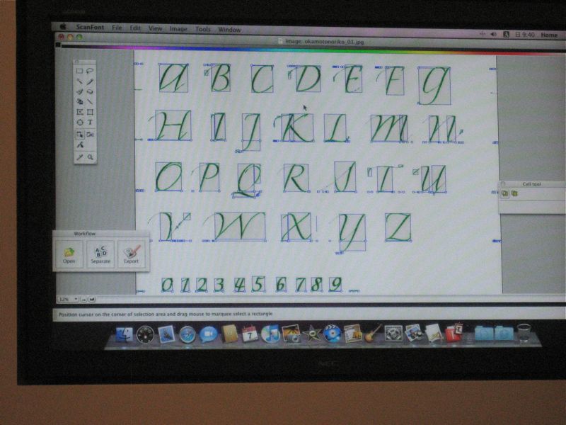
Kobayashi: I can only speak from the type designer's standpoint, but a type designer think of that as ordinary and can do it quite easily. A somewhat capable type designer can imagine from experience a stroke order, what should be done so that a letter connects to the following letter, or how the letters will look combined. If I were told, "Mr. Kobayashi, please make a type that looks like calligraphy," then I already have an organized process in my head, and I can readily select a way that I can make a font without a problem. Now, how can you make a font with a handwritten look in which you can almost see stroke order or applied pressure? For example, there is a font called "Hamada" which I helped digitalize. Gaynor (Goffe), a calligrapher, and I made it, but I did the digitalization alone. Gaynor had written many types of letters from a to z, and from instinct, I was able to select letters that I knew would work and connect nicely. A type designer with some knowledge of calligraphy can make a font with a handwritten look.
Kobayashi: The biggest difference between Japan and overseas is that in Japan, if you go to take lessons in calligraphy, 98% of students are women and 2% men. I've never taken calligraphy lessons overseas, but I would guess that it would be half women and half men. Even successful calligraphers, the ones I know are mostly men. So the male-female ratio is totally different. That may be due to the fact the calligraphy has been developing through so-called "culture school classes" in Japan, so calligraphy is thought of as something for enrichment lessons. I think that's too bad. I would like for graphic designers to know about calligraphy. You need to hold a pen to understand the origins of letters or letterforms. That has not been considered important in the Japanese design education. I really wish that schools would teach calligraphy properly, but unfortunately, I think there isn't anyone who can teach it. There is no one to teach it so the designers graduate from school without the knowledge. Somewhere along the line, the importance of writing letters with pens has been omitted from design education in Japan, and so it's like... it has been okay until now, why change now. I really want to say, "It's really better if you know about these things." That is why in my book Oubunshotai (Latin Alphabets), I wrote that if you hold a pen or a flat brush and write letters, you will understand why a letter is shaped the way it is, and included information so that the readers will realize about the real basics about the origins of letterforms. I really wish that art and design schools in Japan spent much more time to teach this. I think that if calligraphers and graphic designers can relate to each other in Japan, this may be it. For example, calligraphers can be invited as a special instructor for designers. It would be wonderful if calligraphers can take part in design education.


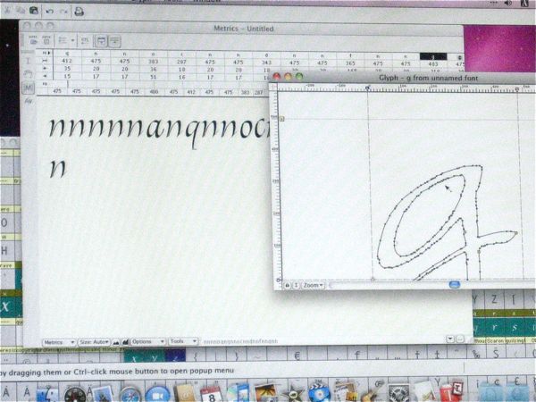
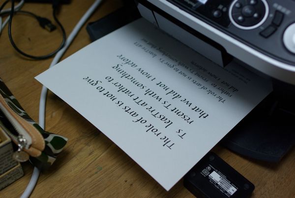
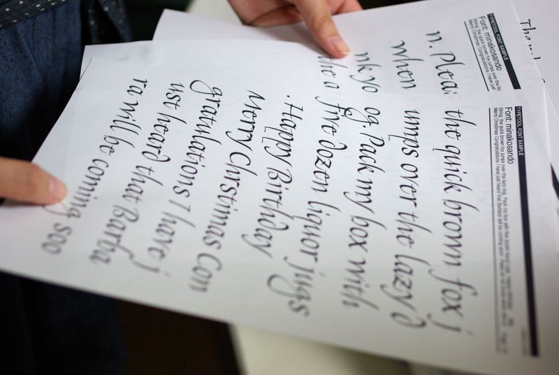
Sando: In the workshop, I wanted to make a font that looks so handwritten that it doesn't look like a font. So I thought it would be better if the width, height, or slant were not so uniform. When I tried to make my letters into a font though, I found that what needs to be uniform must be uniform or the letters do not look cohesive. I thought I should have followed your instructions. I wrote my letters with only a baseline and did not set a line for the x-height. I thought it would look more handwritten that way, but when I tried it, the letters looked uneven and misaligned. The letters were not even aligned along the baseline and the letter sizes were different.
Kobayashi: Did it bother you that much?
Sando: Yes, it did. Maybe I wasn't supposed to do those things on purpose, but I thought I would try. So, I thought looping the descender of "g" would look good or that the ascender of "d" may look interesting if it curved to the left. When the letters became a font, it was too much when the letters were repeated with the same descenders and ascenders. I also thought that when the letters with extenders had the same thickness, they stood out too much. I thought that for the first try, it would have been better if I was careful about uniformity while leaving the good parts of handwritten letters.
Kobayashi: Those are the things you see once you combine the letters. You couldn't while the letters were lined up separately in alphabetical order.
Sando: You're right. For some reason, while I was writing the letters, I didn't notice those points at all. I think when I handwrite next time, I might always be conscious of those points. Hermann Zapf drew his extenders thin as they should be, so they look beautiful. I usually teach students to write uniformly and I make sure that I can write uniformly also, but it is actually difficult to decide if uniformity makes the letters beautiful or if irregularity makes them look interesting. Sometimes I think perfect uniformity looks uninteresting, and then other times, I think uniformity is better.
Kobayashi: Now, if it seems impossible to make a font from letters that are uneven and different, then that isn't quite so. All that works in Zapfino. You wonder what makes this font so different, right? The answer to that isn't a simple one. It's a result of trial and error, and the fact Hermann Zapf made it work in the end is what makes him such a brilliant font designer. But, I do think that thinking about what makes it work is really the interesting part. An easier solution may be for you to draw impeccable but lifeless letters on a grid paper, but if you are able to make a font that looks truly handwritten with letters that are not aligned exactly, then I think you have really made quite a high-level font. It may be difficult to do in the beginning, but in time, I think you can do it.
I explained earlier that with typeface there is only one letter a, but actually, in the current font design environment, it is possible to program so that you have five different a's and five different b's and one is chosen according to what letter comes before and after. But, the experience and discovery of making fonts wouldn't be half as interesting if you knew you could do that from the beginning, so it's better to start from having only one a. It's better to experience not having freedom in the beginning.
Sando: Considering that there is such little freedom, it is also perfect. There is only one a but it works wherever it's used.
Kobayashi: That's right! Why is that? There is so little freedom with fonts, and yet why is it that the letters in Zapfino font connect so well? Why does it have that momentum? And that dynamic look? You look at it and the letter sizes are uneven, and the slants are irregular. That is what is so remarkable about that font.
Sando: I thought that the little difference in thickness or stroke direction made Zapfino beautiful even if the letters look uneven. There is nothing unnatural about it. I understood that from trying to make a font.
Kobayashi: Yes, once you try it yourself, you see it. It becomes interesting after you make a mistake and find out how little freedom you have with fonts. I think that our workshop was a great success if everyone saw that.
Sando: Yes, I think so. I look forward to the next opportunity. Thank you for taking the time to talk with me today.

Biography
Akira Kobayashi has resided in Germany since spring of 2001 as the Type Director of Linotype GmbH. His main duties at Linotype include supervising type designs, controlling the quality of typefaces, planning new typefaces, selecting typefaces in competitions, proposing and producing corporate typefaces, etc.He also works with renowned type designers, Hermann Zapf and Adrian Frutiger, to revive their classic typefaces. In 1998, at a competition in the United States, he won both Best of Category and Best of Show for his Roman typeface "Clifford" for text. In 2000, he won the grand prize in the text typeface category in a typeface design competition at Linotype for his typeface "Conrad". He has published three books from Bijutsu Shuppan-sha: Oubunshotai in 2005, Oubunshotai 2 in 2008, and Font no Fushigi in 2011. He gives lectures on Latin alphabet fonts and holds workshops on font designs both overseas and in Japan.