作成者別アーカイブ: J-LAF

Thomas Ingmire「カリグラフィーWS」

»Thomas Ingmire 「試行としてのカリグラフィー」後半
»Thomas Ingmire 「試行としてのカリグラフィー」前半

»WS 開催概要
»WS 会場
»WS 詳細
»WS スライドレクチャー
»参加者のレベルについて

Thomas Ingmireカリグラフィーワークショップ開催概要

2013年3月末から4月にかけて、Thomas Ingmire氏を講師に迎えて、広島・大阪・東京にてJ-LAF主催のカリグラフィーワークショップを開催します。

for Ad2for Ad1

開催日と講座のタイトルは以下の通りです。
講座の詳細を含めた、参加者募集は12月初めに公開いたしますので、J-LAFウェブサイトにてご確認ください。

【 広島 】
▼2013年3月30日(土)・31日(日) 2日コース
THE VERSAL ALPHABET
- Developing a traditional and modern versalhand -
ヴァーサルアルファベット
- ヴァーサルの基本、エクササイズから、それを生かしたモダン・スタイルやアレンジまで -

▼2013年4月1日(月) 1日コース
CONTRAST
The vital principle for designing with calligraphy
コントラスト
- デザインに必要なコントラストをさまざまな要素で照らし合わせて、カリグラフィー作品に取り入れるレッスン -

【 大阪 】
▼2013年4月4日(木)・5日(金) 2日コース
DESIGN WITH CALLIGRAPHY
- An introduction to basic design concepts for the calligraphers -
カリグラフィーとデザイン
- カリグラフィーをデザインに取り入れるためのレッスン -

▼2013年4月6日(土)・7日(日) 2日コース
THE VERSAL ALPHABET
- Developing a traditional and modern versal hand -
ヴァーサルアルファベット
- ヴァーサルの基本、エクササイズから、それを生かしたモダン・スタイルやアレンジまで -

【 東京 】
▼2013年4月24日(水)・25日(木) 2日コース
LETTERING AS DRAWING
- A new approach to the development of a cursive alphabet -
描画的表現による文字デザイン
- 写本のイタリック/草書文字を模写するところから、スペース、動きの変化、リズムなどを分析後、フォーマルな草書文字、個人の草書文字などを作り出し、独自のスタイルへと発展させる。

▼2013年4月27日(土)・28日(日)・29日(月・祝) 3日コース
THE VISUAL BOOK
- Enhancing the expressive potential of calligraphy -
ヴィジュアルブック制作
- 本としての形態の、その内容を文章としてまたヴィジュアルとして取り入れるためのクラス。
読むためだけではないアート本をつくるためのレッスン。

★全ての講座に、通訳がつきますので、英語への心配は不要です。
★各開催地でのスライドレクチャーも予定しています。

●講師プロフィール●
トーマス・イングマイア 

©2012 Linda A. Cicero

©2012 Linda A. Cicero

オハイオ州立大学とカリフォルニア大学バークレイ校大学院にてランドスケープ・アーキテクチャー(景観設計)を専攻し、そのカリキュラムにおいてデザイン、ドローイング、デッサンなどファインアートの基礎を実践として学ぶ。
ランドスケープ・アーキテクト(景観設計士)として働きながら、偶然受けたカリグラフィー・レッスン、それに続く製本を学ぶうちにライフワークとして考え始め、ドナルド・ジャクソンの長期クラス受講を機にカリグラフィーに専念。
1977年、英国SSIの初の外国人会員として認められる。
当初の作品には伝統的な文字を使ったものが多く見られるが、次第に詩・文章から受ける感情をカリグラフィー的なラインを使って表現する作品づくりへと方向転換していく。
近年では、数百年ぶりに全て手書きで制作された聖書セント・ジョーンズ・バイブルにイルミネーター(装飾師)として参加。
また、造形作家と詩のコラボレーションで16冊のオリジナル本を制作、その作品は美術館や大学などの展覧会で一般公開もされている。現在は引き続き詩人や音楽家とのコラボレーション本の制作を精力的に行っている。
ワークショップやカンファレンスなどの講師歴は35年を越え、北米を始め欧州、オセアニア、香港、日本などで幅広く教えている。様々な書体やギルディングなどの伝統的な技法から、グラフィックの要素を取り入れたものまで、個性溢れるレッスンが多い。1942年生。カリフォルニア州サンフランシスコ在住。

Christmas + Christmas展 2012 開催

201210_27-250x168
昨年は関西で好評だったクリクリ展。今年は再び東京で開催します!
北から南までいろいろな地域から素敵な手作りカードや雑貨が大集合します!
ご自分用はもちろん、大切な方へのプレゼントを探しにいらしてください。
スタッフ一同、心よりお待ちしています。

【期間】2012年11月26日(月)~12月2日(日)

11:00~19:00(最終日17:00まで)

【会場】ギャラリー・羽ペン工房

東京都文京区向丘1-8-6

お問い合わせ: chrichri マル j-laf.org 担当 佐藤・松本
※  マル を@に変換してください。

参加者は11月17日まで募集していますので参加者一覧は随時更新いたします!

*******参加者一覧(順不同)**********

土居秋子

Chibira~チビラ~

東井裕子

冨山静香&伊藤久美子

Studio Piccolo

藤森薫

しましま

ナガイユミ

Eine Kleine Kalligraphie

三戸美奈子

Prism

渋谷直子

Kinu

松本千恵

伊村久美子

Hi*Hi(Sachie&Hiroko)

成瀬真弓

加茂美保

久賀真弓

朝倉紀子+木村美奈子+清水裕子

北見 都

深谷友紀子

林 奈緒子

高橋好美

白石由理子

Christmas + Christmas展 2012 募集

2012_chrichri_chirashi
「Christmas+Christmas展」参加者募集を開始いたしました。

●開 催 日:2012年11月26日(月) ~ 12月2日(日)
        11:00~19:00  (最終日~17:00まで)

●会 場:ギャラリー・羽ペン工房
      〒113-0023 東京都文京区向丘1-8-6

昨年は大阪で開催されて大好評だったクリ+クリが東京に帰ってまいります!
モジ入りの作品はもちろんのこと、モジがなくても手作りのオリジナル作品ならなんでもOKです!みなさまの参加を心よりお待ちしています。

参加申し込み要項(PDF)

販売品預かり書(PDF)

※参加希望者多数により展示スペースがなくなりましたら参加募集を終了いたします。あらかじめご了承ください。

2010 Report on Second Letter Cutting Workshop with Emi Gordon

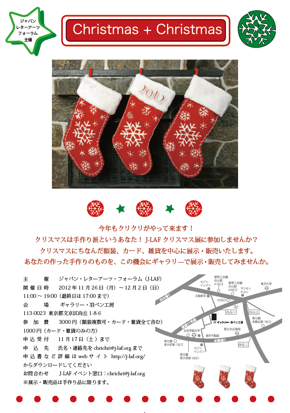
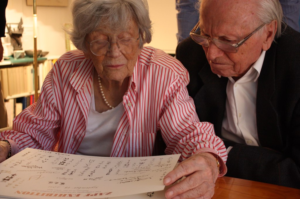
In April 2010, the second workshop of "Introduction to Letter Cutting" by Emi Gordon was held in Osaka and Tokyo. Here is a report by Kunihiko Okano of Shotype Design on the workshop in Tokyo.

Six months had quickly passed since the well-received letter-cutting workshop in Osaka in October 2009. Emi Gordon returned again from the United Kingdom to hold a much-awaited new series of the workshop. Although this time being divided between Osaka and Tokyo, all of eleven attendees of the last workshop returned as well, proving how successful the first workshop was.
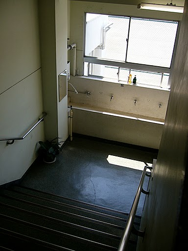
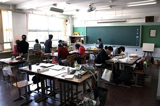
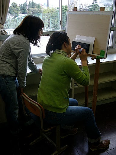
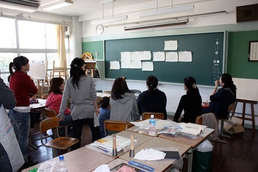
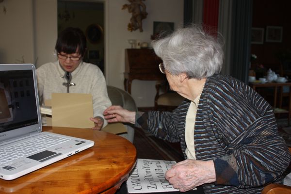
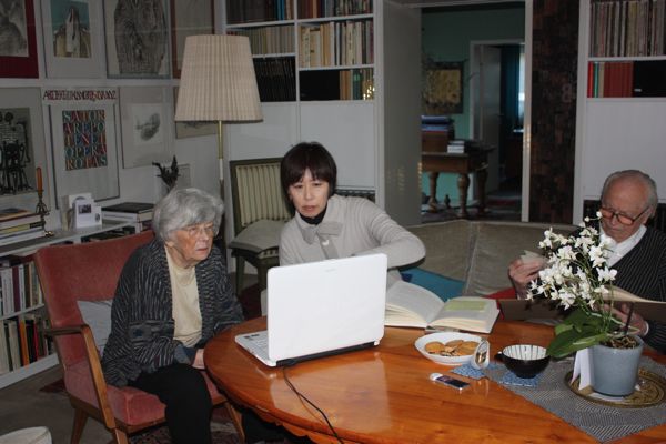
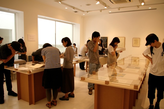
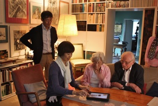
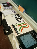
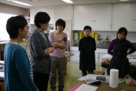
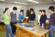
Unusually for mid-April, a cold rain was falling on the first day. The Tokyo workshop was held in the Ikejiri Institute of Design, a facility that used to be an elementary school and now houses design studios, a café, and the like. The three-day workshop began at ten o'clock in the morning with everyone introducing themselves. There were a total of ten participants consisting of six newcomers and four attendees of the last workshop, including myself. Most were calligraphers and three were designers. I told myself not to be daunted by the fact that I was the only male attendee there.

okano1-1okano1-2okano1-3okano1-4


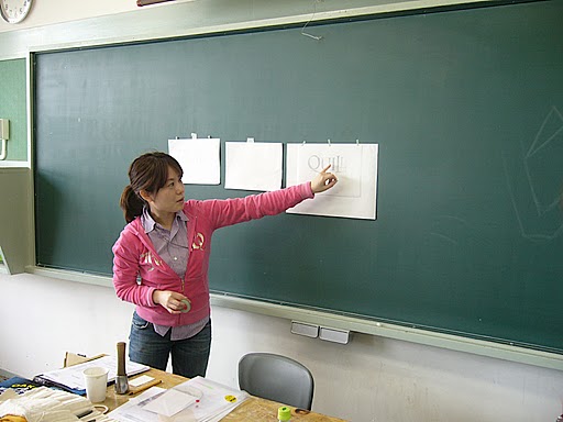
After the self-introduction of the participants, Ms. Gordon briefly explained the outline of the workshop and made us feel relaxed by reminding us, "Keep your own pace. There is no need to rush." The very same words that she gave us at the last workshop helped me not to panic and to take my time with the task at hand. She told us that we need not finish carving all our letters during the workshop and that we could even spend a week on a single letter. She let us take our time so that we understood each process well.

okano2-1okano2-2
okano2-3okano2-5


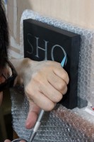
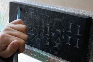
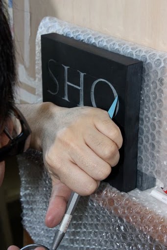
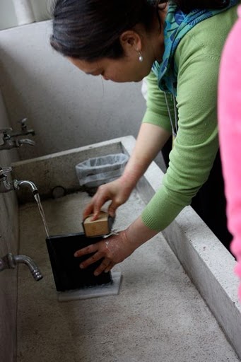
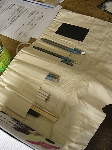
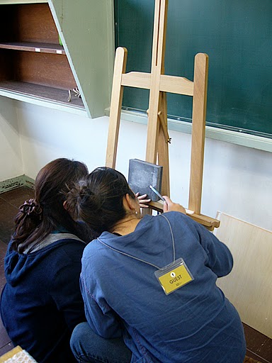
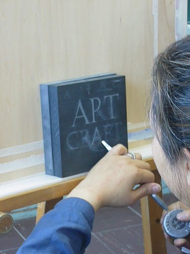
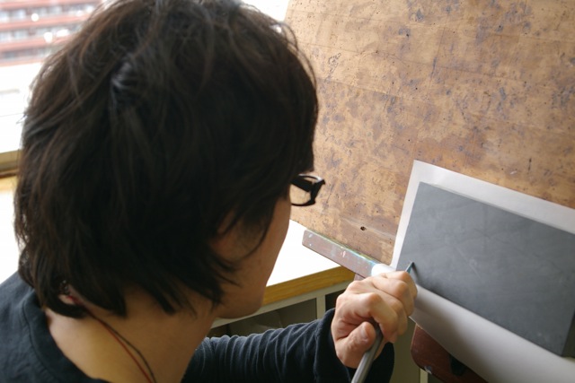
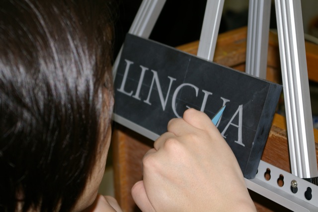
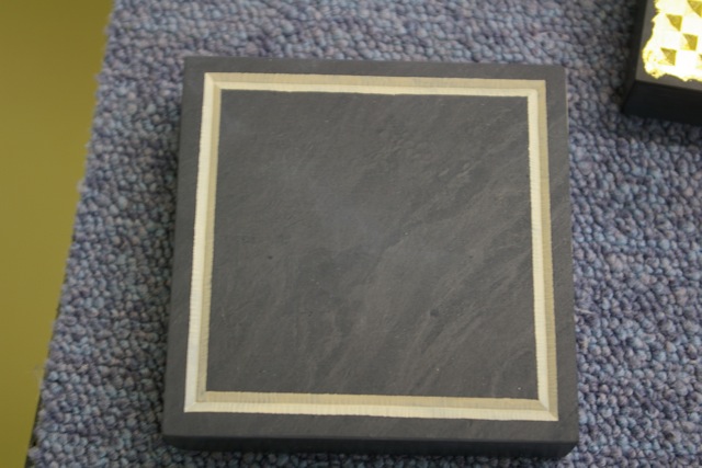
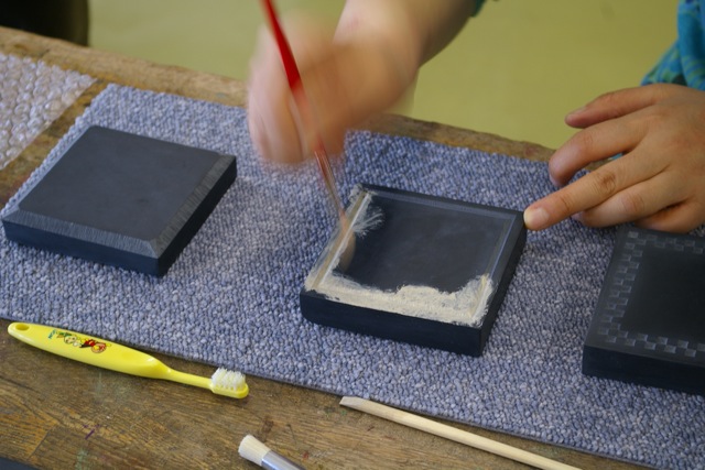
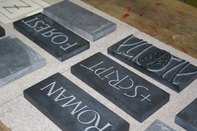
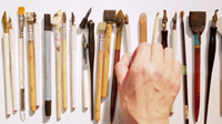
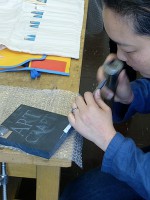
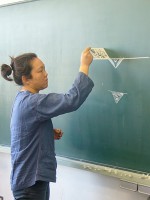
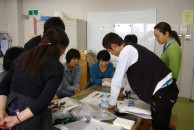
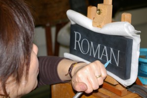
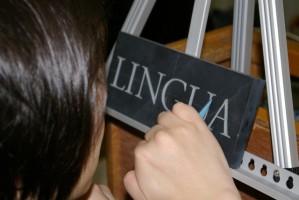
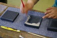
The work began by splitting up beginners and non-beginners. Non-beginners readily set up their easel and began carving the letters that they had started during the last workshop. Those of us who participated in the last workshop from Tokyo had gotten together occasionally for a study session and had each carved on our own, but because some time had passed, we had forgotten the feel of how to carve letters into a stone. So we began by practicing carving using the reverse side of the stone until we remembered what it felt like. As we repeated carving serifs, letter stems, and curves, Ms. Gordon took the time to check on our work and give us some advice. Her instructions were very clear as she not just explained in words but was careful to demonstrate what she meant. It is difficult to understand only by words the angle that the chisel should be held and how much force should be applied to it, but her demonstrations helped us greatly to grasp them.

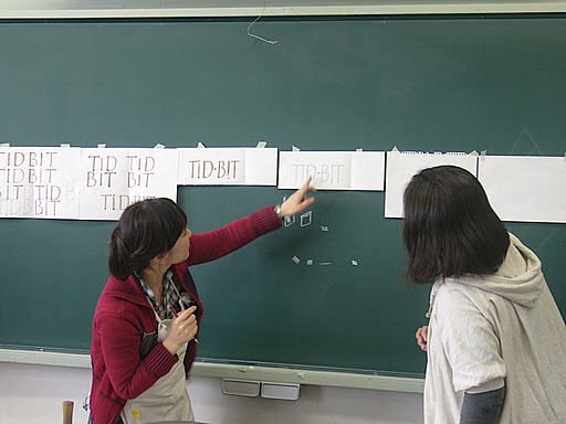
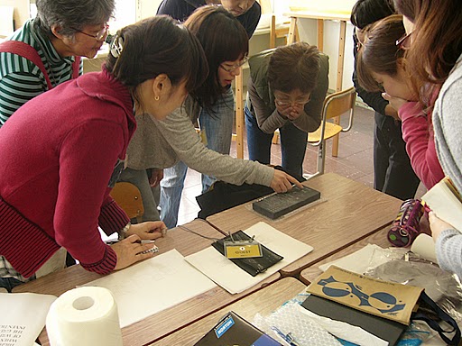
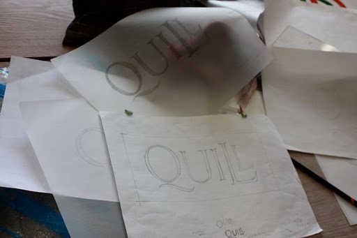
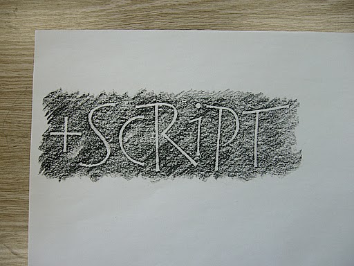
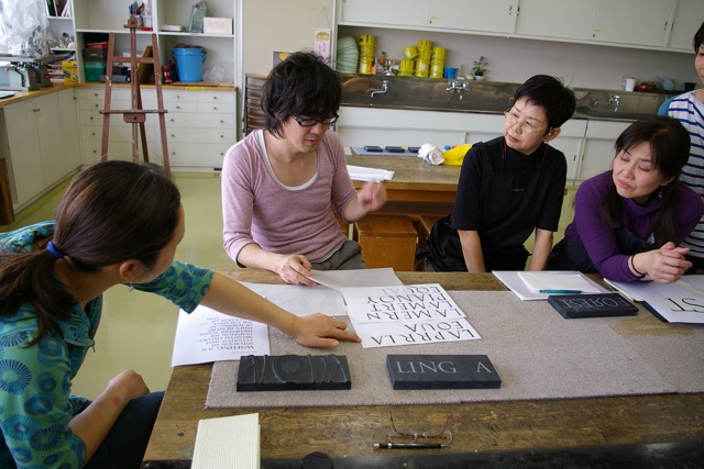
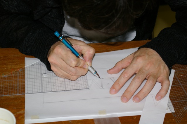
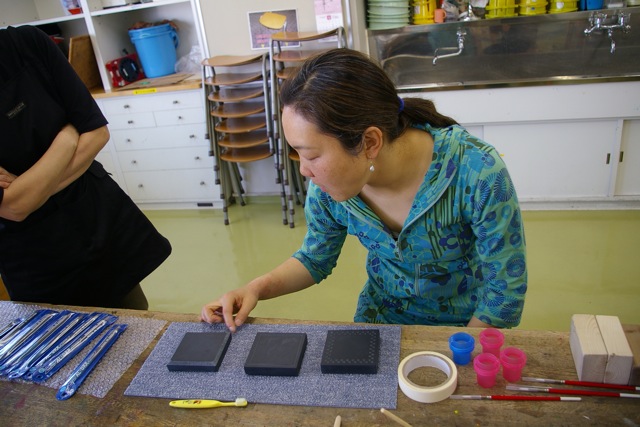
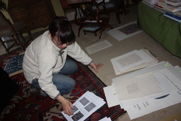
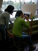
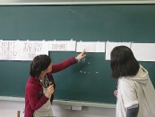
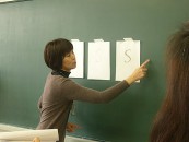
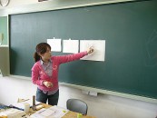
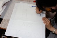
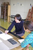
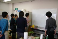
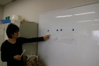
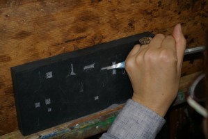
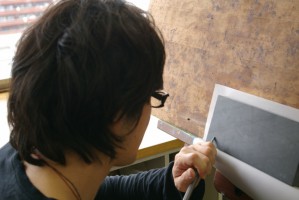
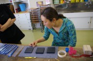
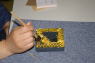
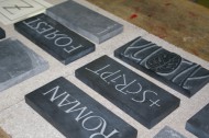
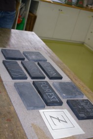
The beginners were divided into three groups and each worked on polishing the stone, drawing designs, and preparing the tools. All participants including non-beginners had been assigned to draw a design of the letters to carve. Several critique sessions were held before and after breaks and we exchanged opinions as each person reported on the progress. Since I usually work alone as a freelance designer, it is not easy for me to ask for someone's opinion even when I am pondering on a design. In the workshop, however, everybody gave their own point of views, allowing me to see things I would not have seen on my own. All the attendees had keen senses and they came up with new ideas and pointed out even a minute detail of a spacing problem. By exchanging opinions, we were able to see things we would not have seen working alone and to correct or adjust details to finalize our designs. Mistakes cannot be afforded in stone cutting. A slight distortion of a line on a drawn design would be transferred onto a stone and last semipermanently. The positive criticisms by participants reminded me to be more careful and precise in my daily work.
okano3-1okano3-2okano3-3okano3-4okano3-5okano3-6okano3-7okano3-8okano3-12okano3-11okano3-10

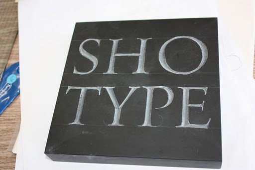
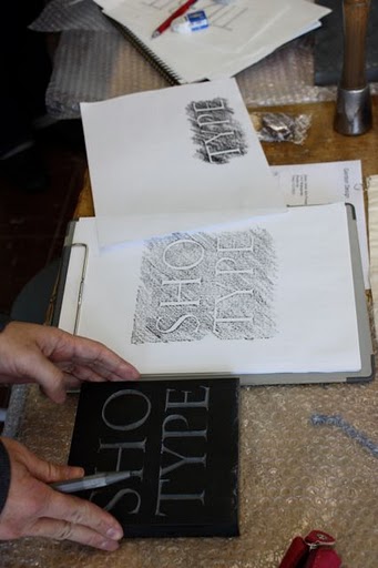
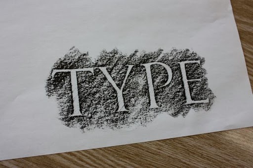
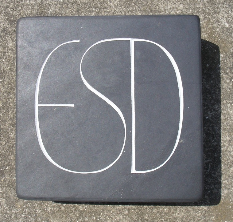
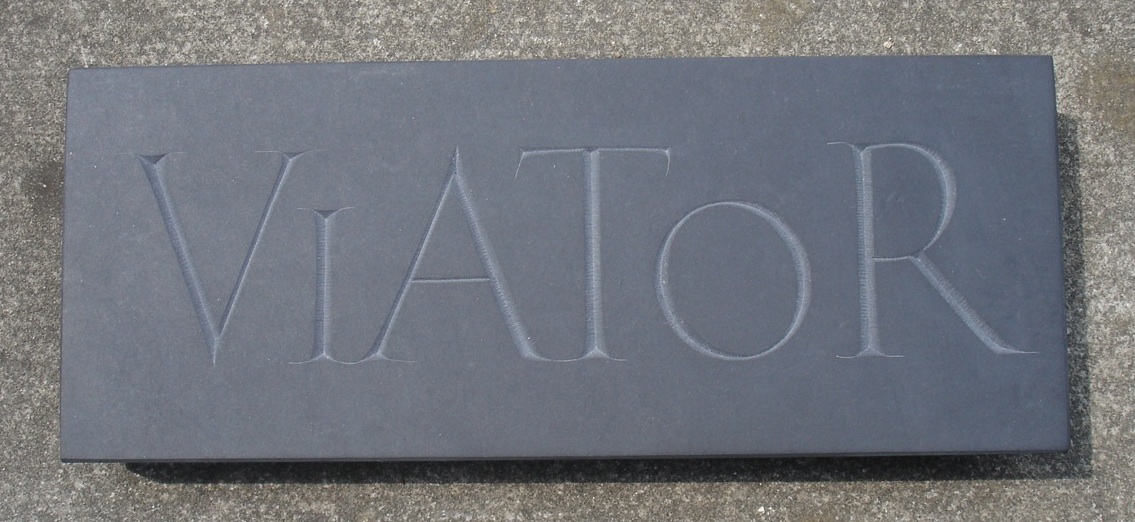
Cutting letters directly into a stone allowed me to make numerous discoveries that I would not have made from any other experience. In my daily work I draw sketches by hand as with the stone, but since I usually finalize my designs on the computer, I can make as many corrections as I want. When confronting the stone that I had spent time polishing, however, I found it hard to begin cutting into the stone for fear of making an error. Experiencing stone cutting made me realize that I usually do not feel that sense of tension in my daily work. Another point that I found refreshing is that stone cutting requires the use of all five senses. Seemingly tangible computer data are in fact intangible: they are so intangible that if you turn off the computer while working on it, the data will disappear without a trace. In contrast to this, there is an unquestionable sense of matter in a stone. It feels cool to the touch and its expressions differ by the angle of light. While cutting into the surface with the chisel, we can sense a faint smell and taste, and even the sound from the stone changes according to the angle of the chisel or the force applied to it. To cut a stone is quite simply to converse with the stone using all five senses. Another thing that I gained from the experience was learning about the origin of letters. The serifs on Roman letters are largely influenced by the movement of the brush, but I felt that how the chisel cuts into the stone and the angle that the cut is made are also greatly connected to the form, and I could gradually imagine how to cut into the surface to make a beautiful serif.

okano4-1okano4-2okano4-3

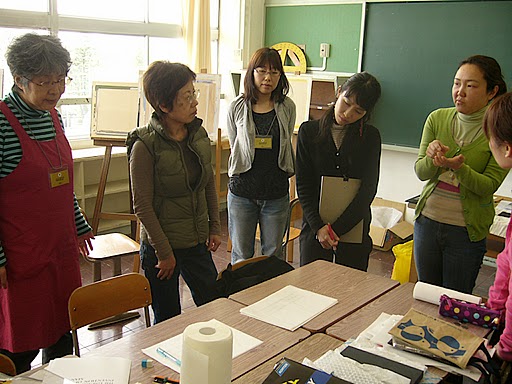
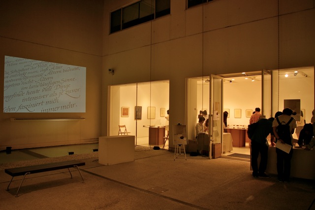
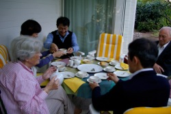
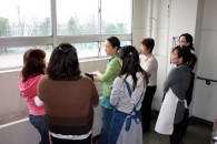
I think that one of the benefits of taking a workshop is the chance to talk with other attendees during the actual workshop, lunches, post-workshop gatherings, and such. In this particular workshop, there were also visitors who participated in the critique session, adding a breath of fresh air to the workshop.
okano5-1okano5-8okano5-7okano5-6okano5-4okano5-3okano5-2

---------------------------------------------

This is a report by Hiroyuki Kinoshita who took the workshop in Osaka from April 17 to 19.

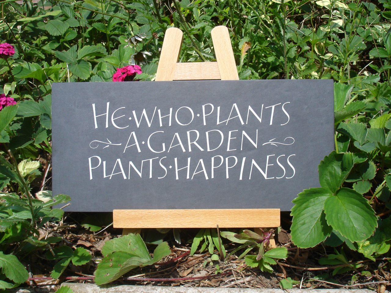
This was my second time to participate in the letter-cutting workshop, and for me the first and the second ones were closely related to each other. Though I am a beginner in the field of letter arts, I have designed an original typeface, and this served as an axis that joined the two workshops. After the first lesson, I revised my typeface design based on the knowledge I gained there, and in light of this, I decided that my theme for the second workshop would be to have a deeper understanding of serifs. The two three-day workshops gave me a precious opportunity to learn the essence of letters, and this is an asset that I will treasure for life.

kino1-1kino1-2kino1-3kino1-4kino1-5kino1-6kino1-7


In the previous workshop, I learned more from what is required before carving rather than how to carve. It was quite a shock for me as I did not expect it at all. Our assignment for the workshop was to draw Roman capital letters, so I thought we would begin the lesson by carving those letters. This was not the case, however: a great deal of time was spent on examining and redrawing letters numerous times. I realized that a failure to draw a beautiful line in our head could lead to small hesitations that hold us back from carving letters. No matter how we take care to draw a very fine line in our sketch, there is no way to avoid the line traced on the stone to become thicker. Without a clear image, therefore, we cannot carve a fine line on the stone. It was the moment that I knew why sufficient preparation was so essential. After the workshop, I reexamined my typeface and realized that it is far from polished or ready to be shown to anyone. The workshop enabled me to see something that otherwise I couldn't notice on my own. I made improvements on the typeface based on this experience and signed up for the second workshop.

kino2-1kino2-2
kino2-3kino2-4


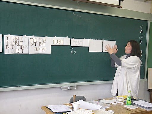
The second time around, I recognized that participating in the workshop meant resolving issues that had been unclear to me. So this time I focused on a better understanding of serifs because I wanted to overcome the hesitations I had with them. One of the benefits of a workshop is to have my works reviewed by harsh eyes. All the participants of the second workshop had good eyes and gave me constructive and objective opinions. I knew it was important for me to make modifications during this workshop as I do not have this kind of opportunities in my daily life. At the end of the first day, thanks to one of the attendees, I had a chance to draw letters with a flat brush. (Thank you, Ms. Shimizu!) When I looked at my sketched letters after drawing, I noticed numerous problems with my serifs. I was able to see how a serif should be drawn by following the movement of a flat brush. It took me two days just to modify my sketch of the letters I planned to carve, but I was satisfied that I had a better understanding of serifs.
kino3-1kino3-6
kino3-5kino3-4
kino3-3kino3-2


Finally on the last day of the second workshop, I had a wonderful experience of being able to draw a smooth line in my head. As with the first workshop, I spent two days for preparation and finally held a chisel on the last day. However, because I already knew that sufficient preparation was more important than to finish carving, I actually looked forward to holding the chisel rather than feeling frustrated. Finally, I began to carve. I was simply moved when I realized that I had a clearer image of the outline of the letters compared to the last time. As practice, I first drew a light line with a white pencil on the reverse side of the stone with an uneven surface, so the line I imagined and the line on the stone were totally different. It was an indescribably great feeling that I was now able to carve along the imagined line, not along the actual line on the stone. At the first workshop, I understood logically what Ms. Gordon said about the significance of preparation before carving letters. This time I was able to see its importance firsthand.

kino4-4kino4-3kino4-1
kino4-2Now that the second workshop has ended, I compare my sketch of the letters and the carved stone and see a gap between the beautiful lines I imagined and the actually drawn and carved lines. The actual lines seem to lack subtle tensions, and they look like they are just keeping their shape. However, given that the two workshops lasted only six days, I think I made an amazing progress. For a beginner with letters like myself, what I gained during the time is an asset I will treasure for life.

ゴードン恵美「レターカッティング入門WS」募集

»2012 レポート
»開催概要

»入門 初心者コース
»経験者(2回目)コース
»経験者(3回目)コース
»受付/キャンセルについて

ゴードン恵美ワークショップ「レターカッティング入門」2012 開催概要

※定員が一杯になりましたので、申し込みを締め切りました。 

■ 講師 ゴードン恵美
プロフィールについては、各クラス詳細のpdfファイルをご覧下さい。

■ 会場
●大阪会場 弁天町市民学習センター 美術室(大阪市港区)
http://www.osakademanabu.com/bentencho

●東京会場 勤労福祉会館 工芸室・美術室(豊島区池袋)
http://www.toshima-mirai.jp/center/e_kinrou/

■ 開催日時
大阪 2012 年7 月14 日(土)~ 7 月16 日(月・祝)
東京 2012 年7 月20 日(金)~ 7 月22 日(日)
レッスンの時間 両会場共に10:00 ~ 16:30

■ 参加費
初心者(1回目)34,000円(石代1枚分込み)
経験者(2回目)32,000円(石の追加を希望する方は別途お申し込みください)
経験者(3回目)32,000円

■ 定員
大阪会場 15 名 
東京会場 15 名
※今回初めて参加される初心者の定員は、大阪会場・東京会場それぞれ5名です。
※経験者の方につきましては、3回目の方は大阪会場でのご参加を、2回目の方は東京会場でのご参加をお勧めいたしますが、どちらの会場への参加も可能です。

■ 申込方法
e-mailのみの申込みとし、必要事項を記入したメールを下記のアドレスにご送信ください。パソコンからのメール受信可能な状態であれば、携帯電話のメールでの申込みも可能です。

1) 件名に、「ゴードン恵美WS 東京会場」又は「ゴードン恵美WS 大阪会場」と記入してください。
2) 本文に、氏名( ふりがな)、住所、電話番号、連絡を希望するメールアドレス、参加回数によって、初参加・経験者(2回目)・経験者(3回目)のいずれかを記入。経験者(2回目)・(3回目)の方は、希望する宿題の番号を記入してください。

*お申込みにお送りいただいたメールには自動返信メールが送信されます。届かない場合にはご連絡ください。

■ 送信先
workshop マル j-laf.org(WSに関する質問、ご意見もこのアドレスまで)
※ 自動返信メールが送信されます。届かない場合にはinfo マル j-laf.orgへご連絡ください。
※  マル を@に変換してください。

■ 申込締切日
東京・大阪ともに空席があります。

5 月27 日(日) 
但し、定員に空きがある場合には、その後の申込みも受付けます。
空きの有無はJ-LAF ウェブサイトでお知らせします。
https://j-laf.org/

■コースの内容・持ち物リスト・当日までの宿題などを含むワークショップ詳細はこちら
レターカッティングワークショップ初心者2012-shokai.pdf
レターカッティングワークショップ経験者2回目2012_2kaime.pdf
レターカッティングワークショップ経験者3回目l2012_3kaime.pdf

■ 参加資格
ローマンキャピタルをペンや平筆で書いた事がある方、またはローマン体のタイプフェイス(例えばPalatino, Optimaなど) を鉛筆でドローイング出来る方。

■ クラス概要 (経験回数によって、課題・宿題の内容が異なりますのでご注意ください)

石に手彫りで字を彫るレターカッティング "Letter Cutting"(またはレターカービング "Letter Carving"と 呼ばれる)は、現在も英国国内だけではなく、ヨーロッパの国々で続けられている伝統工芸です。この入門コースではヴィーカット”V-Cut”と呼ばれる彫り方で文字を彫ることを学びます。このヴィーカットは、ローマ帝国時代に既にその手法が確立され、当時の碑石に使われていたローマンキャピタルの文字のほとんどはこの彫り方で彫られています。

イギリスではエドワード・ジョンストン(1872-1944)の教え子だったエリック・ギル(1882-1940)がそのローマ時代の伝統的手法を彼の石碑の作品に多用し、彼のワークショップで培われたレターカッティングの精神、技術、そして教法は彼の弟子達を通じて今なお多くの職人の中に息づいています。この入門コースはそのギルの弟子であったデービッド・キンダスレー(1915-1995)の教法で主に進められます。

また、コース内では文字のレターフォーム、デザイン等を参加者同士で検討し合うクリティーク(Critique) と呼ばれるローハンプトン大学で採用されていた教法を導入し、生徒それぞれの作品をさまざまな側面から向上を目指すとともに、作品作りにおける生徒の自発性を伸ばしていきます。

【入門 初心者コースの概要】

●初心者コースの目的
石の彫り方だけでなく、道具や石の取り扱い方にも重点を置き、職人としての心構えを体感していただきます。

●初心者コースの内容 
1日目 石と道具の取り扱い方 彫り方の注意点 各自持参したデザインのクリティーク
2日目 試し彫り デザインが終了した生徒さんは、デザインを石に写す作業
3日目 デザインを石に写す作業が終了した生徒さんは、石を彫り始める

●使用する石の大きさ
15x15x2cm または、10x 22.5 x2cm

●入門1期生コースの宿題
ワークショップで彫りたい石のサイズを上記のサイズから選びそのサイズに合わせてローマンキャピタルで1単語(例えば”ORIENT”など)を上下左右のマージンを考えながらレイアウトペーパーに書いて来てください。だいたいメインステムの幅が5mmぐらいで、文字の高さ(エックスハイト)がメインステムの8~10倍の文字を目安としてください。もちろん、基本的にはその他の大きさの字や数字でもかまいません。

【経験者(2回目)コースの概要】

前回のワークショップでの経験を踏まえ、文字の細部に注意しながら文字を彫る作業に集中します。前回のワークショップの時間内にデザインが完了していなかった生徒さんはデザインを終了し、石にデザインを転写する作業後、作品となる石を彫り始めます。また、彫られた文字への彩色、装飾技術をお見せします。

●経験者(2回目)コースの目的
道具と石に対しての繊細な感覚を養います。文字に対しても同様に細かい部分に気をつけながら全体の作品としての完成度を高めます。また、デザインの基本的要素もクリティーク内で検討作品の向上につなげていきます。

●経験者(2回目)コースの内容
1日目 デザインのクリティーク後、デザインを石に転写し、彫り始める
2日目 彫りが完成した生徒さんは、装飾の作業
3日目 仕上げとクリティーク

●経験者(2回目)コースの宿題(下記のうちから選択して下さい)
1.宿題なし。前回のワークショップで下書きしてから、まったく、もしくはあまり彫り進んでいないので、ワークショップでは前回の石を持参して彫るのを続けたい。

2.15x15cmの石に自分の好きな、もしくは彫ってみたいローマンキャピタル1文字(平筆、もしくはカリグラフィーペンを使って書いた文字をベースにする事)を書いてくる。また、この文字の周囲に飾りをつけたいと思います。以下の2つのパターンのうちから1つを選択して、それを含めてデザインして下さい。

パターン1.ボーダーライン 最もシンプルなVーカットのライン。
パターン2.ベベル(Bevel) これはパターンというよりも、石の角を落とし、装飾とした彫り方です。

3.前回同様、自由作品をドローイングしてくる。その際、石の大きさ(15 × 15 × 2cm または、10 × 22.5 × 2 cm)を選択してデザインしてきてください。もちろん、宿題2の飾りを含めたデザインをしてきてもかまいません。

【経験者(3回目)コースの概要】

前回までの内容を踏まえ、個々のニーズに合った作品を作る際のデザインポイントや問題点への対策、そしてストーン·カッティングの新たな技術を導入します。

●経験者(3回目)コースの目的
個々の作品をより深いレベルで探求し、繊細なおかつ複雑な彫る技術を身につけ、表現の幅を広げます。

●経験者(3回目)コースの内容
1日目 デザインのクリティーク後、デザインの調整
2日目 彫る作業
3日目 仕上げとクリティーク

●経験者(3回目)コースの宿題(下記のうちから選択して下さい)
1.宿題なし。前回のワークショップで下書きしてから、まったく、もしくはあまり彫り進んでいないので、ワークショップでは前回の石を持参して彫るのを続けたい。

2.自分で彫りたい石を探し、仕入れてその石に合ったデザインをレイアウトペーパーに描いて来て下さい。
石は基本的にはどんな石を使ってもかまいませんが、御影石(英語ではGranite)は硬すぎて手彫りには向いていませんので、それ以外の石、例えば、大理石、スレート、砂岩(英語ではSand stone), 石灰石(英語では Lime stone)などをお勧めします。

彫りたい石によって用意していただく持ち物が多少違ってきますので、どんな石を使った作品を作るかを必ず講師宛にご連絡ください。ご連絡いただけない場合は希望の石を彫る事ができない場合があるかもしれませんので、よろしくお願いします。(連絡先は、PDFの概要をご参照ください。)

受付/キャンセルについて

■参加者決定方法
申し込み締切り日までの申込み人数が定員を上回った場合には、抽選により受講者を決定し、申し込まれた方全員に6月3日頃までにe-mailで結果をお知らせします。受講者は、その後、お知らせする期限までに参加費用をお振り込みいただくことになります。

■キャンセルについて
期限までにお振込みがない場合には、受講はキャンセルとみなし、キャンセル待ちの方に順に連絡させていただく場合がありますのでご注意下さい。ご旅行など、振込が間に合わない事情のある場合には、前もって連絡をお願い致します。振込後のキャンセルは原則として返金いたしません。ただし、次の受講者がいる場合には、1,000円を差し引いた残りの金額をWS終了後に返金いたします。

■見学希望者の受付について
今回のWSに参加するのは難しい方々に、1日に数名限定になりますが、クラスの見学を受け付けます。見学時間は、14:00~16:00とさせていただきます。希望者多数の場合には、抽選にて決定し、ご希望者全員にご連絡いたします。

許容人数に限りがありますので、団体でのご希望は受けられません。ご了承ください。ご友人と一緒に申し込まれる場合は、3名以内とさせていただきます。
見学を希望される方は、下記事項を明示のうえ workshop マル j-laf.org(WSに関する質問、ご意見もこのアドレスまで)
※ 自動返信メールが送信されます。届かない場合にはinfo マル j-laf.orgへご連絡ください。
※  マル を@に変換してください。

までご連絡ください。

1)件名に、WS見学希望「ゴードン恵美WS 東京会場」又は「ゴードン恵美WS 大阪会場」とご記入ください。
2)本文に、氏名( ふりがな)、住所、電話番号、連絡を希望するメールアドレス、見学希望日をご記入ください。

emi_gordon1emi_gordon2emi_gordon3emi_gordon4

Review of Zapf Exhibition: The Calligraphy of Hermann & Gudrun Zapf

Review of Zapf Exhibition: The Calligraphy of Hermann & Gudrun Zapf

On September 27, 2011, when the sun seemed too bright for an autumn day, Linotype type director Akira Kobayashi, type designer and calligrapher Ryuichi Tateno, and three staff members of J-LAF visited the home of Hermann and Gudrun Zapf in Darmstadt, Germany, to return their works that had been on loan to us for Zapf Exhibition held from September 13 to 25 in Tokyo. Looking back, the first visit by two J-LAF members to borrow their works was exactly eight months ago, on a cold and snowy day of January 27. We still remember vividly how warmly the Zapfs welcomed the nervous visitors into their home.
During our three-day visit in January, we spent two hours a day selecting the works to be exhibited and interviewing the couple about stories behind each piece. When we revisited their home for packing the exhibits on the day we flew back to Japan, to our surprise, the Zapfs presented us a few more works other than the ones we selected. Though we had felt reassured that the couple and our co-organizer Mr. Kobayashi had known each other well for a long time, when the Zaps let us borrow so many of their works from the vast collection that reflects the couple’s history, we were more than grateful that our genuine respect for them was communicated.

Z-3Z-1Z-2Z-22

*Interviewing and packing at the Zapf residence, January 2011

After hectic days in preparation for the exhibition, the Great East Japan Earthquake occurred just eleven days before the opening. The chaos caused by the disaster affected many events in the country, and without exception, we had no choice but to postpone the exhibition.

We are sincerely thankful that even under such severe circumstances, the Zapfs continued to trust us and patiently waited for any progress. We cannot thank Mr. Kobayashi enough for having kept close contact with them so that they would not worry.

It was an emotionally challenging time, but we proceeded with our preparation with the help of many supporters. About six months later, Zapf Exhibition opened at Gallery Le Bain in Tokyo on September 13. The twelve-day exhibition attracted as much as 1,700 visitors, which was far beyond our expectations. It gave visitors who deal with or are interested in letters an opportunity to appreciate the couple’s marvelous works firsthand and provided a comprehensive view of the development from calligraphy to metal types and to digital fonts. We are also grateful that thanks to Masao Takaoka of the Kazui Press Limited, we were able to have a special screening of The Art of Hermann Zapf (produced by Hallmark Cards Inc. in 1967; owned by the Kazui Press Limited), a DVD introducing Prof. Zapf’s calligraphy.
Z-35Z-36Z-37Z-39

*First three from left: Exhibition scenes
*Ritght: Visitors watching the DVD

After the exhibition closed its doors, we revisited Darmstadt for the first time in eight months. The Zapfs warmly welcomed us again with tea in their garden. In the peaceful settings, we gave them a report on the exhibition and expressed our sincere gratitude. We then moved into the house and returned their works with the couple checking the condition of each piece. We also gave them a book containing signatures and comments of the visitors. They carefully went though each page of the book and seemed delighted to read every comment that they could read.

12IMG_665810_IGP0537

*First three from left: Peaceful teatime in the Zapf’s garden, return of the works, and report on the exhibition, September 2011

*Right: The Zapfs going through each page of the book with signatures and comments

When the Zapfs expressed their appreciation to the visitors and everyone involved in the exhibition, we realized that we had overcome all the challenges we faced and successfully ended the exhibition. We would like to give our gratitude to Hermann and Gudrun Zapf, the visitors, and others who made this exhibition possible.

_IGP0573

*The Zapfs giving us a warm send-off
*We have donated 277,250 yen to the Japanese Red Cross Society for earthquake relief, collecting from part of the admissions fees and sales from the exhibition and contributions from parties involved in the exhibition. This donation was also a wish made by the Zapfs. We would like to express our sincere appreciation again to the Zapfs and the exhibition visitors.

ゴードン恵美「レターカッティングWS 2010」レポート

2010年4月に、ゴードン恵美の「レターカッティング入門」ワークショップ第2回目を大阪と東京で開催しました。参加された方のレポートを掲載いたします。

■ 東京会場レポート

東京会場:世田谷ものづくり学校  2010 年4月23日(金)~ 4月25日(日)

前回の大阪でのワークショップの受講からはや半年。参加者に好評だったゴードン恵美さんのレターカッティングワークショップが帰ってきました。
前回参加した11名は、今回は大阪と東京に分かれはしたものの、全員再参加するというほどの待ちに待たれたワークショップです。

初日は4月も中旬だというのに冷たい雨。会場は元小学校であった施設にデザイン事務所やカフェなどが入る世田谷デザインインスチチュートです。午前10時から参加者の自己紹介で三日間のワークショップは始まりました。東京会場は、初心者6名と昨年大阪でのワークショップの経験者が私を含め4名の合わせて10名。カリグラファーの方を中心にデザイナーも3名参加していました。男性は私だけ、女性陣に気後れしないように頑張ろうと気を張りました。

okano1-1okano1-2okano1-3okano1-4


自己紹介のあと、講師である恵美さんから簡単な概要説明があり、「自分のペースを大切に。決して急がなくてもいい。」と話していただきリラックスできました。前回ワークショップでもこの言葉を頂いたおかげで、慌てず急がずじっくりと取り組むことができました。完成しなくてもいい、一文字に一週間かけてもいい、と教えていただき、時間をかけて一つ一つ丁寧に理解しながら進めることができました。

初心者と経験者に分かれ、作業が始まりました。経験者は早速イーゼルを用意し前回の続きを彫りはじめます。前回大阪のワークショップから今日までの間に東京からの参加者が集まって勉強会をしたり、自分でも彫っていましたが、またしばらく経っていたせいか感覚を忘れてしまっていたので、まずは石の裏面に練習彫りをして感覚を取り戻します。セリフの作り方、ステム、カーブの彫り方を何度か繰り返し、恵美さんに見ていただきながらじっくりと学んで行きました。恵美さんの指導はわかりやすく、言葉で説明するだけでなくデモンストレーションをしっかりと見せていただけました。チズルの角度や彫る強さなどは言葉だけでは理解しにくいですが、デモンストレーションを見せていただくことで感覚的に理解できました。

okano2-1okano2-2
okano2-3okano2-5


一方今回初めての参加者は、3つのグループに分かれ、それぞれ石磨き、デザインドローイング、道具の準備を進めて行きます。デザインドローイングについては宿題となっていて経験者も持ち寄りました。休憩前後に何度か合評会が設定され、進捗をお互い報告しながら、全員で意見を出し合います。私はフリーランスのデザイナーで、普段一人で作業することが多く、迷ったときは誰かに相談してみたいという思いにかられても、なかなかそうも行きません。しかしワークショップでは参加者がそれぞれの視点から意見を出し合い、自分では気がつかなかった点に気づかされました。参加者の方々は全員感覚が鋭く、さらに面白いアイデアやスペーシングの問題点を本当に微細な単位でどんどん指摘し合います。意見を交わすことで気がつかない点を知り、修正、調整を加えることでさらに完成度を高めていく作業が印象的でした。石に彫るということは、失敗は許されません。線の少しの歪みも下書きで放っておくとそれが全て石に写されてしまうわけです。そして彫られたものは半永久的に残ってしまう...。皆さんに厳しい目で指摘していただいて日頃の自分のいい加減さ、甘さを見つめ直すことができたように思います。

okano3-1okano3-2okano3-3okano3-4okano3-5okano3-6okano3-7okano3-8okano3-12okano3-11okano3-10

石に文字を直接彫るという作業を通して普段は味わえない多くの発見をすることができました。デザインワークはコンピュータですることが多く、デザインスケッチや下書きは手で描くとはいえ、フィニッシュワークはコンピュータで何度でもやり直すことができます。しかし、自分で綺麗に磨いた石を対峙すると、失敗をおそれるあまり、なかなか彫り出すことができません。そういう緊張感は普段はあまり感じていなかったと、彫る作業に触れて初めて気づかされました。そしてもうひとつ新鮮だったのは、五感を使って制作ができるということ。コンピュータのデータは有形のようでいて無形。使っている最中に電源を落とすと吹っ飛んでしまうような、影もカタチも無いし、直接触ることもできないものです。ところが石には絶対的な物質感があって、触ればひんやりとしていますし、光の角度で表情は変わり、チズルで削るとほのかに石の匂いと味がし、彫る強さや角度によって音も変わります。まさに五感を使って石と対話しながら制作する感覚がとても新鮮でした。その他、文字の成り立ちについても勉強できたのが大きな収穫でした。ローマン体のセリフのでき方は筆の動きも大きく関わっていますが、ノミの入れ方や彫る角度も大きくフォルムに連動しているように思え、どう彫ればセリフを綺麗に掘り出すことができるかというのが、少しづつイメージできるようになった気がします。

okano4-1okano4-2okano4-3

制作以外にも参加者の方々とランチをご一緒したり、親睦会などでいろいろと楽しいお話をすることができ、横のつながりが広がって行くのもワークショップに参加する魅力だと思います。また今回は合評会に飛び入りしていただいたゲストや見学者も多くあり、いつも新鮮な空気が会場に流れていたように思います。
okano5-1okano5-8okano5-7okano5-6okano5-4okano5-3okano5-2

リポート/岡野邦彦(Shotype Design)

■ 大阪会場レポート

大阪会場:弁天町市民学習センター 2010 年4月17日(土)~ 4月19日(月)

このワークショップへの参加は2回目ですが、自分の中では1回目から繋がっています。文字初心者ではありますが、自分なりに描いたオリジナルの書体を持っていて、それが2回のワークショップを繋ぐ軸となっています。1回目のワークショップを受けた後、そこ得た知識をオリジナルの書体に反映させてブラッシュアップしました。それを踏まえた2回目は、まだ曖昧になっていた「セリフの理解」をテーマに臨みました。全2回計6日間で得た文字の命となる部分を学べたことは一生の財産です。

kino1-1kino1-2kino1-3kino1-4kino1-5kino1-6kino1-7


参加1回目となる前回は、彫る技術より、彫るために必要なことから多くを学ぶことになりました。これは予想もしてなかったことで、かなりの衝撃でした。下書きとして事前にローマンキャピタルを描いて来るのが宿題だったので、それからいきなりなり彫るのかと思いきや、まったく違ったわけです。下書きの段階で何度も吟味して、何度も描き直すことに時間をたくさん使いました。いざ彫ろうとしたとき、頭の中に文字の線が奇麗に描けないと、小さな迷いを何回も繰り返してしまって「彫れない」ことに気付きました。なぜなら、神経を使って細ーい線で下書きを描いたにも関わらず、石に写し描いた線はどうしても太くなってしまい、それに沿って繊細な線を彫っていくというのは出来ないからです。「このために十分な準備が必要だったんだなー。」と頭では理解できた瞬間でした。1回目のワークショップを終わってみて、参加前に描いたオリジナルの書体を眺めてみると、問題点がたくさん見えて、人前に出せないくらい恥ずかしい書体であることに気付きました。でも言い換えれば、ワークショップの経験によって何かが見えるようになったわけです。そのオリジナル書体をブラッシュアップして、2回目の参加を申し込みました。

kino2-1kino2-2
kino2-3kino2-4


今回が2回目となるわけですが、いつしか自分の中で、このワークショップ参加することは、曖昧になっている部分を解決すること、という位置づけになっていました。今回の自分なりのテーマは「セリフの理解」。セリフを描くときの迷いをなくしたいという想いで臨みました。厳しい目にさらされるのもワークショップのいいところです。参加者の方はみんな目が良いので、良質な客観的意見をたくさんくれます。こんなことは、自分の日常にはないので、この数日間で修正するのは大事なことだと感じていました。初日の終わりに、参加された方のご好意で平筆を借りて描いてみるチャンスにも恵まれました(ありがとうございます!清水さん!)。筆でいくらか描いてみた後に下書きを見ると、セリフの部分に問題点をいくつも見つけました。「筆の動きを考えると、こうはならないはずだよなぁ。」というところがわかったわけです。結局、下書きの修正で2日目も終わってしまいました。でも、またちょっとセリフの理解が進んだので自分なりには満足してました。

kino3-1kino3-6
kino3-5kino3-4
kino3-3kino3-2


参加2回目の最終日にして、やっと頭の中にスーッと線を描く映像が出てくるという感動を経験することになります。前回と同様に、また準備に2日間も使ってしまい、最終日に彫り始めるということになりました。しかし、この充実した準備は、彫り終わることより重要であることは学んでいたので、焦りもないどころか、むしろ楽しみでした。そしていよいよ石を彫り始めました。すると、前回とまったく違い、頭の中にはっきりと文字の輪郭が現れている状態になっていることに気付いて地味に感動しました。まずは彫る練習ということで、石の裏側のデコボコした部分に白い鉛筆で軽く線を描いただけだったので、目に見えてるものと、頭の中に見えているものは全然違うものでした。この状態で、目に見えている線に沿うのではなく、頭の中の線に沿って彫っていくというのが、なんとも気持ちよく、いい時間でした。なぜ講師の恵美さんが彫る前の準備が重要だと言っているのか、理屈でわかった前回に対して、実感として理解できたのが今回だと言えます。

kino4-4kino4-3kino4-1
kino4-2

ワークショップを終えてみて、自分が描いた下書きと彫った石を眺めていると、頭の中の線はもっと奇麗なのに、実際に描かれた線、彫った線とは少しギャップがあるのがわかります。線にピンとした繊細な張りがないというか、なんとか形を整えようとしてる状態というか、そんな感じに見えます。しかし、思えば、参加2回の合計はたったの6日間なのに、ここまで進歩できたことに驚きです。文字初心者の自分にとって一生の財産だよなぁと思える価値ある時間でした。

木下 博之

■ 第3回目は2012年7月に予定しています。

大阪 2012年7月14日(土)~ 7月16日(月祝)
東京 2012年7月20日(金)~ 7月22日(日)

Thomas Ingmire「カリグラフィーWS」申込状況

【申込状況】J-LAF主催 Thomas Ingmire WS 2013.01.21

Thomas Ingmire Workshopの参加申込は1月20日を以って締切りました。
沢山のご応募ありがとうございました。受講に関するご案内は、今週中にお送りいたします。

広島開催の講座A・講座B、大阪開催の講座D、東京開催の講座Eの4講座は、申込みが定員枠を超えましたので、受付を終了いたします。

◇大阪開催の講座C(定員まで2名)

DESIGN WITH CALLIGRAPHY (カリグラフィーとデザイン)
An introduction to basic design concepts for the calligraphers
カリグラフィーをデザインに取り入れるためのレッスン

◇東京開催の講座F(定員まで1名)

The VISUAL BOOK (ヴィジュアルブック制作)
Enhancing the expressive potential of calligraphy
アート本を作るためのレッスン

上記2講座は、募集を継続いたします。
受付は先着順とさせていただき、定員に達した時点で締切といたします。

尚、各会場で開催のスライドレクチャーについては、募集を継続いたします。
30名の定員まで、まだ余裕があります。
現在「Special」ページに掲載中の記事と関係した内容のレクチャーです。
スライドレクチャーのみのご参加も大歓迎です。

お申込みをお待ちしております。

ヘルマン・ツァップ&グドルン・ツァップ「カリグラフィーの世界」レポート

9月27日、秋とは思えぬ強い日差しの中、ダルムシュタットにあるツァップ夫妻のご自宅に、作品を返却するためJ-LAFスタッフ3名、小林章氏、立野竜一氏の5名で訪れました。
振り返れば、初めて作品をお借りしに伺ったのは冬本番、ちょうど8か月前の1月27日のことでした。雪が舞い降りる寒さの中、緊張した訪問者を温かく迎えてくださったご夫妻の姿は忘れることが出来ません。
1日2時間という約束で展示用の作品選び、作品についてのインタビューを行い、3日間連続でご自宅に通いました。帰国する日にも作品を梱包するため再度訪れましたが、はからずも、選んだものとは別の新しい作品を数点ご用意くださっていました。共催者である小林さんが、ご夫妻と懇意にされていることがJ-LAFにとって心強いことではありましたが、お二人の歴史を感じる膨大な作品から決して少なくない点数をお借り出来たことは、私達のご夫妻への敬意が伝わったのではないかと、大変ありがたく思いました。

Z-3Z-1Z-2Z-22

*2011年1月 ツァップ邸での作品に関するインタビューと梱包作業

帰国後、展示への準備のため慌ただしい日々が過ぎていき、開催まで残すところ11日となった3月11日に東日本大震災が起きました。直後の混乱は、あらゆるイベントにまで影響を及ぼすこととなり、私達も開催延期を選択せざるを得ませんでした。
そのような状況においてもツァップご夫妻は、終始変わらず私達のことを信頼してくださり、心温かく見守ってくださったことに本当に感謝しております。そして、ご夫妻を心配させないように常に連絡を取ってくださった小林さんにも感謝の気持ちでいっぱいです。

心情的には非常に辛い時期を過ごしながらも、再度開催まで多くの関係者に助けられながら準備を整え、約半年後、9月13日から25日まで、ギャラリー ル・ベインにて「ヘルマン・ツァップ&グドルン・ツァップ カリグラフィーの世界」は開催されました。
会期中は、予想を遥かに超えた約1,700名の入場者を迎え、中でも、文字に携わる多くの方達に、ご夫妻の素晴らしい作品を直にご覧いただき、カリグラフィーから金属活字、デジタルフォントまで一連の流れを総合的に認識いただいたのではないかと思っています。また、特別協力をいただきました嘉瑞工房の高岡昌生氏による関連プログラムとして、DVD「The Art of Hermann Zapf」(1967年Hallmark社制作、嘉瑞工房所蔵)を特別上映出来たことで、ヘルマン氏が実際に書いている姿をご覧いただけ、本当に良かったと思っています。

Z-35Z-36Z-37Z-39

*左から3点 ツァップ展会場風景
*右 会場内パティオでのDVD上映風景

会期後に訪れたダルムシュタットのご自宅では、庭にお茶の用意がされていました。穏やかな時間が流れる中、ご夫妻へ作品展の報告をして、お礼を申し上げました。
部屋に移動してからは、作品を一つ一つ確認して頂きながら返却完了。その後、来場者のお名前やコメントを書いていただいた芳名録を、ご夫妻は一枚一枚丁寧にご覧になりました。
読めるコメントは、全て目を通して、とても嬉しそうな表情をされていたのが印象的でした。

12IMG_665810_IGP0537

*左から3点 2011年9月ツァップ邸の庭でお茶の和やかな時間、作品返却と展覧会の報告
*右 来場者芳名帳を丁寧にご覧になるツァップご夫妻

ご夫妻からは、来場者をはじめ展示に関わった全ての人への感謝の言葉をいただき、私達は、様々な困難を乗り切り、作品展が無事に終了したことを実感致しました。最後にツァップご夫妻、関係者の皆さま、ご来場の皆さま全てに感謝申し上げます。本当にありがとうございました。

_IGP0573

*玄関でいつまでも見送ってくださったツァップご夫妻
*尚、今回のツァップ展開催に際し、入場料や売上げからの一部、また開催関係者からのご寄付によって集められました義援金 277,250円を、日本赤十字社に寄付致しましたことをご報告いたします。これはツァップご夫妻の希望でもありました。心より感謝申し上げます。