Interview with JOHN STEVENS 2
Q. You have a reputation for teaching as well as your commercial work. When you teach, what do you keep in mind? Do you use typeface for teaching?
When I teach, I usually do not want to teach only technique or letter styles. Sometimes that is a starting point for me, but never the end point.
My thought has always been; if we know what it is we want to do, establish the gap between where we are and where we are going, working toward that goal or ideal will be more worthwhile. I am speaking conceptually. Beautiful letters are a collection of beautiful strokes and spaces and arrangements. Attention to detail and craft follow that.
I think students today want more than just learning the skills of being a calligrapher; they are looking for ideas for expression- or how to use calligraphy.
It seems calligraphy is many things: for some people, it is the process of making things that interests them. For others, it is creating beautiful images and yet others it is expression they are after. Or a combination of the above. Usually one feature is more apparent over the others, depending on the individual.
When I teach, I try to bring students' goals and strengths to the forefront while at the same time, share with them what experience has taught me as having value. Why is it relevant to care about good letterform in a world that seems indifferent to it? I value good letterform and good design and hopefully, I can get others interested, inspired, to connect with their sense of aesthetics and ideals. (when anyone teaches they are sharing their sense of what is important, I would think.)
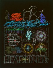

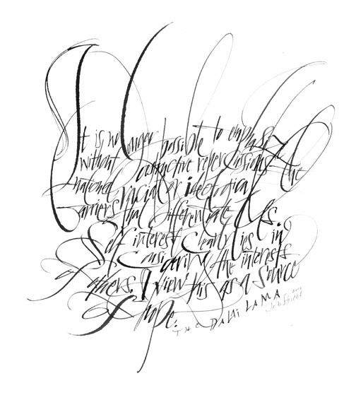
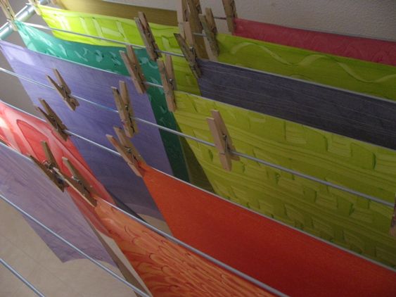
From left to right*Headliners Poster 1986
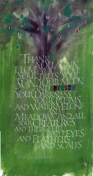
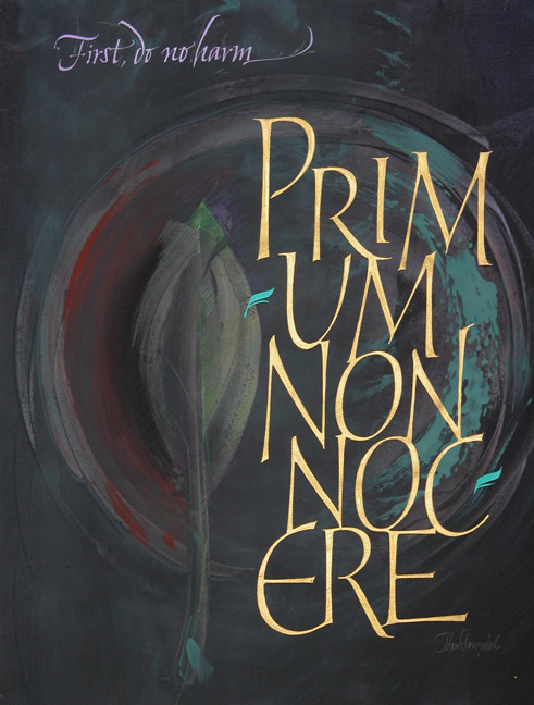
Various pens & brushes on Canson paper in mixed media. Texts are quotes in multi-language regarding calendars and time-keeping concepts of different cultures and times.*Primum non Nocere 2006 Written with a broad-edged brush in gold.
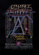
*Headliners Poster 1988 Various media on black paper using pens and brushes of all kinds. This was executed as one piece on paper and printed in facsimile as a poster. The texts are various tributes to the alphabet.
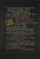
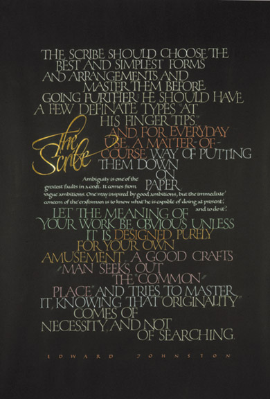
*The Scribe Edward Johnston 1984
*Various pens on Fabriano paper using gouache and 23k raised gold leaf. Text is from the very influential Writing, Illuminating & Lettering, Edward Johnston wrote in 1906.
I do not want to teach "my favorite styles" or promote "derivative" work, work that looks like somebody else did it. I sometimes see people enter workshop pieces into "competitions" as their own work. Yes, they did the piece, but as a learning tool from the teacher. They have not had the time to make it their own and it does not represent their core values. We don't learn anything from that artist other than they take direction well.
I believe we copy to learn up to a point, but eventually we must find what is true for us. So, even if you are making Roman Capitals, miniscules, and italic and learning to make them beautiful, there is still room for the individual. Then if you add your individual expression, adding your own values, inclinations, desires personal to you, these alone will provide a very large palette to work from. Your choices, based on sound knowledge make the piece unique to you- I would like to think - rather than copying another's choices and ideas for effect.
After that, add creative problems, the words, what we want say graphically, or what we what to say with these simple tools and simple marks, it becomes infinite. For some, it begins with words and their meaning. For others, it is reasons that I have mentioned and some I have not.
I am one teacher and I value form, beauty of letterform and design and the expressive power of the moving rhythmical line. I am also attracted to the inherent beauty of the graphical little symbols we call letters. I love to create and discover the powerful and subtle relationships one can create or discover on the page. In teaching I try to bring depth of appreciation and a sense of how to value what I have described.
I especially see this as necessary given the context of the "calligraphy-made-easy" type of workshop. I feel there is an abundance of information for beginners, and that is fine. However, the next level is the important one if we are to grow calligraphy beyond the idea of just beautiful handwriting done "monk-like".
A teacher inadvertently brings value as well as knowledge of technique, tools and insight. It is a symbiotic relationship with students, almost a collaboration.


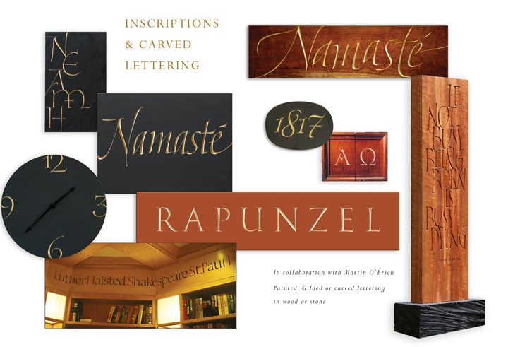
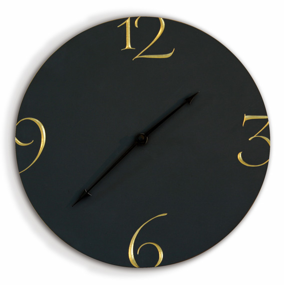
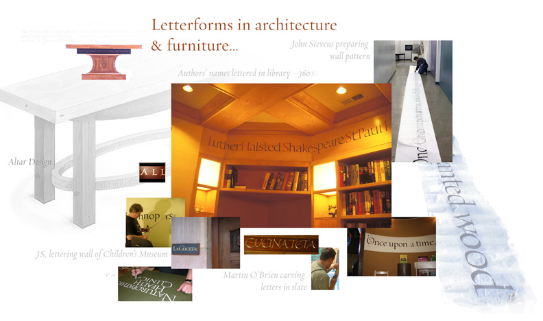
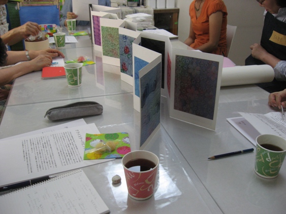
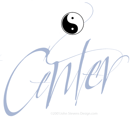
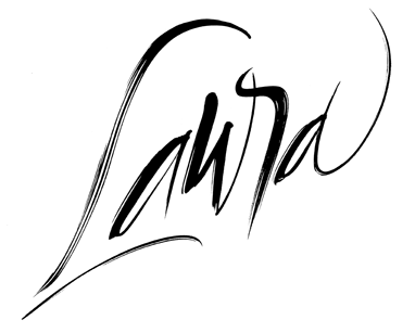
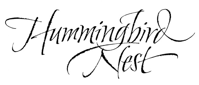
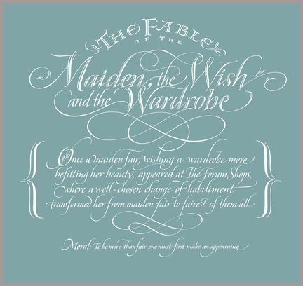
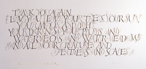
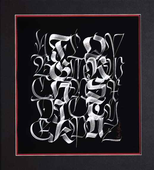
Calligraphic Titles
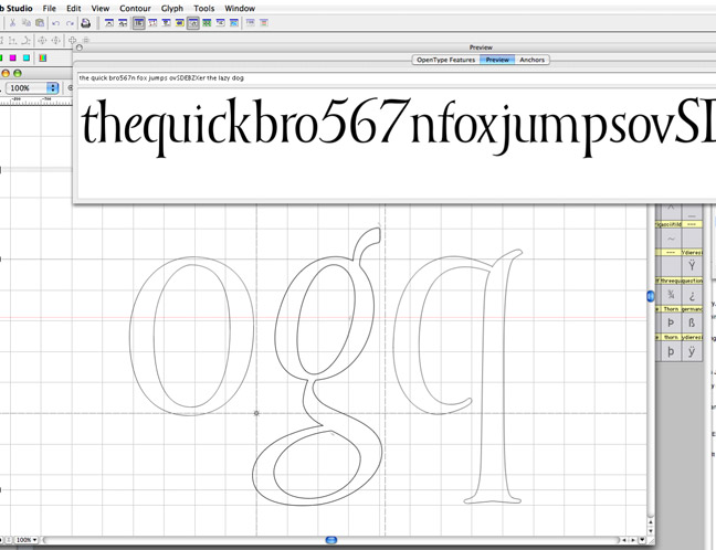
In regard to typefaces: I may use them to teach letterform design (after all, each is the product of design, thought and adherence to parameters much the way calligraphy has parameters). Letters...all letters, embody something; grace, movement, energy, rhythm, attention to craft, expression of ideas. It starts with the "insatiable urge to write" but gets more involved the more one learns.
Fr. Edward Catich was known for his work with The Roman Letter- however, that was only one part of the story; One of his ideas: "Skillfully wrought yet inconsequential ideas are more likely to arouse dismay than admiration." This indicates that technique alone was not enough.
Some of his ideas were an extension of Edward Johnston's and other Arts & Crafts movement people; a thing of beauty is also a thing of truth.
I think, now that is true but it is not the whole truth. In the end, it is a mystery of human endeavor that we are involved in the aesthetics of things. Expression- an extension of ourselves, or maybe pleasure in work? Perhaps seeing our contribution in some way? There is probably not one answer, but searching does take us places. The subject and then the meaning we give it are the simplest way to look at it. That is enough, I suppose.
Maybe it is the old joke about artists: it is hard to get things to go your way in life, so the artist tries to get things to go their way in their work. (Woody Allen, Film Director)


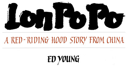
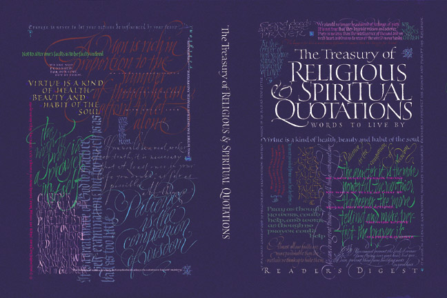
Book Titles
Q: In order to let them get closer in the future, what sort of comprehension do you think calligraphers and typeface designers need to have from each side to relate to each other?
Calligraphers and type designers were historically tied together. Everything came from calligraphy at first. Then the technical limitations in the way type was made and used imposed new parameters on design of letterforms (type). Some history of typography might be useful here.
Now we have a situation where almost anything is possible digitally. The ACT of calligraphy and type design are very different from each other. There are tools to aid in the production of a typeface-although it would be very helpful in my opinion if type people were also calligraphers. However, it is not necessary.
As it turns out, calligraphy (and the aesthetic it teaches us) is what inspired Steve Jobs¹ to insist that the Apple computer software engineers/designers take typographic principles from the canons of the printed page, (that were based on manuscript page developed by calligraphers,) and develop them to work on the computer screen. (what we have today) Not because it was a convention, but because it evolved over a long period of time. A real balance of form and function. As genius as Mr. Jobs is, he did not try to reinvent the wheel.
Calligraphy has a bad rap of not being modern, being thought of in terms of a quaint past and in some cases this bias is justified. Amazingly, our digital world, which has been really mainstream for about 15+ years, has revolutionized the way we see letterforms. Unfortunately, this change is not all for the better. We shrug this off as "change is inevitable". However, there is a negative to every positive- I would like it better if this change did not kill-off calligraphy as we know it.
There are many "new" typeface designs coming out every day. Some good, many not. I would like to believe the in the case of the best designs, their designers have such profound respect for letterform design, that they MUST have been exposed to calligraphic principles somewhere along the line in their education.
Our other enemy is indifference. Too many choices and possibilities, and yet the same typefaces get used over and over. Trajan (the type) is very overused. How many people appreciate the beauty of Waters Titling? It takes knowledge or awareness to see the finer qualities. Otherwise, it just comes down to fashion, (which has leaked into so many areas of life) watch this video: http://www.youtube.com/watch?v=t87QKdOJNv8
My point is: we have more access, but is this translating to better understanding and appreciation? Or are we losing something valuable? And, is there anything we can do about it?
*Left: Calligraphy Design for Caesar's Las Vegas*Right: Vertical Fractur 1999 Broad-edge brush on Canson paper in white gouache. This piece explores a modern expression of the fractur hand with all of its spontaneous permutations on a backdrop of the vertical line of writing reminiscent of eastern cultures. It is a totally spontaneous work with no planning-just years of preparation.
In classical type, the calligraphic roots are visible as the early type makers were either calligraphers themselves or based their models on calligraphy. From that perspective it can be said that ALL type started out as "hand done" and that many classical design ideas about page design, beauty of form, and legibility and conventions of page design (or book design) have been handed down to us from calligraphers- a humanistic perspective.
Baskerville and Caslon and Helvetica where all drawn by somebody before they were cut into punches. Punchcutting itself is a lost art.
For calligraphers, some exposure to type design would sharpen their awareness toward letterforms. -It would teach another perspective about relationships (how to tame an alphabet to not just be a collection of letters called italic or whatever). Frederick Goudy² once said: Anyone can design one letterform, it is the designing the other 51 letters to work with it that is challenging (paraphrasing).
Perhaps these ideas are not so popular today- but necessary for enduring beauty and function. I cannot think of any serious calligrapher that I regard as good, who hasn't spent some time looking at the lessons that type can teach us. Of course, like calligraphy, there is good and bad. All study is useful in the development of an aesthetic, and the work of the great type designers has been an influence on my aesthetic to some degree.
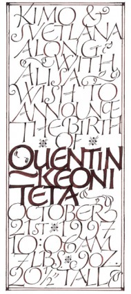
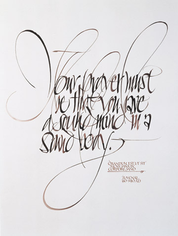
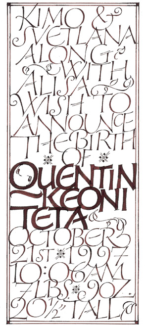
*Left: Readers Digest 1993*Various pens & brushes on Canson paper in mixed media. Texts are quotes regarding spirituality concepts of different cultures and times.*Center: Birth Announcement 1997 Written in sepia ink on laid finish paper using broad edged pens. I wanted this to be as much a keepsake for friends and family as it was an announcement.
*¹ Steve Jobs address about his time at Reed College.
*² Prolific American Type Designer of the 20th Century
Excerpt from Steve Jobs http://news.stanford.edu/news/2005/june15/grad-061505.html
Reed College at that time offered perhaps the best calligraphy instruction in the country. Throughout the campus every poster, every label on every drawer, was beautifully hand calligraphed. Because I had dropped out and didn't have to take the normal classes, I decided to take a calligraphy class to learn how to do this. I learned about serif and san serif typefaces, about varying the amount of space between different letter combinations, about what makes great typography great. It was beautiful, historical, artistically subtle in a way that science can't capture, and I found it fascinating.
None of this had even a hope of any practical application in my life. But ten years later, when we were designing the first Macintosh computer, it all came back to me. And we designed it all into the Mac. It was the first computer with beautiful typography. If I had never dropped in on that single course in college, the Mac would have never had multiple typefaces or proportionally spaced fonts. And since Windows just copied the Mac, it's likely that no personal computer would have them. If I had never dropped out, I would have never dropped in on this calligraphy class, and personal computers might not have the wonderful typography that they do. Of course it was impossible to connect the dots looking forward when I was in college. But it was very, very clear looking backwards ten years later.
Again, you can't connect the dots looking forward; you can only connect them looking backwards. So you have to trust that the dots will somehow connect in your future. You have to trust in something - your gut, destiny, life, karma, whatever. This approach has never let me down, and it has made all the difference in my life.
BIOGRAPHY
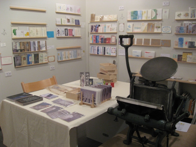
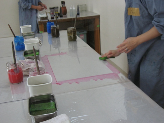
John Stevens is a calligrapher, designer of logotypes & illustrator of expressive letterforms with 27+ years experience. He has worked for well-known clients in book & magazine publishing, packaging, type design, graphic design, television & film. He has exhibited and been published widely and taught workshop in Tokyo in November 2009.


![IMG_4606[1]-thumb-190x126](https://j-laf.org/wp-content/uploads/2014/12/IMG_46061-thumb-190x126.jpg)
![IMG_4608[1]](https://j-laf.org/wp-content/uploads/2014/12/IMG_46081.jpg)
![IMG_4610[1]](https://j-laf.org/wp-content/uploads/2014/12/IMG_46101.jpg)
![IMG_4611[1]](https://j-laf.org/wp-content/uploads/2014/12/IMG_46111.jpg)
![IMG_4576[2]-thumb-190x126](https://j-laf.org/wp-content/uploads/2014/12/IMG_45762-thumb-190x126.jpg)
![IMG_4574[1]-thumb-190x126](https://j-laf.org/wp-content/uploads/2014/12/IMG_45741-thumb-190x126.jpg)
![IMG_4601[1]-thumb-190x285](https://j-laf.org/wp-content/uploads/2014/12/IMG_46011-thumb-190x285.jpg)
![IMG_4580[1]-thumb-190x126-thumb-190x126](https://j-laf.org/wp-content/uploads/2014/12/IMG_45801-thumb-190x126-thumb-190x126.jpg)


![IMG_4248[1]](https://j-laf.org/wp-content/uploads/2014/12/IMG_42481.jpg)
![IMG_4274[1]](https://j-laf.org/wp-content/uploads/2014/12/IMG_42741.jpg)
![IMG_4279[1]](https://j-laf.org/wp-content/uploads/2014/12/IMG_42791.jpg)
![IMG_4270[1]-thumb-120x79](https://j-laf.org/wp-content/uploads/2014/12/IMG_42701-thumb-120x79.jpg)