» マニー・リン「カリグラフィーWS」2019 開催概要
» マニー・リン「カリグラフィーWS」2019 レポート
ワークショップレポート
「マニー・リン カリグラフィーワークショップ」レポート掲載にあたって
「桜の盛りに間に合うかしら?」・・・間に合いました。そんなタイミングで、4月の初めにマニー・リン氏は来日し、ワークショップは大阪会場からスタートしました。韓国・台湾からの参加者もあり、ワークショップの内外で国際的な交流が見られました。マニーは、優しく、温かく、多様な参加者それぞれにアドバイスをし、1歩踏み出すきっかけを与えてくれました。そんな時間を共有してくださった参加者の方々、通訳の方、そして講師のマニー、全員に対し深く感謝しています。どうもありがとうございました。
参加者の中から、浪本 浩一さんに「フォールデットペンを使った表現」、西上泉さんに「LINZ'sバリエーション &緩急に富んだイタリック体」、斎藤 朋恵さんに「異文化の融合によるカリグラフィーの表現」、林順子さんに「緩急に富んだイタリック体」について、ワークショップ体験レポートを書いていただきました。ご協力ありがとうございました。そして、僭越ながら、スライドレクチャー参加のレポートを私が書かせていただきました。
マニーと学んだことが、皆さんの創作活動の中で、何かのヒントとなり、より充実したものとなっていきますよう願っています。
ワークショップ担当: 久賀真弓
* * * * * * * * *
●スライドレクチャー参加レポート 久賀真弓
私は、スライドレクチャーに参加したレポート担当なのですが・・・・、最初に。
私が初めてMannyと会ったのは、2003年にイギリスのワークショップでMannyのクラスを受講した時でした。参加後に、私が国内で書く海外でのワークショップ体験レポートに記載する写真の許可をいただくために、メールでコンタクトしました。反対に、日本でのカリグラフィーの様子をレポートに書いて欲しいとの依頼を受け、必死に英語で書いて、翻訳の専門家であるカリグラファーの友人に添削してもらって提出したことは、とても懐かしい思い出です。
そこからずっと、細くなったり、太くなったりしながら続いてきたMannyとの繋がりは、2014年3月のノルウェー・ベルゲンで参加した作品展を経て、2017年11月の京都でのシンポジウム開催に到りました。そして、今回、Manny単独のワークショップを日本で開催することができました。
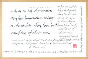
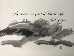
Mannyの表現するもののベースには、複数のコンテンツが敷かれていると思います。特に、東洋・西洋の両方の文化の中で培われた感覚が、作品の中で色々な形で表現されています。いずれの文化も奥が深く、全く別のもののようでいて、どこか共通する始まりを持っていたりしますが、更にそこに、時の流れの違いや技術の進歩による表現の違いが載ってきます。スライドレクチャーの中では、そういった様々なものを表現した作品を見せていただきました。
また、Mannyが、いつ、どのように、書道やカリグラフィーに出会って、生涯付き合っていく存在になっていったのかも語られました。時にコミカルな表現で笑いを誘いながら、「突き詰めるほど拘って取り組む」ものがあることの喜びのようなものを、参加者に伝えてくださったように思います。
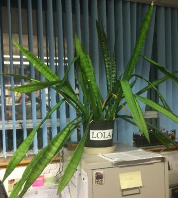
MannyのBamboo Scriptが生まれた経緯と、大切なモデルの鉢植え「Lola」の話は、参加者の記憶に残るトピックでした。行方不明だったLolaが帰ってきて、驚くやら、キュンとするやら。でも、Lolaは2つになってしまったとか(笑)。確かに、Bamboo Scriptのストロークの曲がり方は、Lolaの葉の曲がり具合をなぞらえていました。

話を聞きながら、MannyがBamboo Scriptを作っていた頃に、電話会議での相談があり、書いている音だけ聞かせてもらったことを思い出しました。シャッ、シャッ、と、ペンが紙を擦る音だけが聞こえて、シャッ、シャッ、と、書くのね・・・と、想像したのでした。Bamboo Scriptを書くときには、この音が聞こえます。
今回のMannyの来日では、彼が長く希望していた「日本に家族を連れてくること」が実現しました。2人のお子さんたちは、これまで、彼の仕事の場を直接見たことがなかったのだそうです。東京のスライドレクチャーがその初めての機会となりました。レクチャーの最後に質疑応答があると伝えると、会場へ向かう電車の中で、2人の質問選びが始まり、とても楽しそうに会話が弾んでいました。実際に、2人は良い質問をお父さんへ投げかけました。少し気恥しそうに、でも、きちんと回答しているMannyは、とてもハッピーだったのではないでしょうか。
色んな講師の方に来ていただき、教えていただく度に、その方の芸術家としての成り立ちや素晴らしさを感じます。今回、Mannyは、表現の自由や融合、1つのことを突き詰める素晴らしさ、自分で取り組むための方法などを、彼の表現を通して教えてくれました。また、彼の思いやりに溢れた教え方は、参加者に温かい学びの場を提供してくれました。レポートの末尾ではありますが、Mannyに沢山の感謝を送りたいと思います。
ありがとう!!! Manny!!!
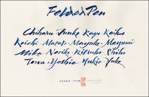
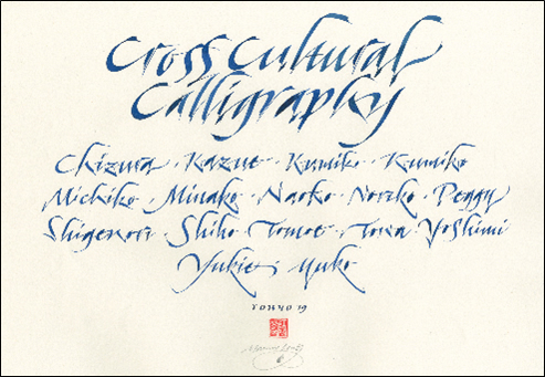
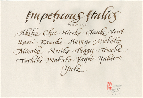
Manny手書きの各クラスの参加者リスト兼テキストの表紙 - 各クラスの最後に抽選で参加者が受領
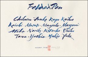
●「フォールデットペンを使った表現」WSレポート 浪本浩一
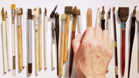
普段からコーラペンはよく作っていて、上手く書けない意外性を楽しんでいるのですが、そうは言ってもちゃんと使いこなせたほうがよいに決まっています。なので、このWSでフォールデットペンのあれこれを学べることにワクワクしていました。
まずはマニーの挨拶から。「このワークショップのテーマはCrossing boundaries。国境を越えること。デザインは計画的で合理的なもの。でもアーチストは何かを表現しようとしている。このデザインとアートを一緒にすることがテーマです」。いったいそれはどういうことなのだろう。難しそう、、。でもマニーは終始ニコニコしていて、冗談もまじえながら和やかにはじまりました。ペンの持ち方、使い方などのレクチャーのあと、自分たちで作ったフォールデットペンと、マニーが参加者のために用意した固めの素材を使ったフォールデットペンを使ってストロークの練習です。
ペン先が大きいために均一な圧力で書くのが難しく、またインクも出過ぎたりして悪戦苦闘。線の角度もなかなか揃いません。角度は揃っていたほうがよいのですが、マニーからは「角度ばかり気にするよりは見た目が大事」という話がありました。
マニーが書いているのを見ていると、彼の手首の柔らかさ、腕全体のしなり、体全体の動きに目がいきます。体を使ってリズムのある文字が書いていく。その身体性がいつもマニーから感じられました。
「フォールデットペンはそれぞれが違うから、ペンとのコミュニケーションが大事」とマニー。そう、じゃじゃ馬的なフォールデットペンを克服しようとかではなくて、ペンと自分との対話、そしてお互いが一体になれるかどうか、これが大事なポイントのようです。
そして各自がアルファベットを書く練習へ。ここでは文字を書く時にあえて角度や大きさに変化を付けるようにすることで、参加者のみなさんの文字が個性的になっていきます。
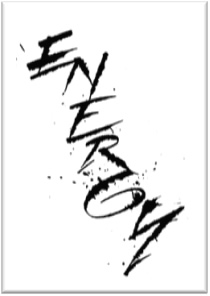
文字の練習の後は、作品作りに向けてのマニーの実演です。迷いなくどんどん書いていきます。書くスピードが速いので紙面構成を考えているようには見えません。でも書き上がると全体がきれいに構成されているから不思議です。マニーが言うには、体の中から生み出されるエナジー、東洋的で言えば「気」で書いているとのこと。それを聞くと“ああ、自分は修行が足りんすぎる”と平身すると同時に、これがアーチストなんだ、と分かりました。マニーが「音をよく聞いて」と言っていたのも印象的でした。ペン、インク、紙、体から発せされるものを感じ取り、そこからエネルギーを生み出していく。そういえば「西洋人より東洋人のほうが理解しやすいんじゃないかな」とマニーが言ってたことを思い出しました。なるほど確かに東洋的な思想かもしれません。私はアジア人ですから少しは希望が持てますね(笑)。しかしこのあたり、香港生まれのイギリス育ちであるマニーの神髄なのかもしれません。
初日の後半からは各自が作品作りに向けて試行錯誤していきます。私はイタリック的なアプローチで書き始めていたのですがどうも単調に書いてしまうので、そのことを相談。マニーは参考にいくつかのバリエーションをすらすらと書いていきます。ただすごいなぁと感心してしまいました。
2日目は、イタリックから路線変更してフォールデットペン表現の1つとしてマニーが紹介していた太細のコントラストを活かしてみることにしました。
そうこうしているうちに早くもWSは終了。みなさんの作品を集めて鑑賞です。


講評では、それぞれの作品についてのコメントとともにトリミングのバリエーションについても検証していきます。このあたりにはグラフィックデザイナーであるマニーの視点がよく現れていました。
ちなみに私の作品については「オーガニックな表情が興味深いですね」とのこと。長所を伸ばせとよく言いますから、これから私はオーガニックなアプローチを追求していきたいと思います(笑)。でも改めて見てみると湧き出るエネルギーよりはデザインが勝っているかもしれません。マニーの言う“Crossing boundaries”な感覚とは何か、今後も考えていきたいと思います。

 WSの最後に、マニーから参加者に向けて「これで終わるのではなく、練習を続けていってください。私も数十年かけてようやく今、このようにできるようになったのです」とのメッセージがありました。本当にその通りです。近道などありません。しっかり練習しないといけないのです!
今回、このような学びと気づきの機会を与えていただき、マニーおよびWSを準備してくださったみなさまに感謝感謝です。ありがとうございました!
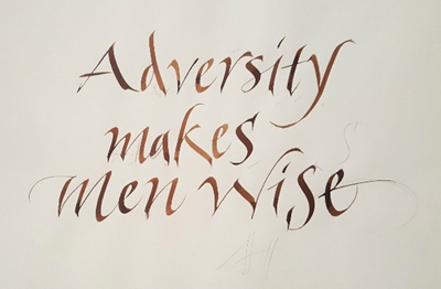
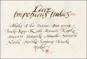
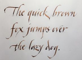
●「LINZ’sバリエーション&緩急に富んだイタリック体(2書体習得クラス)」WSレポート 西上泉
マニー・リン氏を講師に迎え、大阪での2日間のWSに参加致しました。
マニーの作品やお顔、経歴はもちろん存じ上げていましたが、大阪でのスライドレクチャーも拝見できず、WS初日がマニーとの初対面。やはり同じアジアの血、大変親しみやすい。そして穏やかな中にキラリと光る鋭い眼差しが印象的でした。マニーが語られた、色んな体験談が濃いもので精神的にとても実りの多いWSでした。
マニーのイタリックへの思いは大変強く、ある時はひたすらピーター・ソーントンのイタリックをトレースし、また、1990年代にはもうこれ以上何もすることが無いくらいまでイタリックを学び書いていらした頃にデニス・ブラウンのWSに参加し、別の方法でイタリックにアプローチできるのではと感じたこと。結果を考えずに素早く書いてみたり(彼はNaughty Italic やんちゃなイタリックと呼んでいらした)、フォーマルイタリックのルールを沢山破ったりして、自分独自のイタリックを見つけるに至ったこと。
また例えばゴシックは人々にアピールすることが少なくイギリスにおいてはドイツを思い起こさせる書体であるのに対して、イタリックは世界のどこの人にでもアピールできるのも好きな理由の一つである事。
練習、練習、練習を重ねて一つを極めなさい!そうして自分の好きなスクリプトを見つけなさい!私の好きなスクリプトがイタリックであるように!・・・などと熱く語られました。
2日間のWSは、1日目にLINZ’sバリエーション、2日目に緩急に富んだイタリックImpetuous Italicを習得するというもの。文字の習得の説明は難しく多くは記述できないので、かいつまんでWSの模様をレポートいたします。
LINZ’sバリエーションはドイツのグラフィックデザイナー、カリグラファーのAlfred Linzのイタリックのバリエーション。マニー御自身はCarl RohrsからLINZ’sバリエーションを学んだそう。1日目にそのことを伺ったので家に帰って、2008年にCarl RohrsのWSを受けた際の資料を見直すと、なるほどLINZ’sバリエーションのイタリックがありました。しかしマニーがおっしゃるようにバリエーションと言うのはどんどん変化していくもの。マニーとCarlのLINZ’sバリエーションにも、すでにそれぞれの個性があってこれはなかなか面白いです。マニーとCarlに学んだことで、Linzのイタリックが書き手によって変わっていくのを目の当たりにすることができました。
マニーは、とても論理的で丁寧に教えて下さる方。デモンストレーションも大変分かりやすい。講師によっては、どんなに頑張っても私には書けそうもないすごいデモンストレーションを披露してくださって、それはそれで興奮して好きな反面、WS自体は刺激を受けに行っただけ、というのもあるのですが、マニーの教え方は本当に親切で、家に帰ってからでも、自分さえやる気があれば復習出来るように教えて下さったのには感心しました。
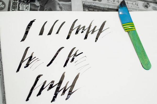
1日目 LINZ’sバリエーション。オートマチックペン(マニーがおっしゃるに柔らかい)3A、またはパラレルペン(マニーがおっしゃるにペン先が短いから固い)6、あるいはマニーが持ってこられたEZA Pen by Alan Ariallなどの太いペン先で、i,l,hなどに共通する縦のラインから練習します。フォールデッドペンでも同じ扱いが出来て、よりダイナミックになるというのもデモで見せていただきました。
写真①下参照(写真はすべてマニーがWSで書かれたもの)
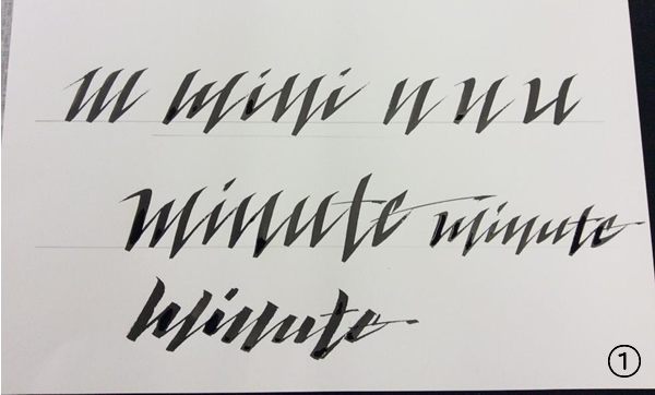
どの書体でもそうですが、太いペン先は粗が見えて本当に良いですね。後で小さなペン先で書くのが楽になります。文字の継ぎ目の白い部分やセリフの足りないところは、後から埋めればよいので、とりあえずどんどん練習します。このLINZ’sバリエーションは斜めに切り取ったような縦のストロークの止め方、そして楔形で次の文字に繋がっていくのが一番の特徴(写真②参照)なのですが、マニーの言う“ダイナミック”な表情を出すまでには、ダイナミックと言う言葉とは裏腹に、かなり丁寧に練習を積まないといけません。「真面目にこつこつ丁寧に」が大前提です。
徐々に“ダイナミック”さを加え、ある程度書けたら文字を上下に振って書く練習(写真①上中参照)。マニーからは「バリエーションだから色々試してみなさい。」と何度も言われました。1日目の最後に、唐突に「小さいペン先で書いて」と言われ、咄嗟に持ち物リストにミッチェルと書かれていたので、普段ブラウゼしか使わない私がミッチェルで書いたのですが、次の日の朝、マニーが、「小さなペン先はブラウゼかスピードボールがいいね」とおっしゃったので、ニブの種類を尋ねればよかった・・・・WSでは何事も臆せず尋ねないと駄目だと思った次第です。ミッチェルでは、LINZ’sバリエーションの雰囲気が私は出なかったのです。たった2日のWSですから、些細なことでも有効にしたかったです。

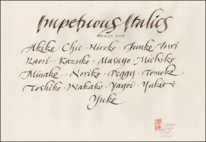
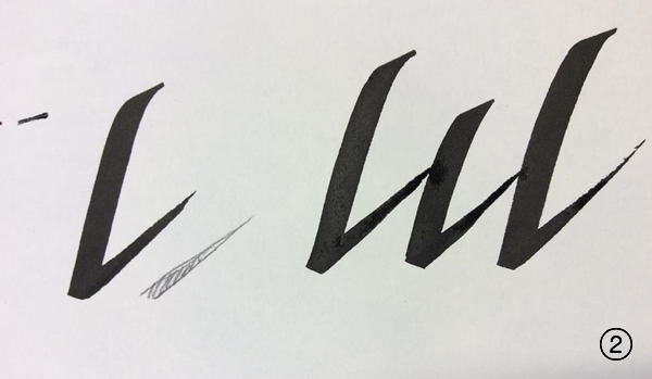
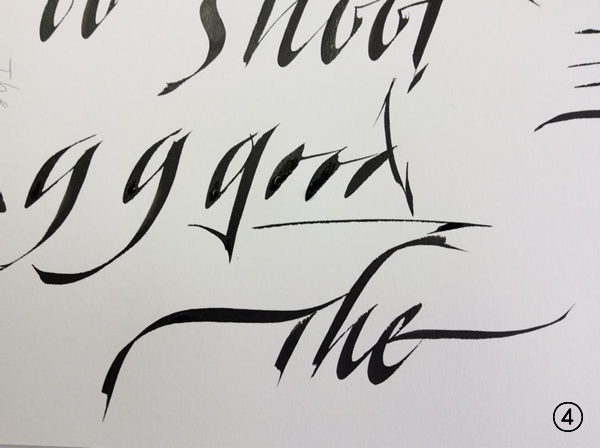
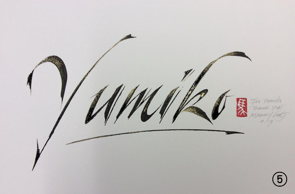
2日目Impetuous Italic。前日のLINZ’sバリエーションと似ているのですが、斜めに止める扱いがない分(写真③参照)、こちらのほうが少し楽な気がしました。Impetuous Italicの良さは、フォーマルなイタリックと混ぜて書いても素敵なことだとおっしゃっていました。前日よりさらにペンアングルを変えたり、紙の向きを変えたり、セリフを派手にしたり、ウェイトを付けたいときは後から足したりして、まさに緩急に富んだイタリックを楽しみ(※写真④参照)、最後には、マニーご持参のシュミンケの金粉を墨汁の上に混ぜて慌ただしく2日間のWSが終わりました。(写真⑤金粉付きはマニーが通訳のYumikoさんに贈ったもの)
今回は文字の習得に励むWSだったので、参加者皆さんの文字が拝見できなかったことや、作品らしきものが書き上げられなかったことが残念で、あともう1日あればという感じでしたが、Yumikoさんが、こちらの聞きたいという気持ちを察して踏み込んで尋ねて下さる的確な通訳や、同じ机を囲んだ楽しい方々のお蔭で、とても心地よく帰路につきました。山羊の毛の大きな筆を使ったデモを見せて頂いた時に、本当に『氣』を感じてゾクっとしました。ゆっくり『氣』を込めて書かれるマニー。これこそ求めていたもの。
常々文字に魂を込めたい、命を吹き込みたいと思っている私には、このWSに参加した甲斐、意味があったと感じた時でした。
マニー!本当に本当に有難うございました。
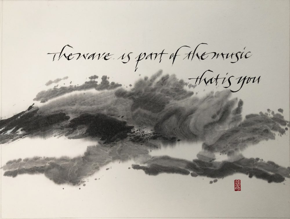
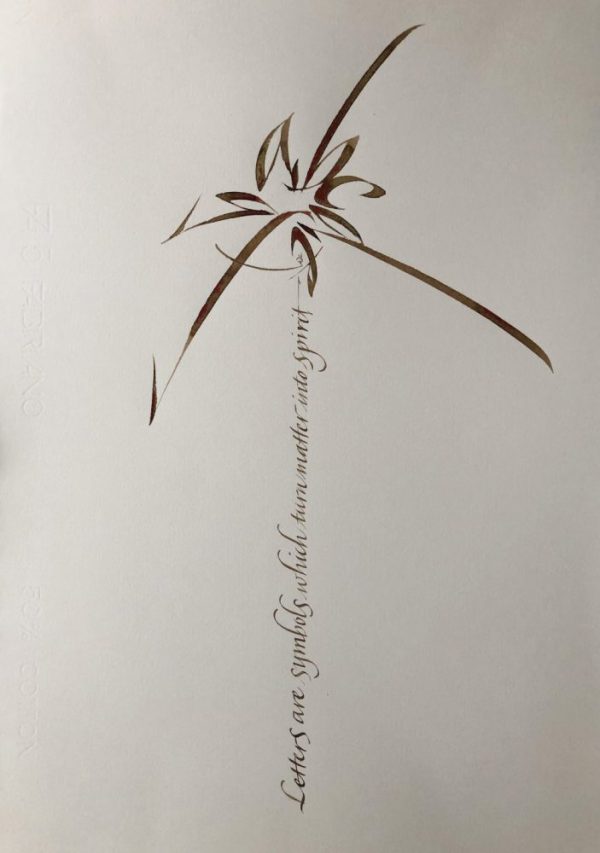
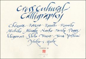
●「異文化の融合によるカリグラフィーの表現」WSレポート 齋藤朋恵
カリグラフィーの異文化融合というテーマに興味をもち参加したワークショップ。最初の日は、Manny先生の数々の作品を見せてもらうところからスタート。
「例えば、同じことをするにしても、場所が違えば、マテリアルも方法も違う。カリグラフィーも一緒で、場所や文化などの背景によって、表現、テクニック様々なものが違う。例えば、西洋と東洋をミックスしてみたらどうなるか、古い技術と新しいテクノロジーをあわせてみたらどうなのかということを試している」と作品を見せながら説明するManny先生。
今回のワークショップでは、東洋的な背景に西洋のカリグラフィーを取り入れていきます。
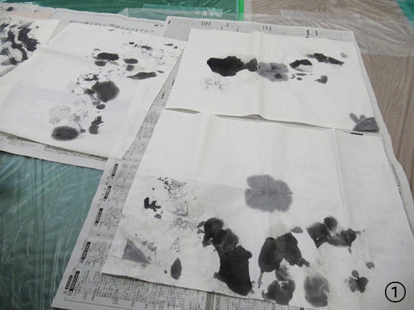
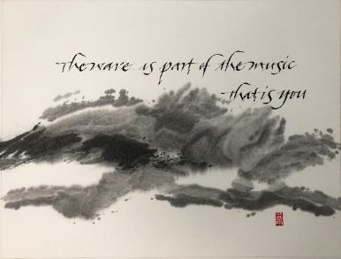
まず、持ってきた和紙に墨で模様をつけていきます。筆もどんなものを使っても良し。墨で濃淡を出しながら、そして、文字を入れるスペースも考えながら模様を書いていきます。筆と和紙と墨で作りだされる独特な模様が非常に興味深かったです。(写真①)
その後、和紙に書いた模様をマットボードに貼り付けます。糊を適量の水で溶き、マットボードに貼り付ける和紙全体を水で湿らせてから、丁寧に刷毛で糊を塗っていきます。塗り終わったら、マットボードに貼り付けます。空気やごみが入らないように細心の注意を払います。
マットボードに貼り付けた和紙が乾くまでの時間に、「書体」の練習をします。
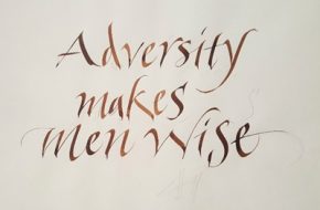
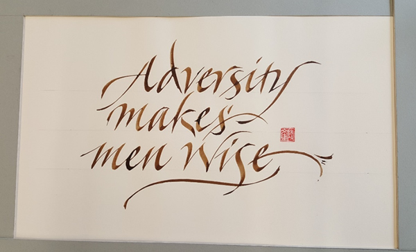
今回の書体は、Bamboo Script(バンブースクリプト)。植物からアイデアを得たManny先生の独自の書体です。まずは、小文字の練習。バンブースクリプトは、aやoの内側のスペースを塗りつぶしてもいいのです。そして、あっという間に一日が終わりました。(写真②)

次の日は、乾燥させたマットボードに、カリグラフィーのペン先で文字が書けるようにマットメディウムを塗布します。マットメディウムを水で薄めて、手早く、ムラなく全体に塗ります。そして、乾燥させている間に書体の練習。大文字、そして作品にする文章を練習します。
先生が書くと植物に見える書体は、私が書くと何だかよくわからない書体になってしまいます。
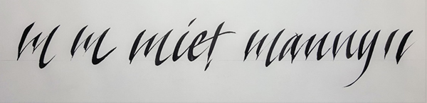
最終日は、マットボードの上に文字を入れ、作品にして、参加者全員の作品をテーブル並べるのですが、何だか私の作品だけ違和感が・・・。(写真③)

ということで、家に帰ってから、ひとりで「バンブースクリプト」に向き合う日々。
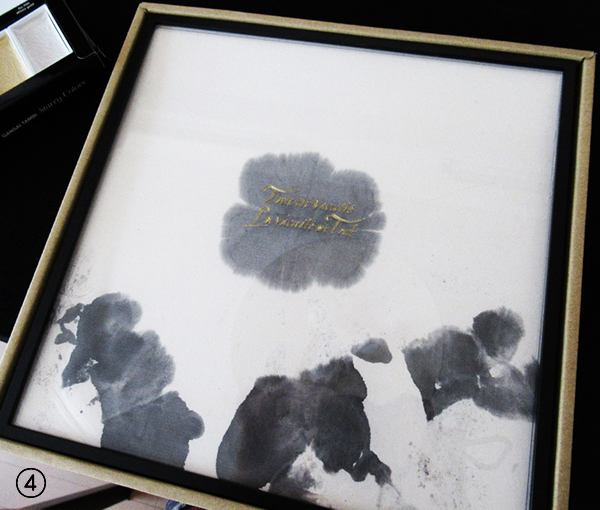
書いても書いても、何だか「これじゃない感」が拭えません。何となく、形になってきたかもしれないと思ったときに、思い切って最後のマットボードに文字を入れてみましたが、やはり、本番と考えると緊張しうまくいきません。再度、和紙をマットボードに貼るところから復習。ワークショップ時の注意事項も聞き流していることが多く、一人で再度やってみると、何だか理解が深まります。失敗したときは、Manny先生の言葉をひとつひとつ思い出しながら作業していきます。やっと、マットボードが出来上がったところで、今度は新しい技術と組み合わせてみようと思い、バンブースクリプトをレーザーカッターで入れてみました。(写真④)
この3日間のワークショップは、本当に有意義で楽しいものでした。Manny先生をはじめ、ワークショップを運営したくださったJ-LAFの皆様、参加者の皆様に、あらためて御礼を申し上げます。本当に、ありがとうございました。
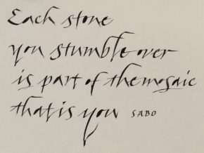
●「Impetuous Italic」WSレポート 林 順子
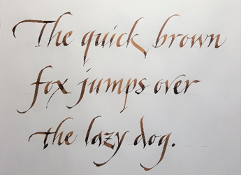
今回参加したWSはImpetuous Italic。緩急をつけたイタリック体の表現、とサブタイトルが付けられていました。「Impetuous」には、衝動的な・激しい・性急なという意味があります。美しく書かれたイタリック体は、ただ美しいだけでなくマニー氏の新たな表現、豊かな表現への欲求と葛藤を経て、スピード感のある即興的に伸び伸びとしたイタリック体へと発展していました。
WSは2日間。初日は、まず基本的なことを押さえてからのストローク練習。
マニー氏は基本的なことを本当に大切にされていて、書く時のポジショニングやツール(オートマチックペン、パラレルペン)の扱い方なども丁寧に説明されていました。書く時のスピードやペン操作、細かな動きのストロークもテーブル毎に説明し、さらに個別にも細やかな指導をして下さいました。
今回のようにフィーリングを生かしたストロークを書く場合は、ペンや紙、インクの相性は勿論ですが、書き手の筆圧やスピードをコントロールすることで、ストロークにも新たな表情が加わります。同じツールを使っていても、マニー氏が書くと、シンプルなストロークもこんなにも表情豊かなストロークになるのかと驚くばかりです。
これまでとは違ったスピード、ペン操作(角度や向き)、ストロークを書く方向の工夫など、新たな表現のストロークを学ぶことができました。
 2日目は、初日に習った文字を繋げていく表現を学び、それぞれが用意した短い文章を、午前中をめどに仕上げることになりました。
また、ペンサイズを小さくして練習、同じ書き方ですが雰囲気が違いますね。
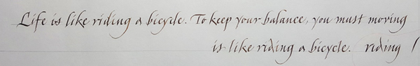
 私が用意した文章をレイアウトしてみたら、縦にmとsが並んでしまいました。文字数も少ないのでレイアウトは変更せず、あえてそのまま、並びが気にならないように変化をつけてみようと思いました。マニー氏にもそのことを伝えてアドバイスを頂きました。
そして、こちらのお手本です。
しっかりとmとsへの変化をつけ、文字間行間のスペースもやや狭くして、全体がまとまるようにフローリッシュラインでバランスを取られていました。
このような文字から繋がっていないフローリッシュラインで大胆にまとめていくやり方も、今後チャレンジしていきたいと思いました。
文字の勢いを止めることなく、そのまま書き進める中で全体のバランスをとっていく、即興的に捉えていく力を発揮していかないといけないと実感しました。
気が付くと、マニー氏がアドバイスした後にレイアウトしたお手本を書いて落款を押すという流れになっており、結果的にマニー氏は参加者全員にそれぞれの短文のお手本を仕上げてくださいました。どのお手本も、まさに即興的に伸び伸びとスピード感のある仕上がりでした。それぞれの文章に向き合う様子は、文字をどう表現しようかと楽しくて仕方がないように感じられ、見ている私たちはどんどんと引き込まれていきました。柔軟に全体のバランスを取り、魅力的な表現でまとめ上げていく、マニー氏のすばらしさに感動しました。
2日間を通して、文字をどのようにして表情豊かにまとめ上げていくのか、それを実践的に示して下さったマニー氏。細やかな気配りでお優しい人柄にも触れ、とても充実したWSとなりました。私も、これからの文字を表情豊かに表現できるように励みたいと思います。
マニー氏、そしてJ-LAFスタッフの皆様、本当にありがとうございました。
最終受付について 2019.03.04
『マニー・リン カリグラフィーワークショップの最終受付について』をNewsのページにアップしました。
受付状況 2019.01.23
『マニー・リン カリグラフィーワークショップ受付状況』をNewsのページにアップしました。
受付状況 2019.01.07
『マニー・リン カリグラフィーワークショップ受付状況』をNewsのページにアップしました。
東京会場決定のお知らせ 2018.12.25
『マニー・リン カリグラフィーワークショップ東京会場決定』をNewsのページにアップしました。
受付状況 2018.12.22
『マニー・リン カリグラフィーワークショップ受付状況』をNewsのページにアップしました。
一般申込み受付スタート 2018.12.17
『マニー・リン カリグラフィーワークショップ一般申込み受付スタート』をNewsのページにアップしました。
受付状況 2018.12.16
『マニー・リン カリグラフィーワークショップ受付状況』をNewsのページにアップしました。
会員申込みスタート 2018.12.10
『マニー・リン カリグラフィーワークショップ申込みスタート』をNewsのページにアップしました。
詳細・申込み要項のご案内 2018.12.3
『マニー・リン「カリグラフィーWS」2019 詳細・申込み要項のご案内』をNewsのページにアップしました。
開催のご案内 2018.11.1
2019年4月にイギリスよりマニー・リンを講師に迎え、ワークショップを開催いたします。
今回は、大阪で2コース(2日間コースを2回)、東京で2コース(3日コース&2日コース)、合計4講座とスライドレクチャーを各1回ずつ開催いたします。ワークショップ4講座は全て内容が異なります。初心者の方から経験豊富な方まで、それぞれに、学びやヒントを得る経験をしていただける内容となっています。
[大阪]
1 Folded Pen Writing (ペンで描くテクスチャーを生かした表現を学ぶクラス)
2 Linz’s Variations & Impetuous Italic–Study of Letter Style(書体を学ぶクラス)
[東京]
3 Cross Cultural Calligraphy(墨・紙・文字を組合せ、洋の東西を超えた作品作りクラス)
4 Impetuous Italic(緩急をつけたイタリック体の表現を学び小作品をデザインするクラス)
※ 東京開催の3のみ、3日間クラスです。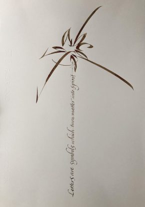
また、マニーが自身の芸術活動の軸としている
「境界を超える」をテーマとした「Crossing Boundaries – The Calligraphic work of Dr. Manny Ling」をスライドレクチャーで見ていただきます。東洋的な感性によるアルファベットの表現、デジタルとアナログなど、相対する表現の世界を垣間見ることができるでしょう。
講座内容及び募集の詳細等については、11月末頃にウェブサイトでお知らせする予定です。
<講師プロフィール>
Dr. Manny Ling マニー・リン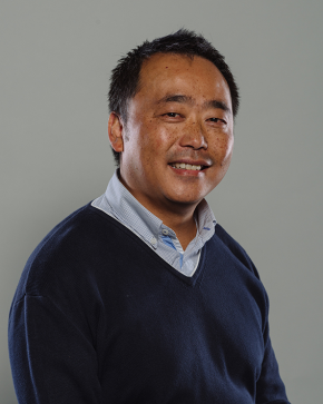
1966年生まれ。イギリスのサンダーランド大学デザイン学科の上級講師として、イギリス、香港、中国で教鞭を取る。紙媒体デザイン、カリグラフィー、レタリング、およびタイポグラフィーデザインを専門とする。イギリスのカリグラフィー会報誌『the EDGE』のデザイン編集者を20年以上に渡り務めた。様々なアーティストや展覧会および地域プロジェクトの出版物デザインを手がけている。彼の作品は世界各国で展示され、多くの出版物に掲載されている。殊に2018年春に香港で開催された個展は、デジタルと手書きのオーバーラップした世界が人々を魅了した。
2008 年に『Calligraphy Across Boundaries』(境界を越えたカリグラフィー)で博士号を取得。同年には、カリグラフィーの促進と発展への貢献に対して、Calligraphy and Lettering Arts Society 名誉フェローの資格が贈られた。IRCC のディレクターであり、数々の国際カリグラフィーシンポジウム、展示、出版のディレクションに携わっている。Typographic Circles と Letter Exchange の正会員。日本のカリグラファーとの交流も深く、2016 年秋には、柿衛文庫(兵庫県伊丹市)で開催された『ワーズワースと芭蕉:歩く詩人』展に出展。2017年11月には、京都にて、サンダーランド大学主催(ジャパン・レターアーツ・フォーラム共催)で開催されたWriting Symposium 2017のオーガナイザー、講師を務めたことは記憶に新しい。
Writing Symposium 2017
西洋のアートとデザインを日常業務とする中国人であることが、彼の生活や芸術表現に深く影響している。彼の作品には、「コントラストと矛盾」というテーマが中心にある。手作りとデジタル、東と西、古いものと新しいもの、勢いと静寂。こういったテーマが彼のカリグラフィー作品の中で表現されている。
<サンダーランド大学講師紹介サイト>
https://www.sunderland.ac.uk/about/staff/design/manny_ling
<2018年香港開催エキジビション>
http://library.ust.hk/exhibitions/manny-ling/
https://www.youtube.com/watch?v=_DjINBCfiOU
 開催日時:2019年4月13日(土)・14日(日)
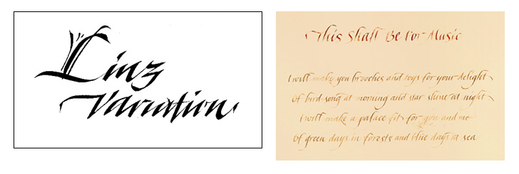
 開催日時:2019年4月19日(金)~21日(日)
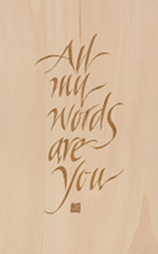 開催日時:2019年4月23日(火)・24日(水)