誠に勝手ながら、2016年12月29日(木)~2015年1月3日(火)まで、メール返信など
の対応業務をお休みとさせていただきます。
ご不便をおかけいたしますが、何卒ご容赦下さいますようお願い申し上げます。
作成者別アーカイブ: Jlaf_staff
ゴードン恵美レターカッティングワークショップ日程変更のお知らせ
東京会場の日程が以下のように変更になりました。
3月18日(土)~20日(月)⇒3月24日(金)~26日(日)
参加を考慮されている皆様にはご迷惑をおかけいたしました。
新日程でのご参加をお待ちしております。
なお、福岡会場の日程は当初の発表通り、3月31日(金)~4月2日(日)で開催いたします。
ゴードン恵美レターカッティング入門ワークショップ2017開催決定
お待たせしました!2017年のレターカッティングワークショップの開催日程が決まりましたのでご案内いたします。
前回の2014年の開催から2年以上期間があきましたが、今回で6回目を迎えるこのワークショップを心待ちにしている方も多数おられると思います。
クラスの詳細と参加者募集については1月上旬に改めてご案内いたします。J-LAFウエブサイトにてご確認ください。
賛助会員の方は優先申込みすることが出来ます。申込開始日までに会員番号が必要ですので、ご入会はどうぞお早めに。
入会手続きはこちらまで https://j-laf.org/join-us
<講師> ゴードン恵美
<開催日程>
東京会場 2017年3月18日(金)~20日(日) →3月24日(金)~26日(日)
福岡会場 2017年3月31日(金)~4月2日(日)
今回は初めて福岡での開催となります。東京、福岡両会場共に初参加の方の募集も行います。
ルカ・バルチェローナ「Take Your Pleasure Seriously」 3回目(最終回)
「Take Your Pleasure Seriously」手書き文字を究める道
---------------------------------------
この記事はルカ・バルチェローナの著書『Take Your Pleasure Seriously』(2012)に 掲載されたものです。
--------------------------------------
うわぁ、
印刷したみたい!
—
ついにできました。今までは私のハードディスクやフラットファイル以外にはちゃんとした保存場所がなく、常に「時代順序が無秩序な」状態で保存されていた私の作品をまとまった形で見られるのです。これまで私はそういう引き出しを開けることになるとついしり込みしてしまい、全部を整理して保存するぞと、繰り返し自分に誓っていました。しかし、データは、少しは移動しても相変わらずそのままで、私が時間をかけて古いスケッチブックに目を通し、それを年代順に分類できるような、なかなか手に入らない平穏な時間を待っていたのです。言うまでもなく、そのような落ち着いた時間はずっとやって来ませんでした。
現在に至るまで、私は古いプロジェクトを分類して整理するより、新しいことに専念するほうが好きでした。こんなふうにして私は、ちゃんとしたウェブサイトやその他の適当な保存場所を持たないという形の上での無秩序に対処してきました。
そしてある日、私は自分のいろんなコレクションをきちんと並べ始め、なんと多くの素材が日の目を見ていなかったかに気付きました。その多くは古びていると思いましたが、それは自分自身の進化に影響を受けた私の見方に過ぎなかったかもしれません。もし5年前の作品を見返して何のあらも見当たらなければ、それはあまり進歩していなかったということでしょう。年数を経て、まるで他人が作った真のヴィンテージもののように思えた作品もありました。かくして、まさにその日、私のすべての作品に具体的な形を与える必要性が心の隅に芽生え、それからその思いは何度も現れるようになりました。
この本(自身の著書『Take Your Pleasure Seriously』)がちょうどよい機会となり、私が過去数年にやったすべてのことを否応なしに振り返って把握することができました。時間的には、私が大変敬服し幸運にも会うことができたカリグラファー達が長い年月を費やした経験に比較しようもありません。それでも、私はその時間を使って、全力で走り、常に新しい作品を制作し、絶え間なく紙とインクを消費しました。そして、いったん立ち止まって何が起こっているか理解する時間もないほどでした。
「まるで印刷のようだ」というコメントを、カリグラファー達は皆、自分の書いた物を見た人達から繰り返し聞きます。そういう人達はたいていどのようにカリグラフィーが実践されているか見たこともないのです。私はそう言われると愉快になります。私だって以前、初めて手書きのレターフォームが載った本を見たときは、そう言ったでしょうし、確かにそう思いました。すべてのカリグラファーにはそれぞれの経験談にも表されている一連の動作があります。文字の世界の外にいる人は、デジタル文字や非の打ちどころのないベクターグラフィックスの完璧さに確かに慣れてしまっています。しかし同時に、平ペンが、一見すると簡単な一連の動作で、見慣れてはいるけれどその起源について考えたこともない文字をいかにして生み出すのかを見て驚くということを、この「まるで印刷のようだ」というコメントをたびたび聞く経験が示していると思います。
カリグラフィーの強みの多くは、特に今日、実演を見るというところにあると私は思います。ですから、私はワークショップではいつもパフォーマンスやビデオ、デモンストレーションを組み入れようと努めています。これらのちょっとした「追加事項」によって、ペンが紙の上を動き、ちょうど良い方法でインクを紙に広げる潜在的な可能性を私が初めて理解した時に感じたのと同じ興奮を、見ている人に起こすのが私の望みなのです。
私は常に、真に上達するには自分の活動に他人を巻き込み、彼らと絶えず連絡を取り合う必要があると思います。ウェブによってこれが可能になり、だれもが自由に作品を見、それにコメントし、ある程度適切に評価することができます。カリグラフィーが私の大半の時間を占めるようになり始めて以来、私はそのとき手掛けていることをネット上に発表することで人と共有することにしました。過去数年の間、私がドラフティングテーブルに向かっている間にも私の作品がウェブ上で世界を駆けめぐっているのを見てきました。わずかな例外といえば、2,3冊の雑誌記事とその他の出版物でしょう。
私はあまり深く考えず思いのままに作品をネット上で発表してきました。考えすぎると、あれで良かったのだろうかと後悔し始めるとわかっているからです。むしろ、新しい作品が完成したらすぐに前もって描いたスケッチやその他のドローイングもアップします。それは、地球の裏側の人が私の作品を即座に見て、おそらく私と同じようにわくわくするかもしれないと思うと、それをすぐに共有せずにはいられなかったと言ってもよいでしょう。時には落胆した人もいるでしょうし、間違った目的のために使った人もいるでしょう。しかし私は気にしませんでした。私は自分が今していることを誰にでも、すべての人に見せるという本能的な欲求を感じました。そして、それこそ私が物ごとの意味を理解し、毎夜熟睡するために必要な事なのです。
私が思い出すのは、ある夜、バーゼルでザンクトガレンの地球儀の複製に携わっていた時のことです。コンピューターを立ち上げ、怖いほどの驚きを感じました。普段は1日200人くらいの人が私の活動を見ているのですが、その日は2000人以上にも達し、途方もない数のメッセージやどんなに頑張っても実現できないような仕事の依頼をもたらしていました。すぐに私はこのような関心はすべて、ある評判の良いタイポグラフィーのブログにアップしたほんの2,3枚の画像から端を発していることに気付きましたが、インターネットのような媒体の信じられないスピードと利便性のおかげで、人生がある一瞬から次の一瞬にどんなに変わるかと考えるとまだ少し震えるくらいでした。私はそのことを大局的に判断しようとしましたが、画像をアップすればするほど日々の依頼が増加しました。タトゥーのデザインを依頼してきた人もいましたし、私がしていることが好きだとだけ書いてくる人もいました。
レター・アーツ・レビュー誌は私の活動についてインタビューと特集記事に16ページを割いてくれましたが、それが出版された時、私は少しうろたえたほどでした。本当に私はこのような知名度に値するほど偉くはないと思ったのです。私は30~40年以上の経験を持つ熟練のカリグラファー達がこれを見てどう思うだろうかと考えました。しかしこの記事を編集したクリストファー・カルダーヘッド は、読者はグラフィティと秩序立ったカリグラフィーの融合にとても興味を持っていると言ってくれました。
その雑誌には、この他にも作品やタグがいくつか掲載されました。それは私が長年にわたって注目し賞賛している質の高い雑誌だったので、誇らしく思いました。このことは、私の作品の美的価値について真の評価をもらったというよりも、むしろ、それまでは薄汚い落書き行為をする輩たちとして、そして適法性の問題や私的財産権の領域と結びついたような、非難されたり表面的にだけ取り扱われたりしているのをたびたび目にしてきたレタリングの一種(グラフィティ)の尊厳を、頑張って取り戻したかのようでした。私の作品についてのその側面はすでに過去のものになっていましたが、それでもなお私は私の歩んできた道を形作った部分としてそれを堂々と認めようと決めていました。そして、物事が元の場所に戻り始めたのはその時からでした。
私は雑誌とウェブ上の両方でたくさんのインタビューに答えてきました。当然、同じような質問には同じような答えになります。例えば、「どんな風に始めたのですか?」という質問には、いつも同じように答えるしかありません。また、タイポグラフィーの冊子『Codex』 の第1号に掲載された記事の最後で「本を出版されますか?」と聞かれた時などは、どのように答えようかということの方に考えが及びました。私は、「まだ誰にもオファーされたことがありませんよ。」と答えました。私自身の怠惰な性格を考えると、決して自分の意志だけでは実現しなかったでしょうから。
そのことがきっかけとなって、前述した作品分類の重要さに直面したまさに翌日、このインタビューの読者の一人が、私が考えているのと同じ基準に沿って本を出版するというプロジェクトを提案して来ました。私は偶然であろうとなかろうと、運命が私達に送るささやかなサインを深く信じます。その結果が、約1年後、皆さんが今手にしているこの本なのです。
思うに、チャンスというのは、乗車するには文字通り飛び乗らなければならないボンジーニョというリオデジャネイロのロープウェイのようなものです。一旦踏み出せば、新しい人々に会え、周りの色や状況が見る見るうちに変わるのを目にします。素早く乗ってしまうと、降りる時にはほとんど気付かないうちにとても豊かな気持ちになっているのです。
ですから私は、文字の形の指導や言葉、精神性、愛、親切、そして友情でここまでの私の旅路を満たし、豊かにしてくれたすべての人に心からの感謝を送ります。私の旅路はといえば、おそらくこれが始まりにすぎないのでしょう。
Luca Barcellona ルカ・バルチェローナ
1978年生まれ。イタリアのミラノにスタジオを持つグラフィックデザイナー、カリグラファー。文字は彼の創作活動において最も重要な要素である。 イタリアカリグラフィー協会にてカリグラフィーの教鞭をとるとともに、アメリカ、オーストラリア、ブラジル、ドイツなど世界各地でワークショップの講師を務める。その活動が示す通り、文字と言葉に関わる伝統的芸術の手書き技術をデジタル時代の表現手段と共存させている。2003年に、ラエ・マルティー二、マルコ・クレフィッシュと、カリグラフィーを含む手書き文字とイラストのライブパフォーマンス集団レベルインクを立ち上げる。2009年には、スイスのカリグラファー、クラウス・ペーター・シェッフェルと共に、スイス国立博物館において、1569年に作られた大きな地球儀を、当時と同じ道具(羽ペン・自然素材で作られたインク)を使った カリグラフィーで、原作に忠実に複製する作業の実現に寄与した。文字のデザイン依頼を受けたブランドとして、Carhartt、Nike、 Mondadori、Zoo York、Dolce & Gabbana、Sony BMG、Seat、Volvo、Universal、Eni、Mont Blanc、Wall Street Instituteなどが挙げられる。また、最近参加した展示には、プラハで開催された『Stuck on the City』、ドイツのCarhartt Galleryで開催された『Don't Forget To Write』がある。多くの個別のプロジェクトへの参加と同様に、彼の作品は多くの出版物に登場している。自身の服飾ブランドLuca Barcellona Gold Seriesを2010年に立ち上げ、最近では初の単行本である『Take Your Pleasure Seriously』を彼自身がメンバーを務めるLazy Dog Press社より刊行している。彼の文字デザインに対する取り組みは、グラフィティの経験から伝統的なカリグラフィーへと導かれ、更に大きな壁に描く ウォールペイント、タイポグラフィーそして活版印刷まで広がっている。
ウェブサイトhttp://www.lucabarcellona.com/
翻訳:深尾全代
清水裕子
“Take Your Pleasure Seriously” by Luca Barcellona -Closing-
The way of handwriting
—
--------------------
This article was originally published in Take Your Pleasure Seriously (2012) by Luca Barcellona.
--------------------
wow,
it looks printed!
—
And it finally is. Now I can see, collected, many of the works that previously had no precise place outside of my hard drives and flat files, where they were stored in a state of constant “chronological disorder.” I often balked at the prospect of opening up those drawers, and repeatedly promised myself I’d organize and archive everything—but there they sat, unchanging even through several moves, awaiting that elusive moment of calm when I’d finally be able to spend hours looking through old sketchbooks and catalogue them according to year. Obviously, that moment of calm never came.
Up until now, I preferred to focus on new projects rather than spend time cataloguing the old ones. That’s how I dealt with the formal disorder of not having a proper website or some other good place to put everything.
Then one day I began laying out a personal collection of sorts, and realized how much material had never seen the light of day: I found that a lot of it looked old, but maybe that was just my perspective, influenced by my own evolution. If you look back at something you did five years ago and don’t have any criticisms, maybe that means you haven’t gone very far. Other things had aged so much that they seemed truly vintage, as if they’d been done by someone else. And so, that very day, the need to give some concrete shape to all the work I’d done sprouted in a corner of my mind, and began popping up again and again.
This book was the perfect occasion, and forced me to look back and take in everything I’d done over the past few years. Time-wise, it was nothing compared to the many years of experience logged by the calligraphers I most admire and have been lucky enough to meet. Nevertheless, I spent that bit of time sprinting ahead, constantly producing new work, ceaselessly consuming paper and ink, and almost never had time to stop for a second and realize what was happening.
"It looks printed” is a comment all calligraphers have repeatedly heard said about their work, usually by people who see them write without ever having seen how calligraphy is practiced. I’m amused when people say that to me. I think I even said it, and certainly thought it, back when I saw books with hand-drawn letterforms for the first time. All professions have their routines, reflected also in their anecdotes. I think that’s symptomatic of the fact that people outside the world of letters are, admittedly, accustomed to the perfection of digital forms and flawless vectors, but are at the same time amazed at how a broad-nib pen can produce, through a series of apparently simple gestures, the same letters they’re so used to seeing, and whose provenance they’d never given any thought to.
I think a lot of calligraphy’s strength, especially nowadays, lies in seeing it done live. That’s why I’ve always tried to incorporate performances, videos, and demonstrations in my workshops. It’s my hope that these little “extras” will spark in viewers the same fire that was lit for me when I first understood the potential of the pen moving across paper, laying down ink in just the right way.
I’ve always believed that, in order to make real progress, you have to involve others in your work, and have constant contact with them. The web makes this possible—everyone is free to access content, comment on it, and judge it in more or less pertinent ways. Ever since writing and calligraphy began to occupy most of my time, I decided to share what I was up to by publishing it online: over the past few years I’ve seen my work circle the globe on the web while I was seated at my drafting table; the sole exception includes a few magazine articles and other print publications.
I’ve always been quite spontaneous about putting things online, knowing that if I gave it too much thought I’d start second-guessing myself. Rather, as soon as I finished a new piece I’d often also post the preparatory sketches and other drawings of it. It was almost as if I couldn’t wait to share what I’d done, thinking about someone on the other side of the planet who’d see it right away, and maybe be as excited about it as I was. Sometimes that someone might have been disappointed, or used it for the wrong ends, but I didn’t care—I felt an instinctual need to show anyone and everyone what I made of the passing time, and that’s exactly what I need to make sense of things and sleep soundly each night.
I remember one evening, when I was in Basel working on a replica of the Saint Gallen Globe, I turned on my computer and was surprised almost to the point of fright: normally, 200-odd people viewed my work on any given day, but that day it had garnered over 2,000 views, which led to an enormous chain of messages and requests for work I could never have fulfilled, no matter how much I wanted to. I soon discovered that all that interest came from just a few images posted on a popular typography blog, but I was still a bit shaken to think how life could change from one moment to the next thanks to the unbelievable speed and user-friendliness of a medium like the Internet. I tried to bring that event into perspective, but the more images I posted, the more daily requests I received: some people asked me to design a tattoo; others just wrote to say they liked what I was doing.
Letter Arts Review devoted an interview and a sixteen-page special to my work, and when it came out I almost felt a bit perturbed. I really wasn’t important enough to be given such visibility, I felt. I thought of all the calligraphers who would see it, professionals with thirty- or forty-plus years of experience, and what they might think. But Chris Calderhead, who edited the article, said the journal’s readers were very interested in the fusion of graffiti and formal calligraphy.
They also published, among other things, some pieces and tags; given that it was a high-caliber magazine I’d followed and respected for quite some time, I was proud of that. It was as if I’d managed to restore the dignity of a type of lettering I’d often seen criticized or covered only superficially, like something related more to the realm of snotty little vandals and questions of legality and private property rights rather than an aesthetic worthy of real judgment. Even though that aspect of my work was already becoming part of the past, I was nevertheless determined to openly recognize it as a formative part of my personal path, and that’s when things began to come full circle.
I gave a lot of interviews, both for print magazines and the web. Naturally, the recurring questions met with recurring answers; for example, the answer to “How did you get started?” can’t but be the same every time. Others—like the one asked at the end of an article published in the first issue of Codex, “Will you make a book?”—made me reflect more on how I wanted to answer. I said that no one had ever made the offer and, considering my laziness, it certainly wouldn’t come about of my own volition.
That led one of the readers, on the very day after the organizational crisis described above, to propose just such a project, following the same criteria I had in mind. I deeply believe in these small signs that fate sends to us, by chance or otherwise. The result, about one year later, is the book you now hold.
I guess some opportunities are like bondinhos, the aerial tramways in Rio that you literally have to jump aboard to catch. Once you make the leap, you can meet new people and watch how quickly the colors and surroundings change. After the quick ride you leave greatly enriched, almost without even realizing it.
And so I send my heartfelt thanks to everyone who has enriched my journey thus far, filling it with their teachings in the form of letters, words, spirituality, love, hospitality, and friendship. As for the journey, perhaps this is just the beginning.
Luca Barcellona is born in 1978. He has his own studio in Milan, where he works as a freelance graphic designer and calligrapher. Letters are the main ingredient of his creations. He teaches calligraphy with the Associazione Calligrafica Italiana and holds workshops and lectures in several cities, as the last one in California and Australia. The means of his work is to make the manual skill of an ancient art as writing and the languages and instruments of the digital era coexist. In 2003 he founded with Rae Martini and Marco Klefisch the collective Rebel Ink, with which he gives life to a live exhibition of calligraphy, writing and illustration. In 2009 he has worked for the National Museum of Zurich, with calligraphist Klaus-Peter Schäffel, to realize the faithful reproduction of a big globe dated back to the 1569, using calligraphy with original materials (quill and natural inks). Among the brands that requested his lettering we can number Carhartt, Nike, Mondadori, Zoo York, Dolce & Gabbana, Sony BMG, Seat, Volvo, Universal, Eni, Mont Blanc, Wall Street Institute. Among his latest collective exhibitions: "Stuck on the City" in Prague, "Don't Forget To Write" at Carhartt Gallery (Germany). As well as taking part to several independent projects his works appeared in many publications. In 2010 he produced his own personal clothing brand "Luca Barcellona Gold Series". He recently published his first monographic book Take Your Pleasure Seriously by Lazy Dog Press, the publishing house which is a member himself. His study into lettering led him to experience from graffiti to classic calligraphy, up to big wallpainting, typography and letterpress printing.
http://www.lucabarcellona.com/
カリグラフィーで書く アコーディオン式クリスマスカード ワークショップ
世田谷区三軒茶屋にある世田谷ものづくり学校で、J-LAF主催(IID協力)カリグラフィーで書くアコーディオン式クリスマスカード講座を開催します。
書いたカードは、折り畳みのアコーディオン型の可愛いカードに仕上げます。
万年筆型カリグラフィーペンのパラレルペンで書いて、お使いのペンはお持ち帰りいただけます。
*世田谷区民は割引があります。
お申し込み、詳細はIID世田谷ものづくり学校まで
日時:10月29日 午後1時半~4時半
受講料: 一般4,000円、世田谷区民3,500円 (材料費込 税込)
定員:10名
講師:NPO法人ジャパン・レターアーツ・フォーラム正会員 伊藤幸恵
この日IID世田谷ものづくり学校にて、ルカ・バルチェローナ ライブパフォ-マンスが開催されます(J-LAF主催)。
こちらもどうぞお見逃しなく。
ルカ・バルチェローナ「Take Your Pleasure Seriously」 2回目(全3回)
「Take Your Pleasure Seriously」手書き文字を究める道
個人的
プロジェクト
—
私は時々、自分の深い欲求に耳を傾けずにはいられなくなることがあります。一日が始まっても、すべてを中断して一人きりになり、ドラフティングテーブルの前に座り、しばらくの間心の中にありながら時間がなくて書けなかった文章を書きたくなるのです。そうすることで気持ちがすっきりして、前に進み、一日に向き合えるのです。
はっきりとした目的がなくても時間を見つけて自分のために何かをするということは、いかなるクリエイティブな仕事をする上でも大変重要です。ここ数年、私のスタジオの仕事量が増大するにつれて、何にも拘束されないで、自分の個人的な活動に費やせる全くの自由時間はますます少なくなってきました。そのことに気づいたとたん、私は仕事のペースを落として自分の好奇心を再発見する時間を見つける必要があると思いました。町や、野外マーケット、まだ訪れたことのない都市の看板などにはアイデアがいっぱいで、外に出てそれを探さなければいけません。ですから私は、例えば、壁いっぱいに文字を書くようなイベントへの参加の招待はたいてい引き受けます。それが自動的に引き金となって、新しい研究、言ってみれば、将来影響を残すであろう何かにつながるのです。望みうる最上の結果は、新しい文字の形を見つけるか、様々な書体間で融合したものを創作することです。なぜなら、ライティングはその性質上、絶えず進化するものだからです。
印刷技術が登場する前の何世紀かの間、カリグラファーは書物に仕える職人と見なされていました。写筆者は必ずしも特別な技術は必要なく、他の人が読めるように書物を単に複製しさえすれは良かったのです。明らかにそれが当時の基準でした。実を言えば、数十年前まで、それと同じ技術が学校で教えられていました。今では信じられないことですが、人々は、博物館の陳列ケースに展示されているマニュスクリプトがどのように作られたのかを学んでいたのです。
いわゆる表現的カリグラフィーや、ルーリングペン(烏口)のような今日私たちが使っている道具類は、フリードリヒ・ポップルや ヴェルナー・シュナイダーのような巨匠やその他多くの人のおかげで知られるようになりました。彼らは、1950年代半ば、それ自体で表現的アートの形としてのカリグラフィーの基礎を構築しました。彼らは、見た目は単に一瞬で行き当たりばったりにも見える、流れるような制御された線の動きで紙面上に道具を走らせることから始めました。彼らが使う道具は平ペンほど緻密ではなく、(書く道具としては)より未発達なものでしたが、すべてが文字の成り立ちについての深い知識をもってなされていました。
出来るだけたくさんの歴史的書体を知り、加えて絶え間なくトレーニングをし、好奇心と自発性を持ち続ければ、自分自身のスタイルだと認識できる(待ち望んだ)瞬間に到達出来ます。「あなたがそれをやったの?そう思いましたよ!」と誰かに言われるやいなや努力は報われます。何年もかかるかもしれませんが、それだけの時間をかける価値のある道のりなのです。また自分の作品を、達人、自分の前を進んできたすばらしいカリグラファー達の作品と比較して、自分の技術レベルを大局的にとらえることも重要です。真に独自の表現方法は皆、いつも、その作者の背景や受けた影響を表しています。あなたの仕事を判断する人がそのことに精通していなければ、あなたを腕のある人だと思いがちです。それはあなたの自尊心を高めてはくれますが、良いカリグラファーを生みだしはしません。
私は、新しい作品に取り掛かるときはいつも、なんて何も知らないのだろう、学ぶことがなんて多いのだろうと気づきます。何百種類もの紙やインクがあり、与えられた文章にはどの道具や文字のスタイルが最適だろうかと考えます。やる気や、直感、知識がすべて合わさって、熟練した手が動くのです。それぞれの紙には最適のペンやインクの濃さがあります。大きな壁面では、課題が増大します。空間認識は、小さな紙の上で作業するする時とは全く違います。後ろに下がって、寸法を目測し、(時には何回も)はしごを上り下りしていると、体中が何日も続けて痛みます。時には、自分の目を信じるだけでよいこともあり、それですべてがきちんと釣り合いがとれるように出来れば2倍の満足感が得られます。
私は、罫線を引くことに関して怠慢なことで目が訓練されて、罫線なしで書けるようになりました。最初はすべての単語がうまくおさまるかどうか分かりません。ちょうどよいサイズの筆を選び、必要に応じて字を詰めたり広げたりしなければなりません。あるいは、事前に参照物を用意し、レイアウトを投影したり、文字を鉛筆でトレースすることも出来ます。ひとつ確かなことは、実は段取りをすればするほど、新鮮さが減ってしまうということです。私は最近気づいたのですが、失敗したり、紙を汚したり、ぼんやりして1文字忘れたりしても、最終的にはそういうことは何も悪くないのだということがわかる楽しみを再発見しました。
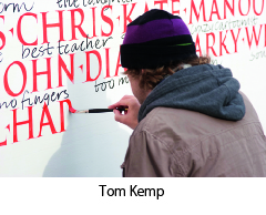
私は、作品をレタッチすること、言ってみれば、私たちの本来の姿ではない完璧さを求めることを強制されていると感じるのは大嫌いです。それは、そこから自分を自由にしようとする欲求なのです。幅何メートルものイラストを描けば、ほんの少しオリジナルスケッチから変更しても誰も気づかないでしょう。しかし、もし字が曲がっていたら、気づくでしょう。ですから、私たちは「空間のアーティスト」(artists of emptiness)でなければならないのです。これはトム・ケンプ のすばらしいワークショップで彼から学んだことです。「無」(the nothing)はすでにそこに、つまり文字と文字の間の空間にあり、テキスト上では文字そのものより重要なくらいです。文字は完璧である必要はないのですが、文字間のスペースこそが調和がとれ、少なくとも説得力がなければなりません。
ルドルフ・コッホの福音書のことを思い出します。その非常に美しいページはひと文字ずつ見ると、ゆがんでばらついて見える文字で出来ています。しかしながら、その、文字がぎっしり書かれたページは生き生きとしていて調和が取れて見えるのです。ですから、もう一度言いますが、最も大切なことは、作品全体なのです。
また、何を書くか、内容も考慮しなければなりません。時には、文章の方からやって来ることがあります。先日、私はフィレンツェで壁に字を書かなければならなかったのですが、何を書くか決めかねていました。地元の書店でジョージ・オーウェルの本を見つけたのですが、その背表紙が書棚の他のすべての本より目立っていました。私は、その本を手に取り、タイトルを見ました。『Why I Write』(私が書く理由)。これだ、と思いました。カバーの宣伝文が、政治的な言葉づかいの、二枚舌で不誠実な性質について語っていました。これはその時の私にぴったりで、私はそれを書くことに決めました。テキストの選択はとても個人的な行為です。私は頑固な無神論者なので、いつも聖典や聖書の引用文は避けてきました。しかし、それらはカリグラフィー作品の最もよく使われる内容であり、技巧的に制作される作品でもあるのです。陳腐な表現に陥ったり他人のものばかり引用するのを避けるのは難しいことですが、本当に自分のもの、自分の一部分、そして人生の中で鍵となった瞬間にその場にあったことを書くのが大切だと思います。例えばほとんど無名の作詞家の歌の一節でもいいのです。そうすれば、自分の作品と共にその音楽も広める手助けが出来るでしょう。
何も書かれていない紙への恐怖心を克服する方法がひとつだけあります。それにまっすぐ向き合い、黒いマークから始めるのです。そうすれば、そのマークがきっと着地点を見つけるでしょう。そしてきっと、学ばなければならないこともまだまだあることでしょう。
カリグラフィーを教えること:
自分も学ぶということ
—
私が初めて実際にカリグラフィーと触れたのは、1999年、イタリアカリグラフィー協会(Associazione Calligrafica Italiana)でした。その協会のことは、当時運営チームの一員だったフランチェスカ・ガンドルフィを通して知りました。インターネットはまだ普及しておらず、情報は、その活動や開設コースが掲載されたチラシの形で届きました。私はすでに独学でカリグラフィーをやっていましたが、このような熟練カリグラファーが、まさに私の地元にいることを発見し、最初にフランチェスカ・ビアゼットーンのイタリック体のコースを受講した時、私にとって全く新しい世界が開けました。
私の取り組みは、依然として、ペン字の訓練というより、グラフィティと強く結びついたものでした。明らかに、その2つの間に大きなギャップ、特に世代間ギャップを感じていました。それでいて、グラフィティライターとカリグラファーはどちらも、方向はしばしば反対ですが、同じレターフォーム(文字の形)に対する情熱によって突き動かされています。いずれにせよ、私は、この2つの世界のつながりを見つけたいと思っていましたし、そのためには古典的なカリグラフィーの様式を深く掘り下げて探求しなければならないことが分かっていました。ですから、出来るだけ多くのコースを取り、歴史的な書体を勉強し、自分のツールキット内の道具やその使い方を多様化させました。
幸運にも、私は、類いまれな独自性を持った偉大な先生たちに出会うことができました。ジョヴァンニ・デ・ファッチョはとても純粋で無尽蔵の資質を持つ真の「ルネッサンス人」です。私は彼から、ゴシックレタリングやその表現上の可能性について多くを学びました。彼の贅沢でクリエイティブなワークショップは忘れがたく、時を超越した雰囲気がありました。イタリアのカリグラフィーの第一人者であるアンナ・ロンキは、厳密さと信じられないような軽やかさがにじみ出るチャンセリー体(イタリック体)を書きます。そして、彼女はペンを走らせて、決して大げさでも場違いな感じでもないエレガントなフローリッシュを生み出します。彼女の特徴は文字と伝統につての深い理解であり、また、掘り下げた効果的な教授法です。彼女は常に第一線で自分のカリグラフィーの考えを守り、ここ数年は、最新の手法を通して学校にハンドライティングを取り戻すという難しい任務を引き受けています。ジェイムズ・クラウ は私に町のいたるところで見つかる文字、歴史をしっかり宿す文字への好奇心を教え込んでくれました。私がよく道路の真ん中で立ち止まり古びた看板の写真を撮るのは彼のせいです。彼はとても魅力的な人で、記憶に残るレッスンを情熱的に進めますが、一方で、遠慮のない正直さで建設的な批判も行います。ルチオ・パッセリーニのおかげで、凸版印刷や、木版印刷、そして質量ともに「良い時間」の価値を正しく理解するようになりました(彼のスタジオが「良い時間」と呼ばれているのには理由があります)。これが本を印刷するには必要なのです。
私が知るようになったカリグラフィー界は多くの卓越した人々で構成されており、その中にはイヴァナ・トゥバロや フランチェスコ・アスコリ、 アンナ・スケッティン、 イヴァノ・ジゾッティ、 マルコ・カンペデッリなどがいます。彼らはそれぞれ、何年にもわたって、確固たる情熱を持ち、懸命に、また、積極的に関与することでカリグラフィーやタイポグラフィーに貢献してきました。イタリアカリグラフィー協会は1991年に創設されました。この協会は、高いクオリティーのカリグラフィー、つまり、20世紀初頭のエドワード・ジョンストンから現在まで受け継がれているカリグラフィーを、イタリアのグラフィックデザインおよび広告界にもたらすことに重要な役割を果たしましたが、それは、まずミラノから始まり、ほうぼうへと広がりました。この協会のサポートがなければ、私は、巨匠達から直接、こんなにたくさんのことを学ぶ機会は持てなかったでしょう。
その創設者達は、イタリア国内で教える前に、イギリス、ベルギー、アメリカといった海外で学びました。彼らは、帰国すると、ハンス・ヨアヒム・ブルゲルトやトーマス・イングマイア、ハッサン・マスディ、 クラウス・ペーター・シェッフェル 、トム・ケンプ、ユアン・クレイトンなどのカリグラファーを招聘しました。彼らのコースはいつも、熱心で資金を他に頼らないボランティアによって運営されています。その後現れた団体も同様の活動をし、同じようにカリグラフィー界に大きな貢献をしました。その中には、トリノにピエロ・デ・マッキや マッシモ・ポレッロが率いるカリグラフィーグループが複数、ローマにモニカ・デンゴが運営するグループがあり、そしておそらくその他にも私が個人的にはまだなじみのない団体がたくさんあるでしょう。彼らの努力がなければ、今日、イタリアでカリグラフィーについて語ろうとすると、誰もがゼロからカリグラフィーとは何かを説明しなければならないでしょう。
私が初めて教えるよう依頼されたとき、うまくいくという自信が十分あったわけではありませんでした。2、3ヶ月かけて、フラクトゥール体のコースを準備し、どんな授業になるか心配でした。そんな私の心配に反して、クラスはとてもうまくいき、多くのコースが後に続くことになりました。最初に気づいたことは、生徒に教えるためには、カリグラフィーをするという純粋な喜びをどうやって伝えるかを知っていなければならないということです。そのためには、十分な寛大さとエネルギーが必要です。なぜなら、ワークショップが終わる頃には疲れ果ててしまうからです。時間がたてば、自分自身の教授法が確立します。そして、同じことを繰り返すのではなく、新しい主題を提示できるように違った角度からの研究をして、生徒の興味、そして、何よりも自分自身の興味を再び引き出していくようにしなければなりません。
私はいつも、それぞれのコースの参加者の多様性に驚きます。好奇心の強いアマチュアから、熱心なグラフィティライター、愛書家、インク壺にノスタルジーを感じる女性、若い頃指で机をこつこつたたいていた女性教師、船乗りのように毒づくタトゥーアーティスト、そして、キーボードにうんざりして再びペンを持ちたくなったジャーナリストにいたるまで様々です。そして、私のコースは学生や新進気鋭のグラフィック・デザイナーといった、かなり若い人が増えてきていることも注目すべきことです。教えることは明らかに、特権的に与えられた学ぶ機会でもあります。そして、教えに行くことがなければ見られなかったような所を旅する機会だけでなく、新しい人出会い、新しい友と知り合う機会も得られるのです。
書くということは、ほかの学習訓練と同じように、受け継いでいく限り存在し続けます。教えるということは、自分がスタートしたのと同じ道を進む可能性を人にも与えることを意味します。それは、一周して元に戻るということです。カリグラフィーは遠くからやって来て、特にイタリアでは深いルーツを持つアートです。カリグラフィーの現在(特にデジタル時代における)や、願わくば長い未来をたどっていけるように、皆さんはその歴史や過去を知りたいと思うに違いありません。
--------------------
この記事はルカ・バルチェローナの著書『Take Your Pleasure Seriously』(2012)に 掲載されたものです。
Luca Barcellona ルカ・バルチェローナ
1978年生まれ。イタリアのミラノにスタジオを持つグラフィックデザイナー、カリグラファー。文字は彼の創作活動において最も重要な要素である。 イタリアカリグラフィー協会にてカリグラフィーの教鞭をとるとともに、アメリカ、オーストラリア、ブラジル、ドイツなど世界各地でワークショップの講師を務める。その活動が示す通り、文字と言葉に関わる伝統的芸術の手書き技術をデジタル時代の表現手段と共存させている。2003年に、ラエ・マルティー二、マルコ・クレフィッシュと、カリグラフィーを含む手書き文字とイラストのライブパフォーマンス集団レベルインクを立ち上げる。2009年には、スイスのカリグラファー、クラウス・ペーター・シェッフェルと共に、スイス国立博物館において、1569年に作られた大きな地球儀を、当時と同じ道具(羽ペン・自然素材で作られたインク)を使った カリグラフィーで、原作に忠実に複製する作業の実現に寄与した。文字のデザイン依頼を受けたブランドとして、Carhartt、Nike、 Mondadori、Zoo York、Dolce & Gabbana、Sony BMG、Seat、Volvo、Universal、Eni、Mont Blanc、Wall Street Instituteなどが挙げられる。また、最近参加した展示には、プラハで開催された『Stuck on the City』、ドイツのCarhartt Galleryで開催された『Don't Forget To Write』がある。多くの個別のプロジェクトへの参加と同様に、彼の作品は多くの出版物に登場している。自身の服飾ブランドLuca Barcellona Gold Seriesを2010年に立ち上げ、最近では初の単行本である『Take Your Pleasure Seriously』を彼自身がメンバーを務めるLazy Dog Press社より刊行している。彼の文字デザインに対する取り組みは、グラフィティの経験から伝統的なカリグラフィーへと導かれ、更に大きな壁に描く ウォールペイント、タイポグラフィーそして活版印刷まで広がっている。
ウェブサイトhttp://www.lucabarcellona.com/
翻訳:深尾全代
清水裕子
“Take Your Pleasure Seriously” by Luca Barcellona -2-
「Take Your Pleasure Seriously」The way of handwriting
personal
projects
—
I occasionally feel a deep need I can’t help but heed: I start my day and just want to shut it all down, isolate myself, sit down at the drafting table and write out the sentence I’ve had in mind for awhile, the one I’ve never had time to write. That makes me feel better, and I can then move on and face the day.
Finding the time to do something for yourself, with no precise aim, is vitally important in any creative line of work. Over the past few years, as my studio work has intensified, the utterly free, unfettered moments I’ve been able to devote to my own personal work have grown increasingly rare. As soon as I realized that, I understood that I needed to slow down and take the time to rediscover my curiosities. So many ideas are out there—on the streets, in open-air markets, in the signs of cities you haven’t been to yet—and you have to go out and look for them. That’s why I usually accept invitations to participate in events that, for instance, call on me to write across an entire wall; it’s like an automatic trigger to do new research, something that will leave its own mark. The best you can hope for is to find new forms of lettering, or create a fusion between various styles, since writing is, by its very nature, in a continuous state of evolution.
In past centuries, before the advent of printing, most people conceived of the calligrapher as an artisan at the service of the text. Copyists didn’t necessarily need any special skills, they just had to reproduce the texts in such a way that others might read them. Obviously, that was the norm back then; truth be told, up until a few decades ago those same skills were taught in schools—it’s hard to believable now, but people used to learn how the manuscripts on view in museum vitrines were made.
So-called expressive calligraphy and the instruments we still use today, like ruling pens, are known in part thanks to masters like Friedrich Poppl, Werner Schneider, and many others who, in the mid-fifties, laid the foundations of calligraphy as an expressive art form in its own right. They began by moving across the page with fluid, controlled gestures that only appeared quick and casual; their instruments were less precise and more rudimentary than nib pens, but everything was done with a deep knowledge of how letters are made.
Knowing as many historic styles as possible, plus constant training and a dose of curiosity and initiative, can lead to the (hoped-for) moment in which your own style becomes recognizable. The hard work pays off as soon as someone asks, “Did you do that? I thought so!” It can take years, but it’s a long road well worth the haul. It’s also essential to compare your work and keep your skill level in perspective by measuring it against the masters, the admired calligraphers who came before. Any truly personal style invariably shows its maker’s background and influences. It’s easy to think you’re good if those judging your work aren’t familiar with the subject; that can boost your self-esteem, but it doesn’t make for a good calligrapher.
When I approach a new piece, I always realize how little I know and how much
I have yet to learn. There are hundreds of different kinds of paper and ink: what instrument and what style will be best suited to the given text? A combination of motivation, instinct, and knowledge all come together to move the trained hand. Each paper has its own ideal pen, its own ideal ink dilution. On large walls, the challenges multiply: the perception of space is entirely different from the one you have when working on a small page, you have to step back, take measurements, go up and down a ladder (sometimes over and over again), and your whole body aches for days on end. Sometimes you can also just trust your eye, and then you get twice the satisfaction if you manage to keep everything straight and in proportion.
My own laziness with regard to ruling lines led me to train my eye so I can do without it. You can’t know, at first, whether all the words will fit; you have to choose the right brush size, and condense or expand things as necessary. Or you can set up a reference in advance, projecting the layout or tracing the letters in pencil. One thing’s for sure: the more construction underneath it all, the less fresh it will feel. One of my own recent finds was rediscovering the pleasure of making mistakes, of messing up the page or absentmindedly forgetting a letter, and ultimately understanding that there’s nothing wrong with that.
I hate feeling forced to retouch a piece or attempt a perfection that simply isn’t in our nature—that’s a need I aim to free myself from. If you do an illustration many meters wide, no one will notice if you change it a bit from the original sketch. But if your writing is crooked, everyone will notice. So we have to be “artists of emptiness,” as I learned from Tom Kemp in one of his amazing workshops. The nothing is already here, in the emptiness between the letters, and in a text it’s almost more important than the letters themselves: they don’t have to be perfect, but the space between them does have to be harmonious, or at least convincing.
Rudolf Koch’s Gospel books come to mind; their exquisitely beautiful pages are made up of letters that appear distorted and loose when looked at one by one. And yet those dense pages of writing appear lively and harmonious. So the most important thing, again, is the work as a whole.
You also have to consider the content—what to write. Sometimes a text comes to you. A while ago I had to write a wall in Florence, but hadn’t yet decided what. I found a book by George Orwell in a local bookstore, its spine stuck out from all the others on the wall. I took it out and looked at the title: Why I Write. That’s it, I thought. The blurb on the cover spoke of the duplicitous, false nature of political lingo. It was perfect for me at the time, and I decided to write it. Choosing a text is a highly personal act: as a staunch atheist, I’ve always steered clear of sacred texts and biblical quotations, but they’re some of the most common content of calligraphic work, even skillfully executed pieces. It’s hard to avoid falling into cliché or constantly quoting others, but I think it’s important to write something that’s truly yours, that’s a part of you and has been there at key moments in your life. It could be a line taken from a song, maybe by a little-known songwriter—in which case you’d help spread the music as well as your own work.
There is only one way to overcome the fear of the blank page: face it head-on, and let a black mark make its start, certain that it will find its end. Certain, too, that there’s still so much more to learn.
teaching calligraphy:
coming full circle
—
My first real contact with calligraphy was through the Associazione Calligrafica Italiana (ACI, the Italian Calligraphic Association) in 1999. I’d heard about it through Francesca Gandolfi, who was part of its administrative team at the time. The Internet wasn’t yet widespread, so info arrived in a flyer showcasing their activities and course offerings. I was already doing calligraphy as an autodidact, but when I discovered that there were such expert calligraphers—in my hometown, no less—and I took my first course on Italic lettering with Francesca Biasetton, a whole new world opened up for me.
My approach was still more closely tied to graffiti writing and bombing the streets than to the discipline of the nib. Obviously, I felt a huge gap between the two, not least a generational gap. And yet both graffiti writers and calligraphers are driven by the same passion for letterforms, albeit in often diametrically opposed ways. In any case, I wanted to find a connection between these two worlds, and in order to do that I knew I’d have to delve deeply into classic calligraphic styles. So I began taking as many courses as I could, studied historic scripts, and diversified the instruments in my toolkit and the way I deployed them.
I was lucky to have had great teachers, each with their own irreplaceable peculiarities. Giovanni De Faccio is a veritable Renaissance man—a highly genuine, inexhaustible resource: I learned a lot from him about gothic lettering and its expressive potential; his rich, creative workshops were unforgettable, and had an almost timeless atmosphere. Anna Ronchi, one of Italy’s leading calligraphers, writes a chancery that exudes the rigor and incredible lightness with which she moves the pen to create elegant flourishes that are never exaggerated and never feel out of place; her specialty is a deep understanding of letters and traditions, as well as an in-depth, effective teaching method. She’s always on the front lines, defending her idea of calligraphy, and over the past few years has taken on the difficult task of bringing handwriting back into the schools through up-to-date programs. James Clough instilled in me a curiosity for letters found all around the city, letters that fully inhabit their own history; it’s his fault that I often find myself stopping in the middle of the street to photograph an old sign. He’s outrageously likable, and enthusiastically conducts memorable lessons while also dispensing constructive criticism with plainspoken honesty. Thanks to Lucio Passerini I learned to appreciate letterpress, blockprinting, and the value of the good time—both qualitative and quantitative (there’s a reason his studio is called Il Buon Tempo)—it takes to print a book.
The world of calligraphy I came to know consists of many exceptional people—including Ivana Tubaro, Francesco Ascoli, Anna Schettin, Ivano Ziggiotti, Marco Campedelli, and many others—who for years now have made their own contributions to calligraphy and typography with unwavering passion, hard work, and active participation. ACI was founded in 1991: this association played a significant role in bringing high-quality calligraphy—the kind of calligraphy passed on to us from Edward Johnston in the early twentieth century—to Italian graphic design and advertising, starting in Milan and spreading far and wide. Without ACI’s support I probably wouldn’t have had the opportunity to learn as much as I did, directly from the masters.
Its founders studied abroad—in England, Belgium, and America—before teaching in Italy. Upon returning they invited calligraphers like Hans Joachim Burgert, Thomas Ingmire, Hassan Massoudy, Klaus Peter Schäffel, Tom Kemp, Ewan Clayton, and others to come and teach as well. Their courses have always been organized by dedicated, self-financed volunteers.The associations that sprung up afterward worked similarly, and made a similarly great contribution to the field. They include the calligraphy groups in Turin led by Piero De Macchi and Massimo Polello, one in Rome run by Monica Dengo, and probably many others I’m not yet personally familiar with. Without their hard work no one in Italy would be talking about calligraphy today without having to start from scratch and explain what it is.
When I was first asked to teach, I wasn’t completely convinced I’d be able to pull it off. I spent a couple months preparing a course on Fraktur, and worried about how it would turn out. Contrary to my fears it went really well, and many other courses followed. The first thing I realized was that, in order to teach, you have to know how to pass on to students the sheer pleasure of practicing calligraphy; it takes major doses of generosity and energy, because at the end of a workshop you feel almost entirely drained. Over time you also develop your own teaching methods, and you have to make an effort not to repeat yourself, instead undertaking different lines of research so as to offer new subjects that reignite people’s interest—and, above all, your own interest.
I’ve always been struck at the diversity of participants in each course: they range from curious amateurs to dedicated graffiti writers, bibliophiles, women nostalgic for the inkwells and knuckle-rapping schoolmarms of their youth, tattoo artists who swear like sailors, and journalists tired of the keyboard who want to take up the pen again. I should also note that my courses are increasingly filled with fairly young people—a lot of students and budding graphic designers. Teaching is definitely a privileged opportunity for learning, too; it gives me the chance to travel and see places I otherwise might never have seen, as well as meet new people and, often, new friends.
Writing, like any other discipline, exists as long as it’s passed on; teaching means giving others the possibility of venturing down the same paths that allowed me to get my own start. It’s like coming full circle. Calligraphy is an art that comes from afar, and has deep roots—especially in Italy. You have to want to know its history and past in order to be able to follow its present (especially in the digital age), and hopefully its long future.
--------------------
This article was originally published in Take Your Pleasure Seriously (2012) by Luca Barcellona.
Luca Barcellona is born in 1978. He has his own studio in Milan, where he works as a freelance graphic designer and calligrapher. Letters are the main ingredient of his creations. He teaches calligraphy with the Associazione Calligrafica Italiana and holds workshops and lectures in several cities, as the last one in California and Australia. The means of his work is to make the manual skill of an ancient art as writing and the languages and instruments of the digital era coexist. In 2003 he founded with Rae Martini and Marco Klefisch the collective Rebel Ink, with which he gives life to a live exhibition of calligraphy, writing and illustration. In 2009 he has worked for the National Museum of Zurich, with calligraphist Klaus-Peter Schäffel, to realize the faithful reproduction of a big globe dated back to the 1569, using calligraphy with original materials (quill and natural inks). Among the brands that requested his lettering we can number Carhartt, Nike, Mondadori, Zoo York, Dolce & Gabbana, Sony BMG, Seat, Volvo, Universal, Eni, Mont Blanc, Wall Street Institute. Among his latest collective exhibitions: "Stuck on the City" in Prague, "Don't Forget To Write" at Carhartt Gallery (Germany). As well as taking part to several independent projects his works appeared in many publications. In 2010 he produced his own personal clothing brand "Luca Barcellona Gold Series". He recently published his first monographic book Take Your Pleasure Seriously by Lazy Dog Press, the publishing house which is a member himself. His study into lettering led him to experience from graffiti to classic calligraphy, up to big wallpainting, typography and letterpress printing.
http://www.lucabarcellona.com/
ルカ・バルチェローナ カリグラフィーワークショップ一般申込みスタート
7月28日(木) 22:00より、ルカ・バルチェローナ カリグラフィーワークショップの一般申込みをスタートします。
先日ご案内いたしました通り、「ブラックレター」「ルーリングペンバリエーション」の2つのワークショップについては、お申し込み多数のため、7月23日で受付を締めきらせていただきました。
ライブパフォーマンスについては、まだ定員まで充分に余裕がございます。
多くのみなさまからのお申込みをお待ちしております。
ライブパフォーマンスの申込みは定員一杯になりましたので締め切らせていただきました。
■ライブパフォーマンス
講師によるライブパフォーマンスと直接の交流をお楽しみください。
開催日時:2016年10月29日(土)
18:00~19:30
開場:17:30
会場:IID世田谷ものづくり学校 1階
IID Gallery + ULTRA LUNCH
http://setagaya-school.net/
定員:100名
参加料:2,000円(ワンドリンク付き)
★和英通訳の方のサポートが付きます。
※ライブパフォーマンスへの参加申込みは、ワークショップへの参加とは別の取扱いとなります。 ワークショップと合わせてお申込みの場合にも、参加料がかかります。ご注意ください。
■締切り日
2016年8月31日(水) 24:00まで
受付の状況は、J-LAFのウェブサイトにて随時アップデートいたします。
締切日以降に定員に空きがある場合には、その後の申込みも受付けます。空きの有無はJ-LAF ウェブサイトでお知らせします。
【ご報告】ルカ・バルチェローナ カリグラフィーワークショップ受付状況
7月21日22:00より優先受付を開始いたしましたルカ・バルチェローナ カリグラフィーワークショップの受付状況をご報告いたします。
2つのワークショップは、非常に多くの方からのお申込みをいただき、7月22日現在、既にキャンセル待ちの状況です。
ルーリングペン・バリエーション:キャンセル待ち2名
ブラックレター:キャンセル待ち12名
一般受付の開始前ではございますが、2つのワークショップにつきましては、この告知を以って、受付を終了させていただきます。
ご了承ください。よろしくお願いいたします。
ライブパフォーマンスの受付状況は、37名受付済み(7月22日現在)です。
定員は100名ですので、まだ余裕がございます。定員まで受付を継続して参ります。
お申込みをお待ちしております。
ライブパフォーマンスの申込みは定員一杯になりましたので締め切らせていただきました。
よろしくお願いいたします。
ワークショップ担当:久賀