作成者別アーカイブ: J-LAF

WOR(L)DS PROJECT REPORT- BEACH CALLIGRAPHY

- BEACH CALLIGRAPHY -

Andrew van der Merwe

WOR(L)DS in general
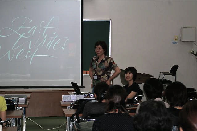
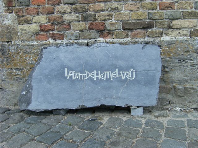
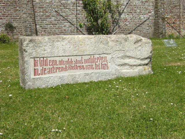
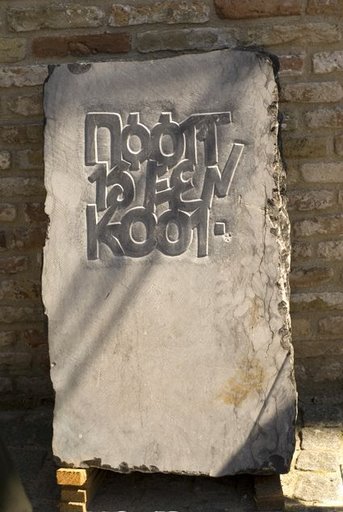
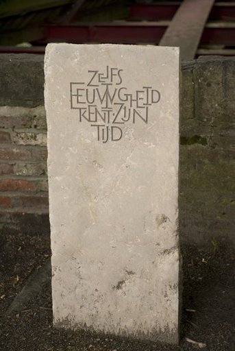
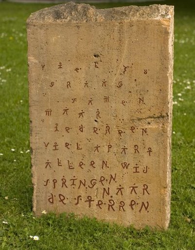
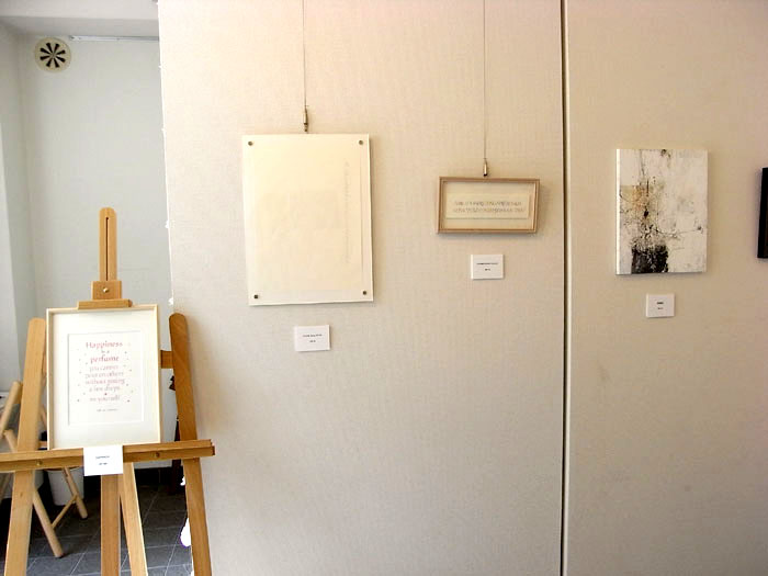
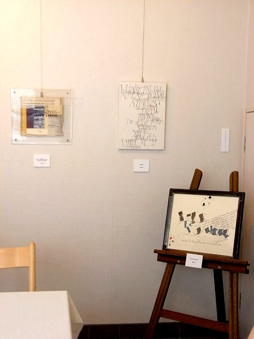
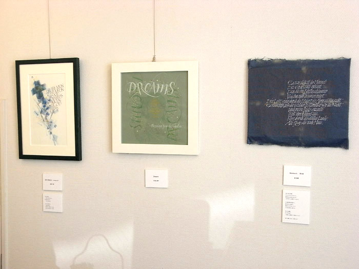
This calligraphy project, brainchild of stone-carver Maud Bekaert, has a number of components, the most important being the stones, designed by South Africans and carved by Belgians, which were auctioned on 28 September with the proceeds going to Breadline Africa and Sprinkle, for the benefit of children orphaned by the Aids epidemic here. The auction was very successful, raising 61 250 Euro (about 715,000 ZAR / 85,150 USD). Sprinkle, under the leadership of, Chantal de Maeyer, is building a much-needed orphanage in the Drakensberg area, and Breadline has a number of orphanages under its wing. Bev Gillespie, who is a member of both the Cape Friends of Calligraphy and Breadline Africa, has played a pivotal role in organising the event and how the funds are to be distributed. It was she who introduced Maud to some of the orphanages which they are dedicated to helping. Other components of the WOR(L)DS event include exhibitions of work by South African calligraphers at Manna and Symposion, and the beach calligraphy show. The beach calligraphy event was intended to enhance the interest in WOR(L)DS and to help with some of the fund raising.

This is a personal report on my beach calligraphy in general and how this, my first major event, worked out.
The stone auction on YouTube(YouTube)
http://www.youtube.com/watch?v=mxr9RkVRJJA
http://www.youtube.com/watch?v=wn5VfmjCYQw

sp0810_01sp0810_02sp0810_03

Beach calligraphy back ground

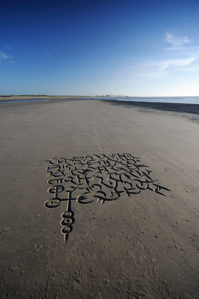
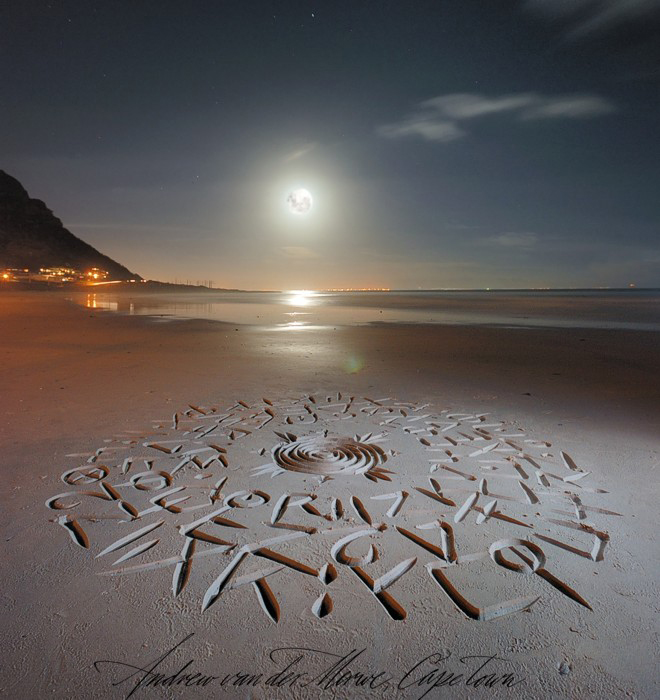
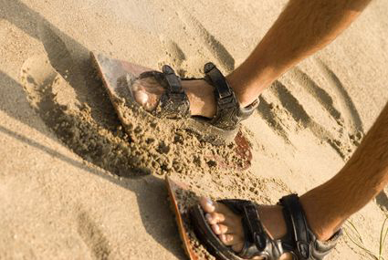
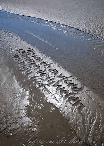
I am a professional calligrapher and have freelanced in Cape Town, South Africa for about 15 years. (for more background info seehttp://www.writtenword.co.za/home_about.htm ) I also surf, and doodling on the beach has always been an enjoyable outlet for me. Scratching in the sand with a stick, however, has proved less than satisfactory because it makes more of a mess than a mark. This has led me, over the past seven years, to develop various instruments which mark the sand in less messy ways, and ultimately to a kind of scoop which leaves neat V-cut letters of the sort one gets in stone carving.

My casual doodling on the beach received a boost in 2004 when a workshop I held for the Cape Friends of Calligraphy was covered by a major local newspaper as well as national television. It was received with great curiosity and enthusiasm. After that, I started taking my beach calligraphy more seriously and began developing new instruments.
The next boost came in 2005 when Maud Bekaert, a Belgian stone carver, who was visiting South Africa on holiday, looked me up via the internet. I showed her around the Cape Peninsula and we stopped at a beach to do some beach calligraphy. She was so taken with it that she began thinking about having me come to Belgium and perform there. At this stage I was still photographing my work with my cell phone camera!
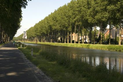
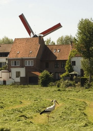
sp0810_22sp0810_23SONY DSC

Zeebrugge

In August 2006 I was invited to Brugge for two days to meet the people of Brugge Plus, the marketing organisation of Brugge, as well as other people important to the cultural organisation of the city. I prepared a demonstration on the beach, which resulted in the green light for the beach calligraphy event. Apparently, no-one had seen anything like it before.
Thanks to Maud’s hard work, a lot happened in the next two years, and I arrived there again in July 2008, ready to spend the whole month writing on the beach. The beach part of the WOR(L)DS event was launched by Patrick Moenaert, the Mayor of Brugge, at a small function in a marquee on the beach , after which the whole party of about 50 people, walked down to see the work I had begun, only to find that it had been washed away by the high tide! I then had to demonstrate for the media and everyone in the awful, mushy, shelly sand that was left! Somehow, much to my surprise, they remained pleased (even after I got mud on the mayor’s shoes!), but for me this difficulty was to set the tone for the first half of my time there. I could not work to my own standard, and struggled to enough work for display, but people remained enthusiastic.
sp0810_14.jpgsp0810_15.jpg
sp0810_14sp0810_15sp0810_16

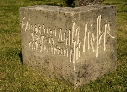
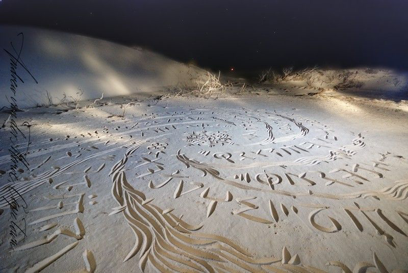
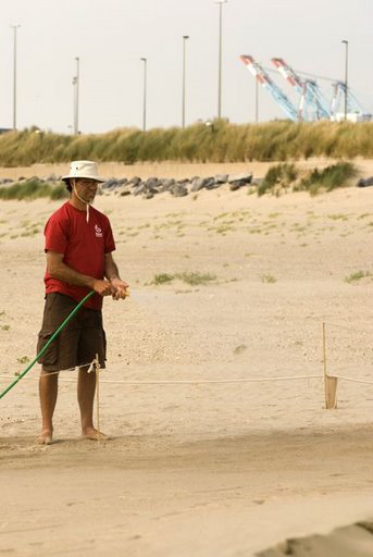
I think we can safely say that it was a world first, but as such there were some serious difficulties. When I arrived on the beach to begin work, I was faced with a huge, 30 x 300m, specially demarcated area, almost none of which contained sand I could work in! It was dry, full of shells and had been driven all over by the construction vehicles which had placed the shipping containers for offices and a viewing platform, which, it turned out, had been placed below the spring high water mark. The only areas I could work in were far down, below the high water mark, where the work would be washed away every day. On top of this, the weather which followed was very bad. It rained constantly and often the wind blew so hard that my work was blown away before I could finish it!
I worked extremely hard and began to feel depressed and miss my family! One thing that saved my sanity in that difficult time was learning an old Flemish word for the temporary nature of things: “vergankelijkeid.” It became my motto. I wrote “vergankelijkeid – onvergetelijkeid” around a small beach flower (onvergetelijkeid = unforgettable).
The wind did however, blow in some dunes of nice fine sand around the containers at the entrance and once we had rigged up a water supply, I was able to wet these dunes and do some good work in them.

sp0810_04sp0810_05sp0810_06

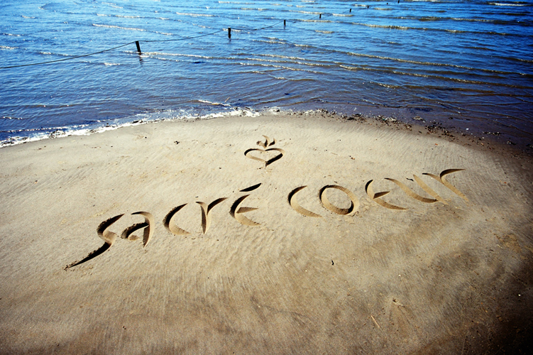
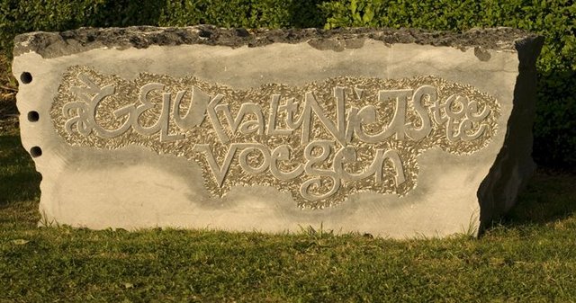
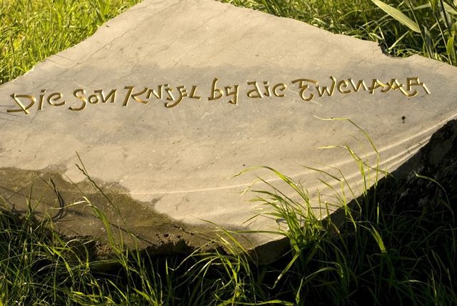
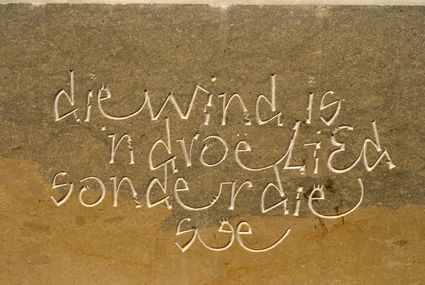
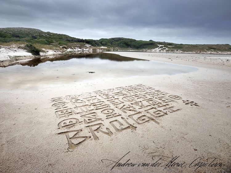
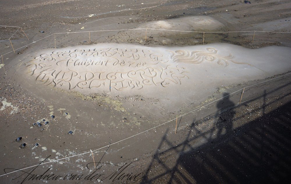
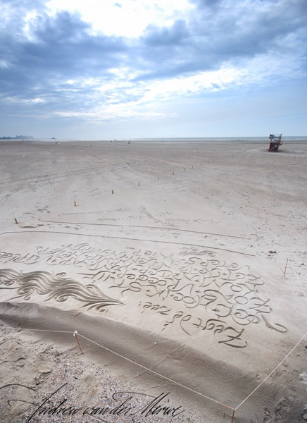
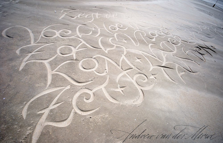
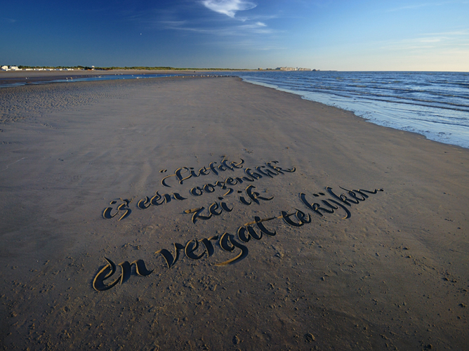
I spent about half my time on the beach carving a very enjoyable poem about the sea, written specially for the event by David van Reybrouck, one of Belgium’s best known poets. This work, I did in the most prominent places near the entrance, and when the weather finally improved, in the last two weeks, it lasted for up to three days.
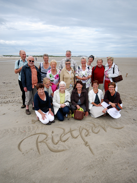
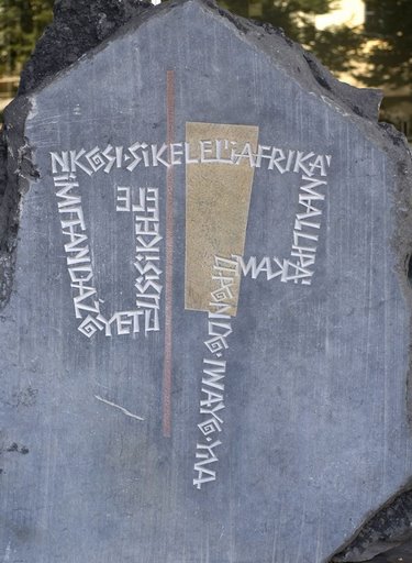
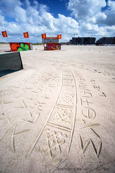
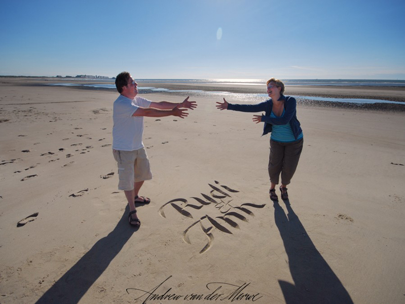
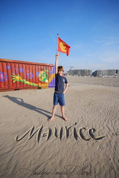
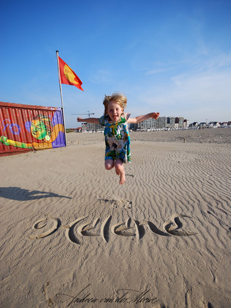
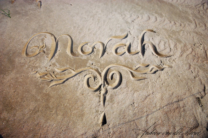
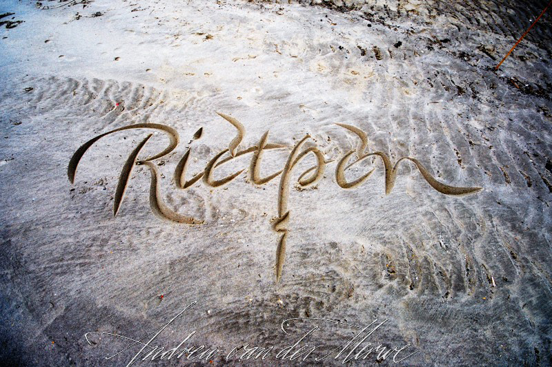
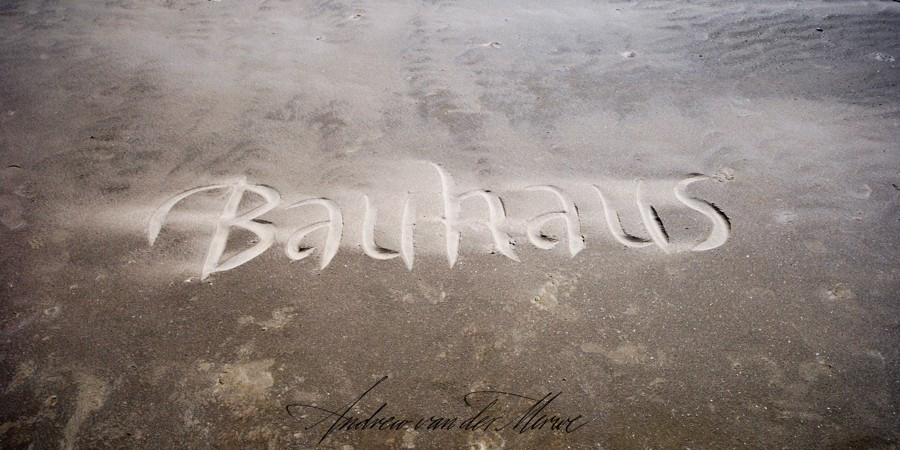
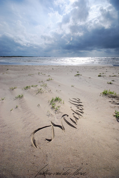
The other half of my time was spent carving names for individuals and sponsors of the event, the proceeds of which went to Sprinkle and Breadline. I carved nearly 300 names and other requests! I did this work below the high water mark. Then I spent most of my evenings and early mornings processing the photographs.
Belgians are witty and fun-loving and I had a very good time relating to the small crowds that gathered around to watch and have their photos taken with their names in the sand. I got some good photographs, and I have to say, that this, in addition to being able to drink the remarkable Belgian beer, was the most enjoyable part of the experience for me.
sp0810_07sp0810_09sp0810_10

Where to from here?

For me, this event has been a lifeline. Trying to make a career as a professional calligrapher in South Africa has been very difficult and there have been many times which I have considered giving up. This event has encouraged me, and thanks to the sponsorship of Brugge Plus, I was paid well enough to be able to set aside my bread-and-butter work long enough to go to Belgium, and to spend time developing my beach calligraphy skills to a new level. I have also been able to buy some of the photography equipment I need.
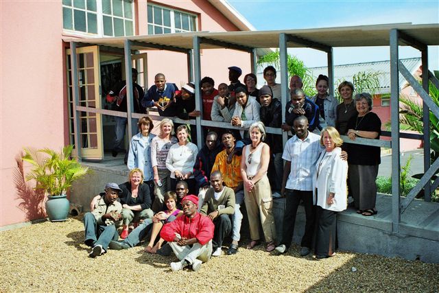
My short term vision for the beach calligraphy is to begin printing and selling greeting cards, to construct a web site at www.beachcalligraphy.com and to offer workshops to interested calligraphy societies around the world so I can begin sharing my discoveries. I am exploring ways to mass produce my instruments. I have also begun teaching some of the refugees who were drawn to calligraphy through the WOR(L)DS project.

sp0810_11sp0810_12sp0810_13

The impact of WOR(L)DS on local calligraphy

I have spoken here mainly about my beach calligraphy, which may be interesting to calligraphers, but is nothing compared with the stories to be told of the lives of the many, many Southern African children orphaned by Aids. For their sake, I am sure we would do this again if the opportunity arose, but there is another important thing that needs to be said about WOR(L)DS: this project has been the catalyst that South African calligraphy needed to begin finding its own voice, its own style. It has also broadened us socially, something we desperately need in a country whose success depends on creating harmony between a huge variety of people who, because of the practice of Apartheid, were at the brink of war with each other. The practice of calligraphy here has previously been dominated by a few, relatively privileged whites, but through WOR(L)DS, we have drawn in people from very different "worlds" - even Zimbabwean and Congolese refugees, thus beginning a new and exciting era for calligraphy in South Africa. This interaction is empowering for the newcomers and gives all our work deeper meaning and vitality.
Calligraphy in South Africa is still very small-time and none of this would have been possible without the wonderful, generous, hard-working, warm, friendly and wise partnership of the calligraphers of Belgium - Maud Bekaert, in particular - and the City of Brugge which threw its weight wholeheartedly behind WOR(L)DS. We will always be grateful and value this friendship.

sp0810_17sp0810_08sp0810_19

Links

The Beach Calligraphy display was a minor part of the WOR(L)DS project and it certainly could never have been as spectacular as the sand sculpture displays that are so well known in Belgium, but the media attention it attracted was surprising. It was covered by local television and local and national newspaper: Here are a few links, including one page with a video insert:

http://www.standaard.be/Artikel/Detail.aspx?artikelId=4P1TSDDJ

http://www.knack.be/weekend/nl/news/articles/a8740-article.jsp

http://www.focustv.be/articles/index.jsp?articleID=35219§ionID=188&siteID=33

http://picasaweb.google.com/Scriptores.Redactie/ZandkalligrafieEls?authkey=P3CHFSYkIXA

One last thing

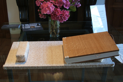
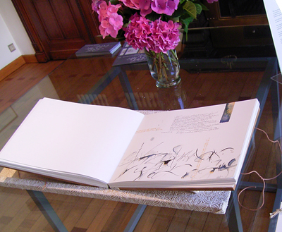
A catalogue of the WOR(L)DS work has been made possible by extensive sponsorships gathered through the hard work of Maud Bekaert. Beautifully designed by one of the main sponsors, Hilde Wintein of OuVert (who also generously accommodated me for the duration of my stay), it is being sold with all the proceeds going to Sprinkle and Breadline. To buy a copy, contact Chantal at chantal@sprinkle.be.
sp0810_21sp0810_20

sp0810_18

定期作品展「Letter Arts Exhibition, Autumn 2008」スタート

autumn_omote3_2

開催日
2008年10月6日(月)〜10月12日(日)
時間
11:00〜19:00(最終日は〜17:00まで)
会場
ギャラリー・羽ペン工房
タイトル
Letter Arts Exhibition, Autumn 2008

Letter Arts Exhibition, Autumn 2008は、2008年夏〜2009年春の1年間、計4回開催のどなたでも参加できる展覧会として企画された定期展覧会の第2回目です。この展覧会が、カリグラファー同士が交流出来る場となり、また、アートとしてのカリグラフィーを一般の方々へ広く紹介できる機会となれば幸いです。

アーティスト10名による作品を、どうぞゆっくりとご鑑賞下さい。
皆様のお越しを、心よりお待ちしております。

EAST WRITES WEST展コラボレーション・ブックが展示されました

IMGP2193_2IMGP2199IMG_0565

神戸レターアーツ シンポジウム(KLAS 9/12~19 神戸セミナーハウス 神戸・カリグラフィー・フォーラム主催)におきまして、EAST WRITES WEST展コラボレーション・ブックが展示されました。

ブックは会期中を通して展示されていましたが、9月12日のKLASオープニングイベントでは、ブック公開に合わせて『「East Writes West 展」〜2年半の足跡と新たなビジョン〜』と題したスライドショーとトークが行われ(講演者はEWW展運営に携わってきた三戸美奈子氏と清水裕子氏)、その後日本で初めてのブック公開が行われました。KLASにはブック作品制作者も多数参加しており、参加者の作品が登場するたびに、会場ではひときわ大きな歓声が上がっていました。

また、会期中には一般が参加できるプログラムもあり、遠方からEWWブックを見に来られた方もおられました。

今後は11月に開催される札幌の作品展で公開予定。

第12回札幌カリグラフィー展    November 11~16 2008
大丸藤井セントラル7F スカイホール 
札幌市中央区南1条西3丁目  011-231-1131

スクリプトと感性―日本語の「かた・ち」/岡山恵美子

岡山恵美子
Department of Asian Studies
Macquarie University, Sydney, Australia

はじめに

今から120年程前に、初めて日本を訪れたラフカディオ・ハーン*iは、開港間もない横浜のようすをこう語っています。「目の届く限り、幟がはためき、濃紺ののれんが揺れ、どれもみな日本の文字や漢字が書いてあるので、美しい神秘の感を与える」。町中に溢れる文字の特異さにすばやく気付いたハーンは、表意文字が日本人の頭脳に作り出す印象は、単なる音声の符号に過ぎないアルファベットが西洋人の頭脳に作りだす印象とは格段の差があり、「表意文字は生命感あふれる絵だ」とも記録しています。来日したばかりで日本語の知識がなかったハーンが、日本の文字の絵画的要素を見抜いたのは炯眼ですが、逆に予備知識がなかったために本質に迫ることができたと言えなくもありません。日本では 源氏物語絵巻や江戸の絵入り小説、浮世絵、書などに代表されるように、文学や芸術の様々な分野で文字と絵がほぼ同等な地位を保ってきました。この伝統は現在に引き継がれ、特にグラフィック・デザインの分野で生かされています。それは、アルファベット文化圏に比べて、日本では文字と絵の距離が非常に近いからではないでしょうか。でも、この関係はこれまであまり研究の対象にはなりませんでした。というのは、文字の研究はアルファベット中心に行われてきたからです。極度に抽象化された表音文字であるアルファベットを使う西洋では、文字と絵は根本的に別のものであり、情報は文字によって単一方向に表記されるものだからです。ところが日本語では、文字の多くが表意的要素を備えているだけでなく、文字の種類、読み方、書く方向、レイアウトなどあらゆる面で複数の選択肢があります。

その結果、画家が積極的に文字を絵に取り入れたり、作家が詩や小説をビジュアルに表現したりするのは珍しくありません。たとえば、「佃島住吉祭り」や「平の建舞」(図1)*ii がその良い例です。両作品ともに文字が絵の焦点で、前者では幟によって初めて絵の場所と行事が判り、後者では「平」という漢字が絵の主役で擬人化された鯰は脇役にすぎません。文学の分野では、表意的な漢字と表音的な仮名で書く日本の作家は、アルファベット圏の作家に比べ視覚的効果に敏感で、文章だけでなくビジュアルな手段を使ってメッセージを伝えようとする傾向が強いようです。谷崎潤一郎の作品の多くは特定の視覚的効果を与えるために、文字・レイアウト・挿絵などに細心の注意が払われています。たとえば、交互に繰り返される夫婦の日記で構成された『鍵』では、 漢字カタカナ混じり文で書かれた夫の日記は堅い男性的印象を与え、 漢字ひらがな混じり文で書かれた妻の日記は柔らかい女性的印象を与えるように計算されています*iii。これは、後で詳しく述べますが、谷崎のライフワークとなった『源氏物語』と平安文学の研究から得た技巧かもしれません。最近でもグラフィックな表現にこだわる作家は少なくありません。京極夏彦は InDesign というグラフィック・ソフトを原稿用紙の替りに使っていて、どの作品をとっても頁の終わりには必ず句点がくるようになっています(*iv)。また、恩田陸のミステリー小説『ユージニア』は頁のサイズが不規則で行がわずかに傾いているだけでなく、偶数行と奇数行では字数が異なっているという凝りようです(*v)。ミステリーの読者に不安と苛立を表現内容と表現形態の両方から味わって貰おうというもくろみでしょうか。
1aTsukudajima1bTairanotatemai

図1 佃島住吉祭り(安藤広重)と平の建舞(作者不詳)

文字と絵の緊密な関係を象徴するもうひとつの表現形態として、文字と絵の中間にある書が挙げられます。英語で言うカリグラフィーは、西洋では普通クラフトの分野に属しますが、日本では芸術であり、絵画同様に収集され美術館で展示されます。書では、紙の色や質・墨の濃淡・線の肥痩・文字と文字の空間すべてが文字と同様に重要で、書のメッセージはこれらすべてを介して伝えられます。書道家西川寧氏の作品に「蟷螂」(図2)という書があります。御子息の西川杏太郎氏のお話では、寧氏はカマキリが細い身体なのに「はさみ」を振り上げて自分より大きい敵を威嚇する気の強さを面白がり、また「蟷螂」という文字の「制型的な形」に興味を示してこの作品を書かれたそうです。蟷螂という漢字の持つ「形」にカマキリという生物の攻撃的な性格と、カマを持ち上げた姿とをオーバーラップさせてビジュアルに表現した作品です。

図2『蟷螂』西川寧

図2『蟷螂』西川寧

これまでお話してきたことからお判りのように、日本の文字の根底には、アルファベットに比べて遥かに絵画的・視覚的性質が潜在しています。アメリカの言語学者レナード・ブルームフィールドが「Writing はランゲージではなくて、ランゲージを記録する道具に過ぎない*vi」と断言したように、アルファベット文化圏では長い間、文字は音声の影と見なされてきました。そのため西洋言語学は、音声 (phonetic dimensions) の研究に終始してきました。文字体系に興味を示した言語学者は非常に少ないのです。

3aOsaka3bTokyo

図3 文字と記号が氾濫する日本の都市 大阪(左)と東京

ところが、実際に私たちの生活を振り返ると、本、雑誌、広告、標識、看板、新聞、テレビ、インターネットなど、文字が溢れています(図3)。マイケル・プロンコは『ニューズウィーク』誌(2003年)で、日本の都市を看板天国と評し、「東京で一日過ごせば、小説を一冊読んだのと同じくらいの言葉に出合える」と言っています*vii。文字無しに生活するのは不可能と言えるかも知れません。その多くの文字が、ハーンが言うように「絵のように」視覚に訴えてきます。これは、抽象化され意味を失ったアルファベットにはない特徴です。また、ロラン・バルトが「日本画は書から生まれた」*viiiと解釈したように、日本語の創造的活動において文字と絵は密接な関係を保ってきました。これは電子メディアの発達した現在も変わりません。逆に、一つのテクストに複数のモード(たとえば文字、絵、写真、動画など)やサインシステム(複数の言語あるいは記号)が共存するマルチモーダルな表現が普遍化するなか、新しいビジュアルな「言語」とその「文法」を模索している西洋に比べて、三つの文字体系を有する本来マルチモーダルな日本語と、文字と絵があらゆる分野で共存するビジュアルな日本文化は優位な立場にあると言えるかもしれません。本稿では、こういった日本語の文字の性質に焦点を当て、西洋で作られた言語理論に疑問を投げかけると同時に、日本語の文字の可能性を追求してみたいと思います。

日本語のかたち

さて、ここからが本題です。では日本語独自の体系とはいったいどんな体系なのでしょうか。言語を構成する三大要素として、音声・意味・文字があります。この三つを切り離したら言語は成り立たないのですが、今回はビジュアルな側面を問題にしているので、文字に焦点を当てて見ていきたいと思います。

グラフィック・デザイナーの杉浦康平氏が『かたち誕生*ix』の中で、こういうことを言っています。日本語の「かたち」という言葉は「五感によってとらえた、もののありさま」という意味で、語源的に「かた」と「ち」に分けられる。「かた」は「同じ形をくりかえし生みだすもの」で、型、鋳型、堅い、固まる、のような言葉につながる。芸能(能、歌舞伎、日舞など)や武道(柔道、空手など)で「かたを覚える」というのはまさにこの意味で使われています。書道でも「永字八法」という基本的な筆法(かた)があります。これに対して「ち」は、「いのち」の「ち」、「ちから」の「ち」で、「かた」のなかをかけめぐる生命・活力のようなものだと言います。そうすると、「かたち」とは単なる目に見える形態だけでなく、不可視の部分を合わせ持つものだということになります。前述の西川寧氏の「蟷螂」はまさに蟷螂という「かた」に「ち(生命)」を吹き込んで「かたち」にしたものだと言えます。

では、いったい日本語のかたちとはどんなものなのでしょうか。ここに一枚の折り込み広告(図4)があります。一見、ありふれた新刊書の広告のようですが、以下に示したように、この一枚に日本語のあらゆる特徴が詰め込まれています。箇条書きにすると次のようになります。

  1. 複数の文字(漢字・ひらがな・カタカナ・アルファベット)
  2. 複数のフォント(最低5種類使われています)
  3. 多方向性(縦書き・横書き)
  4. 句読点の用法(文法上の要請というよりもビジュアルな用法)
  5. 複数の読みの可能性(ニホン/ニッポン、ワタシ/ワタクシ)
  6. 新旧の漢字の共存(藝—旧字体)
  7. 絵と文字の共存
図4 文春新書の折り込み広告

図4 文春新書の折り込み広告

漢字仮名アルファベット混じり文を常用する私たちは、それが当たり前だと思っていますが、複数の文字体系を同時に使用する言語は世界でも日本語だけです。韓国でも漢字ハングル混用の時代がありましたが、今ではほぼハングルだけに統一されています。上に挙げた項目を見ると、文庫本サイズの小さな広告の中に、文字体系だけでなく、文字の方向、フォント、漢字の読み方と表記、絵と文字など、それぞれの項目に複数の要素が共存していることに気付くはずです。中心にある文字絵には「不良債権」「ダイオキシン」「経営責任」など、ストレスの原因になる言葉がゴシック体でひしめき、言葉の意味とフォントの堅さの両方で現代人の置かれた状況を表現しています。一方、左右と上部の文は柔らかいフォントでしかも「文春新書」を囲む枠は角が取れて丸くなっています。「癒し」としての読書をアピールするためでしょうか。このように一つ一つの構成要素が、違ったインパクトで視覚に訴えてくる―これが日本語のビジュアル性の特徴です。社会学者の酒井直樹氏は異なる文字体系の共存が日本語のアイデンティティだと主張していますが(*x)、それ以上に、あらゆる面で異質なものの共存を許してしまうマルチ・モーダルな性質こそが日本語の究極の「かたち」であり、アイデンティティだと私は思います。
それでは、上記の項目の中から今回はマルチ・スクリプトの特徴を見ていくことにします。

マルチ・スクリプト(漢字と仮名の構造)

漢字の構造を初めて体系的に分析したのは後漢時代の許慎で、その著書『説文解字』に六種の法則(象形・指事・会意・形声・転注・仮借)を載せています。これは今でも使われている分類法ですが、転注と仮借は運用上の分類に属し、造字法による分類は前の四つ、なかでも最も基本的なのが象形文字です。象形の象は「かたどる」と読み、物の形の特徴をつかんで表現すると言う意味で、絵画的要素を強く残しています。指事文字は目で見えないものを形で表したもので、「上」や「下」のように記号的要素の強い漢字です。この二つが漢字の中核となるものですが、数的には全体の5%に満たず、残りの95%以上は合成文字の会意・形声に属します。なかでも、形声文字は漢字全体の85〜90%を占めています*xi

5shokeimoji6kaminari

図5 象形文字の成り立ち/図6 会意文字の成り立ち

では、漢字の構造を少し詳しく見てみましょう。図5は象形文字の「山」「日」「回」の楷書体(下欄)とそのもとになった絵文字風な金文(上欄)です。金文の段階ですでにかなり単純化されていますが、それが楷書体になると丸いものがみな四角になります。この○と□は漢字の構造の上で重要な意味を持つものです。次に図6を見て下さい。「雷」という会意文字のでき方を示したものです。「雨」と「田」を上下に組み合わせてできています。意味の違う漢字を組み合わせて、関連する意味の漢字を作るのが会意文字ですが、新しくできた漢字の音はもとの漢字の音とは違う場合がほとんどです。この「雷」という漢字でもう一つ注目したいのは、その構成要素の視点の問題です。「雨」は空から降る雨を横から眺めた側面図、「田」は四角に区割りされた田んぼを空から眺めた鳥瞰図です。つまり、「雷」は二つの意味の合成だけでなく、まったく違う二つの視点の組合せでもあるのです。

次に形声文字を見てみましょう。国語の授業では、形声文字は意味を表す部分(意符または部首)と音を表す部分(音符)とを合わせてできた漢字だと教わると思います。はたして、そうでしょうか。次の例を見て下さい。

意味(部首)+ 音(音符) → 形声文字
草(くさ) + 化(カ) → 花(はな/カ)
革(かわ) + 化(カ) → 靴(くつ/カ)
言(いう) + 化(カ) → 訛(なまり/カ)

「草」「革」「言」の部首に「化(カ)」という音符を加えると、「花」「靴」「訛」という形声文字ができ、すべて「カ」と音読みします。この説明だと、「化」という漢字は純粋に音だけの機能で使われていると思われがちで、実際に学校ではそう教わります。しかし、よく見ると、部首の意味だけでなく、音符「化」の持つ「ばける・かわる」という意味が合成された形声文字のなかに生かされているのは明らかです。形声文字は会意文字の特殊なものという解釈ができるかもしれません。そう考えると、表音的と思われがちな形声文字も表意的機能を強く維持していると言えるのではないでしょうか。

図7 仮名の成り立ち

図7 仮名の成り立ち

では、表音文字である仮名の構造を見てみましょう。仮名と言っても、カタカナとひらがなでは造形も違えば用法も違います。図7は仮名のでき方をごく簡単に示したものです。カタカナの多くは上の二段にあるように、漢字の一部をそのまま取って作られました*xii。これに対して、ひらがなは漢字の草書体、いわば「くずし字」からできています。つまり、カタカナはその漢字「片(カタ)」が表す通り「部分」から成り、ひらがなは「全体」を極限まで平(ヒラ)たくした(くずした)ものと言えます。その結果、カタカナはもとの楷書体の堅さと停滞を継承し、ひらがなは草書体の柔らかさと流れを継承しています。

用法では、平安時代からカタカナは男性専用で漢文を読むための記号として使われ、ひらがなは宮廷の女官によって和歌や日記、物語に使われていました。漢字・カタカナを男手、ひらがなを女手と呼ぶことがありますが、必ずしも、男女で完璧な使い分けがあったわけではなく、漢文で日記を付けていた男性も和歌はひらがなで書いていましたし、漢字・漢文が得意な紫式部のような女性もいました。むしろ、その用途と造形的な特徴から、男性的なカタカナは外国語(漢文)に、女性的なひらがなは和語に使うという役割分担ができていたようです。近代以降、カタカナが英語を始め外国語表記専用の役割を担ってきたのは、当然の成り行きと言えます。このように、でき方と機能を別にしてはいますが、カタカナ・ひらがなに共通している点があります。同じ表音文字でも、アルファベットのように線上に配置されることなく、表意文字の漢字同様に四角な面を構造の基礎にしているところです。文字の単位としては一つ一つが独立して、それぞれのマスに収まっています。この点については、またの機会にお話しますが、マス単位のユニットだからこそ、縦書きにも横書きにもできるのです。

以上、簡単ですが日本語の三種の文字について,以下の項目を取り上げてきました。

  • 漢字の最も基本的なものは象形文字と指事文字である。
  • 象形文字は眼に見えるものをかたちにしたもの、指事文字は見えないものを記号で表したものである。
  • 現在使われている漢字の大部分は形声文字である。
  • 形声文字は意味を表す部首と音を表す音符からなり、その構成要素は象形文字や指事文字である。
  • 音符の表音的側面が強調されがちだが、音符は純粋に音声として機能するのではなく、意味の上でも貢献している。
  • カタカナとひらがなは造形・用途を異にするが、漢字から作られたもので、四角な面を基本としている。

また、一つの言語で複数の異なる文字体系を持つのは(ほぼハングル化した韓国語を別にすれば)日本語だけであり、それが日本語のアイデンティティとなっていることも強調しました。私たち日本人は毎日の営みの中で漢字仮名アルファベット混じり文を無意識に使い、それが当たり前だと思っていますが、マルチ・スクリプトな言語ゆえの様々な問題あるいは可能性について考えてみることも必要ではないでしょうか。そうすることによって、日本語ひいては日本文化への確かな認識を深めることができるのではないではないかと思います。

この文章は、2008年5月22日国際交流基金日本研究フェローズ・セミナーでの発表をもとに、新たに書き下ろしたものです。

*i.小泉八雲『神々の国の首都』講談社学術文庫 1993 (1984)年 9-11頁
*ii.安藤広重『名所江戸百景』第55図「佃島住吉祭り」1858 (ブルックリン美術博物館蔵)、「平の建舞」(作者不詳)1855年の大地震後に描かれた鯰絵(個人蔵)
*iii.谷崎潤一郎『鍵』中央公論社1973(1956)年
*iv.祖父江慎『文字のデザイン・書体のフシギ』「ブックデザインとかなもじ書体のフシギ」左右社 2008年(6−51) 19頁
*v.同上 22−23頁
*vi.Leonhard Bloomfield. Language. New York. 1933年 283頁
*vii.マイケル・プロンコ(Michael Pronko) 「静けさの国の看板天国」『ニュ−ズウィーク日本版』2003年12月3日発行 50頁
*viii.Roland Barthes. Empire of Signs. Translated be Richard Howard. Jonathan Cape: London. 1982 (1970)年 86頁
*ix.杉浦康平 『かたち誕生 図像のコスモロジー』NHK出版 1997年 5−7頁
*x.Sakai Naoki. Voices of the Past – The Status of Language in Eighteenth-Century Japanese Discourse. London and Ithaca: Cornell University Press. 1991年 266頁
*xi.秋山虔編『新編国語便覧 新装版』中央図書 1978年参照
*xii.なかには例外もあり、ケ(介)チ(千)のように漢字全体から作られたカタカナもあります。詳しくは山口謡司著『日本語の奇跡<アイウエオ>と<いろは>の発明』参照


岡山恵美子岡山恵美子
長崎出身。長崎大学教育学部卒業後 、ダブリン・シティ大学修士課程(翻訳理論)、シドニー大学博士課程(言語学)修了 。タスマニア大学、シドニー大学の日本語教師を経て、現在マコーリー大学アジア研究学部専任講師を務める。また、1996年以来、プロの翻訳家としてタスマニア州政府観光課や、シドニーの交通局、移民局関係の翻訳・通訳を手掛ける。2007年、国際交流基金日本研究フェローシップを授与され、名古屋大学大学院国際開発研究科の客員研究員として半年間日本滞在。日本語の文字の持つデザイン性や視覚的要素がデザインの現場や、日常生活の中でどのように機能しているかを、理論と実践の両面から解明しようと、カメラ片手の都市散策を趣味としている。

Investigating Japan's Script-Picture Tradition/ Emiko Okayama(text/English)

Emiko Okayama
Macquarie University, Sydney Australia

When Lafcadio Hearn first stepped into a Japanese city some 120 years ago, he was quick to express his surprise at the array of banners and shop signs. He observed the peculiarity of the writing, describing the characters as pieces of pictures with life (Glimpses of Unfamiliar Japan, 1894: 18-20). Given the pictographic foundation of Japanese writing, it should not come as a surprise that words and pictures have enjoyed substantial equality in Japan, and been used interchangeably across many forms of literature and art – from The Tale of Genji scrolls to Edo picture stories and prints, and in calligraphy. These traditions are alive and well in contemporary Japanese graphic design. I believe this is because writing and pictures are much closer in Japan than in cultures with alphabet writing. It is a condition that has been neglected by scholars, since the dominant views on scripts have come from alphabet users, who see words and pictures as fundamentally different. In the West, the highly abstract, phonetic and single-directional nature of alphabet script has encouraged a separation of words and pictures, and a word-controlled linear presentation of information. But with Japanese, there are multiple choices – of script, characters, script direction, page layout, etc: many characters have a pictographic or ideographic dimension.

As a consequence artists have been far more inclined to incorporate writing in pictures, and writers more inclined to think visually about their texts.
1aTsukudajima1bTairanotatemai

Good examples are Tsukudajima Sumiyoshi matsuri (Ando Hiroshige, 1858) and Taira no tatemaii (Unknown artist, 1855). In both pictures writing is the focus of the picture: a banner in the former indicates the place and event and in the latter the kanji character, taira (peace), is the centre of attraction. In literature, Japanese novelists, writing with strongly graphic kanji and contrasting phonetic kana, are more conscious of visual effects, and express their messages through both textual and visual means. Tanizaki Junichiro’s original novels are such examples: in these he carefully organises scripts, page layout and illustrations to convey particular visual messages. His Kagi (The Key, 1956) consists of two alternating diaries: the husband’s is written with kanji and angular katakana, and the wife’s with kanji and curvaceous hiragana – masculine and feminine respectively. More recent writers are equally adept in their graphic expression. Kyogoku Natsuhiko uses graphic software, InDesign, for his writing template and every single page of his books always ends with a period. Onda Riku’s mystery novel, Eugenia (2005), has pages of different sizes and alternating column widths to add an element of unease to the readers’ experience.

Another example is calligraphy, which sits somewhere between art and writing, and normally considered to be a craft in the West. However, in Japan calligraphy is highly regarded as an art form and commonly housed in art galleries alongside paintings. In Japanese calligraphy, paper, tone of the ink, strokes, shapes of lines and space between scripts are as important as the writing. The meaning (message) of a calligraphic work is conveyed through all these means. Nishikawa Yasushi’s Toro (1976) consists of two characters, which means ‘praying mantis’. In this work, his son, Nishikawa Kyotaro, has explained to me how his father tried to express visually the mantis’s aggressive side when confronted with enemies.
This is the background to my research, from which it is evident that the nature of Japanese script brings with it a set of underpinning ideas that offer far greater graphic versatility than does the alphabet. They can be readily read in any direction. Go into any Japanese library or bookshop, and one will find publications with texts written at least in three directions. Pictures can easily substitute for characters or parts thereof. Over the last six months, I have been exploring this theme in my project, Text-Image Relationships in Art, Literature and E-media in Japan, as a visiting research fellow at the Graduate School of International Development, Nagoya University. My visit was made possible by a Japan Foundation Fellowship 2007-2008. My research suggests that the characteristics of a writing system influence a person’s thinking in all forms of visual and spatial expression. Further, it suggests that because of the picto/ideographic content in Japanese scripts, it may be more useful to think of a script-picture continuum in Japan than the two as separate.

Perhaps one of the most interesting aspects of my work is that which suggests how the nature of the script and associated graphic traditions are giving the Japanese a creative edge in today’s world of e-media, where there are so many ‘new’ opportunities for script-picture combinations to continue ‘old’ cultural practices. My work draws attention to web pages and text messages: reflecting upon contrasting English and Japanese approaches and practices when using words and pictures on websites and in email messages. It highlights the text-driven nature of English websites where images are more often separate from and subordinate to texts, and pages designed to be ‘read’. Japanese counterparts show a higher text-image integration, and actively exploit a variety of computer techniques such as overlaps, layering, pictures within pictures, and wallpaper backgrounds: here, it is less a matter of ‘reading’ and more of ‘navigation’. In the early versions of text-only e-mail environment, the use of images was restricted. Alphabet users were reluctant to move from a conventional writing style with limited visual expression – perhaps multiple exclamation or question marks but little more. Japanese message-makers were quick to express themselves visually in spite of the dearth of symbols: for instance, punctuation marks, and geometric shapes were used to create frames (✩゚・*:.。: :。.:*・゚✩), and emoticons were invented (^_^) (>_<). Such techniques have since been absorbed into text messaging by Western youth. Now the technologies have much improved and combining texts and images has become much easier and Japanese are taking full advantages of these. This is demonstrated by the popularity of mobile novels and mobile comics, which are fast becoming bigger sellers than conventional publications in Japan.

*Note: This is an edited version of my report published in Omusubi, the Japan Foundation Sydney newsletter, in July 2008.

Dr. OkayamaDr. Okayama
Dr. Okayama is a lecturer in the Department of Asian Studies (International Studies from 2009) at Macquarie University where she teaches Japanese language and culture. She is also a NAATI accredited translator and holds a Masters degree in Translation Studies from Dublin City University. Her doctoral thesis at Sydney University was an historical investigation of Japanese third person pronouns covering three centuries, and her main interests lie in translation studies, language change and Japanese visual culture.

EAST WRITES WEST展コラボレーション・ブックが展示されます

EWW_book-1EWW_book-2


2007年にブリュージュ(ベルギー)で展示され、今年7月にシカゴのインターナショナル・カンファレンスでも展示されたEAST WRITES WEST展(*)コラボレーション・ブック(35名のアーティストによる52作品、Sue Hufton製本)の日本初展示が決定しました。

神戸・カリグラフィー・フォーラム主催「神戸 レターアーツ シンポジウム(KLAS 2008年9月12日~19日)」期間中、KLAS参加者だけでなく、一般の方にもご覧いただけます。ブリュージュとシカゴで好評を博したEWW展のコラボレーション・ブック日本初公開に、皆さんどうぞお越し下さい。

詳しくはこちらをご覧下さい。
http://www.kcforum.org/

*EAST WRITES WEST展は、Brody Neuenschwander氏(ベルギー在住テキスト・アーティスト)からアルファ・クラブ(東京)メンバーに提案された、日本人カリグラファー39名による初めての海外グループ作品展(2007年8月〜11月)。J-LAFは、ブリュージュ作品展運営委員会から作品管理および展示運営を引き継ぎ、現在に至っている。

岡本紀子「羽ペン作りWS」2008

8月24日羽ペン作りのワークショップが開催されました。
report_1
カリグラフィーにご興味がある方、
文字・レターアートにご興味がある方
筆記道具にご興味がある方、
ヨーロッパの写本にご興味のある方・・・・・
羽ペンをご自分で作ってみませんか?

8月24日のワークショップにご参加いただきました皆様、ありがとうございました。
皆様とお話させていただくことで、こちらもとても勉強になりましたし、
何より楽しいひとときでした。

ここでは羽ペン作りワークショップの様子を少しご紹介いたします。
羽ペンを作るための「下準備・削り・試し書き」を皆さんとご一緒いたします。
工房では現在、白鳥とガチョウの羽をご用意しています。

report_2「削る」のはそんなに難しいことではありません。
クイルナイフという羽ペン専用のナイフもありますが、
それ以外のものでも十分に使えます。
イギリスのクイルナイフ・ドイツのゾーリンゲンで作られたナイフ・
日本の木工用の刀、クラフトナイフ、カッター 等
いろいろお試しいただいています。
日本では鉛筆を削るように刃を外に向けて削る方が多いですが、
欧米では自分の方に刃を向けて削ります。(本でもそのように説明されています)
この違い、おもしろいですよね。

report_3

report_4

ご自分で削るので、ペン幅もある程度は自由に作れます。
一度削り方をご習得いただければ、ご自身で自宅でもできますし、
羽以外の素材をペンとして使いたい時にも、応用できると思います。

まだ始まったばかりの工房ですが、
羽ペン工房では羽ペン作り以外にも「手」をテーマに
いろいろな企画を少しずつ進めていく予定です。
工房・ギャラリー・お店として・・・・・
誰かが手作りしていたら、覗いてみてくださいね。
これからもよろしくお願いいたします。

羽ペン工房スタッフO

******************************************************************

J-LAF主催ワークショップ「羽ペン作り」

昔々、ヨーロッパの人々は文字を書くための道具に本物の鳥の羽(羽ペン)を使っていました。
羽ペンは、どうやって作られるのでしょうか?本当に書けるのでしょうか?
このワークショップでは、羽ペンの歴史に触れながら、自分の手で一本の羽から羽ペンを作ります。
また、どんな書き心地なのか実際に書いてその感触を楽しんで頂きます。

講師:岡本紀子(カリグラファー)
期日:8月24日(日)
時間:10:00~13:00
場所:ギャラリー・羽ペン工房
文京区向丘1-8-6(スタジオ・アート&クラフトの1F)
定員:6名
受講料:¥4,500(資料代、材料費/羽1本含む 込み)
定員になりしだい締め切らせていただきます。
申込期限:8月10日まで

q0824-thumb-190x301プロフィール
1997年よりカリグラフィーを学ぶ。
1998~2004年まで英国ロンドンに在住し、ローハンプトン大学で学ぶ機会を得る。
現在は三戸美奈子氏のもとで学びながら、
海外カリグラファーのワークショップにも
積極的に参加している。
East Writes West ブリュージュ展に作品を出展。

Wor(l)ds プロジェクト レポート 第2回

Stone Walkストーン・ウォーク

南アフリカでの作業

南アフリカでの作業は、言葉や文字に興味を持つ人々を一週間のワークショップで引き合わせ、アフリカ大陸を反映する新しく、且つ面白い手書き文字にすることから始まった。
Maud Bekaertは、ベルギーと南アフリカの詩人やソングライターによる30以上の「言葉の断片」を手にやって来た。そして、アフリカ南部及びケープタウンの難民コミュニティーから集まった30人以上の人々が、一週間に亘り一丸となって取り組み始めた。

1-1SouthAfricaSide-byBev1-2WSbyBev

1. The South African artists/calligraphers
2. This from the first day of the workshop where Mak1one was teaching us to use spray cans!

彼らが、一人一人に提供された詩や歌の断片に反応し独自の文字を作るには、彼らの意欲をかき立て、情報を提供し、励ましてくれる熟練した指導者や協力者が求められた。そこで、例えば、地元のグラフィティ・アーティストであるMak1oneは、ワークショップの初日にスプレー缶を使いグラフィティを描く作業であるタギングとボミングで、私たちに好きなようにマークや文字を描かせてくれた。Andrew van der Merweは、棒とインクを私たちに手渡し、アフリカ中部と北部の手書き文字などを見せてくれた。Heleen de Haasは、私たちにダンスをさせて、文字というものは、互いに会話しているだけではなく、紙の上で踊ることが大事であるということを理解させ、再び紙とデザインに向き合わせてくれた。そして、そのような指導の間には、Maudが石に彫るとどのように見えるかという視点でアドバイスもくれた。

ワークショップの最終日にはMaudの手元に、どれもユニークで個性のある40以上のデザインがあった。彼女はそれを(彼女の故郷であり、Wor(l)dsプロジェクトの主要スポンサーである)ブリュージュに持ち帰った。Maudがデザインのレイアウトを持ち帰った後、南アフリカ側の人々に出来ることは、どうなるのか期待を膨らませて待つことだった-いったい誰のデザインが選ばれるのだろう。石に彫られたらどうなるのだろう。しかしながら、この取り組みがあったことで、南アフリカでは他にも自発的に取り組みを始めようという考えがふつふつと湧き出てきていたのだが、それについては、またいつか語るとしよう。

ベルギーでの作業

その後は、ベルギーのアーティストの出番であった。石が寄付され、彫る場所もダム(Damme)に準備された。良いデザインが選ばれた後、彫刻家達が14ヶ月間かけて彫った石は、現在Stone Route(石の道)に設置されている。これらの石は、9月末に孤児や脆弱な子供達のために競売にかけられる。彫刻家達が作業したのは、ダムで廃校となった学校だが、その建物もストーン・ウォークで見ることができる。

SONY DSC2-15-Jeske

3. ©Jeske Liossatos/Scriptores Designer: Hellen De Haas Letter Cutter: Werner Dewilde Author: Charl-Pierre Naudé
4. ©Jeske Liossatos/Scriptores Designer: Lin Kerr Letter Cutter: Wim Dufourmont Author: Stef Bos

石の設置には、特別な努力が払われた。例えば、「We spreiden onze vingers uit. We dragen de aarde op handen.」(私たちは、手の指を広げる。私たちは、大地の手を取る。)と彫られた石は、この言葉を書いた詩人Frederik Lucien De Laereの故郷でもあるダムに設置された。ここで言及しておきたいのは、全ての石には個人や組織のスポンサーがいて、彫刻家達は、石を彫る時間を無償で捧げてくれたことである。何名かの彫刻家は、複数の石を彫った。誠に寛大な心の現われである。
1-4Bev&stone-byLin

5. Bev(left) and her stone Designer: Beverly Gillespie Letter Cutter: Janne Vergauwe Author: Frederik Lucien De Laere

Wor(l)dsプロジェクトとストーン・ウォークの幕開け

NKOSI SIKELEL’ AFRIKA!
GOD BLESS AFRICA! (アフリカに神の祝福がありますように!)

これは現在、美しいブリュージュの街の案内所を訪れる全ての人を迎えてくれる言葉である。この言葉は、南アフリカのアーティストでカリグラファーでもある(現在イギリス在住)Linn Kerrによるデザインで、ベルギーの彫刻家Christophe Annysにより彫られた。Wor(l)ds は、6月9日の夕方、ブリュージュのコンサート・ビルディングにて、南アフリカ大使館の観光&文化部のトップであるMantasaye Ngwaila女史によるこの石の除幕式で幕を開けた。
1-3Opening-byBevJPG1-5Lin's-byJeske

6. Opening
7. Nkosi stone by Lin Kerr. The first stone on the Stone Walk: at the entrance of the Information Centre and Concert Building in Bruges ©Jeske Liossatos/Scriptores

美しいコンサートホールで開催されたブリュージュ市長Patrick Moenaert氏主催のオープニング・セレモニーには、多くのアーティストや名士が詰めかけた。南アフリカからも、5人のアーティストが出席した。そして、このプロジェクトの生みの親でもあり、後ろで支えるエネルギーでもあったMaud Bekaertが製作したカタログの発表により、セレモニーの感動が倍増した。195ページのカタログは、言葉、石、そして関わった人間の旅路を詳細に物語っている。写真も美しいこのカタログは、20ユーロで販売されている。このカタログも愛と寛容さの行為によって後援され、全ての製作作業労務が無償で捧げられたのである。収益金は、脆弱な子供達に寄付される。

ストーン・ウォークを歩く

Stone Routeを歩く人は、石が非常に独特でユニークであることに気付く。サイズも特徴も異なる。そして、勿論、デザインが特殊である。アーティストや言葉の意味を反映しており、4つの街への設置についても十分に検討された。

2-14-Jeske2-13-JeskeSONY DSC

8. ©Jeske Liossatos/Scriptores Designer: Jeff Sochen Letter Cutter: Luc Baeye Author: Ronel Nel
9. ©Jeske Liossatos/Scriptores Designer: Lin Kerr Letter Cutter: Wim Dufourmont Author: Ronel Nel
10. ©Jeske Liossatos/Scriptores Designer: Lin Kerr Letter Cutter: Adinda Goddyn Author: Toast Coetzer

その中の1つ、Ley MakaleleがデザインしLuc Baeyeにより彫られた石「Laat die Hemel Vrij」(天を開放しよう)を見て人は思う。青みがかった石に彫られており、天だけではなく自由も表現しているようだ。Leyがコンゴから命からがら逃げ出したことや彼のスピリチュアルな心を知ると、人には更に伝わってくるものがある。
1-6Ley'sStone-byBev1-8Sue'sStone-byBev

11. Ley's stone
12. Sue Williams’ stone - a cityscape in stone

Sue WilliamがデザインしたFrank Polletの言葉「Ik wil een nieuwe stad ontwerpen in de aderende kleuren van het hart」(私は、心臓の静脈の色をした新しい街を設計したい)は、Els Vanthournoutにより彫られ、街の起伏を見ているような感覚と同時に石の温もりも感じ取れる。
1-7Eric'sStone-byJeske2-5-Jeske2-6-Jeske

13. Eric Mawethu's stone ©Jeske Liossatos/Scriptores
14. ©Jeske Liossatos/Scriptores Designer: Phinda Kula Letter Cutter: Maud Bekaert Author: Stef Bos
15. ©Jeske Liossatos/Scriptores Designer: Andrew van der Merwe Letter Cutter: Adinda Goddyn Author: Peter Verhelst

Bart Vonckの言葉「Nooit is Een Kooi」(Neverという言葉は檻と同じ) とEric Mawethuのがっしりとしたデザインは、Luc Baeyeの彫刻でも解釈されているように、「Never」と考えることは、拘束されて自由な発想ができないということだと我々に気付かせてくれる。

SONY DSCSONY DSC2-10-Jeske

16. ©Jeske Liossatos/Scriptores Designer: Andile Hutu Letter Cutter: Jos Brabants Author: Charl-Pierre Naudé
17. ©Jeske Liossatos/Scriptores Designer: Yolande Bezuidenhout Letter Cutter: Jos Geusens Author: Hennie Aucamp
18. ©Jeske Liossatos/Scriptores Designer: Dale Botha Letter Cutter: Christophe Annys Author: Anonymous

Stone Routeの始まりを記すLin Kerrの石「Nkosi Sikelel’ Afrika」は、ヨーロッパに住んでいても、アフリカは人の心に刻みこまれ、忘れられないものとなることに気付かせてくれる。Linは、我々が詩の断片をデザインしていた一週間、イギリスからケープタウンまで飛んできて一緒にいてくれた。彼女は、ひっそりと静かにデザインに集中するだけではなく、黒人居住区から来た新しい若手デザイナーたちを応援し、励まし続けた。全ての40の石は、石の美しさ、言葉の意味、そして詩的な周りの風景を楽しみながら、徒歩か自転車でたどれる道沿いに設置されている。

SONY DSCWindMill-byJeske

19. ©Jeske Liossatos/Scriptores 20, ©Jeske Liossatos/Scriptores

Bev Gillespie

Wor(l)ds プロジェクト レポート 第1回 (text/Japanese)

Wor(l)ds Project Report Vol.2 (text/English)

The Stone Walk:

The Process in South Africa.

In South Africa the first part of the process was to bring people interested in words and letters together in a week-long workshop to develop new and interesting scripts that reflected the continent. Maud Bekaert came over with over 30 “word-fragments” from Belgian and South African poets and songwriters. Over 30 people from various places in Southern Africa and from the refugee community in Cape Town worked with each other for a week.

1-1SouthAfricaSide-byBev1-2WSbyBev

1. The South African artists/calligraphers
2. This from the first day of the workshop where Mak1one was teaching us to use spray cans!

This required skillful teachers and facilitators who were there to challenge, inform and encourage each person’s unique letters and how they interacted with the poetry or song fragment each was given to design. So, for example, Mak1one, a local graffiti artists took us through the first day of the workshop and let us loose with tagging and bombing using the instrument of the spray can, to make marks and letters. Andrew van der Merwe, gave us sticks and ink and helped us look at some of the scripts from the central and northern part of Africa. Heleen de Haas, brought us all back to the page and design, through making us dance together so we could understand how letters need to not only talk to each other but dance across paper. In between Maud had to advise from the point of how the designs would look carved in stone.

By the last day of the workshop, Maud had over 40 designs: very unique and different which she then took back to Brugge (her home town, and one of the main sponsors of Wor(l)ds). Once Maud took the layouts of the designs back with her, the South Africans could only wait and imagine what would happen: whose designs would be chosen and how would they look in stone. However other initiatives were bubbling in South Africa as a result of this working together. But more of that later.

The process in Belgium

Thereafter it was over to the Belgian artists. Stone had been donated as well as a place for the carvers to work in: in Damme. The best designs were chosen and then for 14 months the carvers worked on their stones which you can now see displayed on the stone path. These stones will be auctioned at the end of September for orphans and vulnerable children. They worked in a disused school in Damme which one can also see on the Walk.

SONY DSC2-15-Jeske

3. ©Jeske Liossatos/Scriptores Designer: Hellen De Haas Letter Cutter: Werner Dewilde Author: Charl-Pierre Naudé
4. ©Jeske Liossatos/Scriptores Designer: Lin Kerr Letter Cutter: Wim Dufourmont Author: Stef Bos

Special effort was put into the placing of the stones. For example the stone which carries the words” We spreiden onze vingers uit. We dragen de aarde op handen”: “We spread out our fingers. We take a hand in the earth” was placed in Damme the hometown of the poet “Frederik Lucien De Laere. One has to note that stones were sponsored by various individuals and organizations and all the carvers donated their time to carving the stones: some carving more than one stone: true generosity of spirit.

1-4Bev&stone-byLin

5. Bev(left) and her stone Designer: Beverly Gillespie Letter Cutter: Janne Vergauwe Author: Frederik Lucien De Laere

The Opening of Wor(l)ds and the Stone Walk

NKOSI SIKELEL’ AFRIKA!
GOD BLESS AFRICA!
These are the words which now greet all the visitors to the information centre in the lovely city of Bruges. They were carved into a huge piece of stone by Belgian carver Christophe Annys in a design by a South African artist and calligrapher (now UK resident) Lin Kerr. The opening of Wor(l)ds took place on the evening of the 9th June at the Concert Building in Bruges where the stone was unveiled by Ms Mantsaye Ngwaila, the head of Tourism and Culture at the South African Embassy.
1-3Opening-byBevJPG1-5Lin's-byJeske

6. Opening
7. Nkosi stone by Lin Kerr. The first stone on the Stone Walk: at the entrance of the Information Centre and Concert Building in Bruges ©Jeske Liossatos/Scriptores

The opening ceremony, inside the beautiful Conzertgebou, was hosted by the mayor of Bruges, Mr. Patrick Moenaert, and attended by many artists and dignitaries, who packed the venue. Five of the artists from South Africa were also there. The excitement of the occasion was doubled by the presentation of the catalogue of Wor(l)ds by Maud Bekaert, the creator and energy behind the whole project. The catalogue of 195 pages details the incredible journey of the words, stones and people. The photographs are beautiful and it is on sale for Euro 20. The catalogue was also an act of love and generosity as it was sponsored and all labour was donated. The proceeds of sales go towards vulnerable children.

Walking the walk.

Walking the Stone Route one notices that the stones are very special and very different. They are different is size and in character. And of course different in design. They reflect the artists and the meaning and a lot of thought was put into placing them in the four towns.

2-14-Jeske2-13-JeskeSONY DSC

8. ©Jeske Liossatos/Scriptores Designer: Jeff Sochen Letter Cutter: Luc Baeye Author: Ronel Nel
9. ©Jeske Liossatos/Scriptores Designer: Lin Kerr Letter Cutter: Wim Dufourmont Author: Ronel Nel
10. ©Jeske Liossatos/Scriptores Designer: Lin Kerr Letter Cutter: Adinda Goddyn Author: Toast Coetzer

One thinks of the stone: “Laat die Hemel Vrij”: “Set the Heavens Free”, designed by Ley Makalele. Carved into a blueish stone, by Luc Baeye, it seems to reflect the heavens as well as freedom. And knowing that Ley had to flee for his life from the Congo, and also his deep spirituality, it conveys so much more to one.
1-6Ley'sStone-byBev1-8Sue'sStone-byBev

11. Ley's stone
12. Sue Williams’ stone - a cityscape in stone

Sue William’s design of Frank Pollet’s words “Ik wil een nieuwe stad ontwerpen in de aderende kleuren van het hart”: “I want to design a new town in the veined colour of the heart” carved by Els Vanthournout combines the feeling of looking at the contours of a city with the warmth of the stone.
1-7Eric'sStone-byJeske2-5-Jeske2-6-Jeske

13. Eric Mawethu's stone ©Jeske Liossatos/Scriptores
14. ©Jeske Liossatos/Scriptores Designer: Phinda Kula Letter Cutter: Maud Bekaert Author: Stef Bos
15. ©Jeske Liossatos/Scriptores Designer: Andrew van der Merwe Letter Cutter: Adinda Goddyn Author: Peter Verhelst

Bart Vonck’s words “Nooit is Een Kooi” – “Never is a Cage” and Eric Mawethu’s solid design reminds us that thinking in terms of “never” imprisons us just as interpreted in the carving of Luc Baeye.
SONY DSCSONY DSC2-10-Jeske

16. ©Jeske Liossatos/Scriptores Designer: Andile Hutu Letter Cutter: Jos Brabants Author: Charl-Pierre Naudé
17. ©Jeske Liossatos/Scriptores Designer: Yolande Bezuidenhout Letter Cutter: Jos Geusens Author: Hennie Aucamp
18. ©Jeske Liossatos/Scriptores Designer: Dale Botha Letter Cutter: Christophe Annys Author: Anonymous

Lin Kerr’s stone “Nkosi Sikelel' Afrika” as the start of the Stone Path reminds one that Africa chases a deep groove in your heart and then runs through your veins, even if one lives in Europe. Lin flew from the U.K. to Cape Town to be with all of us for the week in which we all designed the poetry fragments. Unnoticed and quietly she not only concentrated on her designs but offered support and encouragement to the younger, newer designers from the townships.
All 40 stones are along a path which one can walk or cycle along, taking time to enjoy the beauty of the stones, the meaning of the words and also the poetry of the surroundings.
SONY DSCWindMill-byJeske

19. ©Jeske Liossatos/Scriptores 20, ©Jeske Liossatos/Scriptores

Bev Gillespie
Biography
Bev Gillespie works and lives. She was born in Johannesburg but migrated to Cape Town in her 30s where she studied at the University of Cape Town. Most of her work has been in the "not for profit" sector and she is currently working part-time for Breadline Africa (www.breadlineafrica.org.za), one of the beneficiaries of Wor(l)ds. Her interest in calligraphy stems from a course given by Hilary Adams. Later teachers included Lin Kerr and Heleen de Haas.

定期作品展「Letter Arts Exhibition, Summer」2008

Exif_JPEG_PICTURE
J-LAF Letter Arts Exhibition 2008 は無事に終了いたしました。
暑い中、会場に足をお運びくださった皆様、ありがとうございました。

J-LAFが発足して初めての作品展であり、
小さい規模ながら初めての試みをいくつか取り入れたことでスタッフにもやや緊張がありましたが、
心のこもった作品が集まり、良い空間となりました。

次回 Autumun 2008 作品展は10月6日(月)〜10月12日(日)に開催予定です。

Exif_JPEG_PICTUREExif_JPEG_PICTURE