作成者別アーカイブ: J-LAF

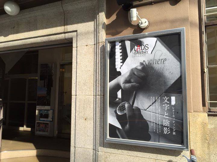
レターカッティング展「文字と陰影」

» レターカッティング展「文字と陰影」開催概要
» レターカッティング展「文字と陰影」大阪会場
» レターカッティング展「文字と陰影」東京会場

レターカッティング展「文字と陰影」終了しました

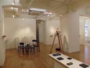
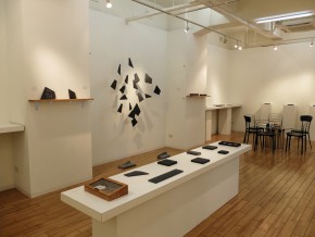
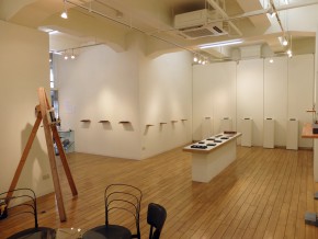
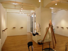
レターカッティング展「文字と陰影」大阪会場

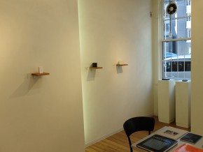
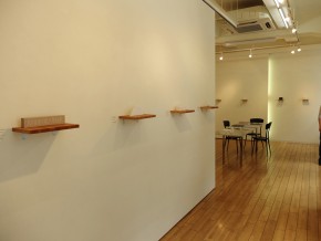
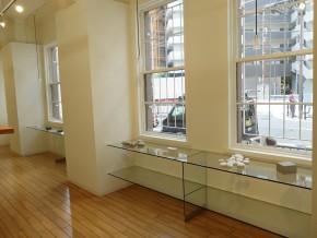
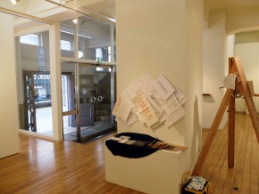
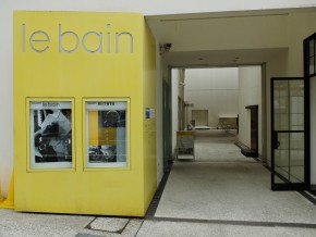
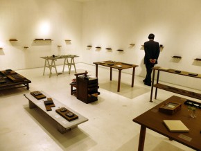
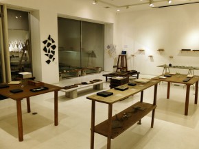
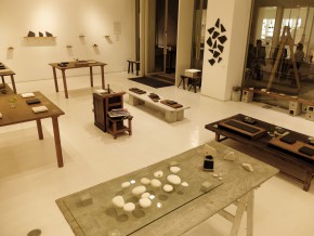
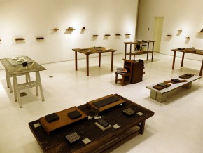
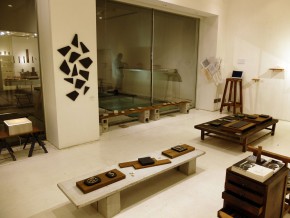
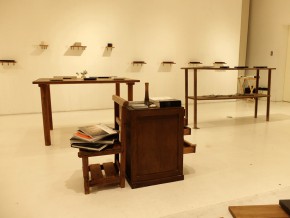
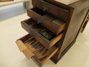
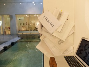
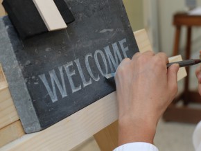
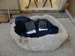
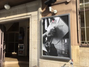
日本初となるレターカッティング(欧文の石彫)のグループ展を、LADSギャラリー(大阪 9月15日〜20日)およびギャラリー ルベイン(東京 9月29日〜10月4日)にて開催いたしました。ご協力いただきました皆さま、ならびにご来場いただきました皆さまに心より感謝申し上げます。

両会場とも、文字にご興味のある方、お仕事で文字に携わっておられる方を中心に、沢山の方にご覧いただき、また彫りの体験をしていただくことができました。レターカッティングそのものが、J-LAFが2009年にワークショップを開催するまで日本では行われておりませんでした。そういう意味では、初回ワークショップのスタートから6年経った今回の展示が、国内でのお披露目の機会となりました。

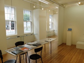
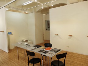
会場には、彫る作業以外の経緯もご覧いただけるように、デザインスケッチや、彫り途中や完成後にとった拓本などの資料も展示いたしました。一般的な彫刻が、彫刻家によるデッサンをもとに彫られているのと同様に、レターカッティングも、文字を手書きで丁寧にデザインしてから彫り上げます。今回の展示に際し、石に彫られた文字の美しさや彫りの技術面だけでなく、美しい手書きデザインがその背景にあること、そして、デザインと彫りとがひとつの流れの中にあることを、上記の資料を通して知っていただくことができました。

また、会場で上映したカリグラフィーとレターアーツに関する動画も併せてご覧いただき、J-LAFが関わるレターアーツというものの全体像と照らし合わせて作品をご鑑賞いただけたかと思います。

J-LAFは、これからも継続的にレターカッティングの普及に努めてまいります。今後とも引き続き、皆さまのご支援をどうぞよろしくお願い申し上げます。

なお、今回の展示の図録(1600円)は、引き続きJ-LAFで販売しております。
ご希望の方は、info ◎ j-laf.org までご連絡ください。(◎を@に変換してください。)

過去のレターカッティング ワークショップ

»ゴードン恵美「レターカッティング WS 2009」レポート
»ゴードン恵美「レターカッティング WS 2010」レポート
»ゴードン恵美「レターカッティング WS 2012」レポート
»ゴードン恵美「レターカッティング WS 2013」レポート

大阪 LADSギャラリー 9月15日〜20日

O-1_IMG_5151

O-11_DSCF7246

O-10_DSCF7247

O-9_DSCF7186

O-8_DSCF7245

O-7_DSCF7244

O-6_DSCF7238

O-5_DSCF7234

O-4_DSCF7233

O-3_DSCF7235

O-2_DSCF7236

東京 ギャラリー ルベイン 9月29日〜10月4日

T-1_DSCF7334

T-2_DSCF7357

T-3_DSCF7352

T-4_DSCF7355

T-5_DSCF7356

T-6_DSCF7358

T-7_DSCF7381

T-8_DSCF7398

T-9_DSCF7410

T-10_DSCF7426

T-11_DSCF7429

年末年始についてのお知らせ

誠に勝手ながら、2014年12月27日(土)~2015年1月4日(日)まで、メール返信などの対応業務をお休みとさせていただきます。ご不便をおかけいたしますが、何卒ご容赦下さいますようお願い申し上げます。

阪急うめだ本店「カリグラフィーイベント」

DSC00395
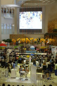
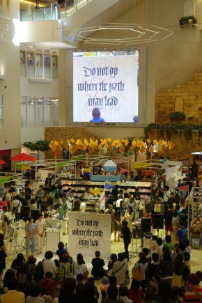
2014年9月23日、阪急うめだ本店で開催された「阪急 文具の博覧会 2014秋 ノートの魅力 再発見」に、J-LAFはカリグラフィーイベントとして参加いたしました。

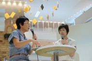
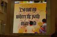
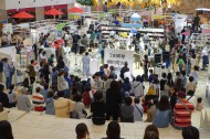
まず三戸美奈子、清水裕子による1時間のスライドトークショー。大きなビジョンに映し出された資料映像とともに、カリグラフィーの歴史やレターアーツの作品についてわかりやすくご紹介しました。普段見慣れない文字の芸術に、熱い視線が注がれていました。

DSC00393DSC00412DSC00448
DSC00495DSC00465

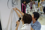
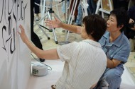
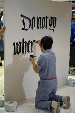
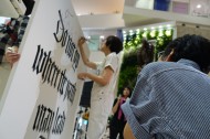
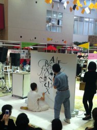
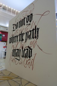
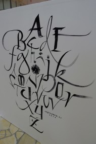
続いて、2名によるライブライティング。1.8m角のパネルにAからZまで、即興で交互に文字を書いていきます。次の文字がどう来るか、書体や大きさはどうなるのか。相手の書いた文字に合わせて次々と新たに文字を生み出していく両人。毎回自由に変化する文字は、観客の目を釘付けにし、最後までどう完成するのか目が離せない、緊張感と躍動感たっぷりのパフォーマンスとなりました。もう片側のパネルには黒のゴシック体と赤のフリーライティングのコントラストを持たせた形で文章を披露。筆さばきや腕の動き、文字のバランス、空間の作り方など、実際に間近でご覧いただくことで、カリグラフィーの奥深さをご堪能いただきました。
DSC00478DSC00491DSC00496
DSC00523DSC00521DSC00513

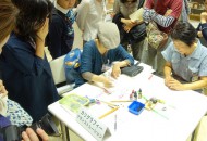
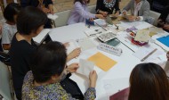
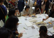
パフォーマンスのあとは、各テーブルを使って、様々なイベントが行われました。
カリグラフィーに使われるペンや道具で自由に体験していただくカリグラフィー文字書き体験。カリグラファーが普段どのように書いているかを披露するデモンストレーション。和とじ、洋とじのノート作りワークショップ(お名前を入れるサービス付き)。
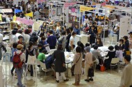
どれも大変な盛況ぶりで、阪急の担当者の方から、「文具関係のワークショップでこんな人だかりはまず見ない」との感想をいただいたほどでした。


DSC00525
今回は、NPO法人となって最初のイベントでもあり、カリグラフィーやレターアーツの普及活動としては絶好の機会でした。多くの方に文字を書く楽しみやレターアーツの存在を「発見」していただけた有意義な1日は、こうして幕を閉じしました。
今後もこうしたイベントを広く開催出来ればと心から望んでいます。


IMG_4759DSC00548DSC00546

"Working as a Calligrapher for Film Production" by Keiko Shimoda

This is a story about my experience when I worked for the film production of 47 Ronin from January to July 2011.

I had a phone call from a member of staff in the film production team who asked me to join them on their set decoration team for six months. At that time, I was employed by a small company so at first I declined the offer, but they called me again the following week. Fortunately I could be a freelancer because I've got my residential visa. I decided to resign my job and join them.

I worked for the Shepperton Studio, the sister studio of Pinewood where all the 007 and other big films were shot. They are both located west of London, near Heathrow Airport, and I live in east London. Travel took two hours by train. I also worked in Budapest, Hungary for ten days where some of the sets were located.

The work routine was quite similar to normal office hours. It started at 8 a.m. and finished at 6 p.m. with an hour for lunch and frequent tea breaks, but there were some days when I had to stay late (until 9-10 p.m.) or work through weekends. There was a very clear hierarchy in the production. The employer was the film production company who employed a group of freelancers for this particular production. It seemed that many of the staff had personal connections to each other, or often had worked together in the past.
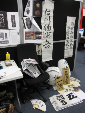
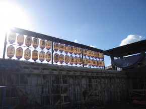
12

34

Upper left to right
My desk at office: Pinning some writing and references started conversations with my colleagues and bosses.
Lanterns for Kira: I even dreamt about these purple lantern...
Lower left to right
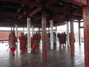
The pillars of the temple: We covered those pillars with silks with the Buddhist prayers written on.
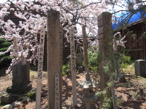
Asano grave yard: One of the things I had to deal with quantity was these wooden plates, ‘sotohba’. Model-maker made these grave stones from plaster after digitizing my handwriting.

My main job was to be a teammate of the set decoration team and write letters in the style of Edo era, translate them and understand what they are, so that I can explain them to non-Japanese colleagues. Materials varied from paper to all sorts of fabrics and woods. Also, I used not only Japanese sumi-ink, but paints too. I also wrote on small things like tiny labels, boxes, or books, as well as larger things such as eighteen-foot banners and shop signs on doors, etc. Almost everything I did everyday was a new experience and challenge.

The biggest quantity I had to deal with was the shipping containers and lanterns. For the containers, I had to write and stencil over the uneven surface similar to a straw mat. And for the lanterns I wrote letters onto them directly with paint. I had never dreamt that it would be so hard to make a decent line on a pleated surface! I felt desperate (and a bit fed up) having to meet a deadline with no one to help me complete this massive task, so I cheekily sneaked my niece’s name or mine onto some. On the other hand, I became fond of working on fabrics. One of my favorites was the six-foot silk banners with Buddhists prayers written on.

Researching became a part of my daily work too. I had to look for the wording to write, the style of things such as scrolls or books, certain kinds of Buddhist prayers and much more. Once I got to know my colleagues, they often asked me to check things we were designing. The way to do seppuku, the lighting system of Kabuki stage, the variety of fans, chopsticks, cosmetics, and also all the religious decorations – Buddhist prayer icons, Shinto shrine decorations, things around grave yards etc. Even the art department, who made all the buildings and worked next to us, asked for my opinion quite often. Fortunately, my family has always been fond of antiques, traditional plays, ancient buildings, and Buddhist statues, so I enjoyed researching and adding to my stock of knowledge.
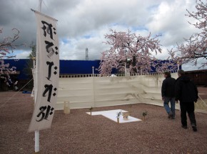
1415

Left to right
The setting for the seppuku: I researched how it should be and also made the banners with Sanskrit letters.
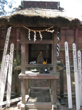
The little shrine and the wooden plates (sotohba): I was in charge for dressing the whole thing up with plates and the straw rope.

An 'instructor of calligraphy' may sound somewhat too important, but this also became a part of my work as I got to know people I was working with. Hiroyuki Sanada, who played Oishi, came to join the production way before the shooting started. We often talked and sometimes exchanged opinions as we were the only Japanese on the same floor at that time, and he was interested in things we were making. When it was decided that the actors should take a short Japanese calligraphy lesson to learn how to hold the brush, etc., they chose me as the instructor since they knew me personally.

I showed some examples I collected of handwritten documents from this era as well as some actual handwritten signatures of the 47 ronin. I also showed the actors how samurai warriors should hold and move brushes when they write and the posture they should keep, and we tried them out together. They needed to be able to write their signatures, so I passed some samples of those around. We had a session once in Budapest and another in Windsor Forest, just a day before they shot the scene.

At the first session, Keanu Reeves, who played Kai, stopped and asked me why all those documents and references look so different from each other, and he also wondered if they were all in the same Japanese. He was the only non-Japanese in the main cast. We Japanese have some kind of experience in writing with a brush as part of our education (which I think is terribly important and hopefully will continue in the future) so we all have some images or vague memories of how they look, but Reeves didn’t of course. That difference probably confused him, so I explained a bit more to him separately and tried spending enough time to actually write the letters. The other actors including Tadanobu Asano, who played Kira, and Rinko Kikuchi, who played a witch, also popped in and enjoyed this rare opportunity to try Japanese calligraphy. We spent thirty to forty minutes on this.
56

Left to right
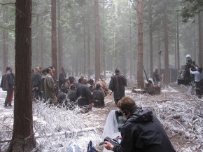
On location: At Windsor Forest, a moment before the shooting started. The atmosphere was very tight.
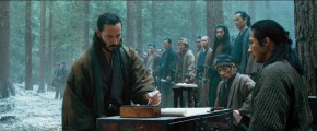
Signing the blood oath - a screen shot from the film: He picked up the brush with his left hand. I was nervous watching this right next to them.

We had another session at Windsor Forest, but that was just for refreshing their practice of using brushes. We set a foldable table on the slope right next to the shooting location. I showed some documents or samples of signatures again and checked their brush movement. Jin Akanisi, who played Chikara, was not with us at Budapest so that was his first experience. Reeves hadn’t decided which hand he should use. He is left-handed, but he was unsure if he should act as if he is right-handed. Also, as his character is imaginary, there was an issue of deciding which character should be used to write his name. We have three different characters to write our language, Hiragana, Katakana and Kanji (the Chinese characters). Normally we all use Kanji for our names, but what about Kai? The script was in only English so there had never been any Kanji for Kai before. I had a character of Kai as 魁 in my mind and I suggested this. Reeves and Sanada decided to go for it. (In the first script Reeves' name was Hiro but he didn’t like it. I was asked to make new suggestions by Reeves' translator and Reeves picked Kai.)

Sanada and Reeves had obviously done some practice before the shooting. I felt almost sorry we can’t see their writing on a big screen. I was surprised at Reeves especially as he had only had one or two days to practice after we decided to go for Kanji, but his writing was fluent and nicely formed. I was amazed how hard they worked to go further. I was there with them on the shooting day at the forest, looking after the tools and other things.
16717

Left to right
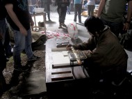
Shooting the close-ups: At the set of the second unit. They reproduced same settings as the main shots―all tools on the chest and costumes.
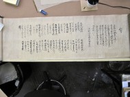
The blood oath: The ‘legend’ and forty-seven signatures. They were used for close-up shots.
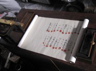
The blood oath scroll with blood marks: It was used for a close-up shooting by the second unit after it was used for the main shooting.

I also did a similar thing with the second unit, who was in charge of close-ups or other individual shots. This time their focus was the actual writing. My ‘students’ were all extra actors whose hands had to represent each of the main casts' and they were all beginners of calligraphy. They gave us two days to learn. I showed similar references and models of each signature and then we had to get on with actual writing. I was there with them while they shot the extra’s hands, too. Is it possible to produce decent calligraphy to be seen on a silver screen after two days practice? But they, non-Japanese shooting crews, would not be able to tell which writing is good enough or not. I tried to talk to one of the directors and we also shot the close-ups of my tip of the brush, without my female fingers in the frame. It was very interesting to see the cameraman trying different lenses, the lighting crew adjusting the lighting each time, and how others such as the make-up crew were working.

Helping to shop for more 'props' became part of my job as well. Way before the shooting started the buyer and designer had been to Japan to buy things which filled our big storage warehouse. These ranged from chopsticks to cupboards or palanquins. But as the shooting went along, we needed more stuff – millions of lanterns for a start, traditional candles, more fans, handles for sliding doors, fabrics for tatami mats. We had to order those from Japanese sellers, so we made phone calls at 6 a.m. in the morning to Japan, myself ordering them in Japanese, with a buyer talking to me in English right next to me. I also did some filing and translation of those receipts or bills.
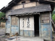
8910

Left to right
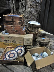
Set of Dejima: Shipping containers which I worked in the early days were put in the set. The atmosphere was great.
The house of sword maker: The letters were painted directly on the big doors. It was hard to make the right balance and layout.
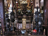
The inside of the temple: It was not on the film but it is one of my favorite sets.

Everyday there were some problems. I was not good at the job called ‘clear’ which we had to make sure that what I wrote was not touching on any copyright. Most of the time the designer just gave me a very rough idea what to write, so I decided what to say. It was my duty to ‘clear’ those each time. Names of casts, poems, prayers, names of shops… I had to submit the documents that had both Japanese and English to those in charge, then start working after I was given the okay. But I often forgot, then they all had to wait for me to do ‘clearance’. This reminded me of the fact that the characters and letters are in fact, information.

Also, I often wished I could have had someone else who was a Japanese to talk about things. I would have felt much easier and less pressured when I had to decide what to write, if I could have talked about or discussed the art, culture or language (because the speaking and writing language of Edo is completely different to current one).

What I felt on a daily basis was that you need to work as a team. Miscommunication or misunderstanding could often spoil the work you did in days. And I had to be in charge of whatever I was making, to explain them to the other members or bosses (as they can’t read Japanese). On the other hand I enjoyed these hard jobs. You get paid for writing your letters all day long for seven months. At late stages, I almost felt my arms moving by themselves to make the brush strokes. Often those letters were much better than the precisely prepared and designed ones. I could almost say that quantity wins over quality.

It was brilliant to meet other professionals, too. ―Joiners, draftsmen, model makers who could create anything by looking at references, painters who could draw really anything, special effects crew who could make the right amount and kind of smoke or fires, camera people who could control ‘monster’ like 3D cameras and the lighting crew who worked very close to with them. As a film lover and a fellow craftsman, it was my pleasure and treasure to be able to see all these professionals who were trying their best to make one film. Lastly, I learnt that you need to be fit to survive in a busy film studio!
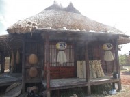
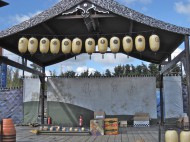
111213

Left to right
A village house : A porch of tatami mat maker’s house in my most favorite set. I love these lanterns too.
A background screen of the stage: That was the first thing I had to tackle the size but the result was not too bad.
The ‘back-lot’: One of the outside set. There is no letter but I wanted to show the scale.

Everyday there were ups and downs. I started my career as a calligrapher when I came to London in 2001, and had been working in a small studio. More than three hundred people were working on the filmmaking sets and different things were happening every minute. Looking back now, there are things I’m still not sure about the results of what I did. It is a shame the film itself was not commercially successful too. I cannot help remembering that Great East Japan Earthquake occurred on the next day I taught the actors to write in Budapest. But after surviving seven months, with lots of compliments from the professional colleagues, I can say that I have been useful to this project. Someone needs your skill and you do your best – maybe this is what work is all about.

Please have a look at my blog also about the work details or back stage stories.
http://calligraphy47.blogspot.co.uk/

Keiko Shimoda
Born in Hyogo, Japan. She started to learn Japanese calligraphy when she was three years old. After graduating college, she worked for a shipping company for eight years in Kobe till 2000. After leaving her job, she got an apprentice job for one year as a graphic designer and calligrapher at Kirsten Burke Calligraphy Studio, Greenwich, London in 2001. She then started working for Mandalay Wedding Stationery, which Kirsten Burke launched in 2002. She started taking private clients around 2010 and helping other professional calligraphers in London. In 2012, she worked as a Japanese calligrapher for the film 47 Ronin for seven months. Since then, she has worked on commission for filmmaking on several occasions. Films she was involved in include Skyfall and Alice Through the Looking Glass. She now works as a freelance Japanese and alphabet calligrapher in London. Clients include Mulberry, Burberry, Jimmy Choo, Claridge's, Christie's and more. A member of SSI (Society of Scribes and Illuminators) and a committee member of SLLA (South London Lettering Association).

Keiko Shimoda's website:http://www.j-wcalligraphy.co.uk/
Kirsten Burke: http://www.kirstenburke.co.uk/
下田恵子「映画制作の舞台裏で字を書く」

2011年1月から7月まで、『47RONIN』という映画制作に関わりました。そのときのことをお話したいと思います。

ある日、私のウエブサイトを見た映画の制作スタッフから電話があり、映画のセットを装飾したり、その為の小道具を作ったりするセットデコレーションのチームの一員として、6ヶ月間働かないかという話を貰ったのがきっかけでした。当時私には勤めていた会社があり、一度断わりましたが、次の週にもまた電話がありました。居住ビザの取得後で、フリーランスとして自由に動ける状態にあったため、考えた末に辞職して、彼らに雇用される形をとりました。

その新しい勤務先は、007のシリーズなどを撮っているPinewood撮影所の妹分、Shepperton撮影所で、いずれもヒースロー空港方面のロンドン西郊外。自宅から片道2時間の通勤です。撮影所の都合でハンガリーのブダペストにもセットを設けたために、そこにも10日ほど滞在して仕事をしました。

勤務の仕方は普通の会社と似ています。朝8時から夕方6時まで、昼休み1時間の10時間勤務。残業や土日出勤もありました。上下関係のはっきりした縦社会で、体育会系のようだと感じました。雇用主は映画制作会社で、雇用される側は、フリーランスの集まりや、以前組んだことのある面々など、紹介で仕事が動いているようでした。

2

34

上段左から
机の周り:資料や試しに書いたものを貼っておくと、通りすがりの同僚やボスとの話のきっかけになりました。
キラ提灯:夢に出るほどの量だった紫の提灯たち。
下段左から
お堂柱:最後の全員切腹のシーンのお堂柱を、お経を書いた絹で包みました。
墓地:数をこなした物の一つである卒塔婆。墓石は書いた字をデータ処理し、小道具作りの人が型取りして出来た石膏のもの。

仕事内容はチームの他のメンバーと英語でコミュニケーションを取りながら、時には翻訳もし、書く内容を理解、把握し、書体を問わずに江戸時代、元禄の頃の日本語を書くことが第一でした。書く対象も紙、布、木など様々で、墨だけでなくペンキなどを使うこともしばしば。小さなものは手のひらより小さい箱のラベルや本から、大きなものは身長より高い幟や、家の戸、舞台の背景などで、毎日が未体験ゾーンでした。一番大量に書いたのは、船荷と提灯です。むしろのような素材にペンキで直接字を書いたり、ステンシルを作ったり。提灯にも直接書くのですが、アコーディオンのような状態の表面に直線を書くのがこんなにも至難の技とは、と思い知らされました。締め切りを前に量に追われるのは辛いことで、最後にはやけになって、勝手に姪の名などを書いたりしてしまいました。逆に、数をこなすうちに作業が気に入って好きになったのは布に書くことで、私の仕事の終わりが見えてきた頃に作った高さ6フィートの絹に書いた字は、自分でもとても気に入っています。

私や皆が作業するために、調べなければならないことも色々ありました。自分で字を書く小道具、巻物の形態や、書く文言、お経の種類に始まり、私がチームに馴染んでくるに従って、字に関係のないことのリサーチも頼まれることが増えるようになりました。切腹の作法、歌舞伎などの舞台照明、使用用途によって異なる扇子の種類、調度品から、仏壇、神棚、墓前のしつらえなどの宗教に関わることを何故か特に任されたり、時には隣で建物を作っている美術チームから意見を聞かれることもありました。さいわい両親や祖父母の影響で古いものが好きで、歌舞伎にも親しみはあり、お寺や神社も好きだったことも手伝って、楽しみながら調べものが出来ました。
1415

左から
切腹の場:誂えや調度品などを調べたと同時に梵字も書きました。東西南北で、書かれる字も異なるのだそうです。
祠と卒塔婆:お供え物や注連縄、紙垂(しで)などを任されました。

書道指導というと堅苦しく聞こえますが、これも日々を過ごすうちに持ち上がった話でした。オオイシ役の真田広之氏は、撮影開始前の早い時期から現場にいらしていて、同じフロアで日本人同士お話をする機会が度々ありました。小道具にも興味や意見をお持ちで、作業場にも顔を出されて意見交換をしていました。そういう繋がりもあって、血判書に署名する大事なシーンの撮影のために、筆の持ち方などを俳優さんたちが学べれば良いのではという話が出た時、私に指導して欲しいと要請が来たのです。当時の筆の運びや実在する登場人物の筆跡の画像をお見せしたり、筆の持ち方運び方、姿勢などを一緒にやってみたり、主な登場人物の署名をお手本として書いてお渡ししたりしました。ブタペストで一度、ウィンザーの森で一度、撮影直前までに計二度直接お稽古をしました。

最初のお話の時に、カイ役のキアヌ・リーブス氏から「(参考資料や当時の筆跡の書体が様々なのを指して)なぜこの見本とあの画像では字の見た目が全く違うのか。同じ日本語なのか。」という質問が出ました。話の最中でしたが、どうしてもそれが気にかかったのか、その場で疑問を解消しておきたかった様子でした。メインのキャストはキアヌ・リーブス氏以外、皆日本人。日本の学校で私たちは一度は筆を持ちます(それはとても良いことで、是非続けて欲しいと思っています)。日本人であればとりあえず毛筆の字の見た目や、筆を使った時の感触などは、何となくでも記憶のどこかにあるわけですが、その前提がないまま話を聞いたり、例を見せられたりしたキアヌ・リーブス氏は混乱してしまったようでした。そういう不利な点はありますが、出来る限り説明をして、実技に集中して貰えるようにしました。他の出演者の皆さんも演技の間の息抜きとして、その様子に興味を持たれたようで、字を書くシーンのないキラ役の浅野忠信氏や、魔女役の菊池凛子氏も覗きに来てくださいました。滅多にない毛筆と墨に触れる機会を楽しんでいらしたようです。ブダペストでは30~40分のお稽古となりました。
56

左から
撮影現場:ウィンザーの森で。撮影開始直前の緊張した空気。
血判書に署名(映画のシーンより抜粋):左で筆をとりました。私はこれを横で少しハラハラしながら見ていました。

ウィンザーでは、撮影直前に筆の感覚を思い出していただく程度で、撮影現場の真横に簡易テーブルを置いて貰って、もう一度各自の署名のおさらいをしたり、筆の持ち方を確認したりしました。その過程にも様々なエピソードがありました。チカラ役の赤西仁氏は、だいぶ後から配役が決まったために、ブダペストでの一度目のお稽古には参加出来ず、その時が初めての指導になりましたし、キアヌ・リーブス氏はここにきて、利き腕の左手で書くべきか、右手で書いているふりをするべきかで迷っていたのです。剣はどちらで持つのか知りませんでしたが、書きやすい方で、とお勧めしました。また、カイというのは架空の人物ですから、名前が平仮名なのか漢字なのか、漢字ならどのカイなのか、或いは片仮名なのか(台本は英語で、表記はただKaiとなっていました)決め兼ねるという問題もこの段階になって問われ、ちょうどその場にいらしたオオイシ役の真田広之氏と三人で相談の上、カイの名前が誕生した際に念頭におかれていた「魁」の字を提案して、それでいくことになりました(全くの余談になりますが、カイはもともとヒロという名で台本に書かれていました。ところがキアヌ・リーブス氏が嫌ったため、彼の通訳であった方と三人で相談して、カイという音になった経緯がありました)。

本番までに真田広之氏、キアヌ・リーブス氏は、自主的に練習してくださったようで、書かれた字がカメラに収められなかったのが残念なほどでした。特にキアヌ・リーブス氏は、カイを漢字にすると決まったのが直前だったのにも関わらず、撮影当日には淀みなくあの難しい字を書かれていて驚きました。皆さん演技以外の細かいところにまで尽力なさるのだなと感心しました。撮影当日も、私は側にいて筆記具などのお世話をしていました。
16717

左から
クローズアップ撮影:第二撮影班のセットで。机上の小物、役者の着物、すべてメインの画面とマッチするように再現します。
血判書:序文と、全員の署名。
捺印後の血判書:メインの撮影終了後、第二撮影班のクローズアップでも使われました。

後に、第二撮影班という、クローズアップなどの個別ショットを担当する撮影班の指導もしました。今度は字がアップになって画面に映ります。指導する対象は、オオイシ役などの代わりをする手のみのエキストラたちで、全員書道初心者でした。撮影前に二日間、彼らと練習出来る時間を貰い、資料などをお見せした上で、各々の署名を真似て貰いました。彼らの手もとが撮られる時も、現場にいて最後までお稽古をしたり、道具を整えたり。しかし銀幕に大きく映し出されても見るに堪える字を書けるようにするには、二日間では所詮無理がありました。ただ、彼らの字が上手ではない、という事実は英米撮影スタッフには分かりません。その場で第二撮影班の監督と話をした結果、指を写すと女性だと分かってしまうため、私が書いて筆先だけを写したものも、後から撮ることになりました。レンズを変えるとそれに合わせて照明も調節するなどしていたのが面白く、機材や照明、撮影の様子を間近で見られた興味深い日々でした。

小道具の購入も手伝いました。撮影までにバイヤーが日本から買い付けてきた骨董品などが船便でコンテナ二箱分ありました。箸から箪笥や駕籠のような大きいものまでが倉庫に並んでいましたが、それでは足らず、提灯、和蝋燭、扇子、馬具、ふすまの取手、畳の縁の布地など、ロンドンから日本へ発注したものも沢山あります。時差を超えて日本の業者に電話をかけ、バイヤーが横で英語で話すのを日本語にして伝え、それにまつわる伝票の整理や翻訳もしました。
8910

左から
出島のセット:最初の仕事のうちの一つである、船荷がセットに配置されたところ。雰囲気満点でした。
刀鍛冶の家:大きい戸に直接ペンキで書く。大きさや太さのバランスが難しかったです。
寺お堂内部:本編には登場しないカットされた場面ですが、好きなセットの一つでした。

困ったこと、厄介だったことも、毎日たくさんありました。クリアと呼ばれる作業は一番苦手でした。私が書く内容が著作権を侵害していないかどうかを確認する作業です。大抵の場合何を書くかは私に一任されていて、著作権の問題をクリアするのも私の責任でした。人名から詩、お経、和歌、店名など、日本語と、それを翻訳した英語の両方を担当者に提出し、OKを貰ってから作業開始となるのですが、時には許可を貰うのをうっかり忘れて、皆に迷惑をかけたこともあります。文字は情報である、と再認識させられた業務でした。相談相手がいなかったのを辛く感じることも度々で、同じ日本人で江戸時代の美術や文化、言葉に強い人が側にいて相談出来たら、書く内容や字面などを判断する時に気が楽だったろうと、今でも思います。

この仕事をしながら日々感じたのは、まず、チームプレーが大事だということ。意思の疎通や連絡を密にしないと、作業が無駄になってしまうことも多々ありました。また、自分が書いているもの、作っているものを理解していないと、質問を受けた時に相手を説得できずに困ることもありました。逆に、その現場ならではのメリットもありました。7ヶ月もの間、朝から晩まで字を書いていると、字面を考えなくても腕が勝手に動くようになり、自分でも妙な感覚でしたが、それらの字はデザインして考えた末に書いた字よりも良くあらわれることが多かった気がします。量が質に変わることもあるということを体感したのです。様々なプロに会えたのも楽しい収穫でした。大工、図面引き、何でも資料を見て3Dで創ってしまう小道具作り、何でも書ける絵描きから、丁度いい量と質の煙が出せる効果係、お化けのようなカメラを操るカメラマン、彼らとバランスをとって動く照明係、いろんな一生懸命のプロのもとで、映画が成り立っているのを間近で見られたのは、映画好きとしてもクラフトに関わる者としても、嬉しいことでした。そして何より体力がいるのだと痛感しました。自分が渦中にいた7ヶ月は怒濤の毎日でした。字を書くことを業とする暮らしをロンドンで始めて、それまでは少人数のスタジオで、限られた人たちの中で同じ作業を繰り返す日々だったのが、三百人強が現場に関わる、新しい事だらけの毎日になりました。少し時間の経った今、振り返ると肝が冷える瞬間も何度もありましたし、結果的にあれで良かったのかどうかと、納得のいっていない仕上がりの物もたくさん。映画全体の出来がどうなのかという思いもあります。ブダペストで皆さんに書道指導をした翌日に、東日本大震災のニュースが飛び込んできたことも切り離せない記憶として残っています。でも、7ヶ月を乗り切れて、終わる時には幾人かの方から肯定的な言葉もいただいて、私が書く字が何かこのプロジェクトの役に立ったという自信がつきました。必要とされて、自分が出来ることを提供する。仕事とはそういうことかもしれない、と今思います。

111213

左から
民家:一番好きだった農村の家並みセットの中の、畳屋の縁側。この提灯は気に入っています。
舞舞台の背景幕:これも大きさに苦労したもののうちの一つですが、仕上がりは悪くなかったです。
野外セットの一部:何も字はないのですが、広さを感じていただきたくて!

一つ一つの仕事の話や裏話などを、もう少し細かくブログに書いています。よろしければご一読下さい。
http://calligraphy47.blogspot.co.uk/

<プロフィール>
下田恵子
兵庫県西宮市生まれ。大学卒業後、神戸で船会社に8年勤め、2000年退社。2001年にロンドンへ行き Kirsten Burke Calligraphy Studio でアプレンティスとして1年勤める。その後同事務所がウエディングステーショナリーの姉妹会社 Mandalay Wedding Stationeryを立ち上げるのと同時に、そこでアシスタントグラフィックデザイナー、カリグラファーとして勤務。2010年ごろから他のカリグラファーの仕事などを手伝い始め、個人でも仕事を受け始める。2012年1月から7月まで 『47RONIN』の映画制作に、書道家として関わる。その後、書道、カリグラフィー両方の仕事を個人で受けるフリーランスになり、現在に至る。
『47RONIN』の後にも『007スカイフォール』や『鏡の国のアリス』など、何度か委託で映画制作に携わる。
主なクライアントとして、 Mulberry, Burberry, Jimmy Choo , Claridge’s , Christie's など。
SSI(Society of Scribes and Illuminators)会員。
SLLA(South London Lettering Association)コミッティーメンバー。

ウエブサイト: http://www.j-wcalligraphy.co.uk/
Kirsten Burke: http://www.kirstenburke.co.uk/
カリグラフィーレクチャー at 東洋美術学校

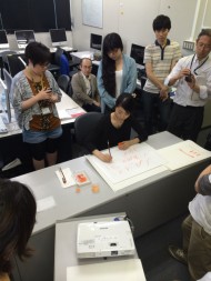
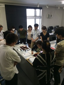
8月9日、東洋美術学校にてカリグラフィーのレクチャーを開催致しました。 文字に興味のある学生さん、卒業生達から成るグループによる夏の勉強会「3B会」の講義の一つを「カリグラフィー その役割と応用」という内容でJ-LAFが担当致しました。
IMG_4503_4IMG_4499-thumb-220x293IMG_

簡単な歴史とカリグラフィーの役割(実用性と芸術性)をスライドでご紹介し、そのあと三戸美奈子、河南美和子、白谷泉の3名によるいろいろな道具、書体、書き方の紹介と実演を行いました。

デモンストレーションへの真剣なまなざし、熱心な質問の数々。 相互に学ぶことも多く、あっという間の充実した2時間半でした。 学生さんやデザイナーさん、文字に興味のある方達に、カリグラフィーやレターアーツを知っていただく大変良い機会となりました。

手で文字を書く重要性を多くの方に理解していただけるように、今後もこういうイベントが開催できることを期待しています。東洋美術学校のみなさま、ありがとうございました。

クリストファー・ハーネィス「孤立した環境の中でのカリグラフィー」後半

25年間ノルウェー・オスロで活動してきたカリグラファーの主観的ストーリー

2-1-CH_logo-132-1-CH_logo-52-1-CH_vitalize-4

レターデザイン3点

オスロに帰国してからは、賞状への名前入れからブックカバーや見出しのデザインまで、様々な仕事の依頼を受け始めました。ちょうどこの時期は、複製方法が旧式から新しいものへと徐々に移行していた頃でもありました。

グーテンベルクの時代から現代までの活版印刷の素晴らしい本を何冊も見てきましたが、自分ではまだ活版印刷で制作する機会には恵まれていません。レトラセット(印刷用転写文字)、写真植字、そして古い写真製版などは使ったことがあります。1989年に故郷に戻った後、グラフィックデザインの私立学校で教鞭をとりました。入学して2年間、生徒たちは1週間の内2日間はカリグラフィーとレタリングを学びます。タイポグラフィーをより良く理解するために、平ペンでどのように文字の形が作られるのかを理解するというのが目的でした。学校が倒産するまでに、海外講師を招致して2つのワークショップを企画しました。1回目はジュリアン・ウォーターズ、2回目はブロディ・ノイエンシュヴァンダーが講師でした。

タイポグラフィーやグラフィックデザインの制作に於いても、MacやPCが急速に旧式の方法に取って代わりました。私が書いたルネサンス・イタリック体と一緒にFutura Extra Bold(フツラ・エクストラボールド)の文字が使われたことや、他にもそんなゾッとするようなタイポグラフィーの使われ方をされたことがあって、自分にとって初めてのMacと、美しいアドビ社のオリジナル書体Adobe Garamond(アドビ・ガラモン)、Minion(ミニオン)、Trajan(トレイジャン)、Lithos(リトス)を手に入れた時は嬉しくて仕方がありませんでした。ようやく(と当時は思ったのですが)自分の好きなようにカリグラフィーとタイポグラフィーを融合させた構成が出来るはずでした。しかしながら、実際はそうとも限らなかったのです。タイポグラフィーが誰にでも出来るものとなり、Macのデスクトップパブリッシングは、感性豊かな(おそらく神経質すぎる)カリグラファーにとっては、幾分悪夢のような状況になりました。それでも私はPageMaker(訳註:アドビ社のDTPソフト)を独学で使い、かなり経ってからInDesignも使えるようになって、カリグラフィーをしながらグラフィックデザイナーにブックデザインを教えてきました。

2-2-CHaanes_Letter32-2-CHaanes_Letter5

2-2-CHaanes_Letter4
1992年、私はヘルマン・ツァップにダルムシュタットに訪ねて行っても良いかと連絡しました。その折に、彼からノルウェーの人に向けたカリグラフィーの手引書の執筆を勧められ、出版します。出版社の校正はあまり良くなかったものの、デザインは当時の自分なりのベストを尽くしたものになりました。ブックデザインについても多くを学べたと思います。ヤン・チヒョルトの「失敗したことからは、想像以上に学ぶことがあった。」という言葉を身をもって体感し、そして「現代のブックアーティストと呼ばれる人たちが、殆どカリグラフィーを学んでいないということを非常に残念に思う。」という言葉にも共感します。グラフィックデザイナーも同様だと感じています。1998年には、ノルウェーでカリグラフィーについて制作された4つのテレビ番組のホスト役を勤め、その番組用に手引書の簡略版も作りました。

ここ数年、自分が選んだ言葉を書いた作品を何度か展示してきましたが、一度、言葉を書かずにアルファベット文字だけの展示会を開いたことがあります。それは、取り組んでいた詩に基づいた結果でもありましたが、私が書いた言葉を読んでくれる人は殆どいないと失望していたからということもありました。アルファベット文字のみを描いてアートとして発表することを、空虚で意義のない行為だと思う人もいるかもしれません。しかし、日本の書家に対して「なぜ何年も何年も瞑想の練習として円相(訳註:禅における書画の1つ)を書き続けるのか?」と尋ねる人はいないでしょう。

今まで受けてきたカリグラフィーの仕事は、ブックカバー(なぜか出版社ではなく著者からの依頼が主)、パッケージ商品(なぜかチーズが多い)の名前入れ、賞状の文章や名前、会社のロゴ、様々なタイトルなどを書くことです。言うまでも無く、難しいクライアントも沢山いました。何かを加えると文字が台無しになってしまうため、こちらの権限を尊重して欲しいなどということを、「何でもあり」と信じている人の多い世の中で説くことは容易ではありません。一方で、本当にやりがいのある素晴らしいコラボレーションも経験しました。思い出されるのは、ノルウェーの出版社カペレン・ダム社(Cappelen Damm)のために作ったロゴです。

2-3-CH_roman-2 2-3-CH_vitalize-62-3-CH_roman-7


2つの出版社、既に大手であるカペレンと、ハリー・ポッターの出版権を取ったことで大手の仲間入りをしたダムの合併が決まった際、新しいロゴのスケッチを私から提案することになりました。合併の過渡期にTrajanを使用していたこともあって、先方はクラシックの要素を持ちながらオリジナリティーとモダンさを兼ね備えたものを求めていました。スケッチを数枚提示し、他に最高責任経営者、出版社のグラフィックデザイナーとタイポグラファーも過程に加わって、全てが順調に進みました。ロゴをデジタル化した方が良いと思いましたが、自分がベジェ曲線やポイントに慣れていなかったため、2年前ディッチリング(イギリス)での私の「ペンから活字体へ、そして再びペンへ」のワークショップで会って以来、お互いの取り組みを尊敬しあっているサムナー・ストーンにお願いして見積もりを出してもらいました。彼にロゴのデジタル化の見積もりをもらってから、私は純粋な好奇心で、ロゴのスケッチをもとに他のアルファベットの文字も全てスケッチすることにしました。そしてそれをデジタル化した場合の見積もりも、併せてもらっておいたのです。出版社に、自分のスケッチ、サムナー・ストーンの見積もり額、私が文字をフォントにした場合の見積もり額を提示したところ、すぐに気に入ってくれました。フォントにはキーボードの文字以外にも多くのものが含まれています。ピリオド、コンマ、クェッションマーク、アンパサンド、リガチャー、アクセントのマークなど、更にスケッチを進めてスキャンしたものをサムナーに送り、彼がFontLabを使いデジタル化しました。私は更に修正を入れ、文字やスペーシングの調整、記号の追加、ロゴマークと社名との組み合わせなど、数ヶ月間の検討作業を経て、やっとフォント化が終わりました。それらは出版社のビルや社内の標識、そして多数の子会社でも使用されています。本の中でどのように使うかや、配色に至るまで提案しました。

2-4-CH_logo-16 2-4-CH_logo-24 2-4-CH_vitalize-10

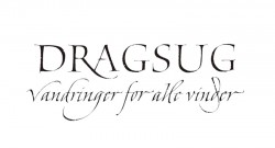
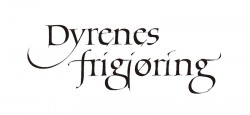
ブックタイトル3点

ノルウェーのカリグラフィー事情のこともお話した方が良いかと思います。でもこれは、あくまでも私個人の経験に基づいた主観ですから、必ずしもノルウェーの文化が私のカリグラフィーに影響を与えたということではありません。とはいえ、私はノルウェーでカリグラファーとして働いてきました。厳しいことが多く、その道のりには偏見や障害もありました。

ノルウェーに印刷技術が伝わったのはグリーンランドと同時期で、スウェーデンやデンマークに伝わったのより200年も後のことです。ヨーロッパ大陸に貴重なものが多いのに比べ、質が高く歴史のあるマニュスクリプトも少ししか残っていません。オスロの美術工芸学校にはカリグラフィーやレタリングの教師陣がいました。先ずは影響力が大きかったイヴァール・ベル。彼はヤン・チヒョルトやマックス・ビルとも交流がありましたが、彼の作品はどこにも見つかりません。後に続いたのはヘルマン・ボンガード(『Calligraphy Review』の記事でスーザン・ヘティが彼を紹介しました。)やオッタル・ヘルゲ・ヨハンセンとヤン・パーレです。パーレとレイフ・バッケ、そしてアレ・ビャルケはブックカバーなどを手がけ、出版業界で活躍してきました。グラフィックデザイナーとして評価されたレイフ・フリマン・アニスダルは、コペンハーゲンでヘルマン・ツァップの指導を受け、ロンドンのペンギン(訳註:英国の大手出版社)で働いていました。エリック・リングレンの『An ABC Book』の中で取り上げられていますし、ノルウェーの大手企業のためにフォントも幾つか作製しています。グレタ・ドブラウグはカペレンのブックカバーをデザインし、アイリーニ・ウェリントンの生徒でもありました。そして、ヤコブ・ラスク・アルネセンも同じくアイリーニ・ウェリントンの生徒で、著書『Levende Skrift』(生きている文字)は、カリグラフィー界とタイポグラフィー界に対しての個人的で感動的なマニフェストです。

2-5-CH_italic-3 2-5-CH_roman-42-5-CH_roman-3

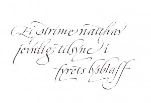
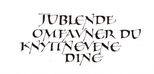
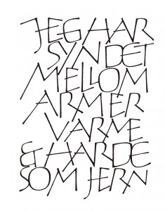
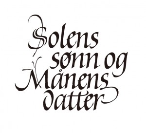
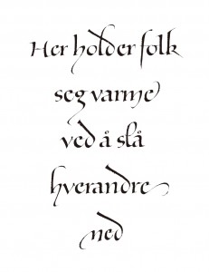
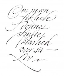
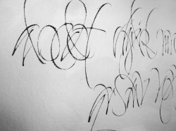
左 インゲ・ホーガネ(ノルウェーの詩人)の俳句。2種類のペンを使用。

私の生徒の2人、ジュリア・ヴァンスとヘドヴィク・ブラントはローハンプトンのコースを修了しました。他にもコースを取った人が数人いますが、私の知る限り、プロのカリグラファーとして働いているのはジュリア・ヴァンスとヘレネ・イェンセンの2人のみです。ヘレネはカリグラフィーを推進し、ワークショップを企画するForeningen Skrft(レタリングアーツ協会)の会長を務めています。ノルウェーには、もう1つKalligrafisk Klubb(カリグラフィー・クラブ)という団体があります。私も1990年にScriptoriumというグループを立ち上げましたが、自分だけで運営することが難しくなりました(それでも『Script』という雑誌を1号だけ発行しました)。

このように教師や実践者はいても、ノルウェーでは一度もカリグラフィーの真の復興はなかったのです。それは我々の文化が若すぎること、人口が少ないこと、美学の歴史や伝統が尊重されていないことに起因するのかもしれません。基礎的なドローイングのスキル、カリグラフィーやレタリングの練習、基礎的なタイポグラフィーのスキルなどはあまり教えられていないのが現状です。カリグラフィーは、タイポグラフィーにとってヌードデッサンのような役割を果たすものになり得るにも関わらず、ノルウェーのグラフィックデザインの学校では、カリグラフィーやドローイングが本当に理解されているとはいえません。

古代の美術工芸であるカリグラフィー愛好者には、多くの任務が前途に待ち受けています。カリグラフィーが教育の中に組み入れられることを確実にし、手書き文字が学校で使い続けられるよう奮闘し、書体に興味を持つ人に手書きの文字と印刷されたものとの関係を理解してもらわねばなりません。そして、アートギャラリーやクラフトを扱う人々に、我々カリグラファーが中世の時代に留まっているのではなく、文字の歴史を起源としながらも新境地を開拓しようとしていることを認識してもらわなければなりません。ペン、インク、そして紙がコンピューター画面や携帯機器と共存することも可能でしょう。もし半信半疑でしたら、ペン、インクと紙の良さを子供たちに伝えてみてください。もしかして、あなた自身も再発見することがあるかもしれません。

2-6-CH_logo-22 2-6-CH_vitalize-8christpher


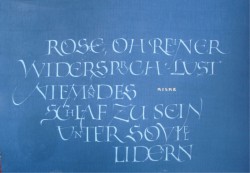
中央 ボブ・ディランの言葉を引用
右 Designの数々

記事の英語版はこちらからご覧ください

CHaanes_Teaching


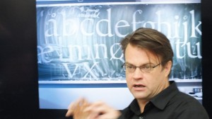
筆者授業風景

<プロフィール>
Christopher Haanes クリストファー・ハーネィス
1966年生まれ。ノルウェーのオスロに在住するカリグラファー、ブックデザイナー、タイポグラファー、教師、作家。Society of Scribes and Illuminators(SSI)では唯一のスカンジナビア人のフェロー。カリグラフィーやタイポグラフィーを指導し始めて20年以上経ち、その間イギリス、オランダ、ドイツ、フランス、イタリア、スウェーデン、オーストラリア、香港、アメリカにてワークショップの講師を務める。1989年からオスロの Westerdals School of Communication(かつてのSkolen for Grafisk Design)にて教鞭をとる。雑誌 『D2』、『Prosa』、『Numer』、『Snitt』に記事やエッセイが掲載され、カリグラフィーとタイポグラフィーの5冊の著書、『Håndbok i kalligrafi』(Aschehoug 1994)、『Kalligrafi』(NRK Fale 1998)、『Bokstavelig』(Aschehoug 2004)、『ABC for voksne og Abstracts (H//O//F 2012)では、デザインも手掛けている。現在は、カリグラフィーの手引書を英語で執筆中。『Letter Arts Review』のThe Annual Juried Issue他、ノルウェーや海外の出版物に作品掲載多数。
http://christopherhaanes.com/
"Calligraphy in the Cold" by Christopher Haanes -Part 2

A subjective story of living as a calligrapher in Oslo for 25 years

2-1-CH_logo-132-1-CH_logo-52-1-CH_vitalize-4

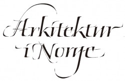
Lettering designs

Upon arriving in Oslo I started taking on various commissions, ranging from names on diplomas to book covers and headings. This was during the transition period where old methods of reproduction would gradually make way to new ones.

I haven't yet had the privilege of doing anything in letterpress, though I have admired many books printed in letterpress from Gutenberg's time up until today. But I have used Letraset, photo setting and old photographic techniques (PMTs). Just after returning home in 1989 I started teaching in a private school for graphic design. During the first of two years the students had two days a week doing calligraphy and lettering. The idea was to give the students an understanding of forming letters with the broad edged pen, in order for them to gain a better understanding of typography. I arranged two workshops with teachers from abroad before the school went bankrupt: One with Julian Waters and one with Brody Neuenschwander.

The Mac and the PC rapidly took over the production of typography and graphic material. Having experienced art directors setting Futura Extra Bold next to my renaissance italic and other more or less horrifying typographic violations I was exalted to get my first Mac, and some beautiful Adobe Originals typefaces: Adobe Garamond, Minion, Trajan, Lithos. Finally (or so I thought) I should be able to create my own compositions integrating calligraphy and typography. That was not always the case: Typography had become everyman's craft, and in the early days of the Mac desktop publishing became somewhat of a nightmare for sensitive and perhaps over-sensitive calligraphers. Still, I taught myself PageMaker, and much later, InDesign, and have been teaching book design for graphic designers alongside the calligraphic practice.

2-2-CHaanes_Letter32-2-CHaanes_Letter5

2-2-CHaanes_Letter4

I wrote Hermann Zapf in 1992 and asked him if I could visit him in Darmstadt. He suggested I wrote a handbook of calligraphy for the Norwegian market, and so I did. I designed it as well as I could at the time, although the publisher didn't exactly do a good job proofreading. It really taught me about book design. I concur totally with Jan Tschichold's statement 'I learned more from my mistakes than I ever imagined'. But also 'I regret very much that calligraphy is so little studied in our time among our so called book artists'. And graphic designers, I might add. In 1998 I was hosting four programs on Norwegian television about calligraphy, and I also made a simplified handbook for that program.

I have exhibited several times over the years, using text of my own choosing, with the exception of an exhibition of alphabets which was the result of my work with poetry and my disappointment in the fact that people rarely bothered to read texts that I had written. Making alphabets and presenting them as art may seem futile, as an empty exercise in style, devoid of meaning. Yet we never ask why a Japanese calligrapher repeats the Ensō circle as a contemplative exercise for years and years.

The types of commissions I have had over the years have ranged from book covers ( I have mainly been asked by the authors & not the publishers for some reason), names for packaging (lots of cheese, for some reason), certificates and names on certificates, logos for various companies, titles of various kinds. It goes without saying that many clients have been difficult to work with: It isn't easy to convince someone that some things just ruins letters, and that they should respect your authority, especially when the most common belief is that 'anything goes'. But I have had some really rewarding and nice collaborations, the main one that springs to life is the logo I made for Cappelen Damm.

2-3-CH_roman-2 2-3-CH_vitalize-62-3-CH_roman-7


The two publishers Cappelen (already a large one) and Damm (which had become a large player due to the fact that they bought the rights to publish Harry Potter) were to merge, and I was asked to present sketches for their new logo. They wanted something classical, but with some originality and modernity, having used Trajan in a transitional phase. I presented them with several sketches. The only other people partaking in the process was the CEO, an in house graphic designer and an in house typographer. The whole process went smoothly. I thought it would be a good idea to get the logo digitized, and since I am not too comfortable working with Bezier curves and points I approached Sumner Stone and asked for a quote. I had met Sumner in Ditchling during the Pen to Print seminar a couple of years earlier, and we were in respect of one another's work. After getting his quote for the logo, I first attempted to draw the rest of the letters of the alphabet out of pure curiosity. I then asked what he would charge for digitizing all the drawings. I brought the drawings and his quote, plus my quote for the font, to the publisher, who immediately liked the idea. I made more drawings, as a font consists of much more than the letters on our keyboard. I drew points, commas, question marks, an ampersand, ligatures, special accents,etc., and scanned them. Then they were sent to Sumner, who digitized them in FontLab. I then corrected the drawings, and over a few months of adjusting letters, spacing, adding some characters and incorporating a logo symbol (to be used alongside the word logo), the typeface was done. It is being used for signage on their building and inside the building, as well as for the publishing company's many sub companies. I also suggested placement on books and a color scheme.

2-4-CH_logo-16 2-4-CH_logo-24 2-4-CH_vitalize-10

Book titles

Something should be said about the Norwegian calligraphy scene. But this is a subjective article about personal experiences, and it would be unfair to say that Norwegian culture has affected my calligraphy. I have worked despite of it, often uphill, meeting many prejudices and obstacles along the way.

Norway got the art of printing at the same time as Greenland, approximately two hundred years after Sweden and Denmark, and we have very few historical manuscripts of a high standard compared with the treasures of the continent. There have been a line of tutors teaching calligraphy and lettering in the school of Arts & Crafts in Oslo, starting with Ivar Bell, who was an influential teacher who corresponded with many known figures in Europe including Jan Tschichold and Max Bill, but whose work is nowhere to be found. He was followed by Herman Bongard (featured in the Calligraphy Review article by Susan Petty), Ottar Helge Johansen, and Jan Pahle. Pahle, Leif Bakke and Are Bjærke have designed book covers and been active in the publishing industry. Leif Frimann Anisdahl, a graphic designer of some standing, had taken classes with Zapf in Copenhagen, worked for Penguin in London, is featured in Erik Lindgren's An ABC Book, and has made several typefaces for large Norwegian companies. Grethe Dobloug designed book covers for Cappelen, and was a former student of Irene Wellington. So was Jacob Rask Arnesen, whose book Levende Skrift is a personal and thrilling manifesto to the calligraphic and typographic world.

2-5-CH_italic-3 2-5-CH_roman-42-5-CH_roman-3

Left:Haiku by Inge Haugane, Norway. Two pens.

Two former students of mine completed the course at Roehampton: Julia Vance and Hedvig Brandt. There have been a few others who have taken the course, to my knowledge, but only two work as full time professionals: Julia Vance and Helene Jenssen. The latter is the chairman of Foreningen Skrift, which was formed to promote calligraphy and arrange workshops. Another group based in Bergen is called Kalligrafisk Klubb. I started up a group, Scriptorium, in 1990, but found it hard to run it by myself (we did make one issue of a magazine, Script).

Yet, despite these teachers and practitioners, there was never truly a renaissance for calligraphy in Norway. Perhaps due to the youth of our culture, the scarce population, the lack of respect for aesthetical history and tradition. The status quo today is that basic drawing skills, basic calligraphy & lettering training and basic typographic skills are barely taught at all. There is no understanding for calligraphy or drawing in our graphic design schools, although calligraphy really can be used as the 'life drawing of typography'.

Many tasks lie ahead for us as devotees of this ancient craft and art: We need to assure that calligraphy has a place in education, we need to fight to ensure the survival of handwriting in schools, that people interested in type see the connection between the written and the printed word, and also that art galleries and crafts communities acknowledge that we have a place among them as calligraphers who are not from some distant Medieval times, but that we are in fact exploring new ground, as well as having our roots in the history of our letters. Perhaps ink, pen and paper can be allowed to co exist with computer screens and mobile devices. If you are in doubt, introduce it to kids. Perhaps you will rediscover your own discovery.

2-6-CH_logo-22 2-6-CH_vitalize-8christpher


Center:Quote by Bob Dylan
Right:Designs

CHaanes_Teaching


Christopher Haanes teaching

CHRISTOPHER HAANES (b. 1966) is a calligrapher, book-designer, typographer, teacher & author living in Oslo, Norway. He is Scandinavia's only Fellow member of the Society of Scribes and Illuminators (FSSI). He has taught the subjects of calligraphy and typography for more than 20 years, including workshops in England, Holland, Germany, France, Italy, Sweden, Australia, Hong Kong, USA. He has taught at Westerdals School of Communication (former Skolen for Grafisk Design) in Oslo since 1989. He has written articles and essays for D2 (Dagens Næringsliv), Prosa, Numer, Snitt. He is author & designer of five books on calligraphy and typography: Håndbok i kalligrafi (Aschehoug 1994), Kalligrafi (NRK Fale 1998), Bokstavelig (Aschehoug 2004), ABC for voksne go Abstracts (H//O//F 2012). He is working on a Handbook in Calligraphy in English at the moment. Work featured in several Letter Arts Review Annual (a juried magazine for the lettering arts), plus many other Norwegian and international publications.
http://christopherhaanes.com/

阪急うめだ本店のイベントに参加

「阪急 文具の博覧会 2014秋 ノートの魅力 再発見」でカリグラフィーイベントを開催いたします

【日時】9月17日(水)~23日(火・祝)※催し最終日は午後6時終了
【場所】阪急うめだ本店 9階 祝祭広場

「J-LAFによるカリグラフィー デモンストレーションと体験」

【開催日】9/21(日) 13:30~18:00

13:30~15:30(コトコトステージでのパフォーマンス)

  • スライドトーク レターアーツの世界
  • ライブ・ライティング 三戸美奈子・清水裕子によるパフォーマンス。

16:00~18:00

  • カリグラフィー体験 (無料)
    カリグラフィーに使われるペンや道具などを自由に使って体験イベント
  • デモンストレーション
    様々な書体をカリグラファーがデモンストレーション
  • ワークショップ「ノートを作ってみよう」参加費540円(税込)
  • 詳しくはこちらまで(デジタルチラシ)

"Calligraphy in the Cold" by Christopher Haanes -Part 1

A subjective story of living as a calligrapher in Oslo for 25 years
1-1-CH_vitalize-51-1-CH_vitalize-91-1-CH_roman-5

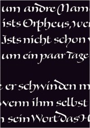
Center:Quote by Rainer Maria Rilke
Right:Book title

My father, Patrick Byrne, an Irishman living in London, gave me a broad edged pen when I was nine years old. I had only briefly met him before. It turned out to be one of those moments which create ripples, felt many years later. It was one of those refill Osmiroid fountain pens with a lever on the side which could be pulled to fill the pen with ink. He demonstrated on a napkin how it could be used to create dense, pointed gothic letters and flourishes on a paper napkin, which has been lost along with who knows how many transient notes and doodles over the years, writings on napkins, beermats, envelopes and receipts. My mother had met my father in Cheltenham in 1963, when she worked there as an au pair. According to my father, his father and grandfather were both ‘calligraphers’, but in the tradition of Irish storytelling he was in the habit of embellishing the truth, which probably was that they simply had nice handwriting. He was an amateur calligrapher himself, and he sent me a few pages of printed exemplars, and eventually Johnston’s Writing & Illuminating, & Lettering from which I tried to rule lines for a manuscript book spread and write a more or less corrupt ‘round hand’. After these initial attempts at calligraphy my pen was put in a drawer for a few years, only to be picked out again during my years at upper secondary school (the Norwegian equivalent being ‘videregående’ school, ages ranging from 15-16 yrs to 17-18 yrs, when I wrote a thesis on ‘The History of Writing'.

1-2-CH_logo-23_21-2-CH_logo-31-2-CH_logo-11_2


Lettering designs

Later, working as a waiter in a café in Oslo, I wrote out ‘today’s dishes’ on a blackboard in the café, as well as bits of poetry in my spare time, quotes from Lawrence Ferlinghetti, Jack Kerouac, Walt Whitman and others using a homemade bamboo pen and pointed brushes as well as my Osmiroid. I also remember going interrailing, getting stranded in a caravan in Assisi for several days , it rained incessantly, I wrote out several verses from the Buddhist Dhammapada. My letterforms were inconsistent, unsharp and uninformed, but my interest in literature and calligraphy had awakened, as well as at least a certain familiarity with the broad edged pen.

I did my first commission for a neighbor, a business card, the calligraphed text being photographically transferred to an aluminum cliché, from which the cards were printed. The letters were written in an ill conceived italic form, and I remember vividly being fascinated with the reproduction itself, as if some strange magic had occurred that had transferred writing to print. This fascination with the connection between the written and the printed word has stayed with me, leading eventually to investigate the (often hidden) relevance of calligraphy to typography, and vice versa.

At the same time, I did a commission for a festival for a small town, LIER 150 ÅR, in which I had a sudden and never-to-be-forgotten encounter with the falseness and arrogance of the commercial advertising industry. I had been told to make a heading for a magazine, but found to my surprise that they had used it as a logo for the whole arrangement, printing it several times in a modified form, where they had themselves tried to put the ÅR (‘years’) inside the 0 of 150, in their own bad writing. It hasn’t been the first time I have encountered violations of copyright laws over the years. Letters are not sacred beings to most people, funny as it may seem.

DSC018031-3-CHaanes_Letter11-3-CH_roman-6

Right:Rilke's Epitaph, 2010

My father sent me a leaflet from Roehampton Institute (Digby Stuart College) and again one of those ‘rippling moments’ took place. I was equally stunned by the beauty of the calligraphy (the whole leaflet was handwritten by Lindsay Castell) and that such a place even existed: Other people who took a serious interest in calligraphy above an amateur level.

Ann Camp had started the education in calligraphy and bookbinding at Roehampton during the seventies as a program for teachers. Her philosophy is outlined in her essay on education in Heather Child’s Calligraphy Today, 2nd edition. It had evolved into an open program for anyone interested, and had students from several different countries. I was told I needed to put in extra work, as most people who had enrolled had taken evening classes already, something that was non-existent in Norway at the time. I am greatly indebted to Ann Camp, whose keen eye and sharp observations helped me get through a first year which was pretty tedious: I threw away most of my old rusty nibs and materials and started afresh, with solid models and strict practice. It proved to be revelating. My main struggle was with ‘the foundational hand’, which was to be written in approx. 4mm x-height, consistently throughout several MS book pages. I had chosen a Walt Whitman poem. ‘I sit and look out upon’, well, several pages of inconsistent writing. They had a room called ‘the quiet room’ to which I had retreated to practice before making the finished piece. Apparently I made no progress. Then, after many lines of practice something ‘clicked’. I got into a writing rhythm that seemingly carried me along without too many worries. Ann Camp came in a few moments later, and immediately pointed to the exact place where my writing had become effortless. ‘There!, something happened there, did you notice?’.
1-4-CH_logo-261-4-CH_logo-251-4-CH_vitalize-1

Book titles

My other tutors included Gaynor Goffe, Tom Perkins, Gerald Fleuss, and Jen Lindsay, as well as visiting tutors including Donald Jackson, John Woodcock, Ann Hechle and Alan Blackman. Tom taught drawn letters and stonecutting, opening up a world of typography for me and pointing to the work of Hermann Zapf, who later had a strong impact on my own work. Gaynor was very good at getting me to ‘stop thinking and start working’, her motto being ‘just do it!’. Jen Lindsay tried, at least, to teach me bookbinding, although I must admit to being genetically indisposed.

Ann Camp suggested I apply for fellowship in my last year (1989), for which I was unanimously elected next to youngest and only (to this day) Scandinavian fellow. I felt that my journey into the field of letters had only just began. I was looking at work by people who used advanced techniques, like rotation of the pen angle, pressure variation, retouching / building up with the corner of the nib. Techniques that were not really taught at Roehampton, at least not consistently (built up ‘versals’ and the Canute Charter hand being exceptions to the rule). Julian Waters, John Stevens and Hermann Zapf were great sources of inspiration.

1-5-CH_logo-91-5-CH_logo-101-5-CH_logo-21

Lettering designs

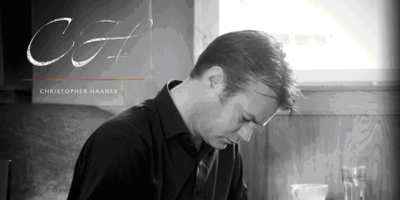
2014-ch01-thumb-400x200

CHRISTOPHER HAANES (b. 1966) is a calligrapher, book-designer, typographer, teacher & author living in Oslo, Norway. He is Scandinavia's only Fellow member of the Society of Scribes and Illuminators (FSSI). He has taught the subjects of calligraphy and typography for more than 20 years, including workshops in England, Holland, Germany, France, Italy, Sweden, Australia, Hong Kong, USA. He has taught at Westerdals School of Communication (former Skolen for Grafisk Design) in Oslo since 1989. He has written articles and essays for D2 (Dagens Næringsliv), Prosa, Numer, Snitt. He is author & designer of five books on calligraphy and typography: Håndbok i kalligrafi (Aschehoug 1994), Kalligrafi (NRK Fale 1998), Bokstavelig (Aschehoug 2004), ABC for voksne og Abstracts (H//O//F 2012). He is working on a Handbook in Calligraphy in English at the moment. Work featured in several Letter Arts Review Annual (a juried magazine for the lettering arts), plus many other Norwegian and international publications.

http://christopherhaanes.com/