「Take Your Pleasure Seriously」手書き文字を究める道
個人的
プロジェクト
—
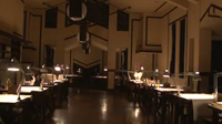
私は時々、自分の深い欲求に耳を傾けずにはいられなくなることがあります。一日が始まっても、すべてを中断して一人きりになり、ドラフティングテーブルの前に座り、しばらくの間心の中にありながら時間がなくて書けなかった文章を書きたくなるのです。そうすることで気持ちがすっきりして、前に進み、一日に向き合えるのです。
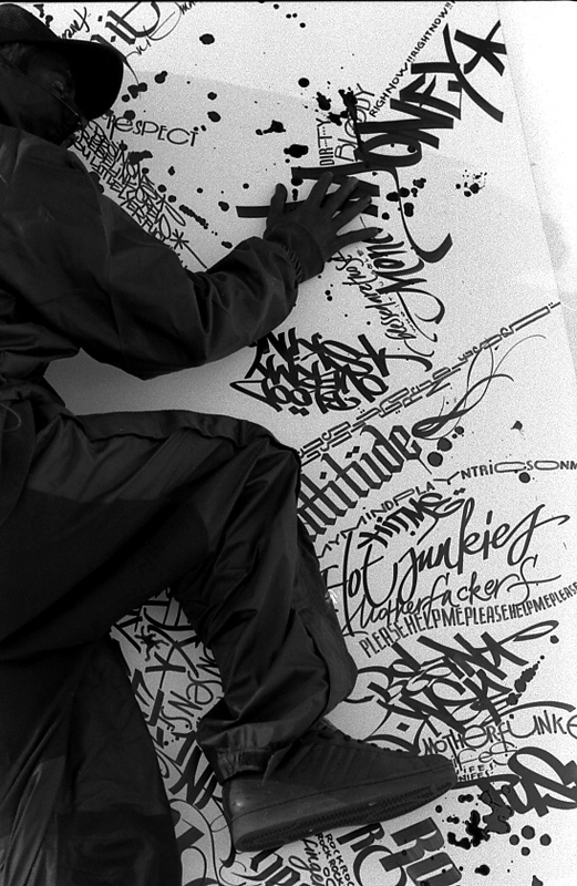
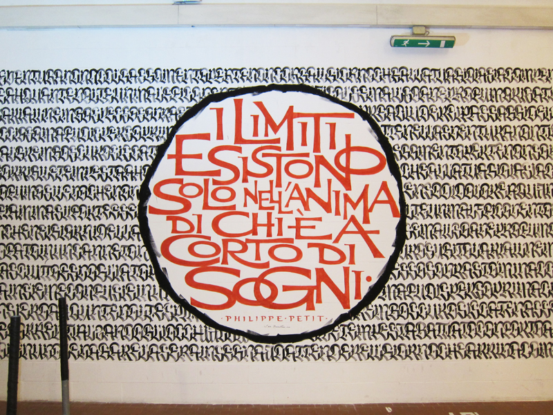
はっきりとした目的がなくても時間を見つけて自分のために何かをするということは、いかなるクリエイティブな仕事をする上でも大変重要です。ここ数年、私のスタジオの仕事量が増大するにつれて、何にも拘束されないで、自分の個人的な活動に費やせる全くの自由時間はますます少なくなってきました。そのことに気づいたとたん、私は仕事のペースを落として自分の好奇心を再発見する時間を見つける必要があると思いました。町や、野外マーケット、まだ訪れたことのない都市の看板などにはアイデアがいっぱいで、外に出てそれを探さなければいけません。ですから私は、例えば、壁いっぱいに文字を書くようなイベントへの参加の招待はたいてい引き受けます。それが自動的に引き金となって、新しい研究、言ってみれば、将来影響を残すであろう何かにつながるのです。望みうる最上の結果は、新しい文字の形を見つけるか、様々な書体間で融合したものを創作することです。なぜなら、ライティングはその性質上、絶えず進化するものだからです。
印刷技術が登場する前の何世紀かの間、カリグラファーは書物に仕える職人と見なされていました。写筆者は必ずしも特別な技術は必要なく、他の人が読めるように書物を単に複製しさえすれは良かったのです。明らかにそれが当時の基準でした。実を言えば、数十年前まで、それと同じ技術が学校で教えられていました。今では信じられないことですが、人々は、博物館の陳列ケースに展示されているマニュスクリプトがどのように作られたのかを学んでいたのです。
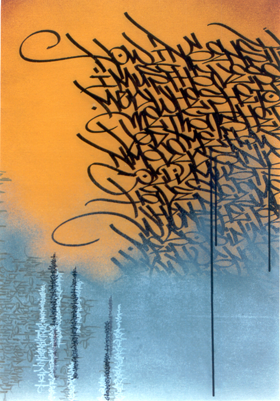
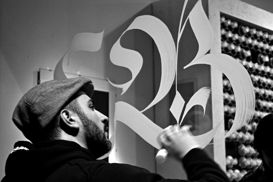
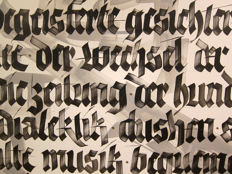
いわゆる表現的カリグラフィーや、ルーリングペン(烏口)のような今日私たちが使っている道具類は、フリードリヒ・ポップルや ヴェルナー・シュナイダーのような巨匠やその他多くの人のおかげで知られるようになりました。彼らは、1950年代半ば、それ自体で表現的アートの形としてのカリグラフィーの基礎を構築しました。彼らは、見た目は単に一瞬で行き当たりばったりにも見える、流れるような制御された線の動きで紙面上に道具を走らせることから始めました。彼らが使う道具は平ペンほど緻密ではなく、(書く道具としては)より未発達なものでしたが、すべてが文字の成り立ちについての深い知識をもってなされていました。
出来るだけたくさんの歴史的書体を知り、加えて絶え間なくトレーニングをし、好奇心と自発性を持ち続ければ、自分自身のスタイルだと認識できる(待ち望んだ)瞬間に到達出来ます。「あなたがそれをやったの?そう思いましたよ!」と誰かに言われるやいなや努力は報われます。何年もかかるかもしれませんが、それだけの時間をかける価値のある道のりなのです。また自分の作品を、達人、自分の前を進んできたすばらしいカリグラファー達の作品と比較して、自分の技術レベルを大局的にとらえることも重要です。真に独自の表現方法は皆、いつも、その作者の背景や受けた影響を表しています。あなたの仕事を判断する人がそのことに精通していなければ、あなたを腕のある人だと思いがちです。それはあなたの自尊心を高めてはくれますが、良いカリグラファーを生みだしはしません。
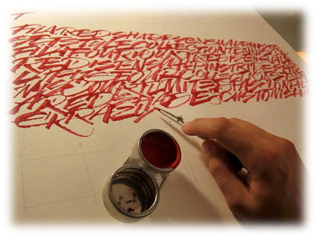
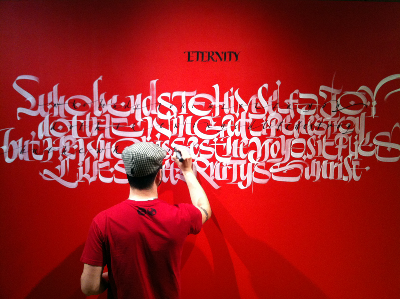
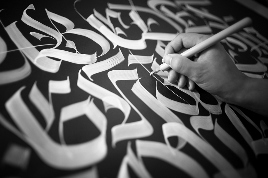
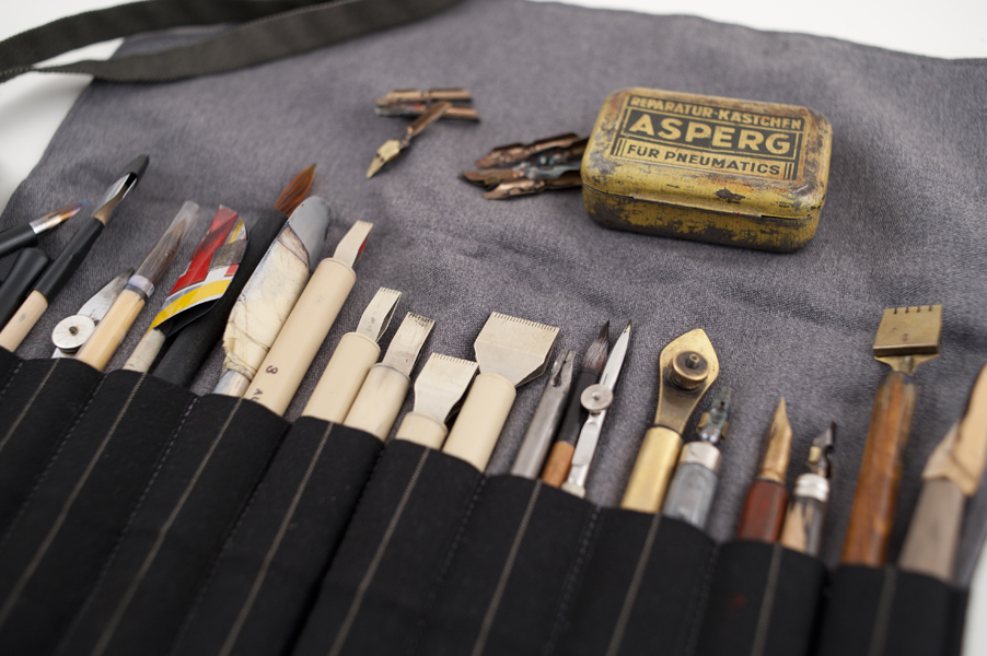
私は、新しい作品に取り掛かるときはいつも、なんて何も知らないのだろう、学ぶことがなんて多いのだろうと気づきます。何百種類もの紙やインクがあり、与えられた文章にはどの道具や文字のスタイルが最適だろうかと考えます。やる気や、直感、知識がすべて合わさって、熟練した手が動くのです。それぞれの紙には最適のペンやインクの濃さがあります。大きな壁面では、課題が増大します。空間認識は、小さな紙の上で作業するする時とは全く違います。後ろに下がって、寸法を目測し、(時には何回も)はしごを上り下りしていると、体中が何日も続けて痛みます。時には、自分の目を信じるだけでよいこともあり、それですべてがきちんと釣り合いがとれるように出来れば2倍の満足感が得られます。
私は、罫線を引くことに関して怠慢なことで目が訓練されて、罫線なしで書けるようになりました。最初はすべての単語がうまくおさまるかどうか分かりません。ちょうどよいサイズの筆を選び、必要に応じて字を詰めたり広げたりしなければなりません。あるいは、事前に参照物を用意し、レイアウトを投影したり、文字を鉛筆でトレースすることも出来ます。ひとつ確かなことは、実は段取りをすればするほど、新鮮さが減ってしまうということです。私は最近気づいたのですが、失敗したり、紙を汚したり、ぼんやりして1文字忘れたりしても、最終的にはそういうことは何も悪くないのだということがわかる楽しみを再発見しました。
私は、作品をレタッチすること、言ってみれば、私たちの本来の姿ではない完璧さを求めることを強制されていると感じるのは大嫌いです。それは、そこから自分を自由にしようとする欲求なのです。幅何メートルものイラストを描けば、ほんの少しオリジナルスケッチから変更しても誰も気づかないでしょう。しかし、もし字が曲がっていたら、気づくでしょう。ですから、私たちは「空間のアーティスト」(artists of emptiness)でなければならないのです。これはトム・ケンプ のすばらしいワークショップで彼から学んだことです。「無」(the nothing)はすでにそこに、つまり文字と文字の間の空間にあり、テキスト上では文字そのものより重要なくらいです。文字は完璧である必要はないのですが、文字間のスペースこそが調和がとれ、少なくとも説得力がなければなりません。
ルドルフ・コッホの福音書のことを思い出します。その非常に美しいページはひと文字ずつ見ると、ゆがんでばらついて見える文字で出来ています。しかしながら、その、文字がぎっしり書かれたページは生き生きとしていて調和が取れて見えるのです。ですから、もう一度言いますが、最も大切なことは、作品全体なのです。
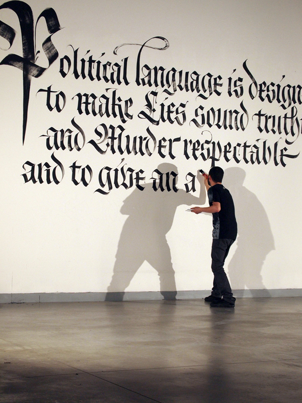

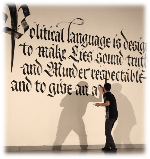
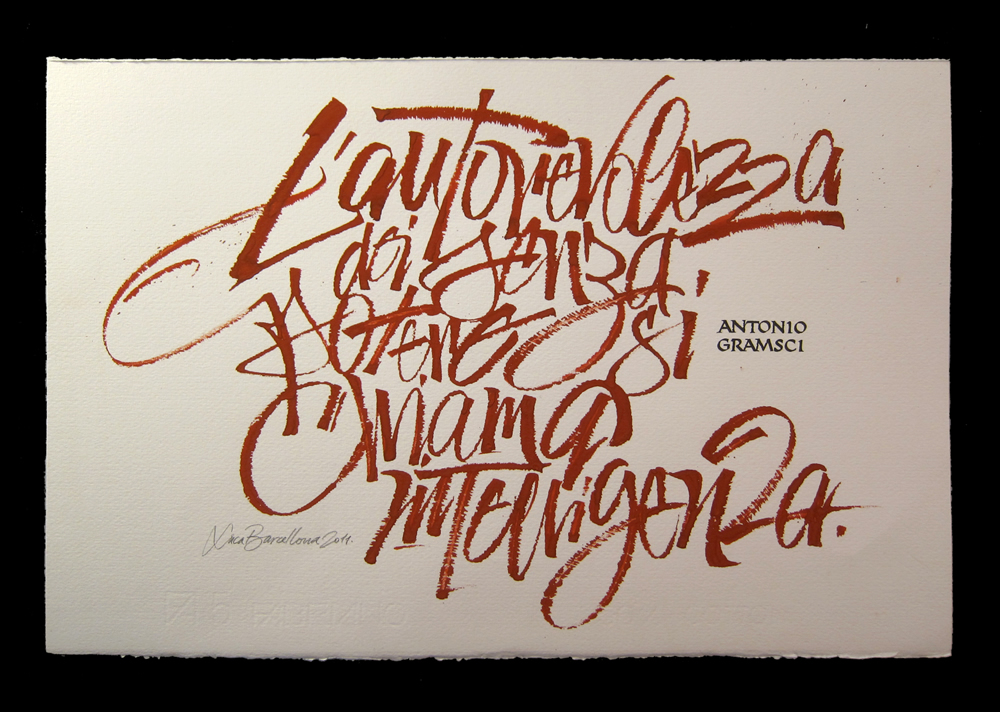
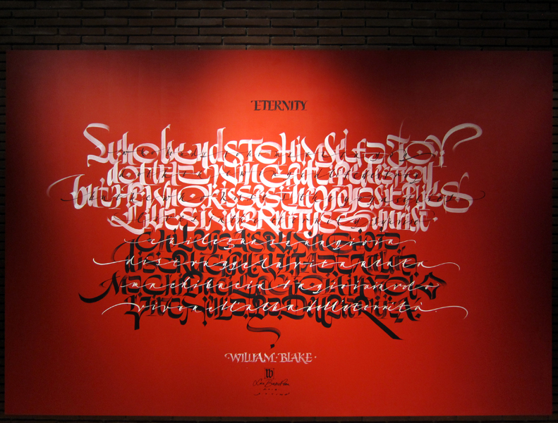
また、何を書くか、内容も考慮しなければなりません。時には、文章の方からやって来ることがあります。先日、私はフィレンツェで壁に字を書かなければならなかったのですが、何を書くか決めかねていました。地元の書店でジョージ・オーウェルの本を見つけたのですが、その背表紙が書棚の他のすべての本より目立っていました。私は、その本を手に取り、タイトルを見ました。『Why I Write』(私が書く理由)。これだ、と思いました。カバーの宣伝文が、政治的な言葉づかいの、二枚舌で不誠実な性質について語っていました。これはその時の私にぴったりで、私はそれを書くことに決めました。テキストの選択はとても個人的な行為です。私は頑固な無神論者なので、いつも聖典や聖書の引用文は避けてきました。しかし、それらはカリグラフィー作品の最もよく使われる内容であり、技巧的に制作される作品でもあるのです。陳腐な表現に陥ったり他人のものばかり引用するのを避けるのは難しいことですが、本当に自分のもの、自分の一部分、そして人生の中で鍵となった瞬間にその場にあったことを書くのが大切だと思います。例えばほとんど無名の作詞家の歌の一節でもいいのです。そうすれば、自分の作品と共にその音楽も広める手助けが出来るでしょう。
何も書かれていない紙への恐怖心を克服する方法がひとつだけあります。それにまっすぐ向き合い、黒いマークから始めるのです。そうすれば、そのマークがきっと着地点を見つけるでしょう。そしてきっと、学ばなければならないこともまだまだあることでしょう。
カリグラフィーを教えること:
自分も学ぶということ
—
私が初めて実際にカリグラフィーと触れたのは、1999年、イタリアカリグラフィー協会(Associazione Calligrafica Italiana)でした。その協会のことは、当時運営チームの一員だったフランチェスカ・ガンドルフィを通して知りました。インターネットはまだ普及しておらず、情報は、その活動や開設コースが掲載されたチラシの形で届きました。私はすでに独学でカリグラフィーをやっていましたが、このような熟練カリグラファーが、まさに私の地元にいることを発見し、最初にフランチェスカ・ビアゼットーンのイタリック体のコースを受講した時、私にとって全く新しい世界が開けました。
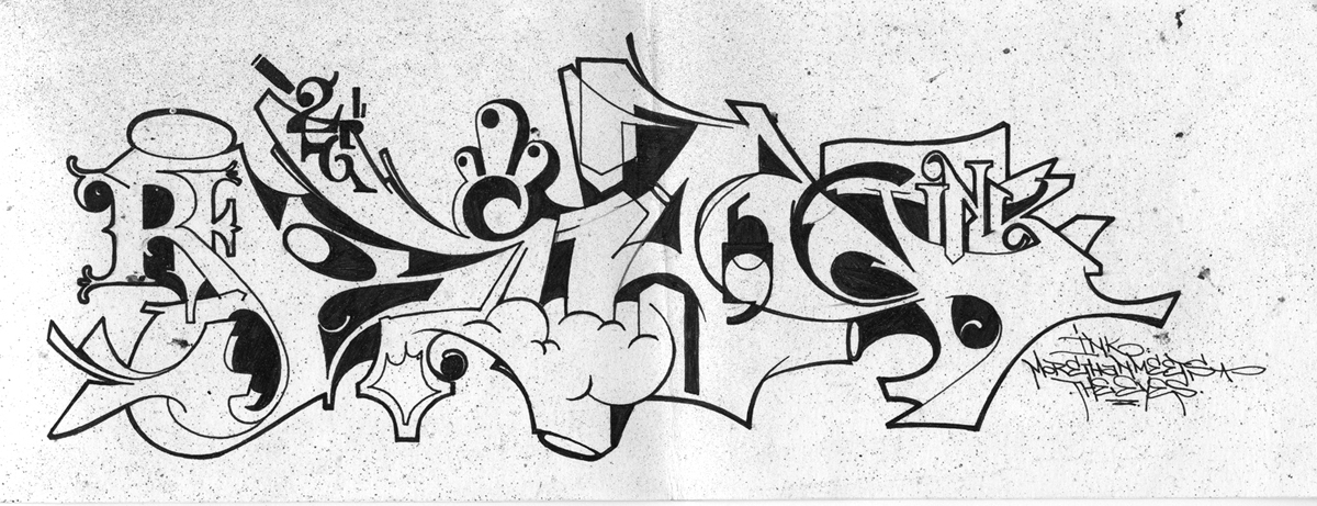
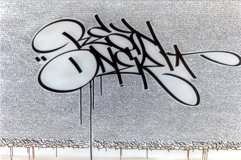
私の取り組みは、依然として、ペン字の訓練というより、グラフィティと強く結びついたものでした。明らかに、その2つの間に大きなギャップ、特に世代間ギャップを感じていました。それでいて、グラフィティライターとカリグラファーはどちらも、方向はしばしば反対ですが、同じレターフォーム(文字の形)に対する情熱によって突き動かされています。いずれにせよ、私は、この2つの世界のつながりを見つけたいと思っていましたし、そのためには古典的なカリグラフィーの様式を深く掘り下げて探求しなければならないことが分かっていました。ですから、出来るだけ多くのコースを取り、歴史的な書体を勉強し、自分のツールキット内の道具やその使い方を多様化させました。
幸運にも、私は、類いまれな独自性を持った偉大な先生たちに出会うことができました。ジョヴァンニ・デ・ファッチョはとても純粋で無尽蔵の資質を持つ真の「ルネッサンス人」です。私は彼から、ゴシックレタリングやその表現上の可能性について多くを学びました。彼の贅沢でクリエイティブなワークショップは忘れがたく、時を超越した雰囲気がありました。イタリアのカリグラフィーの第一人者であるアンナ・ロンキは、厳密さと信じられないような軽やかさがにじみ出るチャンセリー体(イタリック体)を書きます。そして、彼女はペンを走らせて、決して大げさでも場違いな感じでもないエレガントなフローリッシュを生み出します。彼女の特徴は文字と伝統につての深い理解であり、また、掘り下げた効果的な教授法です。彼女は常に第一線で自分のカリグラフィーの考えを守り、ここ数年は、最新の手法を通して学校にハンドライティングを取り戻すという難しい任務を引き受けています。ジェイムズ・クラウ は私に町のいたるところで見つかる文字、歴史をしっかり宿す文字への好奇心を教え込んでくれました。私がよく道路の真ん中で立ち止まり古びた看板の写真を撮るのは彼のせいです。彼はとても魅力的な人で、記憶に残るレッスンを情熱的に進めますが、一方で、遠慮のない正直さで建設的な批判も行います。ルチオ・パッセリーニのおかげで、凸版印刷や、木版印刷、そして質量ともに「良い時間」の価値を正しく理解するようになりました(彼のスタジオが「良い時間」と呼ばれているのには理由があります)。これが本を印刷するには必要なのです。
私が知るようになったカリグラフィー界は多くの卓越した人々で構成されており、その中にはイヴァナ・トゥバロや フランチェスコ・アスコリ、 アンナ・スケッティン、 イヴァノ・ジゾッティ、 マルコ・カンペデッリなどがいます。彼らはそれぞれ、何年にもわたって、確固たる情熱を持ち、懸命に、また、積極的に関与することでカリグラフィーやタイポグラフィーに貢献してきました。イタリアカリグラフィー協会は1991年に創設されました。この協会は、高いクオリティーのカリグラフィー、つまり、20世紀初頭のエドワード・ジョンストンから現在まで受け継がれているカリグラフィーを、イタリアのグラフィックデザインおよび広告界にもたらすことに重要な役割を果たしましたが、それは、まずミラノから始まり、ほうぼうへと広がりました。この協会のサポートがなければ、私は、巨匠達から直接、こんなにたくさんのことを学ぶ機会は持てなかったでしょう。
その創設者達は、イタリア国内で教える前に、イギリス、ベルギー、アメリカといった海外で学びました。彼らは、帰国すると、ハンス・ヨアヒム・ブルゲルトやトーマス・イングマイア、ハッサン・マスディ、 クラウス・ペーター・シェッフェル 、トム・ケンプ、ユアン・クレイトンなどのカリグラファーを招聘しました。彼らのコースはいつも、熱心で資金を他に頼らないボランティアによって運営されています。その後現れた団体も同様の活動をし、同じようにカリグラフィー界に大きな貢献をしました。その中には、トリノにピエロ・デ・マッキや マッシモ・ポレッロが率いるカリグラフィーグループが複数、ローマにモニカ・デンゴが運営するグループがあり、そしておそらくその他にも私が個人的にはまだなじみのない団体がたくさんあるでしょう。彼らの努力がなければ、今日、イタリアでカリグラフィーについて語ろうとすると、誰もがゼロからカリグラフィーとは何かを説明しなければならないでしょう。
私が初めて教えるよう依頼されたとき、うまくいくという自信が十分あったわけではありませんでした。2、3ヶ月かけて、フラクトゥール体のコースを準備し、どんな授業になるか心配でした。そんな私の心配に反して、クラスはとてもうまくいき、多くのコースが後に続くことになりました。最初に気づいたことは、生徒に教えるためには、カリグラフィーをするという純粋な喜びをどうやって伝えるかを知っていなければならないということです。そのためには、十分な寛大さとエネルギーが必要です。なぜなら、ワークショップが終わる頃には疲れ果ててしまうからです。時間がたてば、自分自身の教授法が確立します。そして、同じことを繰り返すのではなく、新しい主題を提示できるように違った角度からの研究をして、生徒の興味、そして、何よりも自分自身の興味を再び引き出していくようにしなければなりません。
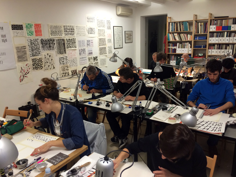
私はいつも、それぞれのコースの参加者の多様性に驚きます。好奇心の強いアマチュアから、熱心なグラフィティライター、愛書家、インク壺にノスタルジーを感じる女性、若い頃指で机をこつこつたたいていた女性教師、船乗りのように毒づくタトゥーアーティスト、そして、キーボードにうんざりして再びペンを持ちたくなったジャーナリストにいたるまで様々です。そして、私のコースは学生や新進気鋭のグラフィック・デザイナーといった、かなり若い人が増えてきていることも注目すべきことです。教えることは明らかに、特権的に与えられた学ぶ機会でもあります。そして、教えに行くことがなければ見られなかったような所を旅する機会だけでなく、新しい人出会い、新しい友と知り合う機会も得られるのです。
書くということは、ほかの学習訓練と同じように、受け継いでいく限り存在し続けます。教えるということは、自分がスタートしたのと同じ道を進む可能性を人にも与えることを意味します。それは、一周して元に戻るということです。カリグラフィーは遠くからやって来て、特にイタリアでは深いルーツを持つアートです。カリグラフィーの現在(特にデジタル時代における)や、願わくば長い未来をたどっていけるように、皆さんはその歴史や過去を知りたいと思うに違いありません。
--------------------
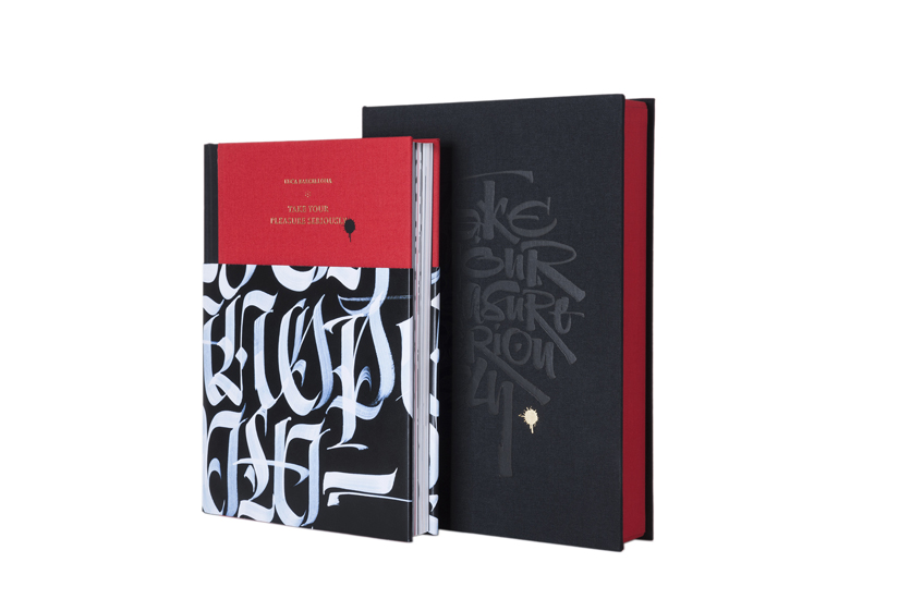
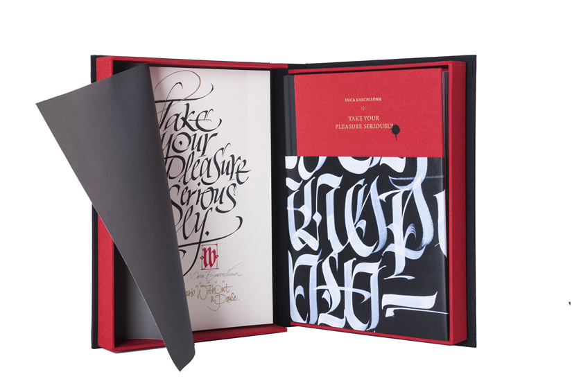
この記事はルカ・バルチェローナの著書『Take Your Pleasure Seriously』(2012)に 掲載されたものです。
--------------------
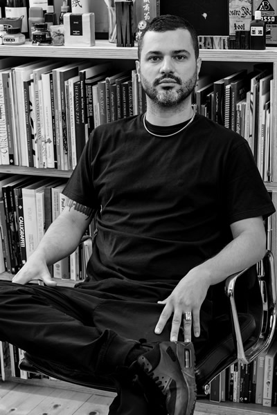
Luca Barcellona ルカ・バルチェローナ
1978年生まれ。イタリアのミラノにスタジオを持つグラフィックデザイナー、カリグラファー。文字は彼の創作活動において最も重要な要素である。 イタリアカリグラフィー協会にてカリグラフィーの教鞭をとるとともに、アメリカ、オーストラリア、ブラジル、ドイツなど世界各地でワークショップの講師を務める。その活動が示す通り、文字と言葉に関わる伝統的芸術の手書き技術をデジタル時代の表現手段と共存させている。2003年に、ラエ・マルティー二、マルコ・クレフィッシュと、カリグラフィーを含む手書き文字とイラストのライブパフォーマンス集団レベルインクを立ち上げる。2009年には、スイスのカリグラファー、クラウス・ペーター・シェッフェルと共に、スイス国立博物館において、1569年に作られた大きな地球儀を、当時と同じ道具(羽ペン・自然素材で作られたインク)を使った カリグラフィーで、原作に忠実に複製する作業の実現に寄与した。文字のデザイン依頼を受けたブランドとして、Carhartt、Nike、 Mondadori、Zoo York、Dolce & Gabbana、Sony BMG、Seat、Volvo、Universal、Eni、Mont Blanc、Wall Street Instituteなどが挙げられる。また、最近参加した展示には、プラハで開催された『Stuck on the City』、ドイツのCarhartt Galleryで開催された『Don't Forget To Write』がある。多くの個別のプロジェクトへの参加と同様に、彼の作品は多くの出版物に登場している。自身の服飾ブランドLuca Barcellona Gold Seriesを2010年に立ち上げ、最近では初の単行本である『Take Your Pleasure Seriously』を彼自身がメンバーを務めるLazy Dog Press社より刊行している。彼の文字デザインに対する取り組みは、グラフィティの経験から伝統的なカリグラフィーへと導かれ、更に大きな壁に描く ウォールペイント、タイポグラフィーそして活版印刷まで広がっている。
ウェブサイトhttp://www.lucabarcellona.com/
翻訳:深尾全代
清水裕子